Jeff Fisher, the Engineer of Creative Identity for the Portland design firm Jeff Fisher LogoMotives, shares his thoughts on some recent major corporate identity makeovers in the latest issue of Fortune magazine. Fisher, Howard Belk of Siegel & Gale, and Bill Gardner of Gardner Design were asked to comment on a variety of logo redesigns now representing major international corporations. Their feedback on the new Kodak, Intel, Sprint and AT&T identities are in the February 6, 2006 print issue of the publication, and online, in the short article Logo-Licious or Lame?
Fortune reporter Telis Demos contacted Fisher after reading his Logo Notions column on the graphic design industry site Creative Latitude.
 Note: In addition to the quotes offered in the Fortune piece I provided the writer with the following comments (and much more in a phone interview) on a variety of recent corporate makeovers:
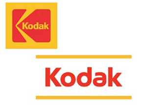
Kodak: I certainly understand Kodak's need to steer their identity away from the film-related imagery of the past in our digital image world. Initially I felt their new image was over-simplified. However, it's growing on me and I do immediately see "Kodak" when I see the new imagery due to the use of the same corporate colors and similar letterforms within the name. I guess the designer did not intend the yellow lines to be part of the new image - the lack of those lines does weaken the strength of the brand identity by eliminating the yellow associated with the corporation for so many years. I do think this will end up being one of the most successful recent corporate makeovers.
 Intel: I think my initial reaction to Intel's new identity was "swoosh-o-licious!" While integrating multiple corporate image elements into a new identity the inclusion of the swooshes makes the new image seem somewhat dated at introduction. I do have a particular aversion to swooshes in logos. They are such a throw-back to the dot doom of the 90's and they are so "last century."
 A couple of my favorite sites or articles about logo swooshes are Logo Hell and Swoosh! There It Is. In Fact, Swooshlike Logos Are Everywhere.
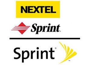
Sprint: My initial impression to this design was: "Why is the name so far away from the icon?" The placement still seems off to me. When I've seen the logo making use of the icon stacked above the name the identity seems stronger to me. I do think the identity works as a good combination of the past Sprint and Nextel identities. I look at the word "Sprint" and still seem their old red in my mind - and the yellow does convey "Nextel" to me. It's a corporate makeover that is growing on me as a designer.
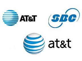 at&t: Probably my least favorite recent corporate makeover. My immediate response was "it's fugly." I think a classic, easily recognized logo has been altered to look like a marble croquet ball and the lower-case type of "at&t" looks juvenile to me - rather than making the corporation seem more friendly to the world.
 Quark: I still think the logo is lame - its look like an "a" rather than a lower-case "q". I also think Quark and the design firm hired did a less than stellar job of creating something unique - especially with the number of similar designs found by designers around the world. (you may want to read the article I wrote about this issue: Inspiration, imitation or innovation - how do designers create unique identities?.)
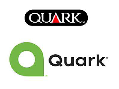
 Visa: This rebranding works for me. The change was so subtle I doubt if many customers have even noticed.
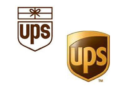 UPS: I still have issues with accepting the new identity introduced by UPS in 2003. How dare they mess with Paul Rand's classic logo? It seems a bit "swooshy" to me with the arcing line in the upper portion of the design. In the "Keep It Simple, Stupid (K.I.S.S.)" world of identity design the 3D aspect of the image has probably created a number of reproduction issues since the logo was put into use.
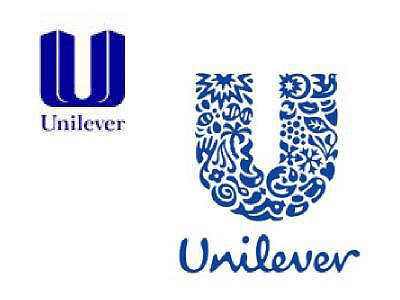 Unilever: Introduced back in 2004, I think this is one of the best and most unique corporate redesigns in recent years. The logo is beautiful, fun to dissect and somehow does work well in small applications. The new symbol also eliminates the World Trade Center tower imagery of the old design.
 USA Network: While the new design is simpler and stronger I do snicker a bit at what appears to me to be male genitalia coming off of the "U" and "A" letterforms in the logo. When I point it out to people they say that is then all they see each time the logo appears on the television screen.
* If I don't "toot!" my own horn, no one else will
© 2006 Jeff Fisher LogoMotives