Spring has sprung (Part Deux)

This is part two of a newspaper article about my garden that appeared in the North Portland Press.The first installment was posted on bLog-oMotives here.

Joy Creek Nursery will be totally redesigning the back garden this year. Jeff and Ed plan to install French doors off their bedroom and build a deck - next to the recent hot tub addition - overlooking the garden. An excess of concrete will be removed and some replaced by the same pavers as in the front of the house. A stone walkway will replace one existing sidewalk. An arbor or pergola will be built adjacent to the garage and part of it will be covered to allow a year-round barbecue area for Ed. Plans include growing grapes and a wisteria on the structure.

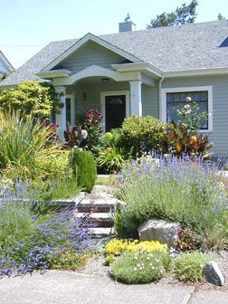
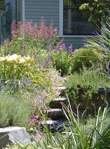
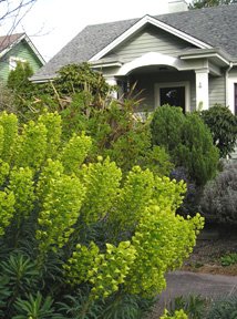
Currently the back yard plantings include begonias, clematis, roses, honeysuckle, hostas, grasses, hydrangeas, fuchsias, a star jasmine, helebores, African daisies, dahlias, heuchera, primroses, datura, calla lilies, ornamental fruit-bearing blueberries, crocosmia, alstroemeria, epimedium, pulmonaria and many others. Many of the shade garden plants are very happy under the lilac or pink dogwood that were in the back yard originally.

How would you best describe your garden?
Eclectic and a color theorist’s nightmare.

What are the uses for your garden?
The biggest benefit of the garden is Jeff’s therapy from working at home. A plaque in the backyard reads “Play in the Dirt” and that is the best escape from working at home. The garden is also a great place to entertain and brings a great deal of enjoyment to neighbors and people just passing by. The vegetable garden provides a great deal of food throughout the year, including greens during the winter months.

How about maintenance and upkeep?
As mentioned above, the upkeep is a form of therapy. However, it is really kept at a minimum. Gravel paths were lined with a weed barrier prior to installation. The small gravel on the median and bed above the wall helps retain heat and moisture, while keeping weeds at a minimum. Compost is put on most of the beds a couple times a year and also keeps weeds at bay, or makes removal easy.

What about water usage and watering cost?
The use of timed irrigation system and drip irrigation equipment throughout most of the garden keep costs to a minimum. Most of the plants in the median and at the foreground of the front garden are somewhat Mediterranean and don’t require a lot of water. The gravel and compost bed covering also retain a lot of moisture.

Do you have tips for other gardeners?
Have fun. Don’t be afraid to experiment. There are no stupid questions when needing additional gardening information. Attend free classes and seminars offered by local nurseries or gardening organizations. Don’t be afraid to plant things wherever you want—if it doesn’t work out, in most cases you can move the plant somewhere else, at the appropriate time of season. Read gardening books and magazines, and attend gardening shows. Prior to moving into their house Jeff and Ed had not even lived in a residence that allowed for a garden.

Favorite part of your garden? Gardening?
A favorite aspect of the garden is that it literally has things blooming year-round. The compliments and comments of people passing by are always appreciated a great deal. Photographers for major national gardening magazines have photographed the garden for possible future stories and that is very gratifying. Ed enjoys the practical use of his vegetable garden. Jeff, as a graphic designer, appreciates the creativity of gardening and the therapeutic aspects.

Where do you shop for plants, bushes, trees, etc.?
Knowing the owners of Joy Creek Nursery in Scappoose, having worked with them over the years, and with their involvement in the design and installation of most of our garden, the vast majority of our plants still come from their nursery. Almost all of our annuals come from Marbott’s on NE Columbia Boulevard. Very seldom do we buy any plants from area grocery stores or home improvement stores. The plants are just not of the same quality as the nurseries we frequent and often don’t thrive—or, in some cases, don’t even survive.

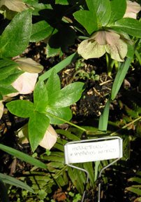
What’s up with the little signs?
When the garden was first planted people would often come to the door to ask what specific plants were, or leave notes on the front door with plant identification questions. On occasion this would happen several times a day. The interruptions were hampering Jeff’s ability to work from his home office. The plant identification signs have helped immensely—and people will often be out front, with a notepad and pencil, writing down the names of various plants. Cars driving down the street literally stop in the middle of the road. People come with their cameras, and sometimes their landscape designers, to document what is going on in the garden.

Note: Every so often, throughout the rest of the gardening year, I will post updates from my therapy sessions in my garden. I hope others are having fun "playing in the dirt."

Check out the redesign and renovation of my backyard garden in How does your garden grow?

© 2006 Jeff Fisher LogoMotives

5oup.com serves up a cup of fresh student talent

5oup.com is providing an online presence for a "creamy mix of fresh talent" to be seen by those seeking young creative individuals worldwide. 5oup is open to all fields of visual creativity and is attracting examples of incredible student work from around the world

New student talent is added to the fresh page each day, and at the end of the week the best of seven are chosen to grace the "featured" slot for the duration of the following week.

Design students James Chambers and Tom Judd set up 5oup at the beginning of 2006 as a portal for like minded student artists to get their work seen. The site went live in February of this year and is an excellent showcase for the work of many talented students.

I appreciate the fact that founder Chambers sent me an email stating that 5oup is a supporter of the NO!SPEC campaign and a link has been added on the site. Show your support of 5oup.com by visiting the site and those of their sponsors.

© 2006 Jeff Fisher LogoMotives.

Spring has sprung - gardening's begun (Part 1)

I've recently spent a couple afternoons getting a good dose of my favorite therapy - gardening. Spring has officially arrived! When we first moved into our North Portland home, friends and family were stunned that I enjoyed getting outdoors to "play in the dirt" of our yard. I'd never had a garden before and found it easy to get lost in gardening as an escape from my work.

We constantly have people literally "stop and smell the roses" as they walk, or drive by, our house. Quite often people will ask where I live and, when I tell them, they will react knowingly with, "Oh, the house with the garden." There will be changes and additions to the garden with the new season. With the nice weather, and longer daylight hours, I will make my way outdoors more - and my gardening efforts will occasionally find their way to this blog.

Our garden has gotten a lot of attention over the past six years. Photographers for Martha Stewart Living and Better Homes & Gardens (their photographer stopped by while the police were investigating a portable meth lab parked across the street) have photographed the garden for possible future stories. Mike Darcy did an episode of his television show, In The Garden, from our front yard in late 2004. The article below was published in the former neighborhood paper, the North Portland Press, and was written by our friend Lisa Horne.

A Garden Treasure in North Portland

Ed Cunningham and Jeff Fisher have been together for 16 years and share many of the same interests, especially travel, gardening, entertainment, art, great food and wine. Ed is a gourmet chef and avid bicyclist. He occasionally bikes to work in downtown Portland where he is the business manager for the Portland office of Holland & Knight, LLP, an international law firm. Jeff is the Engineer of Creative Identity for his own graphic design firm, Jeff Fisher Logomotives, which he has owned for nearly years. Primarily a logo designer, Jeff has worked with clients from all over the world and has written a book about the graphic design business. His North Portland clients include Coyner’s Auto Body, James John Elementary School, Lampros Steel, North Portland Business Association, Peninsula Clean Team, Peninsula Community Development Corporation (publisher of the North Portland Press), Portland Relief Nursery, and Mike Verbout.

When did you move to North Portland?

We moved to the Arbor Lodge neighborhood of North Portland in the spring of 1997 after living in a Pearl District loft for five years. The loft had a little 2" x 3" balcony which allowed for very limited container gardening. A friend called one night and left a lengthy message on our answering machine saying she had found the perfect house for us. Very early the next morning we drove up to the house and I immediately said to Ed, “I want to live here.”

Describe your house and property

Our house is your classic little 1928 Portland bungalow. The house had a history of being a “problem” in the neighborhood and the site of some drug trafficking. When we first moved in the front yard was totally unremarkable, with only a few rhododendrons, an old Peace rose, an unhealthy maple tree and an ash tree that was in bad shape. The front sloped to the sidewalk quite a bit making the grass difficult to mow and the lawn was in need of a lot of help. The back yard was in even worse shape—especially since the previous residents had not had garbage picked up and dumped everything in the back over several years.

When was your garden put in?

The crew from Joy Creek Nursery put in the hardscape (the brick wall, pavers across the median, the new cobblestone path to the porch and an irrigation system) following the plans of landscape designer John Caine in late summer of 1999. The initial plantings were installed by the nationally-known nursery in the early fall of that year. (Note: We've added and subtracted plants a great deal since then. Often becoming the "test garden" for future Joy Creek plant offerings)

What is in your garden?

Median: The trees are a Forest Pansy Redbud with purple and green leaves that pick up many of the other colors in the yard and the colors of the house. Other plants include lavenders, rosemary, thyme, various sedums, ornamental grasses, Russian sage, lobelia tupa, coreopsis, cistus, yucca, oregano, geraniums, penstemons, crocosmia, salvia, kniphofia (Red Hot Poker) and numerous types of bulbs. The large euphorbia, with the vibrant green blooms, literally stops traffic. A huge ornamental thistle always brings comments about the large “weed” growing in the garden. Roses are planted to present blooms at just the right height for people walking by to “stop and smell the roses.” Herbs planted in the median are not used for cooking due to the bed’s use by visiting dogs.

Front: The bed at the top of the wall is mounded, so from the house you don’t see the street or sidewalk—which extends the vista of our garden to the city park across the street. It also gives the upper garden some privacy. The plantings include verbenas, anemones, heuchera, alstro-emeria, climbing roses on unusual metal sculpture trellises, lavenders, fuchsia, grasses, chocolate cosmo, datura, an ornamental dogwood, lobelia, rosemary, sedum, Japanese irises, lilies, hebe, hostas, helebores, calla lilies, ferns, shooting stars, purple sage, a bay laurel, hibiscus, dianthus, diascia, hydrangea, dahlias, rudbeckia, asters, veronica, a peony, ferns, saxifraga, phygelius and potentilla. The two large spiky eryngiums at the front of the garden add a dramatic flair, as do the brilliant orange canna which grows to over seven feet tall in the summer. A fun surprise in the garden are the leeks that also grow quite tall with their round blooms. In addition, Mike Smith, of Joy Creek Nursery, and Jeff planted over 750 bulbs in the front yard including crocus, tulips, snow drops, delicate irises, daffodils and others. One benefit of the garden is that it draws attention away from the large picture windows in the living and dining rooms of the house as people pass by. The garden has been designed to attract the maximum number of honey bees, bumble bees and hummingbirds.

Side: With the north side of the house being in shade most of the day the garden is a work in progress of ferns, bleeding hearts, miniature hostas, tricyrtis and other shade-loving plants.

Back: The back garden has a dual personality with both flowers and a vegetable garden. Ed, a gourmet cook, oversees the vegetable garden with its several varieties of tomatoes, beans, peas, kale, mustard greens, collards, salad greens, squash and raspberries. He also grows a wide variety of herbs for cooking including rosemary, basil, cilantro, thyme, oregano, marjoram and parsley.

More of the North Portland Press article may be found in the blog entry Spring has sprung - Part Deux. Check out the redesign and renovation of my backyard garden in How does your garden grow?

© 2006 Jeff Fisher LogoMotives

Kevin Carroll and a cup of "joe"

While not a huge fan of Starbucks, the mega-corporation gulping up the coffee business around the world (I will never forgive them for what they did in buying my favorite coffee company, Torrefazione Italia, and shutting down all the cafes. I can't even bring myself to buy the beans now marketed in grocery stores under the name. And don't get me started about their corporate grinding of Astoria, OR coffee shop owner Sam Buck...), I have always been able to appreciate the company's effective use of graphic design. advertising and marketing. And now, a quote from someone I've met is on coffee cups at Starbucks.

Kevin Carroll is a force of nature. If you've never seen him speak, find out where he will be next and attend. This guy will "suck the air out of the largest room" (a term a friend once used to describe my sister's energy level) with his passion, enthusiasm and verbalized thoughts. If you haven't read his book, Rules of the Red Rubber Ball: Find and Sustain Your Life's Work, get yourself a copy as soon as possible. In fact, go to the web site of his company, The Katalyst Consultancy for all kinds of great information and to sign up for his monthly newsletter.

Kevin is full of words of wisdom. Now, a morsel of his advice is part of a campaign initiated by Starbucks to encourage conversation and interaction between its customers. Through their "The Way I See It" program, quotations by notable figures have been printed on cups and distributed via 17 million coffee drinks across North America. The Kevin Carroll quote, on cup #77, is:

The human catalysts for "dreamers" are the teachers and encouragers that "dreamers" encounter throughout their lives.� They are invaluable in the quest to turn ideas into reality.� So here's a special thanks to all of the teachers - especially my teacher, Miz Lane!

I've got my own Kevin story. Kevin made me famous - or perhaps, infamous. At the 2004 HOW Design Conference in San Diego, I was lamenting (OK, I was bitching and moaning) to Kevin and my friend Karen Larson (of design firm Larson Mirek) about the fact that my presentation was the last one of a long day. Known for occasionally working in my home office in my underwear, I said "Maybe I should do my presentation in my underwear to wake people up." Kevin's eyes lit up, and he flashed his famous grin, as he yelled "Do it!" Karen soon joined his enthusiasm after initial head-shaking. Then Kevin gave me one additional little piece of advice: "Have one glass of wine before making your presentation to take the edge off." Later that day I got rid of that "edge" - and then my shoes, shirt and pants as I made my presentation. My performance was a huge hit -and to this day I take great pleasure in blaming (and crediting) Kevin Carroll for my actions. I also thank him for his encouragement.

Damn...I may even need to go get a grande latte at Starbucks to support Kevin's thought about teachers...and my thanks to elementary school teacher Tom Tyler, high school art instructor Ken Collins and university journalism/design professor Roy Paul Nelson.

Photo: The Katalyst Consultancy

© 2006 Jeff Fisher LogoMotives

The Caravan Project - and others in the design world - take note and support the NO!SPEC campaign

Earlier this month I posted a bLog-oMotives entry about the launch of the international NO!SPEC crusade. The mission of the campaign is to educate the public about speculative, or 'spec' work. The target audience includes those who use creative services, as well as creative professionals (designers, photographers, illustrators and those in marketing and branding). NO!SPEC also serves as a vehicle to unite those who support the notion that spec work devalues the potential of design and ultimately does a disservice to the client.

Since the announcement of the cause, designers around the world have been informing businesses, organizations and individual designers about NO!SPEC. In some cases such introductions have been in the form of educating others about the fact their "design contest," call for design submissions, or request for unpaid work as a condition of possible hiring, is in fact "spec" work.

One such situation was that of The Caravan Project. According to their web site, "In early June 2006 a crummy looking Caravan will have been transformed into a beautiful piece of graphic design. It will be used as an art gallery for people to display their work, and will travel around Sweden during July 2006." The Caravan Project is made up of three designers - Petter Johansson, Magnus Berg and Fredrik Öst - all with a great passion for design, art and music. I want to compliment Frederick Ost for engaging in a positive dialogue with Cat Morley, Project Manager of NO!SPEC, in regards to how their original call for participation constituted "spec" work. The Caravan Project members worked with NO!SPEC to revise their request into a much more ethical design project procedure. I applaud their willingness to take another look out how their project was being conducted and make alterations. I urge other designers to support The Caravan Project and their promotion of NO!SPEC. When you visit the TCP web site you will see their support in the form of the graphic posted above.

Other business and organizations are also taking note of the purpose of NO!SPEC and responding in a very positive manner as well. Please take a look at the latest NO!SPEC Advocacy Update to see the results of the work being done by design industry professionals on this issue. A special thanks to Carmen von Richthofen, Executive Director of The Association of Registered Graphic Designers of Ontario (RGD Ontario) for her work on the update. If you've got a few minutes, take the time to contact those now promoting the cause of NO!SPEC. The personal efforts of those involved in this campaign are making a difference.

Check out what other designers are writing about NO!SPEC through links posted at Designers Who Blog

© 2006 Jeff Fisher LogoMotives

The lost art of the thank you note (reprise*)

I can't stress the value of a simple "thank you" enough. It will be one of the most important communication tools throughout your professional career. In addition to be being a common courtesy, you are conveying that the value of another person's time, or effort on your behalf, is understood and appreciated. However, expressing appreciation has seemingly become a lost art in day-to-day business dealings.

As a child, one of the most annoying things my mother ever made me do was requiring me to sit down at the dining room table for the purpose of writing personal thank you notes for gifts received on any occasion. A couple years ago I let my Mom know I had been cursing her as I hand wrote about 25 personal notes to people from the HOW Design Conference who had taken the time to give me advice, took me out dinner or presented me with gifts. Her response was, "I guess someone raised you properly."

The use of the thank you note has been in the news recently. The Web presence CareerBuilder.com conducted a survey of hiring professionals in regards to how their employing decisions were influenced by thank you notes, or other forms of appreciation or acknowledgement, from interviewees.

"Although most hiring managers expect to receive a thank-you note, format preferences differ. One-in-four hiring managers prefer to receive a thank-you note in e-mail form only; 19 percent want the e-mail followed up with a hard copy; 21 percent want a typed hard copy only and 23 percent prefer just a handwritten note," wrote Rosemary Haefner, Vice President of Human Resources for CareerBuilder.com, in her article No Thank You Could Mean No Job.

She added, "No matter which format you choose, it's crucial to act quickly when sending a thank-you letter to your interviewer. Twenty-six percent of hiring managers expect to have the letter in-hand two days after the interview, and 36 percent expect to have it within three to five days. Sending the letter quickly reinforces your enthusiasm for the job, and helps keep you top-of-mind for the interviewer."

The thank you note has a variety of valuable applications.

When David E. Carter publishes a book featuring a designer's work, as a result of one of his design competitions or some other effort, he sends a complimentary copy to the contributor. I've made it a practice to make sure I immediately send a thank you to Carter each time I receive one of his publications to add to my collection. In 2001 I received a copy of his book Blue is Hot, Red is Cool, exhibiting several examples of my logo design work. I sent off a thank you, in email form this particular time. I was stunned when I got Carter's response:

"Thanks for the nice note. You don't know how much I appreciate your taking the time to do so. (I know, you are supposed to send 'thank you' notes; parents all taught us that. But of the 70+ copies of the new book I sent, I have received exactly two 'thank you' notes.) Best wishes."

I couldn't believe that lack of appreciation demonstrated by those in our profession. I do realize that everyone has busy schedules, but it should be a regularly scheduled activity to take time to jot off quick notes to those who have done something worthy of a "thank you." Doing so makes a huge impression on people — and for some reason most people's professional manners just aren't what they once were. I recently had a letterpress blank notecard produced for multiple purposes — including showing appreciation.

"I make it a point to send a thank you note," says King Design Group's Cindy King. "I have specific notecards that I designed for this purpose. It's always a handwritten note."

"We always send a handwritten note of some kind after first meeting with any potential client thanking them for their time and consideration." contributes Gary Dickson of Epidemic Design. "Sometimes it is a card that we have produced but, if not, we are very careful to purchase a unique card that cannot be found in a typical store."

Martha Retallick — "The Passionate Postcarder" — adds, "I have a special 'Thank You' postcard. I try to make it a point to send at least five handwritten 'Thank You' cards per day. No, my handwriting isn't the best, but what better incentive to improve it?"

No matter what form you chose to communicate your thanks, making the effort is a must and the recipient will remember it. All designers — and all business people for that matter — need to make it an element of their daily communication, marketing and promotion efforts.

Article links:

David E. Carter / GraphicBooks.org

Cindy King / King Design Group

Gary Dickson / Epidemic Design

Martha Retallick / Western Sky Communications

*Note: This article originally appeared on the late, great web site Commpiled.com. As the site article archive no longer exists, I am reposting it here. Portions of this piece appear in my book, The Savvy Designer's Guide to Success: Ideas and tactics for a killer career."

© 2006 Jeff Fisher LogoMotives

Logo design by HUGE committee:

C&G Partners and nearly 16,000 voters

While on vacation this past month I missed several episodes of my favorite television news program, CBS News Sunday Morning. The February 26th episode had a very interesting graphics-related segment, entitled "Identity Crisis," in which reporter Russ Mitchell took viewers through the process of designing a logo for the show's "The Money Issue" feature.

CBS News Sunday Morning asked identity industry giant C&G Partners, creators of many immediately recognizable logos, to demonstrate the identity design process - in the admittedly ridiculous timeframe of three days. The piece - with great input from New York Times Book Review art director, author and School of Visual Arts Co-Chair Steven Heller (who was kind enough to contribute to my own book) - was a fairly decent video exhibition of a design firm at work. You can view the show segment here. The clip is also available for download from the C&G Partners web page, which further explains the project and answers questions received since the airing of the show.

The results of the major "design by committee" process, with about 16,000 people voting, may be seen on the CBS Sunday Morning web site. (A high-resolution viewing of the "Identity Crisis" segment is also available on the site.) Like the designers on the project, and the voting general public, I would have selected the image chosen from the limited options presented. Still, I don't know if the end result truly best serves the needs of the client - and I think the project conveys some of the limits (and dangers) of a three-day design process and a selection committee of thousands.

Photo: CBS News Sunday Morning

© 2006 Jeff Fisher LogoMotives

SquidSoap: Great product, incredible

packaging and brilliant logo

Every once in a great while a new product comes along that jumps off the shelves, or page of some publication, and makes you take note. The recently released children's product SquidSoap is just such an item - from the standpoint of product design, intended use of the product and graphic identity.

SquidSoap is a liquid soap dispenser that puts a small, kid-safe ink mark on the child's hand when the pump is pushed. The mark can be removed only by washing the hands for 15 to 20 seconds, the amount of time often recommended by experts in infectious disease control. Developed by John Lynn, a chemical engineer in Austin, Texas, SquidSoap ink is made with FDA-approved ingredients; it's even edible, according to the company. The dispenser is refillable, but the inkpad eventually empties. The soap is ordinary liquid hand soap, not the antibacterial kind.

The blue plastic bottle comes with an inviting orange squid with eyes draped over the pump top and down its sides. The brilliant logo makes use of the often-cliche child's handprint in a unique and clever manner. The graphic hand is down-turned and orange, with a blue eye representing the product's ink mark. To any kid, or fun-loving adult, the image will immediately resemble a cartoonish squid. The packaging and logo were designed by the Austin office of Pentagram. DJ Stout and Julie Savasky were the designers.

Where was SquidSoap when I was a kid and my mother was constantly hounding all her children to wash their hands? Still, it will fit nicely into the grown-up "Little Mermaid" themed bathroom of my current home.

SquidSoap may be purchased at select grocery stores, pharmacies and through the the company's web site.

Photo: SquidSoap

© 2006 Jeff Fisher LogoMotives

R.I.P. Commpiled.com

Sadly, the web site Commpiled.com - The Marketing Communications Network - notes today that "The Commpiled Network has been closed and is now for sale." For many the site was a great source of information and inspiration. Articles about various aspects of advertising, marketing, promotion, design and creativity were staples of the web presence. Over a dozen of my own articles appeared on the site since 2004. Thanks to Howard Theriot, and others who were involved, for all of their efforts on the site. It will be missed.

I've already received a few requests for links to my articles that appeared on Commpiled.com. If possible, the pieces are linked below. Some of the articles have also been blog-oMotives entries, published in How Magazine, or posted on CreativeLatitude.com, Graphics.com, and the former StickyIdeas.com. I will get others posted as soon as possible.

The proper care and feeding of the in-house designer (January 2006)

These are a few of my favorite things - from the world of identity design (December 2005)

Designs on your own neighborhood (November 2005)

Designs on dining: Restaurant logos as a graphic invitation to a meal and an experience (September 2005)

Tooting your own horn: How designers can get the word out (September 2005)

Profiting for pro bono creative efforts (August 2005)

How much should I charge? (July 2005)

Designing identities for faceless clients by way of the Internet (June 2005)

A winning strategy: Industry awards as a design tool (May 2005)

Preaching what you practice: Speaking in graphic tongues to the masses (February 2005)

Don't shoot the client (January 2005)

When a "contest" is not a contest (November 2004)

I hope this helps those looking for the articles.

© 2006 Jeff Fisher LogoMotives

International NO!SPEC crusade launches

The international graphic design NO!SPEC crusade launched worldwide this morning. NO!SPEC is an effort to educate Visual Communication Designers and those who use their services, on the damaging effects caused by spec work and spec-based design contests, a group of designers from all over the globe banned together, fueled by passion and a lot of caffeine, to bring NO!SPEC to the public.With legitimate design opportunities turning into calls for spec work at an alarming rate, it is our goal to arm designers with the tools they need to take a stand against this trend, as well as provide businesses with resources and information on why spec work harms our industry, and alternative solutions to their design needs that do not involve working on spec. The NO!SPEC initiative includes contacting designers, educators, businesses and organizations, creating NO!SPEC promotional materials, protest letters, and writing petitions. In the future there will be NO!SPEC material for educators to use in classrooms, and more.

It’s time to take a stand! And with the international support of NO!SPEC, we ask that you please join us in promoting professional, ethical business practices by saying NO! to spec.*

According to Project Manager Catherine (cat) Morley, designers can support the cause by:

• grabbing a NO!SPEC logo at the web site and linking back (By the way, the NO!SPEC logo was designed by Piers Le Sueur of ArtnSoul Graphic Design)

• sharing the powerful posters created by Von Glitschka
with design schools, etc (shown below)

• posting on their blogs

• writing articles or sending in links pertaining to NO!SPEC

• sending protest letters

• signing the petition posted online

• contacting their design organisations

• filling out the NO!SPEC survey

• participating in the 'Have YOUR Say'

• offering to translate the NO!SPEC site to get the
word out internationally

Go to the NO!SPEC web site for much more information and to get involved in this important design industry crusade.

(*Text from the NO!SPEC web site)

Toot! Toot!*:

Jeff Fisher LogoMotives receives

American Corporate Identity 22 honors

The Portland graphic design firm Jeff Fisher LogoMotives has been honored with four awards in the American Corporate Identity 22 design competition. The winning entries will be featured in David E. Carter’s book, American Corporate Identity 2007, to be released later this year. Designer Jeff Fisher has received 25 of the ACI honors over the past nine years.

The identity for the Benicia Historical Museum - in Benicia, CA - was was among those recognized. Sue Fisher, of TriAd, was the art director on the project. The new logo for Just Out, the news- magazine serving the LGBT community of Oregon and SW Washington, was also honored. Marty Davis, publisher of the paper, worked closely with Fisher to establish the new look. Fisher's graphic image for NoBox Design, a Portland interiors firm, also received an ACI 22 award. In addition, Twisted Elegance Interactive's identity was honored. A previous business entity of Jason Holland Design in Seattle, the firm's logo was recognized earlier in the P22 Fonts In Use Competition.

Jeff Fisher has received nearly 500 regional, national and international graphic design awards for his logo and corporate identity efforts. His work is featured in more than 75 publications on the design of logos, the business of graphic design, and small business marketing.

Fisher is a member of the HOW Magazine Editorial Advisory Board and is also on the 2006 HOW Design Conference Advisory Council. His own book, The Savvy Designer's Guide to Success, was released by HOW Design Books in late 2004.

(* If I don't "toot!" my own horn, no one else will.)

© 2006 Jeff Fisher LogoMotives

A reading list for poolside enjoyment

When on vacation I become a book reading fiend. Give me a stack of books, a comfortable chaise, a yummy tropical drink - with a great ocean view - and I'm happy. Recently, while on the island paradise of St. Croix, I read a great selection of books for anyone putting together a take-along library for their spring vacation.

The book I enjoyed reading most of all was Little Chapel on the River : A Pub, a Town and the Search for What Matters Most, by Gwendolyn Bounds. I read this thoroughly enjoyable book, by Wall Street Journal writer Bounds, on the multiple planes while traveling to the Caribbean. Bounds and her partner lived across the street from the World Trade Center and were getting ready to go to work when the planes struck the towers on 9/11. Displaced from their home, a friend takes them to Guinan's, an old Irish bar in the small, upper Hudson River town of Garrison, N.Y. The stories found in that small-town pub make a great read. For additional information check out the writer's personal web site. Bounds also writes about the challenges of small business and entrepreneurship most Tuesdays in the Enterprise column for The Wall Street Journal and the articles can be found at StartupJournal.com.

A book that should be required reading for any designer, advertising or marketing person, or public relations professional is Blink: The Power of Thinking Without Thinking by Malcom Gladwell. This book about how we make snap judgments - in our personal interactions and career situations - offers great insight into how we are sometimes manipulated by marketers and others, and how we should often pay much more attention to our first impressions in many decision-making situations.

The most humorous book I read while relaxing poolside was Simon Doonan's Nasty : My Family and Other Glamorous Varmints. Doonan, creative director of Barney's New York, spins hilarious tales of growing up different and flamboyant in the England of the 50's and 60's with a fascination for the "beautiful people" of the time. We all come from interesting families. However, Doonan's relatives do seem to put the "fun" in dysfunctional.

Numerous friends had recommended The Kite Runner, by Khaled Husseini, in the weeks prior to my trip. I've got to admit I wasn't necessarily excited about reading a book set in Afghanistan, after years of hearing about the country on the national news and reading about it almost daily in the local papers. However, this stunning, fascinating, educational and incredibly well-written book should be required reading for all. Husseini presents an amazing literary "picture" of the actual Afghanistan not packaged for presentation by our news agencies. I could not put this book down once I began reading.

The most interesting and different book I read in St. Croix was Mark Haddon's The Curious Incident of the Dog in the Night-Time. The book cover, with the upside down die-cut poodle, was something that intrigued me from the first time I saw it in a bookstore window. Told by the autistic 15-year-old narrator, the story begins with the pitchfork murder of a dog and then takes the reader on a wild and entertaining ride.

Murder mysteries or thrillers have always been mindless beach reading necessities for me and I read my fair share on this trip. In the past I've been a big fan of the books of James Patterson. His efforts written with other authors have not been as good. Still I found 3rd Degree and 4th of July to be enjoyable reads which didn't require me to think too much. Others in this genre that I read included Just One Look by Harlan Coben, Lisa Scottoline's Everywhere That Mary Went, The Closers by Michael Connelly, The Broker by John Grisham, and David Baldacci's The Camel Club.

The most disappointing selection in my stack of books was Patricia Cornwell's Predator. The early Kay Scarpetta books were much better and would hold my attention. The later offerings seem to be a little far-fetched and the endings, which are really just lead-ins to the next book, are not as satisfying. This was a book that I had to keep searching for because I would leave it in different places around the beach house, rather than being glued to it until I was done.

The best detective book I read this trip was a golden oldie. John D. MacDonald's Dress Her In Indigo, written in 1969, was an excellent example of the adventures of his Travis McGee character.

Books about food and wine are always staples when I put together a vacation reading collection. A Good Year, a novel by Peter Mayle (the author of A Year in Provence), is the light and entertaining adventure of a recently fired English businessman inheriting a chateau and vineyard in the south of France. It's a great beach read.

Hope you have a great vacation this spring - and happy reading!

© 2005 Jeff Fisher LogoMotives

HOW Magazine Article: Shedding Stress

It's time to get back to work after being on the island of St. Croix for an incredibly relaxing two weeks. Being in a tropical paradise was a reminder of how easily we as designers allow the stresses of day-to-day to build into something almost unmanageable. This past year was a tough one for me. Most of 2005 is a blur. The long-term illness deaths of four people very close to me within six months, and a major heart attack scare that landed me in a Portland hospital emergency room, do cause one to take a good look at what is going on with life and work. The time away from work, the Internet, email, phones and computers was great for reflection and sorting through all the "stuff" in my personal and professional life. On that topic, I thought it might be good to revisit the article Shedding Stress, by Pat Matson Knapp, that appeared in HOW Magazine back in February 2004:

"Stress not only wears you down physically and mentally, but it can also take a huge toll on your business. Three experts give you eight ways to build stress-management into your daily routine.

You could call Jeff Fisher the poster child for work-related stress. To please a high-profile, highly demanding client, the principal of Jeff Fisher LogoMotives in Portland, OR, found himself trapped in an endless cycle of grueling work weeks. He spent 12-hour days running between his office and the client's. He wasn't eating properly, wasn't exercising and, finally, couldn't sleep. A visit to his doctor was the wake-up call: His blood pressure was skyrocketing, and at the age of 35, he was, he says, "a heart attack waiting to happen. When I told him about my client situation, he told me to quit the account or end up in the hospital—or worse."

So Fisher did just that: He set up a meeting with his client, explained the situation and resigned. But after his initial panic over losing the steady source of income, a funny thing happened. "The immediate result was that my blood pressure dropped almost 50 points within a few weeks. In two weeks, I had five new—and more manageable—clients. And I learned the importance of balancing my work and personal life." Soon, Fisher established a Monday through Thursday work week for the summer. Later, he adopted the four-day schedule year-round. And his business is more successful than ever."

You can read the rest of the article on the HOWDesign.com site.