Showing posts with label hotel identity design. Show all posts

Logo Talks goes 'Face to Face with Jeff Fisher'

The interview "Face to Face with Jeff Fisher" has been posted on the identity design Web presence Logo Talks. The site, founded earlier this year by designer Otba Mushaweh, presents case studies, showcases, news and interviews about logo design, branding and typography.

The Logo Talks editor asked Fisher, the Engineer of Creative Identity for the Portland-based firm Jeff Fisher LogoMotives, about topics ranging from his career background, to thoughts on design education, his opinion of design contests and more. The designer was also asked to define what makes a good logo design, and for brief critiques of several recently unveiled international logo designs.

© 2010 Jeff Fisher LogoMotives

Two new logo sites provide competition, inspiration and opportunities for designers to be published

Logo designers from around the world currently have the ability to post their design efforts on a wide variety of portfolio and gallery sites. Some simply provide opportunities to share identity designs as inspiration. Others offer a format allowing site visitors to vote on and critique uploaded logos. A site such as the successful membership-based LogoLounge provides interviews, news, articles and results in "winning" designs being published in books.

With new year comes the introduction of two new logos sites offering competition, inspiration and opportunities to possibly be published:

Logo Nest

According to the site:

Logo Nest is a place dedicated to creative designers, both professionals and amateurs, where you can share and compare your creative work. Publishing on this web site is free, and it includes no payment of any kind. Every day, every month and every year, we declare the best logo design, and all logos published on this site will be published in a book Logo Nest 01 at the end of the 2010!

Obviously, one of the advantages for any designer is the fact no submission fees are charged for this Australia-based site. There is no indication of the identity of the competition's "professional and competent judges," who are making initial selections and naming monthly winners. However, in early 2011, designers and site visitors do get the final say in voting for the annual design winner. The site also offers a blog of logo-related entries - and the latest news can be learned by following Logo Nest on Twitter.

iheartlogos

The iheartlogos home page states:

This is a design competition – the only one of its kind. You are the judge here. So is everyone else. When you submit a logo, you let the entire design community decide its fate. In return, you get the right to judge everyone else’s work.

That means when the ever-so-coveted book of winners is published, the winning logos will have been selected by the entire design world. Not some "famous" judge. The award for winning this logo design competition is paid in the highest form of currency – respect.

Site registration is required to view and vote on logo designs at iheartlogos.com. There is a $10 fee for each logo submission. A blog of logo design articles, and other features to come, rounds out the site. Twitter is also being used to share information from @iheartlologs. (In the interest of full disclosure, I should mention that I did participate in the beta testing for iheartlogos.com)

Design competitions can be great ego and career boosters. The international presence of online galleries, being published in design books, and the publicity opportunities from winning results are great additions to a designer's marketing and promotion efforts. My own use of competitions, and the author/publisher relationships established in the process, has resulted in my work being featured in over 130 books. Logo Nest and iheartlogos are both included in the list of design competitions and book submission requests posted regularly on bLog-oMotives.

© 2010 Jeff Fisher LogoMotives

"10 Principles of the Logo Design Masters"
includes Jeff Fisher LogoMotives comments

The industry online presence VECTORTUTS - a blog of tutorials, articles, freebies and more on all things vector - has included input from Jeff Fisher LogoMotives in the article 10 Principles of the Logo Design Masters. The piece, written by Chris Spooner of SpoonGraphics, lists the "K.I.S.S. Principle" as Jeff Fisher's contribution to the methods used by ten identity designers from around the world.

The article passage cited is from "Using, fusing and abusing “the rules” of logo design, written by Fisher for the design resource Creative Latitude.

© 2008 Jeff Fisher LogoMotives

Inspired? Borrowed? Too close for comfort?

Just after I'd posted my "The unimaginative and not-so-bright 'designer'" bLog-oMotives entry I noticed a bit of Internet traffic coming my way from the Typophile forum.

A forum member had posted a student project logo design for some input in regards to color selections. Seeing the initial posting kind of stunned me, and as I read down the thread I came across a post from another forum member:

When I first saw it, I thought it reminded me of something... but I’ve just noticed that it looks like the Cat Adoption Team logo from Jeff Fisher.

Good - it wasn't my imagination. At least someone else saw a similarity. It seems that my own post on the Typofile thread kind of brought the discussion to an end.

So, in this particular case is the student design "inspired" by my own, created with a major element "borrowed" from my design, a "blatant rip-off" of the C.A.T. logo, or the result of two brilliant minds thinking alike? All I know is, that from my perspective, it seems a bit too close for comfort - but I haven't gotten my claws out yet.

© 2008 Jeff Fisher LogoMotives

Watch for a new, improved online 'Fast Company'

Fast Company is one of my favorite business-related magazines. I've always appreciated the fact that the publication has always given so much coverage to various aspects of design, both in print and online.

This past week I was invited to participate in the beta version of the new, improved Fast Company site - which includes the ability to post an expanded personal profile, participate in a variety of online member interactions, and even create an on-site blog. Last night I received an email, from a Fast Company Senior Editor, that my blog entry "When a design "contest" is not a contest" was featured on the new home page (above), as well as the new Design page.

Those in the design community should be on the lookout for the full launch of the new business magazine site. It could be a great marketing, public relations and networking tool for anyone in the profession - in addition to being a valuable source of information.

© 2008 Jeff Fisher LogoMotives

The client is always right - except when REALLY wrong


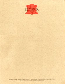
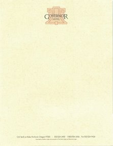
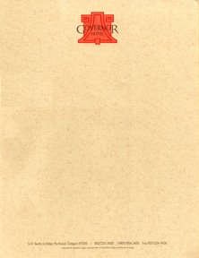
This past weeek, in preparing a proposal for a potential corporate identity project client, I was going through my archives and came across one of the great blunders that occurred in a past effort. The 1992 project, for The Governor Hotel in Portland, was one of the last times I kept my mouth shut when within my head I was screaming "silly client, you're making a huge mistake!" It made me realize that the adage "the customer is always right" is not always true.

My first visit to the hotel site required donning a hard hat to tour the historic structure, which was already being renovated. Director Gus Van Sant had recently filmed a scene featuring transients around a bonfire for "My Own Private Idaho" in what was to be the lobby and, for those who recall that movie scene, the building actually looked worse when I was touring it than it did in the film. I brushed the dust off the paneling on one dark,, dirty wall to get a better look at the beautiful Arts & Crafts bell ornament inlay. I mentioned that the shape would make a great icon for the logo and the response, from one of the hotel development team, was "Oh, no, we don't want to draw attention to the Art and Crafts elements of the building. Huh? Hmmm...after numerous attempts to create a logo the final selected identity incorporated the bell-shaped image I saw on the wall that first day. Lesson learned #1: The client is not always right.

After a lengthy debate about whether the official name was "Governor Hotel" or "The Governor Hotel" it was finally decided, at the last minute, the drop "The" as an identifier. The project moved along well after that. I ended up designing more and more pieces for the hotel over a period of almost nine months. The design assignments included the stationery package, coasters, notepads, pocket inserts for the bathrobes to be in the rooms, notecards, signage, catering and event planning marketing materials, computer paper to be used by the reservations department, print ads, brochures, grand opening invitations, press passes for the opening, the hotel restaurant logo and much more. It was a great deal of fun to select the unique mixture of paper colors and textures that would be combined to create a beautiful identity system for the hotel.

It then came time to select the final colors for the logo and printing of all materials. The hotel's interior designer stepped into the picture and basically demanded that specific colors be used. The PMS colors being suggested would compliment many of the interior elements of the hotel, but I knew they would look horrible on the printed materials. I could also see I was losing the battle and soon gave in out of frustration. My rep at the print house even shook his head when he saw the ink color selection. The stationery package was printed - in quantities of up to 10,000 pieces per item - and delivered to the hotel. The General Manager was stunned when he opened the box and saw the end result. He looked at me and said, "It looks like the Taco Bell Hotel!" (see above)
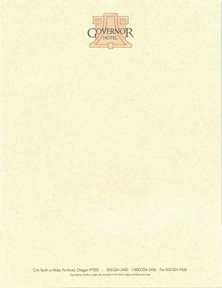
The manager recommended that all the printed materials be scrapped and the reprinting make use of the much more subtle color scheme I had originally suggested. We were able to salvage some of the letterhead stock to be used for printing the new half sheets. I grabbed a few samples of the "Taco Bell Hotel" stationery package before all the boxes were hauled off for recycling.

Lesson learned #2: When the client is wrong they may be REALLY wrong and, when you hear "silly client, you're making a huge mistake!" bouncing around inside your head, you may want to open your mouth and let your thoughts escape.

(Note: The identity project for The Governor Hotel lives on to this day in materials still used by the hotel, in the Japanese book American Hotel Identity Graphics, and in David E. Carter's volume The Big Book of Designs for Letterheads and Websites.)

© 2005 Jeff Fisher LogoMotives