Showing posts with label design clients. Show all posts

Anatomy of a logo design

Several years ago my friend, and long-time client, Anne Kilkenny contracted me to design a logo for a grass roots community effort to oppose the inclusion of a "big box" hardware store in a new development proposed for construction on the east side of Portland's Willamette River. The site, at the end of the Burnside Bridge, was within a few blocks of numerous owner-operated smaller home improvement stores. Residential neighborhoods were nearby. The construction of a large retail store could have a tremendous negative impact on local business, the quality of life for neighbors and traffic.

I had worked with this client for years - including designing the award-winning identity for the nearly 100-year-old W.C. Winks Hardware store and the logo for her Heart of the Pearl retail development in the city's Pearl District. Kilkenny didn't need to provide much initial input on the project. It's just the way we've worked together over the years. I'd read the newspaper reports of the community issue and was familiar with the area in question. She gave me the rather clever acronym for the organization and set me to work. My one directive was to create something "that might look cool on a T-shirt."

I did a couple doodles on a piece a paper and then went directly to my PowerBook to fine-tune my one and only concept for the logo (above). Recently a friend was looking at the design and said "that's a design that would look really cool on a T-shirt, but what is it?" I gave a brief explanation of the concept behind the design and then my friend commented that it was "a really cool design."

In dissecting the design (above), I explained that the squiggly blue line (A.) represented the east bank of the Willamette River and one boundary of the area being impacted. The color blue was another representation of the water. Within the logo there are four abstract human forms (B.) representing the local community activists, the small business owners, other concerned citizens, and the public officials siding with the group. Together these four human forms created a circle (C.) signifying the unity of the various groups on this emotional community issue. Together the elements also created squares (D.) representative of Portland's grid system of small commercial and residential blocks in the area. I used upper and lower case letterforms on the AFriend element (E.), an acronym for Association for Responsible Inner Eastside Neighborhood Development, to make it seem friendlier and a little more neighborly for the group going up against the big corporations (and their lawyers) and city planners in dealing with the issue. A little last minute treatment was coloring the dot over the "i" blue to symbolically remind those involved that a single drop of water in a bucket can make a difference in the end result.

I don't know if my "cool" design had much of an impact on the outcome, but the developers of the project did end up going back to the drawing board to remove the "big box" retailers from their architectural plans.

The AFriend logo appears in The Big Book of Logos 5 and 100s Visual Logos & Letterheads (UK).

© 2010 Jeff Fisher LogoMotives

Trusting your "gut instincts" in avoiding
the possible P.I.T.A. client (Part Deux)

In Part One of "Trusting your 'gut instincts" I shared previous experiences where paying attention to feelings of uneasiness prevented me, as a design professional, from getting involved in potentially bad business situations with possible P.I.T.A. (Pain In The A**) clients. However, it seems that occasionally those "gut instincts" need a tune-up, or at least I need a reminder once in a while to give the signs a bit more credence.

At times a designer may go into a particular situation knowing exactly what they may be dealing with a particular individual or business. Reputation, word on the street, or past business relationship horror stories of others may precede the introduction to the possible client. Such was the case years ago when I was approached to do a variety of work for a potential new client. I thought I was totally prepared to deal with in the situation. I used extremely caution in literally "dotting all the i's and crossing all the t's' in setting up the business relationship documentation.

With a specialized product targeting a male audience, the situation provided an excellent opportunity to design a business identity, create product labeling, write and produce print advertising for a number of high-profile national publications, do some point-of-purchase piece design, and participate in all aspects of the product branding. Unique photos shoots were coordinated and unusual printing processes were implemented in creating some branding elements. I was actually surprised how smoothly the entire project progressed - with no issues arising at all during its course.

The client then asked me to provide an estimate for designing the identity, and creating a complete stationery package, for another business venture. The details were agreed upon and, since an established procedure of simply invoicing individual projects as they were completed was already in place, I didn't require a new project agreement. (That's where I made a mistake.)

The identity portion of the effort was completed and approved by the client. I invoiced the job and was paid. It was then that I was asked to proceed with the design of the stationery package. Rough concepts were presented for a business card, letterhead and envelope. The client then told me that portion of the project was being put on hold due to current financial concerns (Which should have been a "red flag" to me.).

The project was set aside for the time being, and I continued executing work for the original product line.

Upon retrieving mail from my PO Box a few weeks later, I came across an envelope, which I had presented in rough form, for my client's secondary business - in a completed, professionally printed format. I tore open the envelope to find a letter on the letterhead I had presented only as a rough. The communication was from the client's bookkeeper asking for my tax identification information. He must not have been aware of the history behind the stationery package project.

Initially I was stunned. That immediately changed to being incredibly pissed off. I went directly to my attorney's office. He'd helped me carefully prepare the original agreement with the client and I hoped he could provide some advice.

In contacting the print house traditionally used by the client, we found out he had simply taken my rough design concepts to the printer for production and printing, obviously hoping to avoid the expense of me doing the job. The client then refused to take or return my phone calls.

My attorney drafted a letter to the client demanding full payment for the project as estimated. He also requested an additional equal amount, using a great deal of legal-ese justification, or the matter of unauthorized use of my designs would end up in court. Essentially the client was being required to pay double for the project due to his actions.

In a few days I received a check for the full amount requested in my attorney's letter. The client sent along a handwritten note inquiring as to how I could possibly do such a thing to him based on our ongoing business relationship. Huh? I had seen the side of my client others had warned me about and, of course, that business relationship came to an end.

For quite some time I was very leery of any potential client situation that didn't feel "right." I listened closely and carefully to my 'gut instincts."

This past fall, after treatment and recovery from three years of dealing with chronic vertigo - and having completed the writing of my second book, Identity Crisis! 50 Redesigns That Transformed Stale Identities Into Successful Brands - I felt as if I was ready to take on the world. While on an extended vacation in Italy, I received an email from a potential client wanting to solve the "identity crisis" being experienced by their own business.

As explained by the possible client, the project piqued my interest. It involved creating a primary identity, along with a sub-brand and a possible alternative identity with a unique and fun name. In reading the initial email, visual solutions immediately came to mind - always a great sign for me prior to going into a project situation. In fact, 80-85% of the time the final logo for a client is based closely on my immediate mental reaction to the initial information provided by the possible client - sometimes even during the initial client meeting! Still, this particular new business possibility involved an individual in an industry in which, due to past negative experiences, I had told myself I'd never work again. (Hello…Jeff, what are you thinking?). However, this situation sounded like a different take on this industry and a great opportunity to do something new.

The generic email response I send to possible identity design clients includes the following information:

The process usually begins with getting as much information as possible about the client, by way of a Identity Client Survey I have created. With a signed project agreement and a deposit of 35% of the project estimate I will begin work on the logo project. I then present 4-5 rough design concepts and the final image evolves from there. This usually includes three sets of revisions in the process. With most long distance clients the entire process can be done through emailed PDF files or the overnight delivery of concept printouts. When the process is complete I supply the client with the logo in black & white and color on disks for both Mac and PC.

This information is usually more clearly defined, with additional information being obtained and shared by both client and designer, as the potential client evolves into an actual client.

I was sent the logo that had identified the business for the previous decade and a half. There was no question the entity was having an "identity crisis." In my book Identity Crisis!, and when speaking to design-related groups the Jeffism I share is:

Never tell your client that their logo sucks.

In this case, I think a much more tactful assessment would be that the existing logo was certainly not projecting the level of professionalism required to represent the efforts of the businessperson in question.

A meeting was set up and I arrived at the appointed time. The perspective client was quite a bit late (Never a good sign for me - it often tells me the client feels their time is more valuable than my own.). When the potential client arrived I tried to size up the individual and I really wasn't sure what I thought or felt. (Usually I get an immediate sense of whether I like the person or not and if we will "click" in the course of a project.) I gave the person one of my marketing packets, including a cover letter explaining how I work (which is the text of my initial generic email), a blank copy of my estimate sheet and a copy of my project agreement. In the meeting discussion it was discovered that the person knew some individuals with whom I had worked almost two decades ago - and they were a major P.I.T.A. (This information should have been a big "red flag" to me and didn't even register until much later.)

I gave the possible client a very rough idea of what I thought the cost would be - with the courtesy of a "group rate" discount for the multiple project elements and said I would get a project agreement sent their way. The response was "It's more than I wanted to pay, but if that what it takes I'm willing to pay it." (That statement caused a momentary "blip" on my radar - but I took it to mean the value of my work was actually going to be appreciated.)

When I left the meeting I found a $16 parking ticket on my car. (I never get tickets - I assume this was yet another unheeded warning about this project.)

About this time I began experiencing some email problems - like my email program crashing - and it had been repaired when I emailed my project agreement. I explained in the accompanying email I'd had some technical email issues, and that with a signed project agreement and deposit of 35% of the project estimate I would begin work on the project. I was actually wondering if there had been a change of heart in regards to the project, until the deposit check arrived ten days later. Just the deposit check - no signed project agreement; which I thought was really odd. I again asked the client to send the signed project agreement. (This was a MAJOR "red flag" - I don't think I'd ever had a client send a deposit without a signed project agreement.).

I don't start any project without a signed agreement - and always tell other designers they need to do the same. However, the client wanted the project to proceed, I wanted to get my initial concepts to paper, and, having the client's deposit check, I thought the client could be trusted to get me the documentation. Upcoming holidays were going to be interrupting the project schedule and we needed to get things in motion.

At this point the tiny voices in my head should have been yelling "Don't start the project without a signed agreement" or "Politely decline to take on the project without a signed agreement in place!" Every hair on my body should have been standing on end in warning. Flags should have been popping up and hitting me repeatedly. I should have been almost sick to my stomach with "gut instincts" tugging at my insides. Instead, I still thought this was to be a fun and interesting project. Besides, I had some incredible ideas to share with the client.

My "gut instinct" mechanism must have been really out of whack.

Read the ongoing saga of a designer needing an "instinct tune-up" in the upcoming Part Tres conclusion..

© 2008 Jeff Fisher LogoMotives

Trusting your "gut instincts" in avoiding
the possible P.I.T.A. client (Part One)

For years, when speaking to classes of design students or to groups of industry professionals at conferences or other gatherings, I've shared the Jeffism "Pay a great deal of attention to your own 'gut instinct' - it will always be one of your best personal business advisors."

With that advice, I mean that you need to listen to that uncomfortable sensation in your gut when things just don't seem right in a possible business situation. When the little fine hairs on the back of your neck stand up; pay attention and react accordingly. Listen to those voices in your head that are suggesting you run in the opposite direction. With imaginary "red flags" popping up all over; stop what you are doing and evaluate the situation completely before proceeding.

I often tell the story of a potential dream client contacting me in regards to the complete rebranding of an educational institution. I've always enjoyed doing projects for colleges, universities and schools - and it would have been an impressive portfolio piece upon completion.

However, "red flags" began to pop up before I ever met with anyone to discuss the identity crisis of the college. The initial meeting with the potential client was rescheduled several times due to the need of one individual to be in attendance. The message being sent to me in that first round of interaction was that my own schedule was not of importance to the possible client. To meet with the parties involved I had to reschedule appointments on my calendar several times.

Still, I at least wanted to learn more about the possible project and get an in-person sense of what I might be dealing with in a working relationship with these people. I put together a great presentation of past work and set off for our first meeting - calling first to make sure it was still actually happening.

I immediately "clicked" with the marketing director and knew this situation had the potential to be an incredible project opportunity. The other individual in the meeting was the person whose presence was required as one of the major decision-makers in the process of redesigning the identity for the facility. As I got into my presentation this woman picked up a magazine and began to flip through it. She was paying absolutely no attention to me conveying the information that had required our repeated rescheduling of the meeting for her personal benefit.

The presentation went very well. Upon the conclusion of a few back-and-forth questions the very pleasant marketing director stood up, shook my hand and said, "I really look forward to working with you on this project."

The other woman finally put her magazine back down on the table.

I couldn't believe the words were coming out of my mouth as I told the marketing director, "I'm sorry, we won't be working together on this project. It was necessary for us to reschedule this meeting several times so (this other woman) could be in attendance and during my entire presentation she was busy reading a magazine. If she is to be one of the decision-makers in the process I cannot take on this project."

The marketing director was smiling widely at me when I completed my statement. The other woman in the meeting looked mortified.

My legs were shaking as I got up to leave the conference room. By the time I got to my car I felt as if I was going to be physically ill. Still, I knew I had made the right decision in immediately listening to my gut feeling about the situation and acting on my instincts.

When I got back to my home-based studio there was already a message from the second woman apologizing profusely about what had happened. She asked that I reconsider and call her with my decision. I returned her call and told her I had to "listen to my gut instincts" in regards to the project and decline taking it on. I also said I would be happy to recommend several other designers for the redesign effort.

Prior to sharing the names of other designers with the potential client, I called them and explained the situation. Each agreed to my referral. Weeks later one of the designers called me to tell me she had taken on the project and, although she had appreciated my referral and warning, it had been a total nightmare.

Several years later, another situation arose that proved my "gut instinct" was still fine-tuned - and it saved me from a potentially publicly embarrassing situation.

I was contacted by a potential client, who left a phone message about having been in the restaurant industry for several years and needing a designer to brand a new restaurant in a high profile downtown location. I've always loved working on restaurant projects so I was instantly intrigued. I called the gentleman and immediately got a sense that something was not right with the situation (red flag). I felt as if I was talking to the stereotypical used car salesman (little voice in my head talking to me). One of the oddest things was he would not give me a mailing address for the sending of one of my marketing packets - which would give him a great deal of information about how I worked in a project such as the one being proposed (hair standing up on the back of my neck).

My curiosity caused me to do a Google search on the individual and it was really strange when no information at all resulted. A similar search of his phone number gave me a few strange references - including the fact he had previously gone by another name and had been involved in a few sex-related businesses. Now, that was a major red flag for me!

The next day I had a voice mail message that our meeting date and time needed to be changed to accommodate the man's schedule. (Here we go again…) In calling his number, I talked with his secretary, arranged a new appointment time, and actually got a mailing address to send off my packet of additional information.

In meeting the potential client at the site of the restaurant, my sense of his being the "used car salesman" type was confirmed. He shared his plans to create a family style restaurant - in an area of town not exactly suitable for such businesses (weird little feeling in my "gut"). I was then shown some rough concepts from the other designer with whom he was working (MAJOR alarm going off in my brain). Finally, the man said, "Why don't you throw together a few rough designs and if I see something I like I'll send $50 your way." (O.K., now I was WAY beyond annoyed)

Huh? Although I already knew I would not be working with this individual, I was kind of stunned.

As I attempted to collect my thoughts, I asked, "Did you not receive the packet of information I sent explaining how I work on such projects?

"Yeah, I got your packet in the mail - but I can't be bothered to review such things," was his response.

My final comment was, "Well, had you "bothered" to read what I sent you, you would realize I don't work without a signed contract and a deposit on a project proposal - and I don't do speculative work for anyone."

It was his turn to be a bit stunned.

A few weeks later his name was in the news a lot. Almost overnight he had turned his "family style" restaurant into a strip club. City officials, neighborhood business owners and community association leaders were up in arms. In the end, the owner of the property evicted the business from the property due to breaking a clause in the lease.

I was so pleased to have once again paid attention to, and acted upon, my "gut instincts" in avoiding involvement in what could have become a nightmare situation. The flags, of any and every color, waving in my mind had caused me to take a second look at all aspects of the potential project. Listening to the little voices in my head, doing a bit of online research, and speaking my mind had prevented me from taking on what would have surely been a P.I.T.A. (Pain In The A**) client.

Coming up in Part Deux: My "gut instinct" is in need of a major tune-up.

© 2008 Jeff Fisher LogoMotives

Marketing a Portland balloon business in Africa?

Back in 1998 I redesigned the identity for the Portland-based company Balloons on Broadway. Several years after that first redesign I was again hired by my friend, and company owner, Ron Pitt to update the logo.

My original redesign of the logo for the retail store, balloon delivery business and event company won a Summit Creative Award, and appears in the books Logos Redesigned and The New Big Book of Logos.

Fast forward nearly a decade from my first redesign.

Last week a received an email from my friend and client, with the heading "Such a small world in which we live..." Ron explained that his dear friend Ashley, whom he had known since birth as he was a longtime friend of her mother, had assisted him over the years with events and was an "expert balloon inflater." This past year, Ashley and her husband, Travis, had the opportunity to travel through East Africa with her parents. Being community-minded, they spent much of their time in small villages getting to know people, creating relationships and making new friends along the way.

The photos below showcased one of the families they befriended.

Ashley was the first to notice the following:

It really is a small world.

Unfortunately no one is able to adequately explain how the Balloons on Broadway logo ended up embroidered on the leg of a boy's shorts on a continent far away. As Ron noted, "We've never embroidered shorts, nor done much marketing in East Africa (*wink*). In fact we only had one screen run of 12 t-shirts with that logo and they all ended up on the back of our staff. That's it."

"The only way I can rationalize it is that the logo appeared in a publication of some sort in the UK (perhaps one of those listed above) and since Kenya's part of the Commonwealth, the publication ended up there and was spotted by someone who thought it would be a good knock-off," he added. "The boy's mother said she bought the shorts at the local market and couldn't quite understand what all the fuss was about - the kid just needed some shorts."

So, this is just another example of the fact that, especially in this digital world, a designer never knows when work for their clients may be "borrowed" by someone for another use.

© 2008 Jeff Fisher LogoMotives

Début Publications dumps 'Branded'

Over the Labor Day holiday weekend I received an email from the folks at Début Publications Ltd announcing that the logo design book Branded will not be published. The email stated:

"Although the content supplied was of the highest quality, Début regrets to announce the cancellation of the scheduled publication 'Branded'.

Due to the unforseen surge of other logo-based publications and websites, alongside the established products, the viability of 'Branded' as a commercial product became questionable, and after careful consideration it was felt that the title would have become lost in the market place.

We would like to thank the many designers and agencies that submitted artwork for inclusion. Please accept our sincere apologies for the time taken to submit artwork.

I do think it is unfortunate the book will not see the light of day, and not just because I was a contributor whose work had been accepted. Début created a rather unique opportunity to include the work of a wide variety of designers from a large number of countries around the world. I do hope this situation doesn't discourage designers, and design students, from submitting work for future book opportunities - especially others charging no entry or publication fees. The vast majority of such calls for entries do result in books that make it to the bookstore shelves, providing incredible global marketing to a designer.

© 2007 Jeff Fisher LogoMotives.

Toot! Toot!*: Jeff Fisher LogoMotives designs to be
in "Branded" book from Début Publications Ltd

The logo design work of Jeff Fisher, the Engineer of Creative Identity for the firm Jeff Fisher LogoMotives, will be represented with 27 identity examples in the upcoming book Branded from United Kingdom publisher Début Publications Ltd. Logo designs of over 130 international graphic designers, design firms and agencies will be included in the book to be published later this year. Fisher has also been asked to contribute text about an aspect of identity design for the book.

Designs from Jeff Fisher LogoMotives to be featured in the book include those for the Benicia Historical Museum (Benicia, CA), Four Rivers Community School (Ontario, OR), Twisted Elegance Interactive (Seattle, WA), and the Young Native Writer's Essay Contest sponsored by the Holland+Knight Charitable Foundation (Tampa, FL). Logos for DataDork (Fontana, CA), the Valles Caldera National Preserve (New Mexico) and the Seacoast AIDS Walk (Portsmouth, NH) were also selected.

Portland clients to be highlighted in the volume include interiors firm NoBox Design, the VanderVeer Center anti-aging clinic, the City of Portland's Neighborhood Service Center program, Bella Terra Landscape Designs, the AIDS residential care facility Our House of Portland, architect Thomas Fallon and Balloons on Broadway. Designs for the Just Out newsmagazine, Black Dog Furniture Design,the greeting card company Good Pig, Bad Pig and TraveLady Media will also be in the book. Logos for the community activist organization Association for Responsible Inner Eastside Neighborhood Development (AFriend), Pearl Real Estate, and the now closed Balaboosta Delicatessen were also recognized.

Identities honored for North Portland businesses, organizations or events include those for the St. Johns Window Project, North Portland Business Association, Coyner’s Auto Body, and University Park United Methodist Church's annual North Portland Pride BBQ and Festival.

Selected designs also include images created for George Fox University's Tilikum Center for Retreats & Outdoor Ministries (Newberg, OR) and the Emerge Medical Spa at Bridgeport (Tigard, OR).

Jeff Fisher has received nearly 550 regional, national and international graphic design awards for his logo and corporate identity efforts. His work is featured in more than 85 books on the design of logos, the business of graphic design, and small business marketing.

Fisher is a member of the HOW Magazine Editorial Advisory Board, the HOW Design Conference Advisory Council and the UCDA Designer Magazine Editorial Advisory Board. His first book, The Savvy Designer's Guide to Success, was released by HOW Design Books in late 2004. His new volume, Identity Crisis!, will be on bookshelves in late 2007.

* If I don't "toot!" my own horn, no one else will.

© 2007 Jeff Fisher LogoMotives
Logo competition upsets local graphic designers

I was pleased to read of the position being taken by 11 graphic designers in Cleveland in response to the Cleveland Foundation conducting a "contest" to select a new logo. HOW Design Forum member "dougler" brought the article Logo competition upsets local graphic designers to the attention of forum visitors earlier today.

I think many in the design industry have reached a point of "we're mad as hell and not going to take it anymore" in regards to calls for speculative work being masked as "contests." The NO!SPEC movement was launched for the purpose of taking on the issue of graphic design industry "spec" work. Some argue that "spec" requests have always existed in the design industry. That doesn't mean such situations are acceptable or should continue.

The letter written by the designers to The Plain Dealer newspaper, and the follow-up article, are a welcome addition to the ongoing design industry effort to educate businesses, organizations, other designers and the general public about the value of professional graphic design and the processes that may help any design client get the best end result. My previous well-circulated article and bLog-oMotives post, When a "contest" is not a contest, and efforts such as the Graphic Artists Guild's published Suggested Guidelines for Art Competitions and Contests, also are part of that education process.

I seriously doubt that the Cleveland Foundation intended, or expected, to find themselves in the middle of a controversy when announcing the organization's logo design contest. Perhaps the "contest" should have been researched further before putting the specifications out to the public. The newspaper article comments of James Lubetkin, senior communications editor at the foundation, suggest that the organization does have a sensitivity to the situation - after the fact.

I've been involved in situations in the past where an entity seeking a new identity has initially reviewed a great many portfolios. From reviewing past work, a few designers/firms are selected to submit presentations. Those design professionals are compensated with "x" number of dollars for the time spent in preparing and presenting proposals. The business, agency or organization then bases their hiring decision on those presented ideas. I appreciate the search process being conducted in such a manner. As a designer, it conveys to me that the potential client understands the value of the professional graphic design process and the results.

Congratulations to the "Cleveland 11" for putting a public spotlight on the issue.

© Jeff Fisher LogoMotives
Toot! Toot!*: Jeff Fisher LogoMotives designs

chosen for The Big Book of Logos 5

Jeff Fisher, the Engineer of Creative Identity for the firm Jeff Fisher LogoMotives, has been notified that 31 of his identity designs will be included in the book The Big Book of Logos 5 as a result of the LOGO 2007 design competition. The book, from prolific graphic design author David E. Carter, is to feature hundreds of logos from design professionals around the world and is scheduled to be released in late 2007.

Designs from Jeff Fisher LogoMotives to be featured in the book include those for the Benicia Historical Museum (Benicia, CA), Four Rivers Community School (Ontario, OR), the annual golf tournament and auction events for Residence XII (Kirkland, WA), Twisted Elegance Interactive (Seattle, WA), The Parenting Alliance, and the Young Native Writer's Essay Contest sponsored by the Holland+Knight Charitable Foundation (Tampa, FL). An icon produced as part of the international Fluerons of Hope - Font Aid III effort, benefiting those impacted by the tsunami of 2004, was also selected.

Portland clients to be highlighted in the volume include interiors firm NoBox Design, the VanderVeer Center anti-aging clinic, the City of Portland's Neighborhood Service Center program, Bella Terra Landscape Designs, the AIDS residential care facility Our House of Portland, and architect Thomas Fallon.

Logos for the community activist organization Association for Responsible Inner Eastside Neighborhood Development (AFriend), the Reed College Fall Thesis programs for 2004 and 2005, The Spring Showcase presented by the Philoptochos of the Holy Trinity Greek Orthodox Church, and the now closed Balaboosta Delicatessen were also recognized.

Identities honored for North Portland individuals, organizations or events included those for community organizer Mike Verbout, St. Johns Window Project, Portsmouth Neighborhood Association, North Portland Business Association and University Park United Methodist Church's annual North Portland Pride BBQ and Festival.

Selected designs include images created for George Fox University's Tilikum Center for Retreats & Outdoor Ministries (Newberg, OR) and the Emerge Medical Spa at Bridgeport (Tigard, OR).

Gay/Lesbian community logo images to be in the book include designs for Just Out newsmagazine (Portland, OR) and the Diversity Training program of DiversityBuilder.com (Brentwood, TN). In addition, Fisher's "I DO!" image, in support of same-sex marriage, and the logo for his own marriage to his partner Ed Cunningham are celebrated.

The designer's logo for his presentation at the 2004 HOW Design Conference was also honored.

Since 1998, hundreds of examples of the design work of Jeff Fisher LogoMotives have appeared in over 20 books from David E. Carter, including the American Corporate Identity series, the Big Book of Logos collection and Global Corporate Identity. Fisher design efforts are also featured in the volumes Bullet-Proof Logos, Blue is Hot, Red is Cool, The Big Book of Designs for Letterheads and Websites, The Big Book of New Design Ideas, Logos Redesigned, The Big Book of Business Cards, The Big Book of Layouts, and The Big Book of Letterheads.
Jeff Fisher has received nearly 550 regional, national and international graphic design awards for his logo and corporate identity efforts. His work is featured in more than 85 books on the design of logos, the business of graphic design, and small business marketing.

Fisher is a member of the HOW Magazine Editorial Advisory Board, the HOW Design Conference Advisory Council and the UCDA Designer Magazine Editorial Advisory Board. His first book, The Savvy Designer's Guide to Success, was released by HOW Design Books in late 2004. His new volume, Identity Crisis!, will be on bookshelves in late 2007.

(* If I don't "toot!" my own horn, no one else will.)

© 2007 Jeff Fisher LogoMotives

'The ditch between white trash

and trailer trash is called hope'

"My momma always used to say, 'The ditch between white trash and trailer trash is called hope.'"

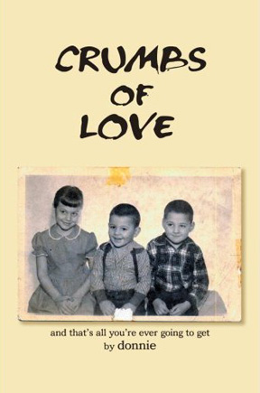
So reads a line from the book Crumbs of Love: And That's All You're Ever Going To Get, by Donnie (the pseudonym of my friend and long-time Portland client Don Horn). I want to congratulate Horn for writing and publishing his memoir, which publisher iUniverse describes as "an unforgettable story of love, betrayal, and one father’s need to always be in control."

Don Horn, a playwright and theatrical producer, has been a friend and client since I met him opening night of his first play nearly 17 years ago. Over those years I've designed over 100 logos for his triangle productions! theatre company, in addition to posters, ads, playbills, T-shirts, an occasional prop and more. I even designed a paper doll book called Dressin' With Divine for the company. A decade ago, he trusted me enough to allow me the opportunity to spend a summer directing the play Party!, with its cast of a gaggle of nude men (including Peter Paige who went on to fame as Emmett on Queer as Folk.). He has always been a great friend and for about six years we've had a Thursday morning theraputic "koffee klatch" with several others. Horn also played host for the wedding of my partner and I at his theater in 2004.

Years ago I read the rough draft of Horn's memoir. The man has led an incredibly fascinating life. I really look forward to reading the book in its final form.

Crumbs of Love is available in book form from Amazon and from iUniverse as an Adobe eBook download.

© 2007 Jeff Fisher LogoMotives

Client gift-giving: The good and the gaffes

"As the song goes, it's 'the most wonderful time of the year,' but for many the holiday season is also the most stressful. If you're a freelancer, you might spend more time racking your brain for client gift ideas than roasting chestnuts over an open fire. While shopping for family and friends can happily be postponed, coming up with the perfect way to say "thank-you" to your customers - especially on a budget - is a challenge that requires planning."

So begins the article, Client gift-giving: The good and the gaffes on The Creative Group eZine. TCG eZine interviewed author and marketing mentor Ilise Benun, and yours truly, about client (and vendor) gift ideas for the piece that was originally posted a few years ago. The advice holds true today as the holiday season quickly sneaks up on us all.

© 2006 Jeff Fisher LogoMotives
Fisher's VanderVeer Center ad design

featured in The Big Book of Layouts

A full-page magazine ad for the VanderVeer Center, a Portland- area provider of anti-aging medicine and cosmetic procedures, is featured in the upcoming book The Big Book of Layouts. The ad design, by Jeff Fisher of Jeff Fisher LogoMotives, is one element of the total rebranding of Dr. Elizabeth VanderVeer's medical facility. In this volume, prolific graphic design author David E. Carter highlights layout design efforts from graphic designers around the world.

Following Fisher's design of the VanderVeer Center identity, the immediate need in the branding of company was the creation of four-color print ads. The ad, featuring one of Dr. VanderVeer's own paintings, introduced the new logo, the tagline "The Art & Science of Image Enhancement," a new color palette and the photos of Loma Smith. The advertisement initially appeared in Affluent Living, Portland Monthly and regional editions of Better Homes & Gardens. Versions of the ad, including black and white adaptations, also appeared in area newspapers. The design concept was then used in the creation of all collateral for the VanderVeer Center and on the firm's website. The stationery package designed for the firm will appear in the upcoming volume The Big Book of Letterheads. The rebranding effort will also be featured in Fisher's book, Identity Crisis!, when it is released by HOW Design Books in 2007.

Since 1998, hundreds of examples of the design work of Jeff Fisher LogoMotives have appeared in over 20 books from David E. Carter, including the American Corporate Identity series, the Big Book of Logos collection and Global Corporate Identity. Fisher design efforts are also featured in the volumes Bullet-Proof Logos, Blue is Hot, Red is Cool, The Big Book of Designs for Letterheads and Websites, The Big Book of New Design Ideas, Logos Redesigned, and The Big Book of Business Cards.

© 2006 Jeff Fisher LogoMotives
Cracked Pots and Twilight in the Garden

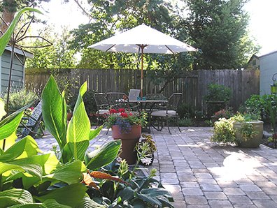
I'm currently sitting out at the table in my garden working from my PowerBook. In looking over my calendar I see that two of my favorite garden-related events are coming up this next week. Put them on your schedule as part of your recovery program following the expected heat wave here in Portland this weekend.

Cracked Pots presents their 7th Annual Garden Art Show July 25 & 26 (next Tuesday and Wednesday) at McMenamins Edgefield in Troutdale. From 1:00 p.m. to 8:00 p.m. over 60 local artists will be displaying and selling their garden art made from recycled materials. The Edgefield gardeners will also be having a plant sale each day from 1:00 p.m. to 5:00 p.m. Grab a brewski (my favorite on a hot summer day is always the Ruby) or summer cocktail from one of the numerous bars at Edgefield before taking an extended tour of the gardens and what the artists have to offer. My garden is home to several pieces purchased over the years at the event.

The internationally recognized Joy Creek Nursery hosts their annual "Twilight in the Garden" event on Saturday, July 29th from 6:00 p.m. to 9:00 p.m. The event gives visitors a chance to tour the beautiful 4+ acres of show gardens in the cool of the evening while enjoying light refreshments, live music by local high school jazz musicians and garden plantings highlighted by the light of dusk. It's also a great opportunity to check out the work of local artists. My garden features birdbaths, pots of all sizes and trellises from the selection at the Scappoose nursery.

Joy Creek is responsible for the design and installation of the gardens in both my front and back yards. The nursery is also a client of mine and I have designed the Joy Creek logo and many other marketing materials over the past 13 years. My partner and I have been long-time friends of owners Mike Smith and Maurice Horn. In fact, as we occasionally stay out at the home on the grounds of the nursery, we refer to the place as "our country house." "Twilight in the Garden" is a chance for others to have the evening nursery experience we've come to take for granted over the years.

Flower photo courtesy of Joy Creek Nursery

© 2006 Jeff Fisher LogoMotives
Words of wisdom from Seth Godin

about how clients should interact with designers

From Seth Godin's Blog come words of wisdom for any client dealing with a "creative type:"

How to live happily with a great designer

- J.

Our House of Portland opens new facility

with unveiling of fresh graphic identity

In my previous bLog-oMotives entry, Designing pro bono efforts for "win-win" results, I mentioned a client relationship with an AIDS residential care facility that began with donated design services. That client was Our House of Portland. Kimberly Webster (now Waters), a previous client of mine, had become Development Director for the nonprofit organization in 1994. In doing a graphics inventory for the group, Webster found there were no existing digital files for the Our House logo being used at the time. She asked if I could clean up the logo and create the digital imagery (above). Her request was the beginning of a long-term relationship with Our House.

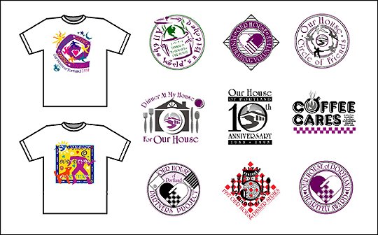
Over the next few years I designed a great deal for the facility. My efforts included the design of many logos for Our House fundraising events and internal programs, T-shirt graphics, stationery packages, print ads, invitations, direct mail pieces, banners, annual reports, the organization newsletter and many more development and marketing materials (below).

Webster moved on to other career opportunities in Seattle. My working relationship with Our House continued. In the late 90's a redesign of the organization's identity was proposed. I invested a great deal of time in creating and presenting possible new logos based on feedback from staff, volunteers and others. As is often the case in logo redesign projects - especially with nonprofit organizations - one of the greatest challenges was to get beyond the emotional attachment to the old logo design and the question of why it was necessary at all to change things from "they way they have always been." The frustration of organization personnel and myself (especially as it was being done pro bono) resulted in the new logo project never being completed. It was also time for me to re-evaluate my five-year relationship with the organization, and I decided to move on to possible relationships with other nonprofits - primarily in my own new neighborhood of North Portland.

In late May of this year, out of the blue, I received an email from John Oules, an individual I had known for quite a few years in his roles of actor, director and producer of local performing arts events. Oules informed me he was the new Marketing Director of Our House of Portland. His email was a request for any information I might have on the history of the Our House logo. A new identity had been instituted recently (above), incorporating a complicated, multi-colored graphic of a circle of people, and those required to use the image were running into many reproduction difficulties. Oules was interested in the possibility of revisiting and updating the original logo for the organization. Our House was nearing completion of a new building, on the location of the previous facility, and he felt it might be an appropriate time to put a new identity in place.

In my initial meeting with Oules, and new Development Director Sally Dadmun Bixby, their hopes for the new identity were conveyed. The identity needed to hint at the old logo, while being more contemporary and cleaner. No longer the grassroots organization founded in 1988, Our House needed to project a more polished and professional image. The font "City of" (based on the type used by the Union Pacific Railroad and created by RailFonts) had already been selected for use on the new building's signage and the lobby donor board. I was asked to consider using the font for the new identity to give the image the contemporary look of the new structure, interiors and other elements of the project. A new Our House tagline, "Inspiring People with HIV/AIDS to Live Well," was another element I was to possibily include in the new logo. I was provided the color palette of the the interior design firm and painting contractor as an additional reference.

I visited the nearly complete construction site to photograph the facade and roofline of the new building. With an immediate visual image of the icon in my head, I returned to my home studio and created three variations of logo concepts. Two were stacked versions of the required elements and one was a horizontal treatment - and the logo was basically designed. The almost immediate response from Oules was "Awesome job. We love the logo!" From Dadmun Bixby came "I am thrilled at how you took what we envisioned and turned it into the logo!"

Staff, volunteers and others were a bit more hesitant in accepting the new image - as I had predicted earlier in the process. That emotional attachment to the original logo was strong and some were concerned about losing the "warm and fuzzy" feeling associated with the original design. One staff member relayed to me that when she initially saw the design in black and white she felt it was a little "cold." As soon as she was shown the logo in chocolate brown and the green of the exterior paint she really liked the image.

It was decided that using the logo in one of the more vertical formats, and also making use of the horizontal version, (above) might best serve the needs of the organization. With days to go before the grand opening of the new home of Our House, embroidered shirts for the staff and volunteers, fridge magnets, banners and some additional signage were ordered.

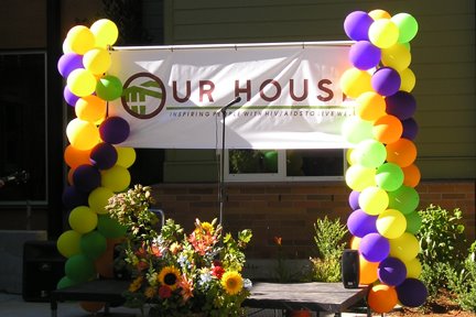
Yesterday, under sunny skies, the new building was opened to the public for viewing. It's a beautiful and functional space for the facilities' residents, visitors and the administration staff. The new logo was introduced to the public with a banner in front of the building (flanked by balloons provided by friend/long-time client Ron Pitt of Balloons on Broadway). Hundreds of people toured the new building, guided by staff wearing their color-coordinated shirts embroidered with the logo. I received many compliments on the new identity. The best came from Development Director Dadmun Bixby, when she said "You nailed it!"

Now, the process of a complete branding will begin.

© 2006 Jeff Fisher LogoMotives

OutStanding: Jeff Fisher Has Style

As I mentioned in a previous blog entry (when announcing my design of the publication's new logo) I've always felt that Just Out - Oregon's statewide monthly newsmagazine for the lesbian, gay, bisexual and transgender communities - is one of the best LGBT papers in the country - in content and design. I was especially pleased when the new logo was recently honored with an American Corporate Identity Award.

It would seem that a mutual admiration society has developed between Just Out and myself over the years. In the most recent issue (April 21, 2006) the paper's OutStanding column features yours truly in an article by contributing writer Chelsia Rice. Publisher and Managing Editor Marty Davis has graciously allowed me to reproduce the article here on bLogo-oMotives:

OutStanding: Jeff Fisher Has Style

Jeff Fisher, Engineer of Creative Identity, is not afraid to toot his own horn; he knows that a little shameless self-promotion goes a long way.

With more than 25 years of experience and approximately 450 regional, national and international graphic design awards, Fisher's promotional tactics are generating international recognition, catapulting his career into high gear. Featured in innumerable publications from Just Out to Fortune, his design firm LogoMotives is a local resource on graphic communica- tions and corporate identity.
According to his Web site, Fisher takes pride in "helping businesses and organizations stay on track through creative, innovative, affordable and award-winning identity design." His tactics are detailed in his widely circulated book The Savvy Designer's Guide to Success, which actually came about from Fisher's self-promotion.

"It's all about tooting," says Fisher. "If I don't toot my own horn, no one else will."

Although 80% of Fisher's work comes from outside Oregon, this sixth-generation Oregonian loves working from his international headquarters, located in the Arbor Lodge home that he shares with his partner of 16 years.

"People are so into neighborhoods, and that's why I love Portland," said Fisher, whose neighbors refer to him and his partner as "the boys." Much of their cooperative partnership is demonstrated in their garden, where Fisher says his partner "does things practical" and Fisher "makes things pretty."

More than 80 publications feature Fisher's logos, graphic designs and small-business marketing. His larger clients include local companies and organizations such as the Governor Hotel, State of Oregon, Portland Trail Blazers and Seattle Seahawks.

Fisher has donated a considerable amount of his time to local organizations such as the late triangle productions! and Our House of Portland. He is also volunteering his creative mind to North Portland United Methodist Church for its second annual Pride celebration.

Fisher enjoys being involved in the community. As for his work, he loves graphic communications because it's "good to have something tangible to create for people."

For more information visit www.jfisherlogomotives.com

Posted with permission of Just Out

© 2006 Jeff Fisher LogoMotives
Toot! Toot!*:

Jeff Fisher LogoMotives work featured in
Graphic Designer's Print + Color Handbook

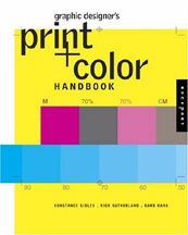
I am addicted to bookstores. In Portland, or while traveling in any other city, I can seldom pass by a book retailer without stopping in to browse. I usually head right for the graphic design section. Quite often, while flipping through the volumes on the shelves, I will come across books containing examples of my work that I didn't know were going to appear in another book. Last week, in Seattle, I found a new Rockport Publishers offering - Graphic Designer's Print + Color Handbook : All You Need to Know about Color and Print from Concept to Final Output by Constance Sidles, Rick Sutherland and Barb Karg - on the shelf at Borders. This book covers everything from choosing color combinations to choosing the best paper and printing methods for a design job. It looks like a great resource for any graphics professional.

In going through the book I found several examples of my own work. It was a surprise to see them in this particular volume, but each had been included in a previous Rockport book on digital printing.

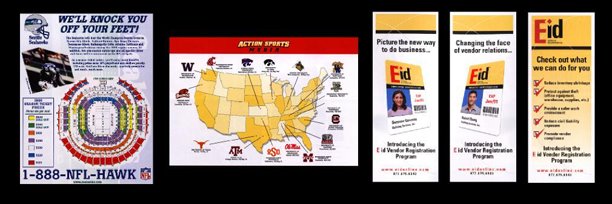
My design for a ticket price seating chart for the the old Kingdome in Seattle is included in the book. Years ago I designed the stationery package and all marketing/advertising materials for the Seattle Seahawks. The seating chart is used by book's authors to show a somewhat complicated piece that was produced using PDF files for proofing/editing by the client in Seattle and then sent in the same format to a print house in Portland.

I also designed all marketing materials for Action Sports Media, another company formed by Seahawks owner Paul Allen. One of the projects was a sales kit that could be customized for potential clients who were interested in ASM's professional and college sports arena digital signage. The piece represented in the new book is a map of all universities sports programs on the ASM client list at the time. It is included in the Print and Color Handbook to illustrate the possible use of short-run digital printing when more expensive traditional printing is not necessary.

The examples of projects I designed for the Oregon company Eid Access (now Eid Passport) are used in the book to show the flexibility of digital printing. The company - a specialist in security programs for military, government, and commercial facilities - used the items I designed as digitally produced brochure panels, handouts and tradeshow exhibit pieces that were 15" high.

It's always great to see my work represented in graphic design books that literally extend my marketing and promotion efforts worldwide. At this point nearly 80 books feature examples of my design efforts - especially my logo design work.

* If I don't "toot!" my own horn, no one else will

© 2006 Jeff Fisher LogoMotives
Happy 30th Anniversary MCC Portland

Today the Metropolitan Community Church of Portland is celebrating 30 years of welcoming gay, lesbian, bisexual, transgendered and straight worshipers to its services. In that time it has grown from a congregation of 12 in 1976 to a membership of over 300 members who now regularly meet in their Arts and Crafts-inspired church in Northeast Portland. Both Just Out and The Oregonian have recently published great feature stories on the church, its history and the congregation.

At various times over the years MCC Portland has been a client of mine. Back in 1995 I was hired to created the logo for the church's capital campaign and the center of that design - featuring an illustration of the building's steeple - has been used as an identity since then. In addition to designing past church brochures, ads, and flyers, I also created logos used to promote Esther's Pantry - which since 1985 has been providing food and personal care items to those living with AIDS.

Happy 30th anniversary to MCC Portland - a very valuable resource to the local community.

© 2006 Jeff Fisher LogoMotives

Toot! Toot!*:

Jeff Fisher LogoMotives biz card designs recognized

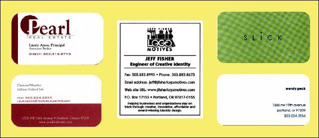
Three business card designs by the firm Jeff Fisher LogoMotives have been published in new graphic design books. The identifying card for Jeff Fisher LogoMotives is featured in the book The Big Book of Business Cards from David E. Carter. The letterpress card, produced by the Portland company Oblation Papers & Press, features Fisher's train-themed logo which has been honored with many international design awards.

The other design recognized in the The Big Book of Business Cards is the two-sided business card for Pearl Real Estate. Although the logo designed by Jeff Fisher LogoMotives is still in use in the signage on the company's headquarters, a new logo and business card now represents the firm.

Japanese publisher PIE Books has included the calling card for Portland hair salon Slick in their latest book, World Business Cards Today. The card features the a silver foil stamp of the logotype on the front and limited contact info on the back. The rectilinear card, with rounded corners, mimicks the actual logo for the company. The logo is also featured in the books LogoLounge: 2,000 International Identities by Leading Designers, the Japanese book New World Logo and The Big Book of Logos 4.

* If I don't "toot!" my own horn, no one else will

© 2006 Jeff Fisher LogoMotives

Design studio housecleaning - excavated artifact #3

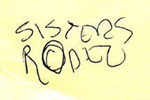
It's amazing what I've saved over the years in regards to projects I've been contracted to design. The simple Post-It note scribble at the left is just one example of the many preliminary concepts I have come across recently in archiving past projects.

Since I was a kid I have spent a great deal of time in the small Central Oregon town of Sisters, Oregon. The favorite backpacking destination of my family was the nearby Three Sisters Wilderness area. In the 1970's my parents bought property in Sisters, eventually building a vacation home that has been their primary residence for the past 15 years. For many years the Sisters Rodeo, "The Biggest Little Show in the World," has been a family tradition - with an annual weekend party at my parents' home that has become somewhat legendary.

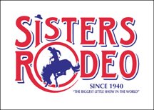
To celebrate the 60th anniversary of the Sisters Rodeo it was determined that it might be time for the organization to finally have an official logo. The Sisters Rodeo Association was already working with my sister's advertising agency, TriAd in nearby Bend, for their advertising, marketing and public relations needs. Sue's firm was asked to take on the identity project and she hired me to create the initial image for the rodeo. In one of our telephone discussions I jotted down a rough type treatment - for a logo that I hoped would convey a hint of the 1940's and be a lasting symbol for the Professional Rodeo Cowboys Association event.

From the beginning of the project I had no doubt the symbol representing this live-action piece of Western Americana would end up being red, white and blue in color. The flags, banners, music and patriotism associated with the rodeo immediately dictated that color palette. I also knew that I wanted a cowboy on a bucking bronco, or bull, as the primary element. Having seen many a cowboy hat fly through the air at previous rodeos, I felt graphically representing that would add a little implied movement - and my own little brand of humor - to the logo. The cowboy graphic fit well into the "O" of my original scribble, and the airborne cowboy hat became the dot of the "i" letterform in the word "Sisters," as the symbol almost designed itself.

The logo has served the event well the past six years - and received several honors. In 2000, the identity was included when the Sisters Rodeo was inducted into the Library of Congress “Local Legacies” archive. The following year the logo was honored with an Award of Merit in the Ad Federation of Central Oregon's annual Drake Awards, a Silver Award in the Summit Creative Awards, and received a LOGO 2001 honor (resulting in the design being published in the book The New Big Book of Logos). The design was also published inLogo Lounge : 2,000 International Identities by Leading Designers.

© 2005 Jeff Fisher LogoMotives

Design studio housecleaning - excavated artifact #2

As I explained in an earlier post, I've been going through boxes of nearly 30 years worth of design work as I attempt to get my studio a bit more organized. In the process I've been coming across initial sketches that became final logos for many clients. Some of the doodles have been on Post-It notes, the backs of envelopes and little scraps of paper.

After initially meeting Don Horn - the founder of Portland's triangle productions! theatre company - at his very first opening night, I began designing logos, signage, posters, T-shirts, theatre programs and other items for his shows and theatre spaces. It was the start of what has become a 15+ year business relationship and friendship. Horn has always been one of my favorite clients; giving me complete creative freedom on the design projects. I have also been recognized with more design awards for the theatre projects than those for any other single client.

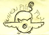
Over the years, I've had the opportunity to create logos for plays with great names. Soon after Horn told me he would be producing the show When Pigs Fly I scribbled a rough concept on a little yellow Post-It note. It immediately seemed natural that the curly tail of the pig would become the "S" in the show's name. The final design evolved directly from that sketch and made use of the colors selected for all promotional pieces for that year's schedule of productions. An added bonus was that the When Pigs Fly identity was recognized with an American Graphic Design Award from Graphic Design: usa and a Bronze Award from the Summit Creative Awards.

© 2005 Jeff Fisher LogoMotives