Showing posts with label event logo. Show all posts

Re-Design: Holocaust Remembrance Project

The Holocaust Remembrance Project is a program of the Holland+Knight Charitable Foundation, Inc - the charitable giving organization of the Holland+Knight law firm. The project is a national essay contest for high school students that is designed to encourage and promote the study of the Holocaust. Participation in the activity encourages students to think responsibly, be aware of world conditions that undermine human dignity, and make decisions that promote the respect and value inherent in every person. The project serves as a living memorial to the millions of innocent victims of the Holocaust.

The existing identity for the Holocaust Remembrance Project seemed depressing, dark and oppressive to me - especially when printed on a dark gray T-shirt given to student participants and essay judges. While those descriptive qualities may apply to that particular period of history, I felt the project identity should be celebrating those who have overcome the negatives of the Holocaust to inspire others to live exemplary lives.

The Holocaust impacted a wide variety of people, not just those of the Jewish faith. The triangle-shaped uniform badges assigned to those in the concentration camps were color-coded to identify the individuals. The color codes were:

• Red: Political prisoners - including Poles, Czechs and members of the Armed Forces

• Green: Those considered to be criminals

• Blue: Emigrants

• Yellow: Jews (two triangles were overlapped to form the Star of David)

• Purple: Jehovah’s Witnesses

• Pink: Gay males

• Black: Vagrants, gypsies, and “anti-social” women (lesbians, prostitutes, women using birth control)

In my initial mental design concept, I felt that those impacted by the Holocaust should take "ownership" of those negative identitifying triangle symbols. I inverted the geometric shapes to point to the sky and form colorful rays of a strong, positive sun image. The result is a graphic identity that has been given a sense of light, while making use of the representative colors and projecting an image of honor and respect in regards to the issue of the Holocaust.

The logo is the third in a series I have created for the Holland+Knight Charitable Foundation. The first was the identity for the Young Native Writers Essay Contest, a project I wrote about in an earlier bLog-oMotives entry. The second identifies the Native Youth Internship Program, initiated in the law firm's Portland office Business Manager, my partner Ed Cunningham.

© 2007 Jeff Fisher LogoMotives

Toot! Toot!*:

Jeff Fisher LogoMotives recognized by

American Corporate Identity 23 awards

The Portland graphic design firm Jeff Fisher LogoMotives has been honored with two awards in the American Corporate Identity 23 design competition. The winning entries will be featured in David E. Carter's book, American Corporate Identity 2008, to be released later this year. Designer Jeff Fisher has received 27 of the ACI honors over the past 10 years.

The logo for the North Portland Pride BBQ and Festival, sponsored by the University Park United Methodist Church, was one of the images honored. The annual summer event, promoting the diversity and inclusivity of both the church congregation and North Portland neighborhood, is represented by a traditional picnic graphic - including ants. The identity for the Emerge Medical Spa at Bridgeport in Tigard OR, with a dragonfly icon centerpiece, was also recognized.

Recently both logos also received LOGO 2007 awards and, as a result, will be featured in the upcoming book The Big Book of Logos 5. In addition, the two designs will be included in the future logo book Branded, from United Kingdom publisher Début Publications Ltd.

Jeff Fisher has received nearly 550 regional, national and international graphic design awards for his logo and corporate identity efforts. His work is featured in more than 85 books on the design of logos, the business of graphic design, and small business marketing.

Fisher is a member of the HOW Magazine Editorial Advisory Board, the HOW Design Conference Advisory Council and the UCDA Designer Magazine Editorial Advisory Board. His first book, The Savvy Designer's Guide to Success, was released by HOW Design Books in late 2004. His new volume, Identity Crisis!, will be on bookshelves in late 2007.

(* If I don't "toot!" my own horn, no one else will.)

© 2007 Jeff Fisher LogoMotives

Toot! Toot!*: Jeff Fisher LogoMotives designs to be

in "Branded" book from Début Publications Ltd

The logo design work of Jeff Fisher, the Engineer of Creative Identity for the firm Jeff Fisher LogoMotives, will be represented with 27 identity examples in the upcoming book Branded from United Kingdom publisher Début Publications Ltd. Logo designs of over 130 international graphic designers, design firms and agencies will be included in the book to be published later this year. Fisher has also been asked to contribute text about an aspect of identity design for the book.

Designs from Jeff Fisher LogoMotives to be featured in the book include those for the Benicia Historical Museum (Benicia, CA), Four Rivers Community School (Ontario, OR), Twisted Elegance Interactive (Seattle, WA), and the Young Native Writer's Essay Contest sponsored by the Holland+Knight Charitable Foundation (Tampa, FL). Logos for DataDork (Fontana, CA), the Valles Caldera National Preserve (New Mexico) and the Seacoast AIDS Walk (Portsmouth, NH) were also selected.

Portland clients to be highlighted in the volume include interiors firm NoBox Design, the VanderVeer Center anti-aging clinic, the City of Portland's Neighborhood Service Center program, Bella Terra Landscape Designs, the AIDS residential care facility Our House of Portland, architect Thomas Fallon and Balloons on Broadway. Designs for the Just Out newsmagazine, Black Dog Furniture Design,the greeting card company Good Pig, Bad Pig and TraveLady Media will also be in the book. Logos for the community activist organization Association for Responsible Inner Eastside Neighborhood Development (AFriend), Pearl Real Estate, and the now closed Balaboosta Delicatessen were also recognized.

Identities honored for North Portland businesses, organizations or events include those for the St. Johns Window Project, North Portland Business Association, Coyner’s Auto Body, and University Park United Methodist Church's annual North Portland Pride BBQ and Festival.

Selected designs also include images created for George Fox University's Tilikum Center for Retreats & Outdoor Ministries (Newberg, OR) and the Emerge Medical Spa at Bridgeport (Tigard, OR).

Jeff Fisher has received nearly 550 regional, national and international graphic design awards for his logo and corporate identity efforts. His work is featured in more than 85 books on the design of logos, the business of graphic design, and small business marketing.

Fisher is a member of the HOW Magazine Editorial Advisory Board, the HOW Design Conference Advisory Council and the UCDA Designer Magazine Editorial Advisory Board. His first book, The Savvy Designer's Guide to Success, was released by HOW Design Books in late 2004. His new volume, Identity Crisis!, will be on bookshelves in late 2007.

* If I don't "toot!" my own horn, no one else will.

© 2007 Jeff Fisher LogoMotives

Toot! Toot!*: Jeff Fisher LogoMotives designs

chosen for The Big Book of Logos 5

Jeff Fisher, the Engineer of Creative Identity for the firm Jeff Fisher LogoMotives, has been notified that 31 of his identity designs will be included in the book The Big Book of Logos 5 as a result of the LOGO 2007 design competition. The book, from prolific graphic design author David E. Carter, is to feature hundreds of logos from design professionals around the world and is scheduled to be released in late 2007.

Designs from Jeff Fisher LogoMotives to be featured in the book include those for the Benicia Historical Museum (Benicia, CA), Four Rivers Community School (Ontario, OR), the annual golf tournament and auction events for Residence XII (Kirkland, WA), Twisted Elegance Interactive (Seattle, WA), The Parenting Alliance, and the Young Native Writer's Essay Contest sponsored by the Holland+Knight Charitable Foundation (Tampa, FL). An icon produced as part of the international Fluerons of Hope - Font Aid III effort, benefiting those impacted by the tsunami of 2004, was also selected.

Portland clients to be highlighted in the volume include interiors firm NoBox Design, the VanderVeer Center anti-aging clinic, the City of Portland's Neighborhood Service Center program, Bella Terra Landscape Designs, the AIDS residential care facility Our House of Portland, and architect Thomas Fallon.

Logos for the community activist organization Association for Responsible Inner Eastside Neighborhood Development (AFriend), the Reed College Fall Thesis programs for 2004 and 2005, The Spring Showcase presented by the Philoptochos of the Holy Trinity Greek Orthodox Church, and the now closed Balaboosta Delicatessen were also recognized.

Identities honored for North Portland individuals, organizations or events included those for community organizer Mike Verbout, St. Johns Window Project, Portsmouth Neighborhood Association, North Portland Business Association and University Park United Methodist Church's annual North Portland Pride BBQ and Festival.

Selected designs include images created for George Fox University's Tilikum Center for Retreats & Outdoor Ministries (Newberg, OR) and the Emerge Medical Spa at Bridgeport (Tigard, OR).

Gay/Lesbian community logo images to be in the book include designs for Just Out newsmagazine (Portland, OR) and the Diversity Training program of DiversityBuilder.com (Brentwood, TN). In addition, Fisher's "I DO!" image, in support of same-sex marriage, and the logo for his own marriage to his partner Ed Cunningham are celebrated.

The designer's logo for his presentation at the 2004 HOW Design Conference was also honored.

Since 1998, hundreds of examples of the design work of Jeff Fisher LogoMotives have appeared in over 20 books from David E. Carter, including the American Corporate Identity series, the Big Book of Logos collection and Global Corporate Identity. Fisher design efforts are also featured in the volumes Bullet-Proof Logos, Blue is Hot, Red is Cool, The Big Book of Designs for Letterheads and Websites, The Big Book of New Design Ideas, Logos Redesigned, The Big Book of Business Cards, The Big Book of Layouts, and The Big Book of Letterheads.

Jeff Fisher has received nearly 550 regional, national and international graphic design awards for his logo and corporate identity efforts. His work is featured in more than 85 books on the design of logos, the business of graphic design, and small business marketing.

Fisher is a member of the HOW Magazine Editorial Advisory Board, the HOW Design Conference Advisory Council and the UCDA Designer Magazine Editorial Advisory Board. His first book, The Savvy Designer's Guide to Success, was released by HOW Design Books in late 2004. His new volume, Identity Crisis!, will be on bookshelves in late 2007.

(* If I don't "toot!" my own horn, no one else will.)

© 2007 Jeff Fisher LogoMotives

Re-Design: Laugh Lover's Ball
(Get your tickets for Feb. 14, 2006)

It's that time of year again - time to put the annual Laugh Lover's Ball - An Evening of Sophisticated Silliness! on your calendar for Valentine's Day in Seattle. The Laugh Lovers Ball involves a host of national and local comedians performing a number of comic genres including: sketch, stand-up, poetry, music and some audience participation gags. Funds raised by this event benefits youth education programs onboard the historic Puget Sound schooner Adventuress. Tickets for the evening may be purchased through Ticketmaster.

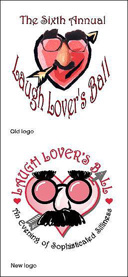
In late 2001 Seattle comedian David Crowe contacted me to redesign the identity for the comedy event held each Valentine's Day. For the previous six years a collage of art elements, photo imagery and distorted type had been combined in a logo representing the night of comedy. Crowe felt it was time to create a strong, simple, cleaner symbol to represent the fundraising event from year to year. I was asked to create a new identity that would maintain elements of the logo already in use. While continuing to use their signature font Harrington, I incorporated the arrow tip as the "A" letterform in the word "BALL." A more graphic representation of the "Groucho Marx" glasses/nose combo was used to illustrate a face on the heart idea "borrowed" from the original design and the tagline for the evening was included in the new logo. Years later the revamped logo is still representing this great event.

You will find additional examples of identity, web and print redesigns on the Creative Latitude site, in a section called GRAPHIC makeovers. Designer Alina Hagen contributes her observations to the submitted design projects. Quite a few of my own redesign efforts are posted at "GRAPHIC makeovers." Creative Latitude is always looking for other before and after design examples to display on the web site - do consider submitting some of your own efforts.

© 2006 Jeff Fisher LogoMotives