Showing posts with label restaurant logos. Show all posts

Logodotes: North Bank Cafe

[Over the 30+ years I've worked professionally as a designer, interesting side stories have come up about my identity designs. This is one of an ongoing series of "Logodotes" - anecdotes about my logo designs.]

In the summer of 2009, I was very sad to learn of the passing of one of my favorite, and most fun, clients. Cecilia Murphy was one-of-a-kind and a Portland institution. It made me smile when, in doing one of the newspaper's "Life Story" features, The Oregonian began the article with "Cecilia Murphy lived by the unofficial motto "'more is more.' Less was not for her."

In that same newspaper article was the minor mention "She had a short-lived coffee shop." That's how I met the vibrant force known as Cecilia Murphy.

In late 2003, Murphy contacted me to assist in helping brand her latest venture - a coffee house and cafe in the St. Johns neighborhood of North Portland. She conveyed a desire to have the business project an image of the television show Northern Exposure meeting North Portland. Some Victorian elements were to be mixed with comfortable over-stuffed furniture and a few rustic Northwest touches - including vintage mounted heads of hunted wildlife.

Her eyes twinkled as she suggested that the cafe identity might included the image of a winking moose, with long eye-lashes and a "big rack." I knew that Murphy meant antlers in this case, but her smile told me she knew exactly what she had said. Throughout our conversation the moose was referred to as "she."

After thinking about the input for a moment, I told my client that I didn't think a female moose would have antlers. Murphy quickly replied, "Well, I guess we'll have a cross-dressing moose."

I appreciated the opportunity to be totally playful with the North Bank Cafe logo project. The moose image quickly developed as a fairly cartoon-ish creature. I researched moose hoof prints, to be used as bullets in the design, and had fun playing with type possibilities, prior to settling on Horndon as my favorite primary font for my initial design concept. Still, second-guessing myself, I was a bit unsure about having possibly taken the beast too far. I included one more conservative concept in the rough designs I presented (above left).

As is the case in 85-90% of my identity design projects, the client was immediately drawn to my very first concept. With a little fine-tuning it became the final logo for the North Bank Cafe (above right).

The North Bank Cafe was short-lived. Unfortunately, Cecilia Murphy is also no longer with us. I am happy that the cross-dressing moose of the logo does live on. It appears in the books Logo Design for Small Business 2, 1000 Restaurant Bar & Cafe Graphics (and its recently-released paperback mini edition) and 100's Visual Logos and Letterheads.

© 2010 Jeff Fisher LogoMotives

Recently released paperback design book editions highlight work by Jeff Fisher LogoMotives

Four recent paperback edition releases, of previously successful design books, feature projects created by Jeff Fisher, the Engineer of Creative Identity for the Portland-based firm Jeff Fisher LogoMotives.

Rockport Publishers is offering the paperback mini version of 1000 Retail Graphics: From Signage to Logos and Everything In-Store, from firm JGA. Fisher's logo for the Portland retail institution W.C. Winks Hardware is included in the book.

The paperback version of Big Book of Business Cards has been released by Collins Design. The volume, by David E. Carter, showcases business card designs by Jeff Fisher for the hair and nail salon Slick, Pearl Real Estate and Jeff Fisher LogoMotives.

Luke Herriott's book 1000 Restaurant, Bar, and Cafe Graphics: From Signage to Logos and Everything In Between, another Rockport Publishers selection, displays Jeff Fisher LogoMotives identity designs for Glo's Broiler, Balboosta, La Patisserie and the North Bank Cafe. This paperback mini edition also takes a look at the menu package created by the designer for Indies Restaurant & Bar.

A full-page magazine ad for the Portland business VanderVeer Center is given exposure in the paperback version of The Big Book of Layouts; also by David E. Carter.

The design industry efforts of Jeff Fisher are highlighted in over 130 books from publishers around the world. A complete list may be found on the Jeff Fisher LogoMotives blogfolio.

© 2009 Jeff Fisher LogoMotives.

Re-Design: Balaboosta Delicatessen

The Japanese book Works in Progress: Graphics for Visual Presentations features a portion of the logo design process for Balaboosta. The following example of a logo re-design project by Jeff Fisher LogoMotives goes into a bit more detail.

Local chef and restaurant owner Lisa Schroeder was opening a new traditional delicatessen on a city block where she owned two other eating establishments. Initially the new eatery was also going to display and sell artisan furniture made from reclaimed products. A polished identity was needed to represent the new business.

Furniture designer Brett Bigham had created an initial image for use in promoting the establishment which would also showcase his creative efforts (above). A more stylized and finished business identity was desired by the owner of the business. Retaining the image of a waitress in the graphic was discussed, as was the incorporation of some retro restaurant imagery.

With "Balaboosta" being a rather unique word, I first presented the client the word in a wide variety of typefaces - both upper and lower case for each font presented (above).

The initial concepts (above) incorporated waitress imagery, a retro-like checkerboard pattern and all of the text elements desired by the client. The first two logo concepts included an oval shape - an element used in the identities of the client's tow other eating establishments.

Feedback on the initial concepts led to the elimination of the waitress image. The client suggested that I concentrate on promoting the food offerings of the delicatessen within the logo design.

I then decided to incorporate a cup of coffee and a bagel as replacements for the "O" letterforms in the word "Balaboosta." In addition, concepts were presented that conveyed a restaurant tabletop with coffee cups, bowl, plate and pitcher. (above) Again, one of the designs involved the inclusion of the oval shape.

The oval resonated with the client and I was asked to move forward with that shape as a graphic element. The coffee cup remained within the design; while the bagel was replaced with a half sandwich and a dill pickle slice. In simplifying the design, the name Balaboosta Delicatessen was the only text retained. A variety of background treatments were presented (above).

The client, who had a great understanding of design and typography, then suggested that I take a look at the font Serific/Serifa as a possible primary type treatment. Baskerville was discussed as a complimentary type selection for the word "Delicatessen" (above).

The simplification of the logo design continued with the elimination of all illustrative elements. The diamond pattern background of previous concepts brought my attention to the tile pattern on the floor of the historic building housing the delicatessen. I then brought that tile pattern - and the colors of wood, paint and tile within the restaurant - into the design (above).

The oval shape was a consistent element from the beginning of the process to create an identity for the Balaboosta Delicatessen. Through the process of distilling the design down to a simplified image, a final sophisticated logo was created.

The client was very pleased with the final identity image and how it complimented the logos of her other restaurants. Unfortunately, the design got little use, as the eating establishment was reconcepted shortly after opening.

In addition to appearing in the Works in Progress: Graphics for Visual Presentations, the Balaboosta design lives on in The Big Book of Logos 5.

(Note: My book, Identity Crisis!: 50 Redesigns That Transformed Stale Identities Into Successful Brands, contains case studies from 35 designers and firms located around the world. Learn more about the book on the Identity Crisis! blog.)

© 2009 Jeff Fisher LogoMotives.

Toot! Toot!*:
Jeff Fisher LogoMotives showcased in
Spanish book Eating & Designing

The design work of Jeff Fisher, the Engineer of Creative Identity for the Portland firm Jeff Fisher LogoMotives, is included in the newly released book Eating & Designing from Spanish publisher Index Book. Logos designed for the Seattle Hamburger Mary's and Celilo - the former restaurant in Portland's Governor Hotel - appear in the book by designer Marta Aymerich. The volume is a collection of restaurant identities from around the world, and the use of those images in menus, signage, advertising, websites and interiors.

A hand holding a raised hamburger takes the form of the Space Needle in the logo for Hamburger Mary's. The design was previously featured in the Japanese books New Logo and Trademark Design and Logo and Trademark Collection.

The Governor Hotel interiors; and marketing and promotion efforts created by designer Jeff Fisher; made use of imagery associated with the Pacific Northwest exploration of the Lewis & Clark expedition and the 1905 Portland exposition celebrating the centennial of the trek. Letterforms from the handwritten journals of Meriwether Lewis were used to create the identity for the Celilo restaurant when the eatery and the hotel originally opened.

Jeff Fisher has received nearly 575 regional, national and international graphic design awards for his logo and corporate identity efforts. His work is featured in nearly 100 books on the design of logos, the business of graphic design, and small business marketing.

Fisher is a member of the HOW Magazine Editorial Advisory Board, the HOW Design Conference Advisory Council and the UCDA Designer Magazine Editorial Advisory Board. His new book, Identity Crisis!: 50 Redesigns That Transformed Stale Identities into Successful Brands, was recently released by HOW Books. His first volume, The Savvy Designer’s Guide to Success, appeared on bookstore shelves in late 2004.

(* If I don’t "toot!" my own horn, no one else will.)

© 2007 Jeff Fisher LogoMotives

Toot! Toot!*:

Jeff Fisher LogoMotives honored with three

2007 American Graphic Design Awards

Jeff Fisher, the Engineer of Creative Identity for the Portland firm Jeff Fisher LogoMotives has received three 2007 American Graphic Design Awards for his identity design efforts. Over the past decade Fisher has been honored with 18 of the awards in the annual national competition coordinated by the trade publication Graphic Design: usa and sponsored by Adobe Systems Incorporated.

The logo for the Portland delicatessen Balaboosta was selected for an award. The eating establishment has since been renovated by the owner and re-opened under a new name.

The identity for the Native Youth Internship Program, of the Holland+ Knight Charitable Foundation, was also recognized. The intern and scholarship program, for Native high school students, was initiated by the designer's partner Ed Cunningham, Business Manager of the national law firm's Portland office. The Holland+Knight Charitable Foundation is headquartered in Tampa, FL.

Fisher's logo design for the AIDS residential care facility Our House of Portland was also honored. The new identity was introduced in conjunction with the grand opening of the organization's new facility this past year.

Jeff Fisher has received over 575 regional, national and international graphic design awards for his logo and corporate identity efforts. His work is featured in nearly 100 books on the design of logos, the business of graphic design, and small business marketing.

Fisher is a member of the HOW Magazine Editorial Advisory Board, the HOW Design Conference Advisory Council and the UCDA Designer Magazine Editorial Advisory Board. His first book, The Savvy Designer’s Guide to Success, was released by HOW Design Books in late 2004. His new volume, Identity Crisis!, will be on bookshelves in October 2007.

(* If I don’t "toot!" my own horn, no one else will.)

© 2007 Jeff Fisher LogoMotives
Toot! Toot!*:

Jeff Fisher LogoMotives designs featured in
1000 Restaurant Bar & Cafe Graphics

The identity design work of Jeff Fisher, the Engineer of Creative Identity for the Portland-based firm Jeff Fisher LogoMotives, is featured in the new book 1000 Restaurant Bar & Cafe Graphics: From Signage to Logos and Everything in Between from Rockport Publishers, The book, featuring a wide variety of design images from around the world, was compiled, designed and edited by the Luke Herriott of the U.K. design firm Studio Ink.

The images selected include the identities for Seattle eatery Glo's Broiler, and Portland establishments North Bank Cafe, Balaboosta, and La Patisserie. The menu design for Indies Restaurant & Bar in New York City is also recognized.

Jeff Fisher has received over 575 regional, national and international graphic design awards for his logo and corporate identity efforts. His work is featured in nearly 100 books on the design of logos, the business of graphic design, and small business marketing.

Fisher is a member of the HOW Magazine Editorial Advisory Board, the HOW Design Conference Advisory Council and the UCDA Designer Magazine Editorial Advisory Board. His first book, The Savvy Designer’s Guide to Success, was released by HOW Design Books in late 2004. His new volume, Identity Crisis!, will be on bookshelves in October 2007.

(* If I don’t "toot!" my own horn, no one else will.)

© 2007 Jeff Fisher LogoMotives
Design studio housecleaning - excavated artifact #10

The sorting through backed-up digital files, filing cabinets and boxes continues in my home studio as I archive over 30 years of design work. Recently I came across a somewhat mangled photocopy of a page from an old PRINT Regional Design Annual. In looking over the images on the page, I had no idea why I might have made a copy of this particular selection of design images. However, when I looked on the backside of the piece of paper, two pencil sketches of what would become the logo for the Seattle restaurant Glo's Broiler were evident.

When living in Seattle in the late 1980's, I developed a personal connection with the Capital Hill eatery. The late Glo Raineri, the founder of the breakfast and lunch cafe - and the mother of one of my closest friends - was also my roommate. I was one of a number of young men who, at various times, rented rooms in her house, which was sometimes referred to as "Glo's Home for Wayward Boys." Her restaurant became a natural extension of that life and I ate many meals in the place. That I would eventually design the logo for the place was no surprise.

I especially enjoy designing restaurant identities. There's often an incredibly creative challenge in capturing the essence of an eating establishment in an eye-catching and concise logo image to represent a business entity that conveys a very specific theme or food style. In the past, I wrote about such design projects in the Logo Notions article Designs on dining: Restaurant logos as a graphic invitation to a meal and an experience.

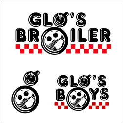
For me, Glo's Broiler had the feeling of an old-fashioned diner and that type of imagery came to mind as possible logo elements - neon, sytlized illustration, chrome, a checkerboard tablecloth, and red vinyl upholstery. My first pencil sketch (above) tilted a square border into a diamond shape, and introduced a steaming coffee cup as a replacement for the "o" in the word "Glo's;" while a plate of a common breakfast entree became the "o" in "Broiler." The second doodle (at right) eliminated the confining border and hinted at the type treatment - which I already knew would make use of the font Frankfurter Highlight. It's interesting that in the revised concept the addition of a checkerboard base can barely be seen on the paper. I erased it from the drawing whole working on the logo creation.

As the identity design developed, the bacon, eggs and toast graphic took inspiration from a similar image in a silkscreen print I had produced, and sold through several galleries, years earlier. In a "happy accident," the placement of the coffee cup and plate created a lower-case "g" - a secondary representation of "Glo." The checkerboard imagery then returned to give the logo some balance and weight.

With the completion of the logo, it was decided to do T-shirts to market the restaurant. A snide comment from a guy in a bar, referring to me as one of "Glo's boys," resulted in an additional "Glo's Boys" logo being creating and it became the identity for a bowling team the restaurant sponsored.

Glo, given the name of "Mother of Capital Hill" by Seattle newspapers, passed away in October of 2005. The restaurant remains open, although the logo has not been used for some time. Still, the image lives on in the books Bullet-Proof Logos, Logo Design for Small Business 2 and the Japanese volume New Logo and Trademark Design (which was recently re-released as the paperback Logo and Trademark Collection).

Note: In previous bLog-oMotives entries I took a look back at excavated artifacts 1, 2, 3, 4, 5, 6, 7, 8, and 9.

© 2007 Jeff Fisher LogoMotives

Design studio housecleaning - excavated artifact #8

I am continuing to sort through and archive over 30 years of design projects as I organize my home studio. It amazes me how much concept and process documentation I have filed away over the years. I seems a possible book on my 30+ years is evolving as I find more such materials all the time - and I haven't even started converting years of floppy disks to more stable archival vehicles.

Recently I came across the original planning meeting notes for a 1995 AIDS organization fundraising event to be called "Coffee Cares." The sheet of notebook paper listed a variety of possible event names and taglines. As the meeting progressed I scribbled out a possible logo design in ball point pen - based in part on the design of my own previous logo design for the Seattle restaurant Glo's Broiler. By the time the meeting was adjourned the event identity was created in my mind and on my page of notes.

My rough sketch included a roughed out intrepretation of the font Frankfurter Highlight for that retro cafe look, a checkerboard pattern above and below the event name, a space for the yet-to-be-determined tagline and steam coming off the coffee cup in the form of the AIDS ribbon.

Within a day my final logo concept was created, presented and accepted by the event planners. Little changed from the original scribble. I did drop the checkerboard pattern above "Coffee Cares" and the space reserved for the tagline was moved from the left to the right - now filled with the message "Baristas, bakeries & bistros supporting people with AIDS."

The image was very successful in drawing attention to the city-wide event in Portland and the fundraiser added to the coffers of local AIDS organizations. The logo was also featured in the books Restaurant Graphics 2, Typography and Blue is Hot,Red is Cool: Choosing the Right Color for Your Logo.

Note: In previous bLog-oMotives entries I took a look back at excavated artifacts 1, 2, 3, 4, 5, 6, and 7.

© 2007 Jeff Fisher LogoMotives

Toot! Toot!*: Jeff Fisher LogoMotives designs to be

in "Branded" book from Début Publications Ltd

The logo design work of Jeff Fisher, the Engineer of Creative Identity for the firm Jeff Fisher LogoMotives, will be represented with 27 identity examples in the upcoming book Branded from United Kingdom publisher Début Publications Ltd. Logo designs of over 130 international graphic designers, design firms and agencies will be included in the book to be published later this year. Fisher has also been asked to contribute text about an aspect of identity design for the book.

Designs from Jeff Fisher LogoMotives to be featured in the book include those for the Benicia Historical Museum (Benicia, CA), Four Rivers Community School (Ontario, OR), Twisted Elegance Interactive (Seattle, WA), and the Young Native Writer's Essay Contest sponsored by the Holland+Knight Charitable Foundation (Tampa, FL). Logos for DataDork (Fontana, CA), the Valles Caldera National Preserve (New Mexico) and the Seacoast AIDS Walk (Portsmouth, NH) were also selected.
Portland clients to be highlighted in the volume include interiors firm NoBox Design, the VanderVeer Center anti-aging clinic, the City of Portland's Neighborhood Service Center program, Bella Terra Landscape Designs, the AIDS residential care facility Our House of Portland, architect Thomas Fallon and Balloons on Broadway. Designs for the Just Out newsmagazine, Black Dog Furniture Design,the greeting card company Good Pig, Bad Pig and TraveLady Media will also be in the book. Logos for the community activist organization Association for Responsible Inner Eastside Neighborhood Development (AFriend), Pearl Real Estate, and the now closed Balaboosta Delicatessen were also recognized.

Identities honored for North Portland businesses, organizations or events include those for the St. Johns Window Project, North Portland Business Association, Coyner’s Auto Body, and University Park United Methodist Church's annual North Portland Pride BBQ and Festival.

Selected designs also include images created for George Fox University's Tilikum Center for Retreats & Outdoor Ministries (Newberg, OR) and the Emerge Medical Spa at Bridgeport (Tigard, OR).

Jeff Fisher has received nearly 550 regional, national and international graphic design awards for his logo and corporate identity efforts. His work is featured in more than 85 books on the design of logos, the business of graphic design, and small business marketing.

Fisher is a member of the HOW Magazine Editorial Advisory Board, the HOW Design Conference Advisory Council and the UCDA Designer Magazine Editorial Advisory Board. His first book, The Savvy Designer's Guide to Success, was released by HOW Design Books in late 2004. His new volume, Identity Crisis!, will be on bookshelves in late 2007.

* If I don't "toot!" my own horn, no one else will.

© 2007 Jeff Fisher LogoMotives
Toot! Toot!*: Jeff Fisher LogoMotives designs

chosen for The Big Book of Logos 5

Jeff Fisher, the Engineer of Creative Identity for the firm Jeff Fisher LogoMotives, has been notified that 31 of his identity designs will be included in the book The Big Book of Logos 5 as a result of the LOGO 2007 design competition. The book, from prolific graphic design author David E. Carter, is to feature hundreds of logos from design professionals around the world and is scheduled to be released in late 2007.

Designs from Jeff Fisher LogoMotives to be featured in the book include those for the Benicia Historical Museum (Benicia, CA), Four Rivers Community School (Ontario, OR), the annual golf tournament and auction events for Residence XII (Kirkland, WA), Twisted Elegance Interactive (Seattle, WA), The Parenting Alliance, and the Young Native Writer's Essay Contest sponsored by the Holland+Knight Charitable Foundation (Tampa, FL). An icon produced as part of the international Fluerons of Hope - Font Aid III effort, benefiting those impacted by the tsunami of 2004, was also selected.
Portland clients to be highlighted in the volume include interiors firm NoBox Design, the VanderVeer Center anti-aging clinic, the City of Portland's Neighborhood Service Center program, Bella Terra Landscape Designs, the AIDS residential care facility Our House of Portland, and architect Thomas Fallon.

Logos for the community activist organization Association for Responsible Inner Eastside Neighborhood Development (AFriend), the Reed College Fall Thesis programs for 2004 and 2005, The Spring Showcase presented by the Philoptochos of the Holy Trinity Greek Orthodox Church, and the now closed Balaboosta Delicatessen were also recognized.

Identities honored for North Portland individuals, organizations or events included those for community organizer Mike Verbout, St. Johns Window Project, Portsmouth Neighborhood Association, North Portland Business Association and University Park United Methodist Church's annual North Portland Pride BBQ and Festival.

Selected designs include images created for George Fox University's Tilikum Center for Retreats & Outdoor Ministries (Newberg, OR) and the Emerge Medical Spa at Bridgeport (Tigard, OR).

Gay/Lesbian community logo images to be in the book include designs for Just Out newsmagazine (Portland, OR) and the Diversity Training program of DiversityBuilder.com (Brentwood, TN). In addition, Fisher's "I DO!" image, in support of same-sex marriage, and the logo for his own marriage to his partner Ed Cunningham are celebrated.

The designer's logo for his presentation at the 2004 HOW Design Conference was also honored.

Since 1998, hundreds of examples of the design work of Jeff Fisher LogoMotives have appeared in over 20 books from David E. Carter, including the American Corporate Identity series, the Big Book of Logos collection and Global Corporate Identity. Fisher design efforts are also featured in the volumes Bullet-Proof Logos, Blue is Hot, Red is Cool, The Big Book of Designs for Letterheads and Websites, The Big Book of New Design Ideas, Logos Redesigned, The Big Book of Business Cards, The Big Book of Layouts, and The Big Book of Letterheads.
Jeff Fisher has received nearly 550 regional, national and international graphic design awards for his logo and corporate identity efforts. His work is featured in more than 85 books on the design of logos, the business of graphic design, and small business marketing.

Fisher is a member of the HOW Magazine Editorial Advisory Board, the HOW Design Conference Advisory Council and the UCDA Designer Magazine Editorial Advisory Board. His first book, The Savvy Designer's Guide to Success, was released by HOW Design Books in late 2004. His new volume, Identity Crisis!, will be on bookshelves in late 2007.

(* If I don't "toot!" my own horn, no one else will.)

© 2007 Jeff Fisher LogoMotives

"My Kid Could Design That Restaurant Logo!"

That odd headline, from a recent entry on the New York Magazine blog Grub Street, popped up on my Internet radar this morning. When I checked out the link I was thrilled to find the work of Louise Fili (a designer whose restaurant identity work I truly admire) featured in a blurb about her designs being included in the Society of Illustrators' current exhibition at the Museum of Illustration in New York. You need to hurry if you want to see the exhibit in person as it ends on January 27th. I'd previously read about the exhibit, but had done little to check out what it was all about (I've been a little busy writing a book in recent months...).

Luckily the exhibit "Letter As Image,Image As Letter," described as "six designers reinventing lettering and creating new vocabularies of design," also has a great online presence. Check out the incredible restaurant logos by Fili - including the design for one of my favorite restaurants, The Pink Door in Seattle. The site also allows you to view the beautiful illustrative efforts of Michael Doret, Gerard Huerta, Tom Nikosey, Daniel Pelavin, and Tom White.

I'm glad that headline caught my attention this morning - although I'm now distracted checking out the work of some fascinating designers and illustrators. It's very satisfying to know that some kids do grow up to create restaurant logos the calibre of Louise Fili's work.

© 2007 Jeff Fisher LogoMotives

Making a logo design concept your own

In a previous bLog-oMotives entry, and Creative Latitude article, I wrote about designers creating truly unique identities. The process involves so much more than just slapping a graphic, or icon, up next to a block of text or a word. With the vast majority of my logo designs I try to envision a graphic element, appropriate to the message to be conveyed in the design, as a possible letterform representation within the name. Combining the two often results in an incredibly individual and memorable symbol to identify the client.

One of my personal favorites has always been the logo I designed for the Seattle breakfast establishment Glo's Broiler. It's a good example of a well thought out concept coming together with a "happy accident" to produce a strong identifying image. In designing the logo, I knew I wanted a coffee cup and plate to represent the "o" letterforms in the name. Then, as I rotated the coffee cup illustration a bit, a lower-case "g" appeared within the design.

The same treatment then worked in a secondary image for the restaurant. The owner wanted to have a complimentary logo to represent the athletic teams the eatery sponsored and the "Glo's Boys" imagery was the second "happy accident" in the branding process.

The Glo's Broiler image appears in the books Bullet-Proof Logos, Logo Design for Small Business 2 and the Japanese volume New Logo and Trademark Design (which was recently re-released as the paperback Logo and Trademark Collection).

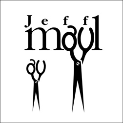
While archiving logo design work I have done over the past 30 years, I've been coming across many other projects where I have used graphic elements as substitutes for letterforms with a variety of results. One of the earliest successes was the logo design for hairstylist Jeff Maul. By just taking the time to look at hair-cutting scissors in a different way, I was able to see possible letter shapes in the holes used for fingers.

The St. Johns Window Project is a local event where North Portland artists are asked to create works of art to be displayed in the windows of area businesses. When asked to create a logo for the annual event, I immediately visualized window frames as replacements for letters in the name - before the organization's contact could even finish explaining what they hoped for in an identity. The effort received a 2003 American Graphic Design Award from Graphic Design: usa magazine.

Personal chef and caterer Jim Crabtree wanted a simple and distinctive identity for his business. In researching catering logo images, I kept coming across graphic representations of dinner plates, waiters, picnic baskets, fruits and vegetables, serving trays, bottles of wine, and other fairly common items. None of the examples gave me the impresson of being unique to the industry. Jim himself was one of the most unique aspects of his business - with his spiky hair and angular features. That's when I realized a "W," the first letter in his company name, could easily be adapted to represent a portion of a man's body. The final design resulted in many of the owner's friends and clients saying "it looks just like him."

The "What's For Dinner?" logo is also featured in the Logo Design for Small Business 2, New Logo and Trademark Design and Logo and Trademark Collection.

When tackling logo design challenges, designers should take into consideration that letterforms may resemble applicable graphic imagery - and graphic elements may be excellent replacements for particular letter shapes. By expanding on an initial concept the result may be a truly unique design solution. Other such examples will be highlighted in future bLog-oMotives entries.

© 2007 Jeff Fisher LogoMotives

Toot! Toot!*:

Logos: From North to South America features

Jeff Fisher LogoMotives in a big way

The identity design work of Portland, OR firm Jeff Fisher LogoMotives is represented in a big way in the new Index Book release Logos; From North to South America by Pedro Guitton. The Spanish publisher has included 46 of designer Jeff Fisher's logos in the 478-page volume, which contains hundreds of identity examples and comments about logo design from many of the professionals featured.

Small business logos from the designer featured in the book include that of his own business Jeff Fisher LogoMotives, and Portland businesses Balloons on Broadway, Big Daddy Marketing Specialties, Coyner's Auto Body, the Diva salon, greeting card company Good Pig - Bad Pig, retail development Heart of the Pearl and W.C. Winks Hardware. The identities for Harrison Flowers (Hood River, OR), Cooke Stationery (Salem, OR), writer Kimberly Waters (Seattle, WA), Kay Johnson's Sing Out Productions (Littleton, CO), the New England Firewood Company (Lancaster, MA), Walk Your Talk (Silver Springs, MD), Lone Star Site Design (Texas) and Buttonberry Books (Lebanon, NJ) were also showcased.

Education images exhibited in the volume include the logos for James John Elementary School in North Portland and the school's reading program, Buckman Elementary School's annual auction (Portland, OR), and an admissions program identity for George Fox University (Newberg, OR). Each year Fisher creates a graphic for the Fall Thesis celebration at Reed College (Portland, OR) and the images from 1999 through 2002 are in the book.

Organization logos for North Portland's Peninsula Clean Team, the Oregon Adult Soccer Association, the North Portland Business Association, the restoration campaign for the Vista House in Oregon's Columbia River Gorge and the Valles Caldera National Preserve in New Mexico are also highlighted. Gay/lesbian community identities in the book include those for Oregon Family OUTings (Eugene, OR) and the 2001 and 2003 logos for the annual Cascade Cup softball tournament.

The Hospice of Humboldt (Eureka, CA), Monroe Orthodontics (Aloha & Rainier, OR), the Seacoast AIDS Walk (Portsmouth, NH) and the designer's own safe sex message graphic A Rubber's Ducky are featured in the section on health-related logos.

Entertainment identities in the collection include several from the triangle productions! theatre company in Portland. Those include the play The Dream State, the company's 11th anniversary icon, the musical Naked Boys Singing, the 12th season image, and the shows When Pigs Fly, Veronica's Position, As Bees in Honey Drown, Caught in the Net, and Girls' Night Out. In addition, the logo for the Broadway Rose Theatre Company (Tigard, OR) production of Will Rogers Follies is presented.

Jeff Fisher has received nearly 500 regional, national and international graphic design awards for his logo and corporate identity efforts. His work is featured in more than 80 books on the design of logos, the business of graphic design, and small business marketing.

Fisher is a member of the HOW Magazine Editorial Advisory Board, the HOW Design Conference Advisory Council and the Board of Directors of Proscodi: Professional Society of Communication Design. His first book, The Savvy Designer's Guide to Success, was released by HOW Design Books in late 2004. He is currently writing "Identity Crisis," also for HOW Design Books, which is expected to be on bookshelves in 2007.

(* If I don't "toot!" my own horn, no one else will.)

© 2006 Jeff Fisher LogoMotives

Review: Logo Design for Small Business 2 - A Designer’s Reference Guide to Practical Logo Design

It may be a bit odd for me to reviewing a book that includes quite a few examples of my own work. However, with my own logo designs in over 70 books at this point. my selection of logo design volumes to consider for review might end up being somewhat limited.

Dan Antonelli does not disappoint the logo designer with Logo Design for Small Business 2, the follow-up to his first book, Logo Design for Small Business. Antonelli preaches what he practices. I appreciate the fact he is educated as a designer, has worked in the industry for a number of years and is in business as a sign maker. He understands, and is able to convey, what a designer needs to accomplish – and, from his own unique perspective, what a vendor needs as a final product. The author provides a great deal of advice in regards to the business of logo design for small businesses, as well as displaying examples from a variety of designers for inspiration.

Don’t be put off by the rather short length of this book – it’s 72 pages of useful information. Those just starting out in logo design will benefit from the excellent advice of Antonelli. For seasoned pros the book is a reminder of many things we should consider in our day to day designing of identities. All logo designers will recoup the cost of the book on the first project produced after reading the book – and it should be on the reference bookshelf of anyone interested in the design of logos.

My designs highlighted in the volume include the identity for my own company Jeff Fisher LogoMotives and numerous Portland businesses, including Balloons on Broadway, Black Dog Furniture Designs, the hair salon Diva, Janet Loughrey Horticulture Photography, hair stylist Jeff Maul,Joy Creek Nursery, Monroe Orthodontics, the North Bank Cafe, Thomas F. Fallon Architect, TraveLady Media, W.C. Winks Hardware and the personal chef/catering firm What's for Dinner? Seattle small businesses represented include the restaurant Glo's Broiler and writer Kimberly Waters. The identities for restaurants Crossings at the Riverhouse, located in Bend, OR, and New York's former Indies Restaurant & Bar are also displayed. Other featured businesses include DataDork (Fontana, CA), DesignEire (Dublin, Ireland), Buttonberry Books (Lebanon, NJ) and KidstuffPR.com (Black Earth, WI).

© 2005 Jeff Fisher LogoMotives

Designs on a North Portland neighborhood

The “international headquarters” of the graphic design firm Jeff Fisher LogoMotives has been located in the Arbor Lodge neighborhood of North Portland for the past nine and a half years. In that time, from my home-based studio, I have made quite an impression on the local community. While I often find myself designing logos for businesses and organizations across the U.S. and around the world, some of the greatest satisfaction has come from creating identities for clients in my own neighborhood.

One of the major landmarks in the area, the majestic St. Johns Bridge, has found its way into logo designs for the North Portland Business Association, James John School, Project Safe Summer and community activist Mike Verbout. The Peninsula Community Development Corporation, Portsmouth Neighborhood Association, Peninsula Clean Team, Caring Community of North Portland, and Kenton Neighborhood Service Center have all been given the LogoMotives treatment. Area events being identified with my images include the annual Portland Iron Chef fundraiser of the Children's Relief Nursery, the St. Johns Window Project art exhibit, the North Portland Pride B.B.Q. and Festival sponsored by the University Park United Methodist Church and others. Business sector logos I have designed for neighborhood companies include the North Bank Cafe, Coyner's Auto Body and Lampros Steel.

One of my favorite North Portland projects was the logo design for the North Bank Cafe. When discussing the logo project, the restaurant owner mentioned she wanted the image to convey a cross between the old television show "Northern Exposure" and the feeling of the St. Johns neighborhood. She also asked that I include a moose as a graphic element if possible, as she hoped to have a giant moose head hanging on the wall. Not taking herself too seriously, she suggested that the moose have long eyelashes and be winking. It seemed to be a large order for one logo image - and I saw the moose with large antlers from my initial concept. Only one problem -a female moose doesn't have the familiar large rack. Still, the owner was thrilled with my solution and we decided that the moose in the logo was a cross-dressing or drag queen creature. Unfortunately, the life of the cafe was limited, but the logo's reach continues to be worldwide.

The North Bank Cafe logo is just one of the many neighborhood images having a life of its own far beyond the local area. It is among the North Portland logos have brought me numerous design awards, including those of the American Graphic Design Awards, LOGO 2001, LOGO 2002, LOGO 2004 and the Summit Creative Awards. The Peninsula Community Development Corporation and Lampros Steel logos appear in the book Logos Redesigned: How 200 Companies Successfully Changed Their Image and on the Creative Latitude design site's GRAPHIC makeovers section. Other logos appear in the books The Big Books of Logos, The New Big Book of Logos, The Big Book of Logos 3, Logo Design for Small Business 2, and the Japanese book New Logo World. All the exposure has added a great deal to my marketing efforts around the world.

It's not unusual for a designer to set their sights on big buck, corporate clients as they map out a career. However, at times the best - and most appreciative - clients may be the smaller businesses and organizations right outside your front door.

© 2005 Jeff Fisher LogoMotives

Designs on dining: Restaurant logos as a graphic invitation to a meal and an experience

Over the years some of my own most enjoyable, challenging and visible identity design projects have been those for restaurant industry businesses. Much of the pleasure comes from an ability to push the creative envelope a bit and not be limited by the often-conservative boundaries of much more corporate identity design. I usually have an opportunity to be more playful with restaurant logos and have more fun with color. In addition, the architecture of the buildings, the design of the interiors, the type of food to be served and other elements come into play. The challenges of such projects most often raise their ugly heads in the form of budget limitations and the lateness of some restaurant owners to initiate the logo/identity design process for their new business in a timely manner – especially when the scheduling of projects for other vendors are overlooked. The visibility, and multiple uses, of the completed eating establishment image is a valuable marketing tool for a designer as easily recognizable public exposure of one’s design work. Unfortunately, with something like 50% of all restaurants closing in the first two to three years in business the visibility of such design examples often is limited in duration. (That figure is not necessarily more dramatic than the failure rate of other start-up businesses – the boarding up of a local dining establishment is often just more evident to the average person viewing from the street.)

The above is the introduction to a "Logo Notions" column I recently wrote on the topic of restaurant identity. You can check out the entire article at CreativeLatitude.com

© 2005 Jeff Fisher LogoMotives