Showing posts with label theatrical logos. Show all posts

Putting a new face on a common design element

Throughout history two masks have come to symbolize theatre and its two major dramatic categories of comedy and tragedy. Such masks have played an important part in the history of drama since the time of the ancient Greeks, originally allowing actors to clearly convey emotions such as anger, joy, or sorrow to the entire large audience. Masks also made it easier for the performers, limited to the male of species, to portray female characters.

During that same theatrical history the mask images were used in architecture, art, design and printing as graphic representations of stage venues, performance groups and plays. The result has been the overuse of mask imagery, in recognizeable forms, again and again.

As a designer who has created theatre graphic images for over 30 years, it is a challenge when being asked to use common elements in related graphics - especially in the design of logos for theater spaces, production companies or theatrical events. When creating such identities, it is necessary to move beyond the literal to produce fresh imagery making use of ancient themes.

In 1995, I was asked to design the logo for a San Francisco nonprofit using comedy performances to raise funds for AIDS organizations. The identity for Laugh Line Productions (below left) incorporated a interpretation of the comedy mask as the "U" letterform in the word "LAUGH." Today the logo looks a bit too basic and literal to me - but it is where I began to think about alternative treatments of the masks for future designs. The Laugh Line image is featured in the books Letterhead and Logo Design 4 and The Best of Letterhead and Logo Design.

One of my favorite theatre logos is my design for the former Main Street Playhouse (above right) in Portland. The space was located in the old Masonic Building, designed by renowned architect Pietro Belluschi. (The building has since been completely renovated and is now part of the Portland Art Museum complex.) Outside of the building, lining the streets along the city's South Park Blocks, are beautiful cast iron street lights. While standing near the theatre one night, I realized that the globes of the light fixtures could easily become the masks of comedy and tragedy. The graphic treatment, with the human imagery almost coming across as reflections in the glass, is so subtle than many people have missed the meaning completely. Still, the design was recognized with an American Graphic Design Award and publication in the PRINT Regional Design Annual.

Following the death of Portland actor (and acquaintance) Rob Buckmaster, I was asked to create a logo for the foundation established in his honor. It was a very sad time for the local theatre community, but still, thinking of Rob could immediately bring a smile to anyone's face. Once again I felt the masks of comedy and tragedy could provide a graphic solution to the design challenge. In the design the masks became a bit more graphic than in previous designs, and I purposely placed the sad image upside down to focus on the happier element within the logo. It was a widely accepted identity for the foundation. The Rob Buckmaster Fund logo appears in the books American Corporate Identity 14 and The New Big Book of Logos.

Much of my logo design for the theatre has been during my relationship with the triangle productions! production company, which began back in 1990. Each new season of plays and musicals has required the creation of an anniversary logo image to be used on ticket brochures, the website, posters, ads and playbills. When it came time to design the 14th anniversary identity, I immediately saw the numeral "4" as an abstract human form that could take on the characteristics of one of the historic mask forms. With my creation of the tagline "14 years of tears & cheers," placement of the the tragedy and comedy masks was determined within the design. I have mixed feelings about the fact that most people see either the "14" or the two masks in the logo - but not both design elements. The few that do "get it" have an "aha!" moment that is very gratifying to me. The identity appears in the book 100s Visual Logos & Letterheads (UK).

I wanted to present these examples to show that with a little creativity, and effort, a designer can avoid the "easy out" of just slapping very common imagery up next to some text. The result can be a unique design solution that attracts the attention of the viewer and, in some cases, draws them in for a closer second look.

©2010 Jeff Fisher LogoMotives

The logo’s the thing – identity design takes the stage

In “Hamlet” William Shakespeare made the comment “the play’s the thing.” Unfortunately he did not expand on that thought as far as suggesting how theatre companies draw audiences to their venues to see the plays presented.

As a graphic designer I have had many opportunities over the past 30 years to assist performing arts organizations in the marketing and promotion of their efforts by creating logos for companies and theater spaces, identities for shows, posters, season ticket brochures, T-shirts and other marketing pieces. I remember creating a rough, stencil like image for a high school production of Thorton Wilder’s “Our Town” back in the mid-70’s, but I certainly had no premonitions that I would be doing a great deal of such work in the future. In college I designed posters, ads, T-shirts and other graphics for plays, concerts and other art-related associations and events. Later, while living in Seattle, I designed logos, programs, ads and promotion items for the performing arts groups Alice B. Theatre, the Seattle Men’s Chorus, the Evergreen Theater Conservatory and similar companies.

It was also in Seattle that I first became aware of the logo design work being done for local theater by Art Chantry (above). I’d met Chantry, the subject of the book Some People Can’t Surf: The Graphic Design of Art Chantry by Julie Lasky, while he was working at the alternative publication “The Rocket.” His logo creations for local theater companies and plays are what caught my attention the most. The work was stark - almost always just black and white – and had a simplicity that conveyed a great deal about the theatre production company or play being represented. The designs really inspired me to seek out opportunities doing logo design work for similar clients.

In early 1990 I attended the first play of a new Portland theatre company. I’ve got to admit, while looking over the program for the play, my first thought was “these guys could use some help.” Little did I know that I would meet the playwright/director/producer/ticker seller at a party a few weeks later. In that first conversation, Don Horn asked if I’d be interested in meeting with him to discuss some design projects for the theatre. For 16 years I worked with the theatre company, triangle productions!, located in Portland, Oregon. I designed over 100 logos for the company, its venues, shows that have been presented and special promotions. My work for the company has received nearly that number of design awards and many of the logos have been featured in numerous international design books. We have created programs, posters, signage, T-shirts, magnets, beverage cups, a paper doll book and many other unique (and fun) items in an effort to draw audiences to shows over the past decade and a half.

For myself, designing logos for live theatre companies offers me a chance to be at my most creative. With design projects for such a creative clientele there is often a great deal of room to stretch one’s creative muscles. This is not standard or conservative graphic design faire. In designing logos for theatrical productions a designer can often go over the top in the creation of attention-getting images. There is an incredible opportunity to play with type and color in unrestricted ways. I enjoy working with somewhat unusual color combinations and incorporating type from font houses such as P22, Fonthead Design, House Industries or Veer – type you many not normally see in more corporate or commercial designs. It’s not a question of “pushing the envelope” or working “out of the box” – there is no ‘envelope” or “box.” Within the theatrical graphic imagery a designer has the chance to convey the essence of a play, monologue or musical in a unique and stylized manner.

The subject matter lends itself to blatant graphic interpretations. My own experience has included being able to produce images for productions from Shakespeare to spoofs on the Bard. Topic matter has included AIDS, cannibalism, strippers, sex, country-western music, vaginas, religion, Internet dating, death, unique personal relationships, murder, concentration camps, drag queens, drug use and everything in between. Titles have included “Girls’ Night Out,” “2 Boys in a Bed on an Cold Winter’s Night,” “Dishin’ With Divine,” “The Food Chain,” “Naked Boys Singing” and so many more. (The play “Party!” is a personal favorite. Not only did I design the logo, T-shirts and a program – I actually got to spend the summer of my first mid-life crisis directing the show with seven naked men on stage – including Peter Paige who went on to “Queer as Folk” fame) How could a designer not be inspired to come up with some great logo designs to represent such topics and shows?

Don Horn, of triangle productions!, was an incredible client. Each of the past seasons he has provided me with the scripts of all the plays to be produced that year. After reading the plays, I had a meeting with Don to discuss a possible theme for the year as far as design style or colors to be used in printing the season ticket brochure, posters and programs. He then set me loose to be creative – and left me alone! The “leaving me alone” part was initially a foreign concept to me. Never before had I worked with a client who gave me free reign of the process. I never had Horn reject a logo I created for one of his shows. It was a very strange and wonderful client relationship over the years – and I truly value this particular client as a friend.

Judith Mayer, of Keyword Design, also appreciates the opportunity to collaborate with other creatives in a design relationship much different than most corporate clients.

“(Theatre clients) are sometimes more willing to go for a daring or whimsical design solution,” according to Mayer. “The fact that a show is a short term event gives them a little more freedom than if it were a logo that a business wants to last 20 years.”

Mayer enjoys the challenge of telling a story, or conveying a mood, through simple striking graphics. She designs for the Towle Community Theater, in Hammond, Indiana, which presents several shows each season that are not considered standards or classics. Mayer’s challenge is to make the public understand what kind of a show it is – even if they have never before heard the title. The examples below were all designed by Mayer for the Towle Community Theater:

“To create a logo that sums up the story means a lot of image editing - getting down to the strongest symbols or characters,” says Mayer. “In using only the key things that define the story, I try to say a lot using very little.”

As in many of my own theater design experiences, Mayer finds that when a season is promoted all at once the logos for four or five shows need to complement each other and at the same time show a range. She feels the logos must share similar characteristics in order to look like a complete set and must have differences to show whether it is a comedy, drama, classic or cutting edge theatre.

Mayer sits down with the director and has him tell her the story and asks him to list the important characters, props, locations, costume elements, scenery and songs if any.

“I may also ask him to define the look and feel of the production so that I have a pool of potential graphics to choose from,” Mayer adds. “Having him tell me the story takes into account the differences this production may have from another theater’s production of the same play.”

“Total creative freedom.”

That is what designer Jim Charlier, of JCharlier Communication Design, gets out working with those in the theatre arts. He created the series of logos below for the Niagara University Department of Theatre and Fine Arts’ current season of plays. The initial project was to create a 16-page season program booklet.

Charlier is fortunate to enough to have access to a wealth of imagery from The Castellani Art Museum of Niagara University for use in the season program. The permanent collection consists of contemporary prints, photographs, paintings, drawings and sculpture by artists such as Picasso, Basquiat, Modigliani, Dali, Motherwell, DeKooning, Nevelson, Rothenberg, Haring, Rauschenberg and many more.

“Because rights and permissions to use the artworks are either costly (for advertising purposes), or take time to acquire, I am the one that suggested creating a logo for each play, not only to individualize the play, but to also be practical for other advertising needs such as black and white print ads.” says Charlier.

“I created the series using one typeface (P22 Garamouche) to give them consistency for the season. Many of these logos were my first and only attempts. Nary a change was made by the client — they are smart, have good taste and are appreciative of professional-quality work,” Charlier remarks.

Charlier comments that such projects offer him the only total creative freedom he gets in designing logos - unless designing for himself which he finds can be much “tougher.” He finds that most clients add complexity to either the process or the final design in the creation of logos.

“Designers always want to simplify,” Charlier adds. “Working on the theatre projects is a breath of fresh air and I get to make them as simple as I want them to be.”

In Charlier’s situation many productions are already known commodities, such as Chicago and Gypsy. He doesn’t find there is much “heavy lifting” to get the gist of the play across to the potential audience. His logos take graphic cues directly from the storyline or theme of the play - whether comedy, drama or musical.

The One Act Plays image (above) represents a series of plays written by different students presented in one production. Charlier felt that since the productions are not well known a type treatment seemed logically generic as a graphic solution. Often such treatments project a striking image for a play with simplicity and elegance.

“I added self-imposed constraints - to use one typeface, few or one color (because of the B&W print ads) and simple,” says the designer. “The logos couldn't compete with the Picasso or Miro used on the same page in this particular season program.”

“A synopsis of the play works best for me (in getting inspiration) – it’s like speed reading to get the gist of the production,” Charlier concludes. “That's what the logo has to do - be read quickly to convey the strong graphic “gist” of the show.”

Note: This article appeared in its original format in the Logo Notions section at CreativeLatitude.com.

© 2008 Jeff Fisher LogoMotives

Theatre Logos Agency gives designer

theatrical images a new high-profile life

Throughout my career, the logo designs I have been asked to create for live theatre presentations have been my favorite creative exercises. From designing for my high school's theatre performances (over 30 years ago), through an on-going 17-year relationship with playwright, director and producer Don Horn and his triangle productions! theatre company, the opportunity to put a graphic face on plays and musicals has never failed to get my creative juices flowing. I previously wrote about topic in my Logo Notions article The logo’s the thing – identity design takes the stage, on the Creative Latitude website.

One of the unique aspects of creating identities for live theatre is that the logos often have a lifespan as short as the run of the show - usually a few weeks or, at the most, a few months. Luckily, from being recognized with design industry honors or being published in various graphic design books, many of my theatre graphic images have experienced some longevity.

The Theatre Logos Agency is giving new life to the work many designers have created for live theatre, through the sublicensing of the designs to other theatre companies.


Just over a week ago, I was contacted by Michael Q. Fellmeth, the founder of Theatre Logos Agency (TLA), after he read the Logo Notions article mentioned above. Fellmeth expressed interest in taking on Jeff Fisher LogoMotives as a client for the sublicensing of some of the theatre logos I have produced over time. After doing some reseach, getting the blessing of my client, and reviewing the agreement sent to me by TLA, I have opted to enter into a business relationship with TLA.
Theatre Logos Agency was founded in 2006. This past month the company "officially" opened with their web presence going live, and it's a valuable resource for designers interested in participating in the effort - in addition to being a great destination for the theatre production company seeking high quality designs to promote productions. In defining TLA, the following is posted on the website:

"Theatre Logos Agency (TLA) was established to service the growing demand from producing organizations for high-quality artwork. Prior to the formation of TLA, no central clearinghouse existed for the rights to use original artwork from Broadway, Off-Broadway, West End, and regional productions. TLA is pleased to bring together our clients' artwork with producing organizations that can utilize it in the promotion of their productions. TLA associates, made up of experienced theatrical-licensing professionals, are ready to service both the needs of our clients and producing organizations."

TLA has selected a number of my designs to include in the offerings to theatre production companies. Some of my favorite images (above) are among those to be presented for licensing. The theatrical logos have served my client, and myself, well in the past.

A few of the chosen logos have been recognized with awards from the PRINT Regional Design Annual, American Graphic Design Awards and Summit Creative Awards. The theatre logos have also been featured in the books New Logo & Trademark Design (Japan), The New Big Book of Logos, The Big Book of Logos 3, and The Big Book of Logos 4. Letterhead and Logo Design 7, Graphically Speaking, LogoLounge - Volume 1, Logo & Trademark Collection (Japan), and New Logo: Two (Singapore) have also showcased some of the designs.

It will be fascinating to see if the images are given even greater exposure through the efforts of TLA. I encourage other designers, who have created logos and other promotional materials for live theatre productions, to take a look at what the Theatre Logos Agency has to offer.

© 2007 Jeff Fisher LogoMotives
Design studio housecleaning - excavated artifact #6

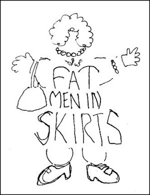
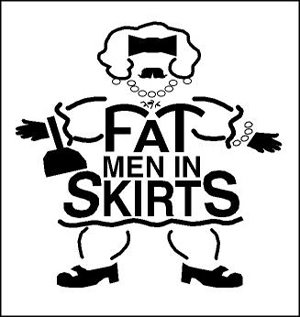
In his recent Right Brain Reader piece, Away from the sketch pad; away from the struggle, Philip Bailey mentioned the logo I had designed for the theatrical production Fat Men in Skirts. Having done the logo about a decade ago, I had not thought about the image in some time - and then the other day I came across my original sketch for the identity on a scrap of laser paper that I had filed away.

I've been designing logos for triangle productions! theatre presentations for over 16 years. Producer/director Don Horn has been a dream client. He'll throw some odd play or musical name my way and leave me alone to create the identity for the show. He seldom even requests any changes in the designs. In this case, the production was to be playwright Nicky Silver's show Fat Men in Skirts.

I almost immediately had an image for the logo in my mind - kind of a cross between a middle-aged thick manly man and someone's pleasantly plump grandmother - with curly black chest hair. I quickly sketched out a rough design and then proceeded to take the image to the computer. In my digital design I wanted to maintain some of the qualities of the rough drawing - without giving the "fat man" too much detail.

The show was yet another successful local theatre production. My logo design had some success as well. It was recognized by the PRINT's Regional Design Annual at the time and was published in the Japanese design book New Logo & Trademark Design - which was recently republished in paperback as Logo and Trademark Collection.

My latest assignment: Create the logo for Tonya & Nancy: The Opera (Yes, that Tonya and Nancy!).

© 2006 Jeff Fisher LogoMotives
Design studio housecleaning - excavated artifact #2

As I explained in an earlier post, I've been going through boxes of nearly 30 years worth of design work as I attempt to get my studio a bit more organized. In the process I've been coming across initial sketches that became final logos for many clients. Some of the doodles have been on Post-It notes, the backs of envelopes and little scraps of paper.

After initially meeting Don Horn - the founder of Portland's triangle productions! theatre company - at his very first opening night, I began designing logos, signage, posters, T-shirts, theatre programs and other items for his shows and theatre spaces. It was the start of what has become a 15+ year business relationship and friendship. Horn has always been one of my favorite clients; giving me complete creative freedom on the design projects. I have also been recognized with more design awards for the theatre projects than those for any other single client.

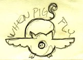
Over the years, I've had the opportunity to create logos for plays with great names. Soon after Horn told me he would be producing the show When Pigs Fly I scribbled a rough concept on a little yellow Post-It note. It immediately seemed natural that the curly tail of the pig would become the "S" in the show's name. The final design evolved directly from that sketch and made use of the colors selected for all promotional pieces for that year's schedule of productions. An added bonus was that the When Pigs Fly identity was recognized with an American Graphic Design Award from Graphic Design: usa and a Bronze Award from the Summit Creative Awards.

© 2005 Jeff Fisher LogoMotives
