Showing posts with label Logo Notions. Show all posts

The logo’s the thing – identity design takes the stage

In “Hamlet” William Shakespeare made the comment “the play’s the thing.” Unfortunately he did not expand on that thought as far as suggesting how theatre companies draw audiences to their venues to see the plays presented.

As a graphic designer I have had many opportunities over the past 30 years to assist performing arts organizations in the marketing and promotion of their efforts by creating logos for companies and theater spaces, identities for shows, posters, season ticket brochures, T-shirts and other marketing pieces. I remember creating a rough, stencil like image for a high school production of Thorton Wilder’s “Our Town” back in the mid-70’s, but I certainly had no premonitions that I would be doing a great deal of such work in the future. In college I designed posters, ads, T-shirts and other graphics for plays, concerts and other art-related associations and events. Later, while living in Seattle, I designed logos, programs, ads and promotion items for the performing arts groups Alice B. Theatre, the Seattle Men’s Chorus, the Evergreen Theater Conservatory and similar companies.

It was also in Seattle that I first became aware of the logo design work being done for local theater by Art Chantry (above). I’d met Chantry, the subject of the book Some People Can’t Surf: The Graphic Design of Art Chantry by Julie Lasky, while he was working at the alternative publication “The Rocket.” His logo creations for local theater companies and plays are what caught my attention the most. The work was stark - almost always just black and white – and had a simplicity that conveyed a great deal about the theatre production company or play being represented. The designs really inspired me to seek out opportunities doing logo design work for similar clients.

In early 1990 I attended the first play of a new Portland theatre company. I’ve got to admit, while looking over the program for the play, my first thought was “these guys could use some help.” Little did I know that I would meet the playwright/director/producer/ticker seller at a party a few weeks later. In that first conversation, Don Horn asked if I’d be interested in meeting with him to discuss some design projects for the theatre. For 16 years I worked with the theatre company, triangle productions!, located in Portland, Oregon. I designed over 100 logos for the company, its venues, shows that have been presented and special promotions. My work for the company has received nearly that number of design awards and many of the logos have been featured in numerous international design books. We have created programs, posters, signage, T-shirts, magnets, beverage cups, a paper doll book and many other unique (and fun) items in an effort to draw audiences to shows over the past decade and a half.

For myself, designing logos for live theatre companies offers me a chance to be at my most creative. With design projects for such a creative clientele there is often a great deal of room to stretch one’s creative muscles. This is not standard or conservative graphic design faire. In designing logos for theatrical productions a designer can often go over the top in the creation of attention-getting images. There is an incredible opportunity to play with type and color in unrestricted ways. I enjoy working with somewhat unusual color combinations and incorporating type from font houses such as P22, Fonthead Design, House Industries or Veer – type you many not normally see in more corporate or commercial designs. It’s not a question of “pushing the envelope” or working “out of the box” – there is no ‘envelope” or “box.” Within the theatrical graphic imagery a designer has the chance to convey the essence of a play, monologue or musical in a unique and stylized manner.

The subject matter lends itself to blatant graphic interpretations. My own experience has included being able to produce images for productions from Shakespeare to spoofs on the Bard. Topic matter has included AIDS, cannibalism, strippers, sex, country-western music, vaginas, religion, Internet dating, death, unique personal relationships, murder, concentration camps, drag queens, drug use and everything in between. Titles have included “Girls’ Night Out,” “2 Boys in a Bed on an Cold Winter’s Night,” “Dishin’ With Divine,” “The Food Chain,” “Naked Boys Singing” and so many more. (The play “Party!” is a personal favorite. Not only did I design the logo, T-shirts and a program – I actually got to spend the summer of my first mid-life crisis directing the show with seven naked men on stage – including Peter Paige who went on to “Queer as Folk” fame) How could a designer not be inspired to come up with some great logo designs to represent such topics and shows?

Don Horn, of triangle productions!, was an incredible client. Each of the past seasons he has provided me with the scripts of all the plays to be produced that year. After reading the plays, I had a meeting with Don to discuss a possible theme for the year as far as design style or colors to be used in printing the season ticket brochure, posters and programs. He then set me loose to be creative – and left me alone! The “leaving me alone” part was initially a foreign concept to me. Never before had I worked with a client who gave me free reign of the process. I never had Horn reject a logo I created for one of his shows. It was a very strange and wonderful client relationship over the years – and I truly value this particular client as a friend.

Judith Mayer, of Keyword Design, also appreciates the opportunity to collaborate with other creatives in a design relationship much different than most corporate clients.

“(Theatre clients) are sometimes more willing to go for a daring or whimsical design solution,” according to Mayer. “The fact that a show is a short term event gives them a little more freedom than if it were a logo that a business wants to last 20 years.”

Mayer enjoys the challenge of telling a story, or conveying a mood, through simple striking graphics. She designs for the Towle Community Theater, in Hammond, Indiana, which presents several shows each season that are not considered standards or classics. Mayer’s challenge is to make the public understand what kind of a show it is – even if they have never before heard the title. The examples below were all designed by Mayer for the Towle Community Theater:

“To create a logo that sums up the story means a lot of image editing - getting down to the strongest symbols or characters,” says Mayer. “In using only the key things that define the story, I try to say a lot using very little.”

As in many of my own theater design experiences, Mayer finds that when a season is promoted all at once the logos for four or five shows need to complement each other and at the same time show a range. She feels the logos must share similar characteristics in order to look like a complete set and must have differences to show whether it is a comedy, drama, classic or cutting edge theatre.

Mayer sits down with the director and has him tell her the story and asks him to list the important characters, props, locations, costume elements, scenery and songs if any.

“I may also ask him to define the look and feel of the production so that I have a pool of potential graphics to choose from,” Mayer adds. “Having him tell me the story takes into account the differences this production may have from another theater’s production of the same play.”

“Total creative freedom.”

That is what designer Jim Charlier, of JCharlier Communication Design, gets out working with those in the theatre arts. He created the series of logos below for the Niagara University Department of Theatre and Fine Arts’ current season of plays. The initial project was to create a 16-page season program booklet.

Charlier is fortunate to enough to have access to a wealth of imagery from The Castellani Art Museum of Niagara University for use in the season program. The permanent collection consists of contemporary prints, photographs, paintings, drawings and sculpture by artists such as Picasso, Basquiat, Modigliani, Dali, Motherwell, DeKooning, Nevelson, Rothenberg, Haring, Rauschenberg and many more.

“Because rights and permissions to use the artworks are either costly (for advertising purposes), or take time to acquire, I am the one that suggested creating a logo for each play, not only to individualize the play, but to also be practical for other advertising needs such as black and white print ads.” says Charlier.

“I created the series using one typeface (P22 Garamouche) to give them consistency for the season. Many of these logos were my first and only attempts. Nary a change was made by the client — they are smart, have good taste and are appreciative of professional-quality work,” Charlier remarks.

Charlier comments that such projects offer him the only total creative freedom he gets in designing logos - unless designing for himself which he finds can be much “tougher.” He finds that most clients add complexity to either the process or the final design in the creation of logos.

“Designers always want to simplify,” Charlier adds. “Working on the theatre projects is a breath of fresh air and I get to make them as simple as I want them to be.”

In Charlier’s situation many productions are already known commodities, such as Chicago and Gypsy. He doesn’t find there is much “heavy lifting” to get the gist of the play across to the potential audience. His logos take graphic cues directly from the storyline or theme of the play - whether comedy, drama or musical.

The One Act Plays image (above) represents a series of plays written by different students presented in one production. Charlier felt that since the productions are not well known a type treatment seemed logically generic as a graphic solution. Often such treatments project a striking image for a play with simplicity and elegance.

“I added self-imposed constraints - to use one typeface, few or one color (because of the B&W print ads) and simple,” says the designer. “The logos couldn't compete with the Picasso or Miro used on the same page in this particular season program.”

“A synopsis of the play works best for me (in getting inspiration) – it’s like speed reading to get the gist of the production,” Charlier concludes. “That's what the logo has to do - be read quickly to convey the strong graphic “gist” of the show.”

Note: This article appeared in its original format in the Logo Notions section at CreativeLatitude.com.

© 2008 Jeff Fisher LogoMotives

Logo Design Love goes live

Some unusual cyber traffic coming my way caused me to take a look at the unfamiliar source Logo Design Love this morning. Today is the launch of the blog of articles, examples and resources for those who love logos. The project is the work of David Airey, a self-employed graphic designer in Edinburgh, Scotland.

I was happy to see my Creative Latitude column Logo Notions (which is greatly in need of an in-the-works update) and bLog-oMotives are as listed Logo Design Love resources. Some "love" was also sent to my book, Identity Crisis!: 50 redesigns that transformed stale identities into successful brands, in the form a recommendation from the new industry blog. I'm honored to be considered a charter "Friend of Logo Design Love."

It looks like Logo Design Love is going to be a great place to visit, on a regular basis, for anyone with a passion for identity design. Check it out.

© 2008 Jeff Fisher LogoMotives

Logo Notions article listed on

"Top 50 Logo Design Tutorials"

A lot of website and bLog-oMotives traffic has been coming my way recently as the result of one of my Logo Notions articles, on the design industry site Creative Latitude, being listed on the "Top 50 Logo Design Tutorials" by the folks at E Logo Design. There, highlighted by my own Jeff Fisher LogoMotives identity, is a link to the article "Using, fusing and abusing “the rules” of logo design." Some great resources are among the other interesting posted links, too.
© 2007 Jeff Fisher LogoMotives

Theatre Logos Agency gives designer

theatrical images a new high-profile life

Throughout my career, the logo designs I have been asked to create for live theatre presentations have been my favorite creative exercises. From designing for my high school's theatre performances (over 30 years ago), through an on-going 17-year relationship with playwright, director and producer Don Horn and his triangle productions! theatre company, the opportunity to put a graphic face on plays and musicals has never failed to get my creative juices flowing. I previously wrote about topic in my Logo Notions article The logo’s the thing – identity design takes the stage, on the Creative Latitude website.

One of the unique aspects of creating identities for live theatre is that the logos often have a lifespan as short as the run of the show - usually a few weeks or, at the most, a few months. Luckily, from being recognized with design industry honors or being published in various graphic design books, many of my theatre graphic images have experienced some longevity.

The Theatre Logos Agency is giving new life to the work many designers have created for live theatre, through the sublicensing of the designs to other theatre companies.


Just over a week ago, I was contacted by Michael Q. Fellmeth, the founder of Theatre Logos Agency (TLA), after he read the Logo Notions article mentioned above. Fellmeth expressed interest in taking on Jeff Fisher LogoMotives as a client for the sublicensing of some of the theatre logos I have produced over time. After doing some reseach, getting the blessing of my client, and reviewing the agreement sent to me by TLA, I have opted to enter into a business relationship with TLA.

Theatre Logos Agency was founded in 2006. This past month the company "officially" opened with their web presence going live, and it's a valuable resource for designers interested in participating in the effort - in addition to being a great destination for the theatre production company seeking high quality designs to promote productions. In defining TLA, the following is posted on the website:

"Theatre Logos Agency (TLA) was established to service the growing demand from producing organizations for high-quality artwork. Prior to the formation of TLA, no central clearinghouse existed for the rights to use original artwork from Broadway, Off-Broadway, West End, and regional productions. TLA is pleased to bring together our clients' artwork with producing organizations that can utilize it in the promotion of their productions. TLA associates, made up of experienced theatrical-licensing professionals, are ready to service both the needs of our clients and producing organizations."

TLA has selected a number of my designs to include in the offerings to theatre production companies. Some of my favorite images (above) are among those to be presented for licensing. The theatrical logos have served my client, and myself, well in the past.

A few of the chosen logos have been recognized with awards from the PRINT Regional Design Annual, American Graphic Design Awards and Summit Creative Awards. The theatre logos have also been featured in the books New Logo & Trademark Design (Japan), The New Big Book of Logos, The Big Book of Logos 3, and The Big Book of Logos 4. Letterhead and Logo Design 7, Graphically Speaking, LogoLounge - Volume 1, Logo & Trademark Collection (Japan), and New Logo: Two (Singapore) have also showcased some of the designs.

It will be fascinating to see if the images are given even greater exposure through the efforts of TLA. I encourage other designers, who have created logos and other promotional materials for live theatre productions, to take a look at what the Theatre Logos Agency has to offer.

© 2007 Jeff Fisher LogoMotives
Using, fusing and abusing “the rules” of logo design

Over 35 years ago I was designing my earliest logos. Since then some basic principles, or rules, about designing identities have always stuck with me and guided my efforts in the development of graphic symbols to represent businesses, organizations and events. Curiosity about the rules used by other designers, led me to ask Jeff Andrews of Jeff Andrews Design, SKA Studios' Sheri Audette, and Steve Gordon, Jr. of RDQ to share their personal experiences in regards to logo design guidelines.

The latest Logo Notions column has gone live on Creative Latitude. Check out the rules that guide logo designers in Using, fusing and abusing “the rules” of logo design.

© 2006 Jeff Fisher LogoMotives

Toot! Toot!*:

Jeff Fisher comments featured in Fortune

"Logo-Licious or Lame?" piece

Jeff Fisher, the Engineer of Creative Identity for the Portland design firm Jeff Fisher LogoMotives, shares his thoughts on some recent major corporate identity makeovers in the latest issue of Fortune magazine. Fisher, Howard Belk of Siegel & Gale, and Bill Gardner of Gardner Design were asked to comment on a variety of logo redesigns now representing major international corporations. Their feedback on the new Kodak, Intel, Sprint and AT&T identities are in the February 6, 2006 print issue of the publication, and online, in the short article Logo-Licious or Lame?

Fortune reporter Telis Demos contacted Fisher after reading his Logo Notions column on the graphic design industry site Creative Latitude.

Note: In addition to the quotes offered in the Fortune piece I provided the writer with the following comments (and much more in a phone interview) on a variety of recent corporate makeovers:

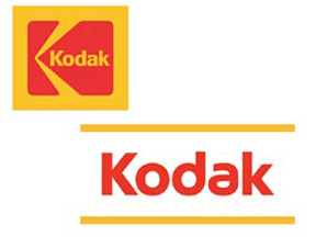
Kodak: I certainly understand Kodak's need to steer their identity away from the film-related imagery of the past in our digital image world. Initially I felt their new image was over-simplified. However, it's growing on me and I do immediately see "Kodak" when I see the new imagery due to the use of the same corporate colors and similar letterforms within the name. I guess the designer did not intend the yellow lines to be part of the new image - the lack of those lines does weaken the strength of the brand identity by eliminating the yellow associated with the corporation for so many years. I do think this will end up being one of the most successful recent corporate makeovers.

Intel: I think my initial reaction to Intel's new identity was "swoosh-o-licious!" While integrating multiple corporate image elements into a new identity the inclusion of the swooshes makes the new image seem somewhat dated at introduction. I do have a particular aversion to swooshes in logos. They are such a throw-back to the dot doom of the 90's and they are so "last century."

A couple of my favorite sites or articles about logo swooshes are Logo Hell and Swoosh! There It Is. In Fact, Swooshlike Logos Are Everywhere.

Sprint: My initial impression to this design was: "Why is the name so far away from the icon?" The placement still seems off to me. When I've seen the logo making use of the icon stacked above the name the identity seems stronger to me. I do think the identity works as a good combination of the past Sprint and Nextel identities. I look at the word "Sprint" and still seem their old red in my mind - and the yellow does convey "Nextel" to me. It's a corporate makeover that is growing on me as a designer.

at&t: Probably my least favorite recent corporate makeover. My immediate response was "it's fugly." I think a classic, easily recognized logo has been altered to look like a marble croquet ball and the lower-case type of "at&t" looks juvenile to me - rather than making the corporation seem more friendly to the world.

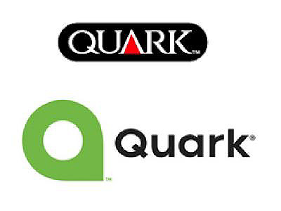
Quark: I still think the logo is lame - its look like an "a" rather than a lower-case "q". I also think Quark and the design firm hired did a less than stellar job of creating something unique - especially with the number of similar designs found by designers around the world. (you may want to read the article I wrote about this issue: Inspiration, imitation or innovation - how do designers create unique identities?.)

Visa: This rebranding works for me. The change was so subtle I doubt if many customers have even noticed.

UPS: I still have issues with accepting the new identity introduced by UPS in 2003. How dare they mess with Paul Rand's classic logo? It seems a bit "swooshy" to me with the arcing line in the upper portion of the design. In the "Keep It Simple, Stupid (K.I.S.S.)" world of identity design the 3D aspect of the image has probably created a number of reproduction issues since the logo was put into use.

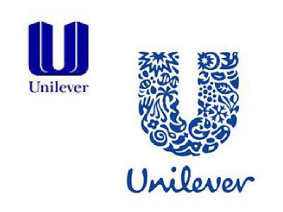
Unilever: Introduced back in 2004, I think this is one of the best and most unique corporate redesigns in recent years. The logo is beautiful, fun to dissect and somehow does work well in small applications. The new symbol also eliminates the World Trade Center tower imagery of the old design.

USA Network: While the new design is simpler and stronger I do snicker a bit at what appears to me to be male genitalia coming off of the "U" and "A" letterforms in the logo. When I point it out to people they say that is then all they see each time the logo appears on the television screen.

* If I don't "toot!" my own horn, no one else will

© 2006 Jeff Fisher LogoMotives

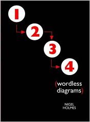
Review: Wordless Diagrams by Nigel Holmes

I’ve been a fan of the work of designer Nigel Holmes, the former Graphics Director for Time magazine and principal of the firm Explanation Graphics, for many years. His 1985 book Designing Pictorial Symbols was very helpful in teaching me, early in my career, to distill concepts down to their simplest forms.

With his newest book, Wordless Diagrams from Bloomsbury Publishing, Holmes continues the entertaining form of education for which he is known through his publications and public speaking engagements. While not directly related to the practice of identity design, this volume is an excellent creative concepting tool for any designer interested in the creation of logos. Actually, any designer could benefit from the included lessons – and have a few chuckles in the process.

The book reinforces the old K.I.S.S. (Keep It Simple, Stupid) principle of design I learned in college three decades ago. In simple graphic forms, chronologically numbered for ease of use, Holmes clearly illustrates nearly 100 tasks such as how to wave like a Royal, how to make a snowman, how to pierce a tongue, and how to cremate a body. In addition, readers will also learn how to milk a cow, pour a beer and keep a low-cut dress in place as they are taken on this wordless, visual adventure. “How to train for and then eat 53 1/2 hot dogs” immediately reminded me of the lesson in simplicity, visually and verbally conveyed by Holmes, in a past HOW Design Conference presentation: “Always line up your sausages.”

Note: This review originally appeared in a Logo Notions column on the design industry site Creative Latitude.

© 2006 Jeff Fisher LogoMotives

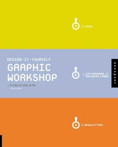
Review: Design-it-Yourself Graphic Workshop: A step-by-step guide

"This is not a design theory book – it is a design instruction book." With the first line of his introduction to Design-It-Yourself Graphic Workshop designer, marketing specialist and writer Chuck Green has defined his recently released book succinctly. Rockport Publishers has wisely repackaged Green’s earlier books Design-It-Yourself Logos, Letterheads & Business Cards and Do-It-Yourself Newsletters into one handsome, all-inclusive hardback resource that will be a great addition to the design library of any wannabe, newbie or seasoned design professional. The book provides you immediate desk-side access to that favorite design instructor at school who always had the suggestion of how to tackle any creative challenge.

Green belittles no reader as he conveys the hows, whys, shoulds and musts in making use of basic graphic design principles on a variety of projects. The messages throughout Graphic Workshop are clear, straightforward and gently challenging. The design is clean, colorful and inspiring. Some design professionals may cringe at the “do-it-yourself” portion of the title (as I admittedly did with the earlier books), which seems to unconsciously bring the controversial “anyone with a computer can be a graphic designer” school of thought into play. However, if a potential reader can get past that descriptive title element, and concentrate on the phrase Graphic Workshop, the price of admission will be well worth the ride Chuck Green provides. When that young student in your life expresses an interest in the field of graphic design, Graphic Workshop would be the perfect gift. For those starting their careers, opening their own firms, or just needing a gentle kick in the rear-end, the book should be a welcomed source of encouragement. Every corporate, or organization, in-house designer should have copy at hand. In reading the book, I also realized Graphic Workshop would be a great tool to use in explaining to clients why something has been designed for them in a specific manner.

(P.S.: Happy New Year!)

© 2006 Jeff Fisher LogoMotives

Review: Letterhead & Logo Design 9 - the best yet

Rockport Publishers continues their long-running design book series with Letterhead & Logo Design 9, this volume by Christopher Simmons and his San Francisco design firm MINE. The designs presented in the book were selected from over 3000 submissions from identity designers in 38 states and 40 countries. With a new spin on the publication series, the nearly 300 examples of logos, stationery packages, and other promotional items presented in this volume are organized by attributes, rather than the usual categorization by industry or type of client. The selection of designs exhibited was based on beauty, wit and whimsy, simplicity, subtlety, virtuosity, typography, materiality and miscellany. The latest, and freshest, addition to the on-going Rockport collection will elicit many “damn, why didn’t I think of that?” thoughts and provide a great deal of inspiration to any graphic designer with even the slightest interest in logo design. Simmons is having a banner publishing year, having released the book Logo Lab earlier in 2005. Logo Notions also did a profile on the designer earlier this year with the title “What a ‘little birdy’ told me about identity design.”

© 2005 Jeff Fisher LogoMotives

These are a few of my favorite things -

from the world of identity design.

Can't you almost hear Julie Andrew singing the classic Sound of Music favorite "These are a few of my favorite things?" As 2005 comes to an end we are bombarded by media lists of "favorites" and "bests" from newspapers, webzines, television shows and more. Why should "Logo Notions" be any different?

With Maria von Trapp bouncing around in my head I considered some of my favorites from the world of identity design. What is my favorite internationally recognized logo? What local business identity always grabs my attention and makes me say to myself "Damn, I wish that I had thought of that incredible concept!" What logo of my own is my favorite? And, if I had had the opportunity, what logo would I like to redesign in 2006 as a kind of graphic New Year's resolution?

In addition to answering the questions myself, I decided to pose them to a few other design professionals whose identity design efforts have attracted my attention as I have flipped through my library of design books, browsed online portfolios or seen their work in person. Designer Cheryl Roder-Quill of angryporcupine*design in Park City UT, Calvin Lee from Mayhem Studios in Los Angeles, and Gianluigi Tobanelli of Studio GT&P in Foligno, Italy, all agreed to provide their memories, thoughts and favorites for the latest Logo Notions column at Creative Latitude.

© 2005 Jeff Fisher LogoMotives

Review: Logo Design for Small Business 2 - A Designer’s Reference Guide to Practical Logo Design

It may be a bit odd for me to reviewing a book that includes quite a few examples of my own work. However, with my own logo designs in over 70 books at this point. my selection of logo design volumes to consider for review might end up being somewhat limited.

Dan Antonelli does not disappoint the logo designer with Logo Design for Small Business 2, the follow-up to his first book, Logo Design for Small Business. Antonelli preaches what he practices. I appreciate the fact he is educated as a designer, has worked in the industry for a number of years and is in business as a sign maker. He understands, and is able to convey, what a designer needs to accomplish – and, from his own unique perspective, what a vendor needs as a final product. The author provides a great deal of advice in regards to the business of logo design for small businesses, as well as displaying examples from a variety of designers for inspiration.

Don’t be put off by the rather short length of this book – it’s 72 pages of useful information. Those just starting out in logo design will benefit from the excellent advice of Antonelli. For seasoned pros the book is a reminder of many things we should consider in our day to day designing of identities. All logo designers will recoup the cost of the book on the first project produced after reading the book – and it should be on the reference bookshelf of anyone interested in the design of logos.

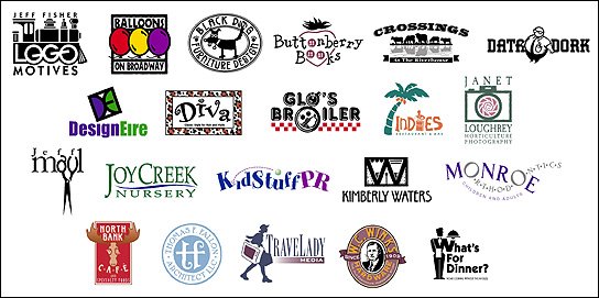
My designs highlighted in the volume include the identity for my own company Jeff Fisher LogoMotives and numerous Portland businesses, including Balloons on Broadway, Black Dog Furniture Designs, the hair salon Diva, Janet Loughrey Horticulture Photography, hair stylist Jeff Maul,Joy Creek Nursery, Monroe Orthodontics, the North Bank Cafe, Thomas F. Fallon Architect, TraveLady Media, W.C. Winks Hardware and the personal chef/catering firm What's for Dinner? Seattle small businesses represented include the restaurant Glo's Broiler and writer Kimberly Waters. The identities for restaurants Crossings at the Riverhouse, located in Bend, OR, and New York's former Indies Restaurant & Bar are also displayed. Other featured businesses include DataDork (Fontana, CA), DesignEire (Dublin, Ireland), Buttonberry Books (Lebanon, NJ) and KidstuffPR.com (Black Earth, WI).

© 2005 Jeff Fisher LogoMotives

Inspiration, imitation or innovation - how do designers create unique identities?

In September of this year, with great public relations fanfare, the software company Quark introduced their new corporate identity. In presenting the new image, Quark corporate communications director Glen Turpin touted it as a “fresh, inviting and open” symbol representing a “q” letterform. My first thought upon seeing the image was - that's not a "q," that's a lower-case "a." The second impression I had of the "fresh, inviting and open" symbol was - I've previously seen that image elsewhere. I was not alone. Designers from around the world began posting similar logos from a variety of companies and organizations.

The rollout of the new Quark image resulted in some praise as well. CreativePro.com Editor in Chief Terri Stone wrote a column about the identity, ending it with "Brand beauty is in the eye of the beholder, of course, but to my eye, Quark's new identity system is a winner. I applaud the company for pulling it off." Not being one to keep my mouth shut, or my keyboard still, I sent an email off to Stone expressing my feeling about the new symbol not being as "fresh" as touted. That email led to me being interviewed for Gene Gable's followup article, Sometimes a Logo is Just a Logo.

When questioned for the piece, I mentioned David E. Carter's book, Bullet-Proof Logos: Creating Great Designs Which Avoid Legal Problems as a great resource for any identity designer wanting to create an original logo. Wanting to expand on the issue a bit, I wrote about the topic for the November update of Logo Notions on the site Creative Latitude. While researching the article, Carter, John Wingard of John Wingard Design, and Tim Frame of Tim Frame Design were all kind enough to provide some input.

The "Logo Notions" article also gave me the opportunity to feature my logo for the Seattle restaurant Glo's Broiler, which is included in "Bullet-Proof Logos." I've always taken great pleasure in the fact that, in designing the logo, I placed the coffee cup and plate imagery in a manner that creates a subliminal lower-case "g" as a secondary identifying icon for the eating establishment. It was one of those "happy accidents" in design that help make an identity unique. The namesake and former owner of the restaurant, Glo Raineri - who I've always called my "second Mom" - recently passed away. The restaurant and the logo live on as part of her legacy.

© 2005 Jeff Fisher LogoMotives

Designs on dining: Restaurant logos as a graphic invitation to a meal and an experience

Over the years some of my own most enjoyable, challenging and visible identity design projects have been those for restaurant industry businesses. Much of the pleasure comes from an ability to push the creative envelope a bit and not be limited by the often-conservative boundaries of much more corporate identity design. I usually have an opportunity to be more playful with restaurant logos and have more fun with color. In addition, the architecture of the buildings, the design of the interiors, the type of food to be served and other elements come into play. The challenges of such projects most often raise their ugly heads in the form of budget limitations and the lateness of some restaurant owners to initiate the logo/identity design process for their new business in a timely manner – especially when the scheduling of projects for other vendors are overlooked. The visibility, and multiple uses, of the completed eating establishment image is a valuable marketing tool for a designer as easily recognizable public exposure of one’s design work. Unfortunately, with something like 50% of all restaurants closing in the first two to three years in business the visibility of such design examples often is limited in duration. (That figure is not necessarily more dramatic than the failure rate of other start-up businesses – the boarding up of a local dining establishment is often just more evident to the average person viewing from the street.)

The above is the introduction to a "Logo Notions" column I recently wrote on the topic of restaurant identity. You can check out the entire article at CreativeLatitude.com

© 2005 Jeff Fisher LogoMotives