


 In a recent bLog-oMotives entry I mentioned that the P22 Type Foundry was altering their pricing structure - and having a sale on their current boxed sets. The sale ends on December 31st. The font selections of P22 are based in letterform designs used throughout history. Over the years, often when needing type representative of a specific historic era, the company has been a great resource of appropriate type for my logo design projects.
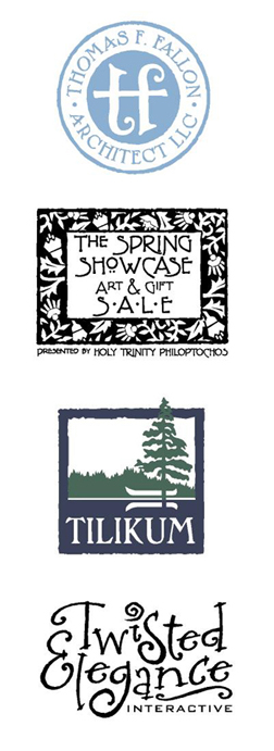
When architect Thomas Fallon was seeking an identity for his firm, he explained that much of his residential home design was reflective of the Arts & Craft era. I immediately felt that P22 would be a possible resource for type to be used in any designs. I was drawn to the unique letterforms of the font Dard Hunter for use on his logo text. In fact, to create the icon in the center of his logo, I combined elements from a lowercase Dard Hunter "t" to create an image representing the initials "t" and "f." Additional research lead to the subtle blue color being selected as representative of the time and Arts & Craft stylings.
The Fallon identity received an American Corporate Identity 21 honor and appears in the book American Corporate Identity 2006 as a result. It is also in the volume Logo Design for Small Business 2.
Another P22 font, Terracotta, was used in designing the event identity for The Spring Showcase Art & Gift Sale for Portland's Greek Orthodox Church. Organizers of the annual event, the Holy Trinity Philoptochos, desired a somewhat classic-looking logo that would work well for flyers, ads, notecards and other promotion items. The frame of the logo was inspired by an old floral graphic I had seen in a book of wallpaper patterns. Again, P22 seemed like the perfect place to find a typeface complimentary to the art elements. The typeface, and graphic elements, also worked well with the architecture and interior of the beautiful church.
A long-time client, George Fox University, contacted me a couple years ago to redesign the identity for their Tilikum Center for Retreats & Outdoor Ministries. The center includes 92 acres of green meadows, quiet lake waters, and wooded hiking trails. The previous logo was a somewhat free-from shape and did not work well in some applications. A more concise identity, still conveying the serenity and beauty of the retreat location, was desired. The P22 font Pan-Am worked very well with the stylized organic frame created for the new logo image.
Although not using one of the P22 fonts that are historically inspired, the identity for Jason Holland's Twisted Elegance Interactive does make use of a font selection from the company's International House of Fonts. The typeface Bramble was selected to convey a sense of elegance - with a bit of twist.
The Twisted Elegance logo was recognized by P22's Fonts-In-Use competition in March 2005. It was also recognized with an American Corporate Identity 22 award and is included in the new book American Corporate Identity 2007.
P22 also has a variety of other font selections in addition to the International House of Fonts. Be sure to check out the offerings of the Langston Type Company, the Rimmer Type Foundry and the Sherwood Type Collection All offer excellent type suggestions for logo designer.
© 2006 Jeff Fisher LogoMotives

1 comment:
Post a Comment