Showing posts with label fonts. Show all posts

"Little Guys" offer big resources

As an independent graphic design business person I always like to support others in the same position. I'm pleased to give The Little Guys Network some exposure on bLog-oMotives. The group is a consortium of small businesses offering design profession resources.

The image companies in the "Little Guys" neighborhood include Andy Nortnik, ArtBitz, Art Parts, Havana Street and Miss Mary. Just down the street are the font firms Blue Vinyl Fonts, FontHaus, Fonthead Design and Letterhead Fonts. Around the corner are the design resources The Design Center and ideabook.com.

Fonthead Design is one of my personal favorites when it comes to type for some logo designs. In fact, I wrote about the company in a previous bLog-oMotives entry. I've also got a bit of a connection to Chuck Green, the individual behind ideabook.com - he was a contributor to my first book, The Savvy Designer's Guide to Success.

If you get a chance, take a look at The Little Guys Network. You'll find some great resources that may be a big help to you in future design efforts.

Illustration: Little Guys Network home page

© Jeff Fisher LogoMotives

Building Letters Three: Tsumani Edition available

Following the devastating Indian Ocean tsumani of December 2004, many in the design and typography communities felt the need to do something to help those impacted by the natural disaster. The immediate response was the coordination of an effort by Building Letters and the Society of Typographic Aficionados (SOTA) in creating Font Aid III, a project uniting the typographic and design communities in raising funds to expedite relief efforts in the affected countries.

More than 220 designers worldwide submitted over 400 glyphs for a collaborative charity-ware typeface, Fleurons of Hope, which has since been available for a minimum donation of $20 at MyFonts. My own design (below left) was included in the Font Aid project result. In early 2005, 35 foundries donated proceeds from sales of their top-selling fonts through MyFonts for a 30-day period. More than $18,000 was raised through the Font Aid III effort.

This past fall the second phase of the project, the publication Building Letters Three: Tsunami Edition, was released at the ATypI Conference in Lisbon as part of the continuing design industry response to the tsunami. The publication includes articles by Tom de Gay, Nick Shinn, Max Kinsman, Fiona Ross, Donald Beekman, a piece on the Fleurons of Hope project, and a CD of 25 fonts by designers Tomáš Brousil, David Březina, Veronika Burian, Stefan Hattenbach, Richard Kegler, Ludmila Lorenz, José Louis Coyotl Mixcoatl, Bram Pitoyo, Pieter van Rosmalen, José Scaglione, Jürgen Weltlin, and Seonil Yun. The Fluerons on Hope font is also on the disk.

All proceeds from the sale of the publication go to Direct Relief International for distribution to those most in need of the continuing aid. Order your copy from the Building Letters website.

© 2007 Jeff Fisher LogoMotives

P22 type and the logo designer

In a recent bLog-oMotives entry I mentioned that the P22 Type Foundry was altering their pricing structure - and having a sale on their current boxed sets. The sale ends on December 31st. The font selections of P22 are based in letterform designs used throughout history. Over the years, often when needing type representative of a specific historic era, the company has been a great resource of appropriate type for my logo design projects.

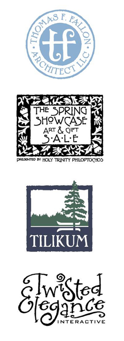
When architect Thomas Fallon was seeking an identity for his firm, he explained that much of his residential home design was reflective of the Arts & Craft era. I immediately felt that P22 would be a possible resource for type to be used in any designs. I was drawn to the unique letterforms of the font Dard Hunter for use on his logo text. In fact, to create the icon in the center of his logo, I combined elements from a lowercase Dard Hunter "t" to create an image representing the initials "t" and "f." Additional research lead to the subtle blue color being selected as representative of the time and Arts & Craft stylings.

The Fallon identity received an American Corporate Identity 21 honor and appears in the book American Corporate Identity 2006 as a result. It is also in the volume Logo Design for Small Business 2.

Another P22 font, Terracotta, was used in designing the event identity for The Spring Showcase Art & Gift Sale for Portland's Greek Orthodox Church. Organizers of the annual event, the Holy Trinity Philoptochos, desired a somewhat classic-looking logo that would work well for flyers, ads, notecards and other promotion items. The frame of the logo was inspired by an old floral graphic I had seen in a book of wallpaper patterns. Again, P22 seemed like the perfect place to find a typeface complimentary to the art elements. The typeface, and graphic elements, also worked well with the architecture and interior of the beautiful church.

A long-time client, George Fox University, contacted me a couple years ago to redesign the identity for their Tilikum Center for Retreats & Outdoor Ministries. The center includes 92 acres of green meadows, quiet lake waters, and wooded hiking trails. The previous logo was a somewhat free-from shape and did not work well in some applications. A more concise identity, still conveying the serenity and beauty of the retreat location, was desired. The P22 font Pan-Am worked very well with the stylized organic frame created for the new logo image.

Although not using one of the P22 fonts that are historically inspired, the identity for Jason Holland's Twisted Elegance Interactive does make use of a font selection from the company's International House of Fonts. The typeface Bramble was selected to convey a sense of elegance - with a bit of twist.

The Twisted Elegance logo was recognized by P22's Fonts-In-Use competition in March 2005. It was also recognized with an American Corporate Identity 22 award and is included in the new book American Corporate Identity 2007.

P22 also has a variety of other font selections in addition to the International House of Fonts. Be sure to check out the offerings of the Langston Type Company, the Rimmer Type Foundry and the Sherwood Type Collection All offer excellent type suggestions for logo designer.

© 2006 Jeff Fisher LogoMotives

P22 Foundry announces font pricing changes

I recently received the following email from the P22 Type Foundry, one of my favorite font resources for logo text, announcing some pricing changes:

"As of Jan 1, 2007, we will be adjusting some font prices. The P22 font sets that are now $29.95 will be priced according to the number of fonts in each set. For example, Cezanne (a set of two fonts) will remain at $29.95, while Eaglefeather (a set of 5 fonts) will be adjusted to $59.95. Single fonts will remain at $19.95 each.

In addition, we will no longer offer boxed P22 fonts on CDs as an online ordering option. We will still offer the CD back-up option for all fonts issued by any division of P22 type foundry for the nominal charge of $5, plus shipping.

Now is definitely the time to order those P22 boxed fonts you've been wanting...for yourself or for holiday gifts. Existing prices and ordering options will remain in effect until Dec 31, 2006.

In addition, as of January 1, 2007, all fonts in the P22 division (i.e., not fonts issued through IHOF, Lanston, Sherwood or Rimmer) will be delivered in TrueType, PostScript and OpenType format."

Prior to the new pricing changes, P22 is having a sale on their boxed CD font sets. Even after the price increase the foundry's fonts will still be a great value in comparison to the offerings of some other companies.

In other P22 news, the company is "cleaning house" in preparation for an upcoming move and offering a "P22 Ephemera Pack" for only $10 plus shipping. Each pack features over 40 different items - including P22 catalogs, postcards, expired P22 dollars, stickers, packaging and other P22 stuff. Double and Triple packs with scarcer items are also available.

Designers might also want to consider joining the P22 Club 2007. For $99.95 club members get five fonts, 20% off all purchases during the calendar year and more.

For many years I've used P22 fonts in designing identities. In a future bLog-oMotives entry I'll post a some of the designs using type from the P22 collection.

It may be time to visit the P22 website and check out what they have to offer.

© 2006 Jeff Fisher LogoMotives

You've got to love a blog called FontLover

OK, I'll admit it; I'm kind of a "font geek." I'm often called by that name and will automatically respond to it. However, I'd much prefer to be called a "font lover" - and I recently came across FontLover.com in its revised blog form. I hadn't been to the URL in some time. In cleaning out my "favorites" I thought I'd check out the link. I think I've rediscovered font heaven. Recent font news, new releases, reviews of typography books and products, and links galore to great foundries have been collected in one great online design resource.

According to the the "about" page on the site:

"Fontlover.com began in November of 2000 as a brainstorm. That was when all the email-update services suddenly became pay services and sending out constant updates annoyed people so the idea was born that there should be a place to get updates at a website that you could visit daily and as a bonus not have your email box filled up. There was this new thing called blogging and I thought…. that’s it!"

Well, they did it right. I think I've rediscovered one of the most productive online time-wasters I've come across in a long time. This "font lover" looks forward to visiting the resource on a regular basis.

© 2006 Jeff Fisher LogoMotives

Font fun from Fonthead

OK, I'll admit it - I'm a bit of a typography geek. I think it all stems from college type classes where it was necessary to render entire typeface families in pencil to study the letterform shapes and interactions with each other. Those studies 30 years ago have helped a great deal throughout my career and, as I moved to using the computer as a design tool about 15 years ago, I had an understanding that there's a lot more to typography than just digital type manipulation.

One of the great things about my focus on identity design is the freedom it often allows me when selecting type for my projects. Fun logos, for non-traditional businesses or events, require fun, non-traditional type. Several years ago I discovered a great resource in the typeface creations of Fonthead Design. With much of my identity work being done for a less than boring clientele, the selections from Fonthead have been excellent design challenge solutions for me.

For example, the typeface Circus Dog was used in my designs for Harrison Flowers, the triangle productions! theatrical presentation The Dream State, the greeting card company Good Pig, Bad Pig and the local St. Johns Window Project art event. Very Merry is the font I selected for use in the images for Black Dog Furniture Design, Oregon Family OUTings and the Portland retail development Heart of the Pearl. The identity for publisher Buttonberry Books and the James John School reading program featured the typeface Carnation.

Fonthead's offering of Bonkers was used in the symbols for triangle productions! Twelfth Anniversary, Buckman School, and a campaign for the Buckman Arts Magnet - and as a secondary typeface (to one I myself have been designing for about 15 years!) in a Fall Thesis image for Reed College. The option Hot Coffee found its way into the logos for the Caring Community of North Portland, and the additional theatre productions The Big Bang and Shopping and F***ing.

The body of the human form in the Big Daddy identity is made up of the font Blue Moon. The typeface used in the triangle productions!: 14 Years of Tears & Jeers image is the Fonthead creation Asimov Sans. When designing the logo for the Portland Iron Chef fund-raising event, an annual benefit for the Portland Relief Nursery, I was pleased to find the typeface Stiltskin, which seemed to work in conveying an Asian influence.

I really appreciate the designs of smaller type producers like Fonthead. The unusual letterform designs add a unique quality to my logos. When I have used the same font in a number of logo designs, the type takes on different qualities when used in different formats. The end results have made for happy clients - and received a great deal of additional attention as well. Several of the designs shown have won American Graphic Design Awards or were selected for inclusion in the Print Regional Design Annual. In addition, a number of the logos are included in the books American Corporate Identity 2002, Logo Design for Small Business 2, Letterhead and Logo Design 7, Graphically Speaking, Global Corporate Identity, The Big Book of Logos 3, The Big Book of Logos 4 and Graphis Logo 6. Quite a few of the designs appear in the Japanese book New Logo World and the Spanish volume Logos From North to South America.

Fonthead Design does deserve some of the credit, for creating the type I've used in producing my logo designs. I hope that you will check out what they have to offer. Besides the very reasonably priced font volume offerings, they do offer a selection of freeware fonts on their site. Right now they also are offering a free font of your choice in a "Buy None, Get One Free" promotion. (Thanks to Tamar on the About.com Graphic Design Forum for bringing it to my attention and to Fonthead for allowing me to post the info on bLog-oMotives.) Take a look at what Fonthead has to offer. Select and download a free font. Then, do me a favor and send them a little note of thanks.

© 2006 Jeff Fisher LogoMotives

Is Papyrus the new Comic Sans?

On a recent flight I was flipping through the American Airlines publication American Way and there were way too many instances of Papyrus being used in display advertising throughout the magazine. Three logos in the issue, and one ad headline, made use of the font. After arriving in Florida, I began to spot Papyrus everywhere - on signage for real estate develop- ments, within restaurant logos, in television commercials for day spas, and elsewhere. Florida designer Dawn Burgess suggested that the font gives designers an "easy out" when looking for a typeface that hints at a tropical environment.
However, the overuse of Papyrus is not just a Sunshine State phenomenon. I've noticed it more all the time here at home in Oregon as well. It now jumps at me from newspaper ads, magazine pages and television commercials. I can't drive down a street of retail businesses without seeing Papyrus displayed on signs. How about a little originality here - Papyrus, one of my favorite places to shop, doesn't take the easy way out and use the font of the same name for its identity.

Several months ago I took on a new client, a specialist in cosmetic procedures, who used the typeface for her corporate identity. I was drowning in a sea of printed materials saturated in Papyrus. In discussing plans for her new identity she asked only one thing: That I maintain Papyrus as the primary font in her branding because she liked it so much. I somehow avoiding keening in her office at that moment - but did find myself banging my head on the steering wheel of my car a bit later in the parking lot. When back at my studio, I was able to calm down enough to send her the following email:

I will certainly steer you away from use of the font Papyrus as a primary typeface, even though you have expressed how much you like it, as it is extremely overused due to being too available to just about anyone with a computer these days. It simply does not convey professionalism or sophistication for a business at the level of yours. The organic quality of the font is not a bad thing - but the roughness of the letters contradicts what you try to achieve with an individual's personal appearance, especially when it comes to the look of better quality, smoother skin..

Success! My client acknowledged that she agreed with me after receiving my cyber missive. Then, like myself, she began to notice the font being used everywhere - day spa commercials, cosmetic procedure clinic signage, print ads in magazines, billboards and more.

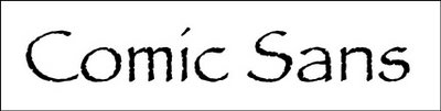
Is Papyrus the new Comic Sans? In a way, the situation is very similar. Comic sans has been overused for years due to its availability as a standard font on most computer systems. For some time, designers have enjoyed bashing Comic Sans. I was recently even questioned, on an online forum, as to whether I had used Comic Sans as the font in the logo for a theatrical production. (It was not the dreaded font - I had used Lemonade). Admittedly, I am a fan of the site Ban Comic Sans.

Papyrus is not a bad font. The font itself does not misbehave. It takes someone with a computer system to overuse the typeface and use it poorly. Since being created by type designer Chris Costello, back in 1983, I'm sure it has served he and his career very well. (You really should check out other examples of his great typography work.) It's certainly not Costello's fault that his beautiful font has taken on the characteristics of a mutant life form - although I do hope he did very well in licensing negotiations. Like Comic Sans, Papyrus now comes as a standard font with many computer software programs. I asked my partner Ed (who is known as "The computer geek with social skills*") if Papyrus came with many Microsoft software programs. He was soon directing me to an online list showing that the font is packaged with Greetings 99, Home Publishing 99, Office 2000 Premium, Office 97 Small Business Edition SR2, Office Professional Edition 2003, PhotoDraw 2000, Picture It! 2000, Picture It! 98, Picture It! 99, Publisher 2000, Publisher 98, and Works 2002. Yikes! No wonder I sometimes feel as if I am being smothered in the typeface - and most of these programs are not those of choice for any professional graphic designer.

It is simply too easy for designers to make type selections from those preloaded on computer systems or packaged with software programs. The CGWSS* did also direct me to Microsoft's Fonts and Products page, which allows you to determine which fonts come with what software programs. The standard fonts on a Mac can be found on the Mac OS X 10.3 Fonts List. Perhaps such resources are valuable to designers in suggesting fonts - especially decorative or display examples - that should not be used in the creation of truly unique finished graphics.

© 2006 Jeff Fisher LogoMotives

Good article, shame it's not Helvetica

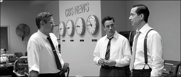
In the Sunday New York Times, on New Year's Day, writer Peter Edidin's article Good Film, Shame About the Helvetica highlighted a still photograph from the movie "Good Night, And Good Luck" showing stars George Clooney, Robert Downey Jr. and David Strathairn standing in a television newsroom with "CBS News" on the wall behind them.

Edidin wrote: "It appears that the CBS News sign, prominently displayed in the film's carefully reconstructed New York newsroom, uses the typeface Helvetica. But Helvetica was not designed until 1957, the year McCarthy died. The movie takes place in the early 1950's."

Designer Michael Beirut, of the Pentagram Studio, was quoted as saying, "I thought it was a bit jarring...After all, even in 1957, Helvetica was an exotica Swiss import."

The article pointed out several situations where major motion pictures made use of historically inaccurate type in scenes requiring new historical perfection for many other aspects of the film. The Typecasting: The use (and misuse) of period typography web page of type designer Mark Simonson was mentioned in the piece as a resource for information on such cinematic bloopers, including errors in the movies "Chocolat" and "L.A. Confidential."

Beirut also pointed out in the New York Times article that Helvetica was used on 1912 ship dials in the movie "Titanic." He compared that inappropriate type usage to "taking out a Palm Pilot on the deck of the Titanic."

Designer Scott Stowell, of the new York design firm Open, was quoted in the article saying "The thing that bugs me is that they create these elaborate period pieces for films. They put old cars on the street and get the hairstyles right, but typography, it seems like they don't know or care."

After reading the article I tore it out of the paper and put it aside as a future blog entry topic. Last night i was searching online for any additional information about the story and came across a Google link to a Mark Simonson "Notebook" entry in regards to receiving an email from the art director of "Good Night, And Good Luck" following the appearance of the newspaper article. According to Simonson "She pointed out that Helvetica was not used in the film, contrary to what was claimed in the article. She said, rather, that the sign shown in the example frame was set in Akzidenz Grotesk, a face which predated (and in fact was the basis for) Helvetica, and that this choice was based on extensive research of CBS’s graphic design during the period depicted in the film."

Further discussions by ,what the New York Times article referred to as, "militant typography fans," about the type used, on both Typofile.com and Design Observer, provided additional insight (and examples) to the actual usage of the typeface Akzidenz Grotesk.

Moral of the story: Filmmakers, New York Times writers and (God forbid) even graphic designers can make mistakes given the right set of certain circumstances.

Photo credit: Melinda Sue Gordon/Warner Independent Pictures

© 2006 Jeff Fisher LogoMotives

Typographica's favorite fonts of 2005: Part 1

I've always loved type. My love affair with letterforms began back in college with the study of type as part of my journalism and design courses. While others bitched and moaned about the hand-rendering of type forms, I was fascinated by the difficult assignments (Don't even bother submitting your assignment with graphite smears!). Getting new type catalogs in the mail is as exciting to me as the joy expressed by Steve Martin's character Navin R. Johnson, in the film The Jerk, with the arrival on the new telephone directory when he exclaimed, "The new phone book's here! The new phone book's here!"

Typographica: A Journal of Typography recently published the first half of their annual list of Favorite Fonts of 2005 and I've really enjoyed reviewing their selections. In the Typographica recap of the best releases during the first half of 2005, the editors note the trends of the year: Independent font foundries are putting out some great type offerings - two-thirds of the 15 fonts featured are the work of one-man design studios. OpenType is an option in nearly all the fonts named, even though the design software industry is slow to support the format. Designer Xavier Dupré, creator of the font Zingha illustrating this blog entry, has three designs among the 15 recognized offerings.

Each featured font is presented with a visual "tease," a review from an industry expert and links to where you may find the type for your own use. In addition to the top 15, the editors single out nearly four dozen other notable font releases from early 2005. If you are looking for a great distraction from that frustrating project, grab yourself an espresso drink, sit back, relax and be prepared for some incredible visual stimulation. (I'll post a link to Part II of the Typographica list when it goes live later this month.)

© 2006 Jeff Fisher LogoMotives