Showing posts with label Typography. Show all posts

Toot! Toot!*: Jeff Fisher LogoMotives designs included in Font Aid V "Made For Japan" relief effort

The Society of Typographic Aficionados (SOTA) has announced the release of “Made For Japan”, a font created exclusively for Font Aid V to raise funds for relief efforts following the devastating earthquake and tsunami in Japan. Nearly 300 contributors from 45 countries submitted over 500 glyphs in a single week. Behind the scenes, volunteers Neil Summerour, Silas Dilworth, Delve Withrington, and Grant Hutchinson were up to their elbows in Adobe Illustrator and Fontlab assembling the typeface

The contributions of Jeff Fisher LogoMotives include an image of a traditional origami crane representing peace, long life, good luck and prosperity (above left); a graphic Japanese sun dawning on a new day (above center): and a single gingko leaf, symbolizing health and happiness, growing out of pain and suffering. (above right).

The font is currently being sold for $20US through Veer and MyFonts. It will also be available through Ascender Fonts, Fonts.com, and Linotype in the very near future.

With the help of Sogo Japan, all proceeds from sales of this typeface will be delivered directly to organizations in Japan, such as Second Hand and AMDA International (Association of Medical Doctors of Asia). Sogo Japan strives to help circumvent regular international charity channels and the inefficiencies associated with them.

Proceeds from previous Font Aid efforts have gone to UNICEF to help war and disaster refugees, benefit the victims of the September 11 tragedies in the US, raised funds to expedite relief efforts in countries affected by the Indian Ocean earthquake and tsunamis, and been used by Doctors Without Borders to help with earthquake relief efforts in Haiti. Jeff Fisher LogoMotives contributed an original ampersand design for the 2010 “Coming Together” effort. In the 2005 Font Aid III initiative, a combined program of SOTA and Building Letters, designer Jeff Fisher submitted an icon that became part of the the collaborative Fleurons of Hope typeface.

More information about Jeff Fisher, and his design and writing efforts, may be found on the Jeff Fisher LogoMotives blogfolio.

(* If I don’t "toot!" my own horn, no one else will.)

© 2011 Jeff Fisher LogoMotives

Toot! Toot!*: New edition of 'Type Rules!' includes identity of design firm Jeff Fisher LogoMotives

The identity for Portland design firm Jeff Fisher LogoMotives is one of the new typographic images illustrating the recently released third edition of the book Type Rules!: The Designer's Guide to Professional Typography, by educator and expert Ilene Strizver of The Type Studio. The volume was published by John Wiley & Sons, Inc.

Type Rules! is a practical guide to understanding type and how to use it effectively. It is intended for beginners and advanced professionals alike, and covers a broad range of topics. The new edition includes:

• New information on OpenType, font management utilities, font web sites, and interactive typography.
• An expanded history of type and an updated glossary of key terms.
• Exercises throughout to help reinforce the concepts presented in the book.
• A wealth of tried-and-true as well as recently developed type tips.
• More in-depth type issues, including scaling logos.

The featured logo was selected after author Strizver made use of her Twitter account @TheTypeStudio to request "type-centric images and design" examples for the new edition of her book. Fisher contacted Strizver, provided a link to a Flickr gallery of his identity work, and the author selected the identity representing the logo design firm.

The Jeff Fisher LogoMotives identity also appears in Letterhead and Logo Design 5, American Corporate Identity/14, New Logo & Trademark Design (Japan), the 1998 PRINT Regional Design Annual, The New Big Book of Logos, PRINT’s Best Logos & Symbols 6, Logo Design for Small Business 2, The Big Book of Business Cards, Logos from North to South America (Spain), New Logo & Trademark Collection (Japan), and The Savvy Designer’s Guide to Success.

Fisher, a 30+ year design industry veteran, is the author of Identity Crisis!: 50 redesigns that transformed stale identities into successful brands and The Savvy Designer's Guide to Success: Ideas and tactics for a killer career. He is currently writing the book Logo Type: 200 Best Typographic Logos from Around the World Explained, about typography in identity design, with a scheduled 2011 release.

The designer has received over 600 design awards and his work has been published in more than 140 books on identity design, self-promotion and the marketing of small businesses.

More information about Jeff Fisher, and his design and writing efforts, may be found on the Jeff Fisher LogoMotives blogfolio.

(* If I don’t "toot!" my own horn, no one else will.)

© 2010 Jeff Fisher LogoMotives

Art textbook for Singapore 5th grade students features C.A.T. logo design by Jeff Fisher LogoMotives

I often get requests from editors, writers and publishers for the use of my design work as illustrative examples in books and magazines. Once of the most unique arrived a couple months ago via email from an editor at textbook publisher Pearson Education South Asia. In collaboration with the Ministry of Education in Singapore, they were producing an art curriculum text for elementary school students and asked to include my logo design concept for the Cat Adoption Team in the book.

As a result, the logo appears in the textbook Perfect Match Art Primary 5, by Prisca Ko Hak Moi. This past week I received a copy of the book and I'm very impressed at what 5th grade students in Singapore are taught about art and design. The C.A.T. logo appears in a section titled "Wordplay," with lessons on logos, what different fonts convey, computer manipulation of text, and the replacing of letterforms with objects.

The Cat Adoption Team design won a Silver Award in the Summit Creative Awards. It is featured in the books Killed Ideas, Vol. 1, Letterhead & Logo Design 11, American Graphic Design & Advertising 25, and For a Good Cause (Spain). The yet to be published volumes LogoLounge Master Library Vol. 2, Logolicious and Logo Nest 01 (Australia) will also include the design.

© 2010 Jeff Fisher LogoMotives

Font Aid IV release 'Coming Together' benefits Haitian victims through Doctors Without Borders

The Society of Typographic Aficionados (SOTA) is proud to announce the release of “Coming Together”, a font created exclusively for Font Aid IV to benefit the victims of the recent earthquake in Haiti. The font consists entirely of ampersands, to represent the idea of people coming together to help one another. Nearly 400 type designers, graphic designers, and other artists from 37 countries around the world contributed artwork to the font.

The ampersand contribution of Jeff Fisher LogoMotives (above right) was inspired by traditional Haitian art hand-cut from discarded steel drums. The vines and leaves coming from the roots in the art, signify regrowth; while the bird taking flight represents hope for the future.

The font is being be sold for $20US and is available through font distributors Ascender Fonts, Veer, FontShop, and MyFonts. All proceeds from the sale of the font will go to Doctors Without Borders, to help with their relief efforts in Haiti.

The “Coming Together” font contains over 400 glyphs and is supplied as a single, cross-platform OpenType font. All glyphs are accessible using OpenType-savvy applications, Unicode-savvy utilities, the Character Map utility on Windows, and FontBook on Mac OS X.

Proceeds from previous Font Aid efforts have gone to UNICEF to help war and disaster refugees, benefit the victims of the September 11 tragedies in the US, and raised funds to expedite relief efforts in countries affected by the Indian Ocean earthquake and tsunamis. In the 2005 Font Aid III initiative, a combined program of SOTA and Building Letters, designer Jeff Fisher submitted an icon that became part of the the collaborative Fleurons of Hope typeface.

© 2010 Jeff Fisher LogoMotives

Jeffism #11

"I'm just a few characters short of a full alphabet."

- Jeff Fisher literally describing a typography project he started back in 1994 - but a statement given a different meaning by so many friends and design peers.

© 2009 Jeff Fisher LogoMotives

Letter & Ligatures: High Concept House Show

I've always been a fan of the typography, products and design sensibility of House Industries. I wish I was going to be in Los Angeles, between November 8 and December 5, to have the opportunity to visit Letters & Ligatures, "a new exhibition of prints, patterns, installations and sculptures based on House Industries’ 15-year excursion into the alphabetical world."

The exhibit will be displayed at the Subliminal Projects Gallery, 1331 W Sunset Boulevard in Los Angeles. An opening reception will be held Saturday, November 8, 2008 from 8 – 11 p.m.

© 2008 Jeff Fisher LogoMotives

LogoMotives in "Designer's Favorite Fonts in Use"

Thanks to designer and illustrator Niki Brown for including my input in the Design O'Blog entry "Designer's Favorite Fonts in Use." Others submitting their favorite fonts, along with a variety of design examples, include Calvin Lee of Mayhem Studios, Logo Design Love's David Airey, Adelle Charles from Fuel Your Creativity, Liz Andrade of CMD+Shift Design, and Steph Adamo.

© 2008 Jeff Fisher LogoMotives

Re-Design: The Sentinel

Yesterday the result of my latest identity redesign project arrived in the mail - the July issue of my local neighborhood monthly newspaper, The Sentinel.

A few weeks ago "scrappy" (Note: admittedly an inside joke reference) Managing Editor and Publisher Cornelius Swart contacted me in regards to possibly redesigning the paper's identity and assisting in the establishment of a color palette for the news vehicle. Swart, who I originally met several years ago when he was working with the Portsmouth Community Development Corporation - another local identity re-design client, was familiar with my wide variety of past North Portland logo design clients. In addition, over the past 30 years I have designed identities for several publications.

The Sentinel was going through a total redesign, including a change in page size as a cost-saving measure and to allow for greater unfolded newspaper rack placement in local businesses. Art Director Colleen Froehlich was creating the still evolving page format. St. Johns web designer Andy Nelson was - and is - working on the yet to be unveiled new web presence for the paper.

In meeting with all the players, in person and via email, I got a good sense of the direction in which they hoped the public persona of the publication would go. There was a desire to have "the look" be unique, fresher and bolder, while maintaining some elements of the common appearance of a newspaper or tabloid publication. The current image seemed to be fairly traditional to me (above top).

Initially I presented type treatments of The Sentinel, with an image of an eye replacing the dot over the letterform "i" and revamped sun rays as a background, making use of the fonts Unicorn, Boca Raton Solid, Blue Blate Special and Rockwell Extra Bold. I also toyed with adding some emphasis to the "n" and "ne" letters in "Sentinel," as references to "north" and "northeast" Portland, with overly complicated results. I maintained the placement of "THE" as a element of continuity, and historical perspective, to the existing identity.

Swart and his staff narrowed the type selection to the Boca Raton and Rockwell treatments. They liked the "sexiness" of Boca Raton, but thought it might be a little too "magazine-like." Those providing input felt that Rockwell conveyed the "seriousness" needed for a newspaper, but the uppercase "S" letterform was too heavy, "clunky" and distracting. I was asked to finesse - or change - the "S" in the Rockwell treatment, to tweak the eye imagery, and play with "i" letterform a bit to make it possibly more lighthouse or "sentinel-like."

In literally going back to the drawing table, I worked on the "S" element for quite some time. I kept returning to the fact that everyone involved liked the "S" letterform from the Boca Raton font a great deal. In what was a bit of an "a-ha" moment I simply took the "S" from Boca Raton and dropped it in front of the Rockwell treatment of the remaining letters in the word "Sentinel." It seemed to work beautifully - and the newspaper crew agreed.

With some emails back and forth, in tweaking the eye element in my logo concept, the final new identity was approved (above bottom). The rays of light coming from the eye imagery seemed to become less and less important as the project progressed and eventually disappeared.

One of the things I really appreciated about working with the individuals involved in this project is that they really knew their "stuff." The design process for The Sentinel was much more of an actual collaboration than efforts with most of my clientele.

In our first meeting, Swart arrived with his copy of the Jim Krause book Color Index. Numerous Post-It notes marked color combinations he liked and was considering as possible palettes for future use in the newspaper. Once the logo design was finalized in black and white, Swart, art director Froehlich and I met to discuss the pros and cons of the various color options. From our discussion the suggested colors to be used were determined (above). While a blue and orange-ish color combination had been used previously, the new selections were richer and more intense. If used, the added suggested color options of the green and purple will give the paper an even greater visual richness.

It was great to receive the newly formatted paper (old design above left; new design above right) in the mail just days after completing the identity design. I appreciate Swart's column, and blog, mention that, "Thanks to local logo guru Jeff Fisher, The Sentinel has a spiffy new brand identity and logo."

(Note: My book, Identity Crisis!: 50 Redesigns That Transformed Stale Identities Into Successful Brands, contains case studies from 35 designers and firms located around the world. Learn more about the book on the Identity Crisis! blog.)

© 2008 Jeff Fisher LogoMotives

Barnes & Noble Studio interviews book cover
designer John Gall in new online series

In the the premier of the new Barnes & Noble Studio series Cover Story, John Gall, Art Director for Vintage/Random House, talks about the design process and shares his five secrets for creating a successful book cover. The series will explore the world of book cover designers through stories and anecdotes.

Book cover design has always fascinated me and this is a great five-minute look at the process through the examples and tips presented by Gall.

A Tribute to Herb Lubalin

One of my favorite design time-wasters (and thoroughly inspiring sites) is the blog The Serif. This past weekend Serif master Jim posted a link to a visual Tribute to Herbert Lubalin. Since then I've been back to visit the images several times. Designer and typographer Peter Gabor has put together a great collection of designs from Lubalin. Many of the examples presented are those I would slobber over as a high school and college student while hoping to become a graphic designer when I grew up. (I never grew up, but I did become a designer!)

(Image "borrowed" from The Serif)

Re-Design: Valley Catholic High School

With my ongoing home studio housecleaning I have found quite a few examples of past "before and after" design projects. As further evidence that I have never thrown anything away, I found the "before" logo examples of three schools for which I created new identities many years ago. Two were on business cards, and one was a complete stationery package, that I have held onto for 10 to 20 years.

The first example, presented in this blog entry, was an identity design project the firm Whitman Advertising & Public Relations contracted me to execute back in the late 1980's. The client was St. Mary of the Valley High School, an education institution established in 1902, located in Beaverton, Oregon. The institution's name was a bit for people to stumble through - and the logo being used (above) seemed to present similar difficulties.

Within the original identity there had been an attempt to maintain a much-used monogram made up of the letterforms "St," "M" and "V," resulting in a somewhat awkward configuration of the school name when spelled out in its entirety. The lowercase "t" cut into the dome element sitting on top of the "S" and "M." The odd, horizontal configuration of the logo created layout and design difficulties each time it was used. With the original logo art long since misplaced, both the dome illustration and the dated University Roman type treatment were starting to lose fine line integrity from being repeatedly reproduced.

I was asked to create the identity for the updated school name of Valley Catholic High School. There had been a previous attempt (above left) to produce a logo with the new name, but it simply wasn't working well for the client - for many of the same reasons mentioned in regards to the original identity.

I just recently came across the original sketches and drawings (above) of my initial rough concepts for the logo. With the dome of the main building being a familiar community landmark there was no question it would the primary element in the design. In the pre-computer time, the ideas were sketched out in fine point felt tip pen, made use of rub-down type, incorporated some individual letters cut from photocopies, and had a good amount of Liquid Paper correction fluid on the pages.

Following acceptance of the "dome within a dome" rough design, I produced a stronger, bolder graphic - using a rapidiograph pen, circle templates and a ruler - eliminating many of the earlier reproduction issues. The font ITC Caslon 224 Medium was what I specified as the predominant type within the design; with Franklin Gothic Condensed used for secondary text elements. Of course, this was back in the day when typesetting was ordered through a type house.

The Valley Catholic High School identity I created was used for several years. I'm not sure when the current image, with a much more literal treatment of the dome graphic, was adopted - but the school name was changed again in 1991, to Valley Catholic School, when the high school and middle school programs were merged.

I'll present the other school logo makeovers, uncovered in a box of old files, in future bLog-oMotives entries.

© 2007 Jeff Fisher LogoMotives

Design studio housecleaning - excavated artifact #13

I am a doodler. In the never-ending process of sorting through, and archiving, design projects from throughout my career, I am finding that I doodle a lot. I'm also learning that I must have never thrown anything away. Well, that last point has changed a bit. I've already taken 1.5 pickup truck loads of paper, cardboard and magazines to the neighbor- hood recycling center.

The other day I came across a folded catalog envelope. In unfolding the paper, I found the notes from a telephone conversation with Karen Fisher (no relation), made while she was living in Ogden, Utah. Karen is actually the mother of one of my partner's best friends from high school. She had come up with a business concept for building cupboards that would be placed in antique malls, and other suitable locations, to sell antiques, collectibles, gifts and other items ranging in price from $1 to $100.

The business name of "WhatNots" had been established; as had the tagline of "A Cupboard Collection of Spunky Stuff."

As the conversation continued, I doodled - including a small sketch of an antique cupboard; based on one I use as a china cabinet in my own dining room. My client said she would send me a photo of the one in her home (at right), which was the inspiration for her business model.

While we were talking, I was designing in my head. I immediately "saw" the business name "WhatNots" broken in two, with each half conveniently containing four letterforms. At the center of the logo would be the graphic image of the cupboard. With the description of the business, an "Arts & Crafty" type treatment was my only consideration. My cupboard illustration had a rough look to it and I felt the font Willow was a great solution. (The font was also used on a previous "excavated artifact.") I even used the period character from the font to create the knobs of the drawers and doors in the cupboard illustration.

The final WhatNots identity has always been a personal favorite. In addition, it won a LOGO 2000 award and appears in the book The Big Book of Logos 3.

For a look at some identity design rough concepts I've dug up while cleaning out my home studio, take a look at some other "excavated artifacts."

© 2007 Jeff Fisher LogoMotives

Design studio housecleaning - excavated artifact #12

Over a nearly 30-year career a designer does seem to accumulate a lot of "stuff" - especially when it seems nothing has ever been tossed out in the trash or recycled. My design studio housecleaning continues. I've been cleaning and cataloging my dusty advertising collectibles. The same is being done with my library of design books going back to my high school days. This past week I made sure that the contents of hundreds of old floppy disks from 1992-1997 were probably backed up and stored. See what I mean about never throwing anything away?

I am safely storing away doodles and sketches for logo designs, and other projects, that I've come across while cleaning out files and boxes. One pieces of paper, a laser printout of a letterhead for an engineering firm, displays the original doodle for my Jeff Maul logo, a couple others for clients of the advertising agency owned by my sister, and three sketches for what would become the identity for WordWright.

In 1994, Kimberly Webster came to me to create an identity for her technical, business and grant writing efforts. Her company name was to be WordWright. She wanted an image that projected a hand-wrought quality, conveying the sense of her work being done by a traditional craftsperson.

In my twisted little mind I immediately saw an image of pens and a pencil forming a rustic "W" icon. The doodles above, done with a fine-point black pen, show the progression of my thoughts to a final logo concept.

The font ITC Willow seemed like an appropriate "fit" with the graphic imagery. The combination resulted in a strong one-color identifying symbol for Webster's Portland-based business.

Webster moved to Seattle in 1997 and felt it was necessary to update the logo in introducing herself to a new market of potential independent project clients. With her last name beginning with a "W," the solution was simple. Her name was given the Willow type treatment and she was ready to take on her new business market.

A couple years later Webster called me to announce she was getting married and her logo once again needed to be altered. I've always accused her of seeking out someone whose surname began with a "W." With the married name of "Waters," a type change was all the change required.

This past year there was yet another name change. As this alteration required changing the established icon for the first time, I will write about it in a future Re-Design bLog-oMotives entry.

The original WordWright image made an appearance in the Japanese book New Logo & Trademark Design - republished in paperbook as Logo and Trademark Collection. In its "Kimberly Webster" form the identity was featured in the 1998 Print Regional Design Annual and the Japanese book Logo World. The "Kimberly Waters" logo is included in Letterhead and Logo Design 7, Logo Design for Small Business 2, The Big Book of Logos 3 and the Spanish book Logos: From North to South America (which will soon be released in paperback).

In previous bLog-oMotives entries I took a look back at excavated artifacts 1, 2, 3, 4, 5, 6, 7, 8, 9, 10 and 11.

© 2007 Jeff Fisher LogoMotives

Design studio housecleaning - excavated artifact #11

Sorting through 30 years of files and boxes of old design projects is a major undertaking. I've been doing it for several months now and I've only made a small dent in the archives of my work. I'm also archiving old project floppy and zip disks as I dig through the stuff in my home-studio. Still, I guess that it's a good thing I seldom throw anything away.

The other day I was going through a box of old papers and came across a page of media contacts. Many of the names had been crossed out. Phone numbers were scribbled all over the page. I couldn't imagine why I might have saved the piece of paper. I turned it over and discovered numerous phone messages, obviously transcribed from my old answering machine. There were some other messy mindless sketches at the top of the page. Doodled at the bottom was the image of a television set, a micro- phone and a newspaper - the beginnings of one of my favorite initial logo efforts.

In the early 90's I started doing contract design work for an independent public relations and marketing specialist by the name of Denny Shleifer. Shortly after starting our business relationship, he asked if I could design a new logo for his business - something that was more dynamic and fun than the image he was using at the time. Shleifer brought an energy to his work that I hadn't experienced in many people in his industry and he was a great deal of fun to be around.

The doodle above, surrounded by other notes, was obviously done while I was on the phone with someone else. The black ink of the drawing matches some other notations. It immediately captured the persona of Denny Shleifer.

Once in a while there are those logo concepts that I just know will be the identity to represent the client. This was one of those situations. I remember showing Shleifer the final concept and he responded with "Wow, this is me!"

The design provided me additional confidence in my logo design abilities when it was selected to be included in the Rockport Publishers book Letterhead & Logo Design 4. Years later it was featured in The Best of Letterhead & Logo Design.

In 1995 Shleifer incorporated his business and changed the official name to Shleifer Marketing Communications, Inc. The altered name required a few adjustments in the logo. I unsuccessfully tried to convince my client that "Inc." did not need to be in the new image. Still, it didn't seem to be too distracting in the revised identity.

The new Shleifer logo got additional exposure in the books International Logos & Trademarks 4, Letterhead & Logo Design 5, More Logos & Letterheads, and the Japanese offerings New Logo & Trademark Design and Logo & Trademark Collection.

In previous bLog-oMotives entries I took a look back at excavated artifacts 1, 2, 3, 4, 5, 6, 7, 8, 9, and 10.

© 2007 Jeff Fisher LogoMotives

Design studio housecleaning - excavated artifact #10

The sorting through backed-up digital files, filing cabinets and boxes continues in my home studio as I archive over 30 years of design work. Recently I came across a somewhat mangled photocopy of a page from an old PRINT Regional Design Annual. In looking over the images on the page, I had no idea why I might have made a copy of this particular selection of design images. However, when I looked on the backside of the piece of paper, two pencil sketches of what would become the logo for the Seattle restaurant Glo's Broiler were evident.

When living in Seattle in the late 1980's, I developed a personal connection with the Capital Hill eatery. The late Glo Raineri, the founder of the breakfast and lunch cafe - and the mother of one of my closest friends - was also my roommate. I was one of a number of young men who, at various times, rented rooms in her house, which was sometimes referred to as "Glo's Home for Wayward Boys." Her restaurant became a natural extension of that life and I ate many meals in the place. That I would eventually design the logo for the place was no surprise.

I especially enjoy designing restaurant identities. There's often an incredibly creative challenge in capturing the essence of an eating establishment in an eye-catching and concise logo image to represent a business entity that conveys a very specific theme or food style. In the past, I wrote about such design projects in the Logo Notions article Designs on dining: Restaurant logos as a graphic invitation to a meal and an experience.

For me, Glo's Broiler had the feeling of an old-fashioned diner and that type of imagery came to mind as possible logo elements - neon, sytlized illustration, chrome, a checkerboard tablecloth, and red vinyl upholstery. My first pencil sketch (above) tilted a square border into a diamond shape, and introduced a steaming coffee cup as a replacement for the "o" in the word "Glo's;" while a plate of a common breakfast entree became the "o" in "Broiler." The second doodle (at right) eliminated the confining border and hinted at the type treatment - which I already knew would make use of the font Frankfurter Highlight. It's interesting that in the revised concept the addition of a checkerboard base can barely be seen on the paper. I erased it from the drawing whole working on the logo creation.

As the identity design developed, the bacon, eggs and toast graphic took inspiration from a similar image in a silkscreen print I had produced, and sold through several galleries, years earlier. In a "happy accident," the placement of the coffee cup and plate created a lower-case "g" - a secondary representation of "Glo." The checkerboard imagery then returned to give the logo some balance and weight.

With the completion of the logo, it was decided to do T-shirts to market the restaurant. A snide comment from a guy in a bar, referring to me as one of "Glo's boys," resulted in an additional "Glo's Boys" logo being creating and it became the identity for a bowling team the restaurant sponsored.

Glo, given the name of "Mother of Capital Hill" by Seattle newspapers, passed away in October of 2005. The restaurant remains open, although the logo has not been used for some time. Still, the image lives on in the books Bullet-Proof Logos, Logo Design for Small Business 2 and the Japanese volume New Logo and Trademark Design (which was recently re-released as the paperback Logo and Trademark Collection).

Note: In previous bLog-oMotives entries I took a look back at excavated artifacts 1, 2, 3, 4, 5, 6, 7, 8, and 9.

© 2007 Jeff Fisher LogoMotives

Design studio housecleaning - excavated artifact #9

The design studio housecleaning continues. There are boxes of old design concepts and projects that haven't been touched in at least a decade. Here's another example of a logo design concept I recently came across.

Back in 1997 a close friend was discussing the possibility of opening a retail store that focused on outdoor bird houses, various bird seed products and related items for the gardener looking to invite wild birds into their landscapes. During an afternoon conversation a brain-fart resulted in the name "For the Birds" being realized for the venture. I told the friend I would be thrilled to create the logo for the business while she did necessary further research on the business.

A few days later I scribbled out a potential design, with a black ballpoint pen, on the back of a folded piece of laser paper from my recycle bin (actually a printout of my own then recently completed Jeff Fisher LogoMotives identity is on the other side of the sheet). The scribble has a bird house graphic as its centerpiece, with the opening to the residence as the letterform "O" in the word "FOR." Little doodles of bird images sit on top of the letters "B" and "S" from "BIRDS."

I obviously wasn't completely pleased with the concept. On the reverse side of a fax printout, along with a collection of phone messages and client appointment notes, is an additional rough sketch of the design idea. This one has a bird as the "B" letterform in the word "BIRDS."

The two concept drawings were combined - with the addition of a leafy tree branch for balance - to create the final logo design, which has always been a personal favorite. In the end, my friend never opened her bird house store as her career went off in another direction. However, the logo design has lived on in the books New Logo & Trademark Design (Japan), Bullet-Proof Logos, The New Big Book of Logos and Logo & Trademark Collection (Japan).

Note: In previous bLog-oMotives entries I took a look back at excavated artifacts 1, 2, 3, 4, 5, 6, 7, and 8.

© 2007 Jeff Fisher LogoMotives

"Helvetica" to be shown at PDX Fest

"Helvetica," Gary Hustwit's documentary celebrating the 50th birthday of the typeface, is one of the films being presented as part of the Portland Documentary and eXperimental Film Festival. Commonly known as PDX Fest, the five-day event kicks off tonight at the historic Hollywood Theatre in Portland. Shawn Levy, of The Oregonian, wrote in today's newspaper that the festival "is a cultural treasure that no other city on Earth can quite emulate, and you should do what you can to sample it during its brief run in the next few days."

According to the film's website, "'Helvetica' is a feature-length independent film about typography, graphic design and global visual culture. It looks at the proliferation of one typeface as part of a larger conversation about the way type affects our lives." Levy mentions in his article that the documentary also "serves as a brief, selective history of modern design."

"Helvetica" will be screened at 8:00 p.m. on Sunday, April 29 at the Hollywood Theatre, 4122 N.E. Sandy Blvd. Director Gary Hustwit will be in town to present the Portland premiere of his film.

Founded and organized by local filmmakers, PDX Fest, showcases provocative, artistic and uncompromising films from around the globe. The festival is produced by Peripheral Produce, a video distribution label and screening series started by filmmaker Matt McCormick.

The sixth PDX Fest includes opening events, screenings, exhibitions and discussions with filmmakers. A full schedule of events is listed on the PDX Fest website.

Image from "Helvetica" website

© 2007 Jeff Fisher LogoMotives

"Little Guys" offer big resources

As an independent graphic design business person I always like to support others in the same position. I'm pleased to give The Little Guys Network some exposure on bLog-oMotives. The group is a consortium of small businesses offering design profession resources.

The image companies in the "Little Guys" neighborhood include Andy Nortnik, ArtBitz, Art Parts, Havana Street and Miss Mary. Just down the street are the font firms Blue Vinyl Fonts, FontHaus, Fonthead Design and Letterhead Fonts. Around the corner are the design resources The Design Center and ideabook.com.

Fonthead Design is one of my personal favorites when it comes to type for some logo designs. In fact, I wrote about the company in a previous bLog-oMotives entry. I've also got a bit of a connection to Chuck Green, the individual behind ideabook.com - he was a contributor to my first book, The Savvy Designer's Guide to Success.

If you get a chance, take a look at The Little Guys Network. You'll find some great resources that may be a big help to you in future design efforts.

Illustration: Little Guys Network home page

© Jeff Fisher LogoMotives

Design studio housecleaning - excavated artifact #8

I am continuing to sort through and archive over 30 years of design projects as I organize my home studio. It amazes me how much concept and process documentation I have filed away over the years. I seems a possible book on my 30+ years is evolving as I find more such materials all the time - and I haven't even started converting years of floppy disks to more stable archival vehicles.

Recently I came across the original planning meeting notes for a 1995 AIDS organization fundraising event to be called "Coffee Cares." The sheet of notebook paper listed a variety of possible event names and taglines. As the meeting progressed I scribbled out a possible logo design in ball point pen - based in part on the design of my own previous logo design for the Seattle restaurant Glo's Broiler. By the time the meeting was adjourned the event identity was created in my mind and on my page of notes.

My rough sketch included a roughed out intrepretation of the font Frankfurter Highlight for that retro cafe look, a checkerboard pattern above and below the event name, a space for the yet-to-be-determined tagline and steam coming off the coffee cup in the form of the AIDS ribbon.

Within a day my final logo concept was created, presented and accepted by the event planners. Little changed from the original scribble. I did drop the checkerboard pattern above "Coffee Cares" and the space reserved for the tagline was moved from the left to the right - now filled with the message "Baristas, bakeries & bistros supporting people with AIDS."

The image was very successful in drawing attention to the city-wide event in Portland and the fundraiser added to the coffers of local AIDS organizations. The logo was also featured in the books Restaurant Graphics 2, Typography and Blue is Hot,Red is Cool: Choosing the Right Color for Your Logo.

Note: In previous bLog-oMotives entries I took a look back at excavated artifacts 1, 2, 3, 4, 5, 6, and 7.

© 2007 Jeff Fisher LogoMotives

Corita Kent - artist, designer, activist - gets her due

In my college years, and after first moving to Portland in 1980, my favorite artist, graphic designer, political activist and wise woman just happened to also be a Roman Catholic nun. Corita Kent blended her faith, political beliefs, art, graphic design, typography and sometimes the headlines of the day into some of the most recognizable, and unsung, imagery of the 1960's, 1970's and early 1980's. Now, over 20 years since her death in 1986, she is getting the attention I always personally felt she deserved as a female graphic communicator in what was primarily a good old boys' club.
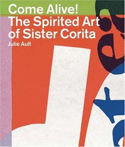
Much of the renewed interest in Corita Kent comes with the release of the book Come Alive!: The Spirited Art of Corita Kent by Julie Ault. I was thrilled to learn of the book from a recent entry at UnBeige. That blurb led me to Lorraine Wild's piece, Sister Corita: The Juiciest Tomato, at Design Observer and Mark Kingsley's Speak Up article, Corita. (This is a fascinating woman who ended up on the cover of Newsweek back in 1967.)

With the London release of Come Alive!, from Four Corners, there was an exhibit of Corita's work at the Between Bridges gallery, which got the attention of The Guardian newspaper. Nun Like Her was the Creative Review response to the exhibition and book release. The exhibit, Sister Corita: The Joyous Revolutionary is currently available for touring and I do hope it gets more exposure in the U.S. Six Corita prints are part of the exhibit DISSENT!, on display at Harvard University's Fogg Art Museum through February 28, 2007.

If I sound a bit excited about the March release of this book, I am. As a designer new to the profession in the early 80's, I received a signed Corita as a gift and was able to purchase another from a gallery that would later end up selling my own silkscreen efforts. Each morning I wake up to the graphic representation of the Corita Kent quote, "Life is a succession of moments, to live each one is to succeed." There's a bit of irony that my other Kent piece, Yes #3 (a large red heart over the word "love"), went to the other party when I got divorced in 1985.

Today the Immaculate Heart Community is the home to the Corita Art Center. The center's online presence includes an archive of Corita Kent's serigraphs and pieces for sale. The U.S. release of the book Come Alive! is currently available for pre-sale.

Update - 05.22.07: I just got the book for myself with a birthday gift card. It's an incredible resource for anyone interested in the work of Corita Kent. I would highly recommend it.

Print image © The Corita Art Center

© 2007 Jeff Fisher LogoMotives
