


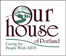
 In my previous bLog-oMotives entry, Designing pro bono efforts for "win-win" results, I mentioned a client relationship with an AIDS residential care facility that began with donated design services. That client was Our House of Portland. Kimberly Webster (now Waters), a previous client of mine, had become Development Director for the nonprofit organization in 1994. In doing a graphics inventory for the group, Webster found there were no existing digital files for the Our House logo being used at the time. She asked if I could clean up the logo and create the digital imagery (above). Her request was the beginning of a long-term relationship with Our House.
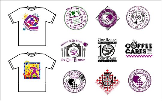
Over the next few years I designed a great deal for the facility. My efforts included the design of many logos for Our House fundraising events and internal programs, T-shirt graphics, stationery packages, print ads, invitations, direct mail pieces, banners, annual reports, the organization newsletter and many more development and marketing materials (below).
Webster moved on to other career opportunities in Seattle. My working relationship with Our House continued. In the late 90's a redesign of the organization's identity was proposed. I invested a great deal of time in creating and presenting possible new logos based on feedback from staff, volunteers and others. As is often the case in logo redesign projects - especially with nonprofit organizations - one of the greatest challenges was to get beyond the emotional attachment to the old logo design and the question of why it was necessary at all to change things from "they way they have always been." The frustration of organization personnel and myself (especially as it was being done pro bono) resulted in the new logo project never being completed. It was also time for me to re-evaluate my five-year relationship with the organization, and I decided to move on to possible relationships with other nonprofits - primarily in my own new neighborhood of North Portland.
 In late May of this year, out of the blue, I received an email from John Oules, an individual I had known for quite a few years in his roles of actor, director and producer of local performing arts events. Oules informed me he was the new Marketing Director of Our House of Portland. His email was a request for any information I might have on the history of the Our House logo. A new identity had been instituted recently (above), incorporating a complicated, multi-colored graphic of a circle of people, and those required to use the image were running into many reproduction difficulties. Oules was interested in the possibility of revisiting and updating the original logo for the organization. Our House was nearing completion of a new building, on the location of the previous facility, and he felt it might be an appropriate time to put a new identity in place.
In my initial meeting with Oules, and new Development Director Sally Dadmun Bixby, their hopes for the new identity were conveyed. The identity needed to hint at the old logo, while being more contemporary and cleaner. No longer the grassroots organization founded in 1988, Our House needed to project a more polished and professional image. The font "City of" (based on the type used by the Union Pacific Railroad and created by RailFonts) had already been selected for use on the new building's signage and the lobby donor board. I was asked to consider using the font for the new identity to give the image the contemporary look of the new structure, interiors and other elements of the project. A new Our House tagline, "Inspiring People with HIV/AIDS to Live Well," was another element I was to possibily include in the new logo. I was provided the color palette of the the interior design firm and painting contractor as an additional reference.
I visited the nearly complete construction site to photograph the facade and roofline of the new building. With an immediate visual image of the icon in my head, I returned to my home studio and created three variations of logo concepts. Two were stacked versions of the required elements and one was a horizontal treatment - and the logo was basically designed. The almost immediate response from Oules was "Awesome job. We love the logo!" From Dadmun Bixby came "I am thrilled at how you took what we envisioned and turned it into the logo!"
Staff, volunteers and others were a bit more hesitant in accepting the new image - as I had predicted earlier in the process. That emotional attachment to the original logo was strong and some were concerned about losing the "warm and fuzzy" feeling associated with the original design. One staff member relayed to me that when she initially saw the design in black and white she felt it was a little "cold." As soon as she was shown the logo in chocolate brown and the green of the exterior paint she really liked the image.
It was decided that using the logo in one of the more vertical formats, and also making use of the horizontal version, (above) might best serve the needs of the organization. With days to go before the grand opening of the new home of Our House, embroidered shirts for the staff and volunteers, fridge magnets, banners and some additional signage were ordered.
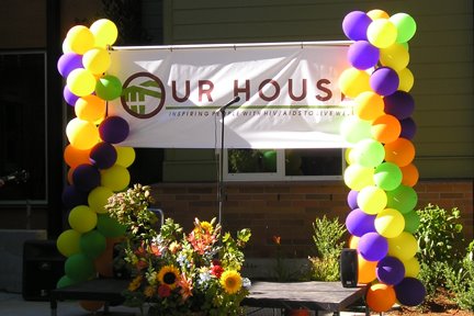 Yesterday, under sunny skies, the new building was opened to the public for viewing. It's a beautiful and functional space for the facilities' residents, visitors and the administration staff. The new logo was introduced to the public with a banner in front of the building (flanked by balloons provided by friend/long-time client Ron Pitt of Balloons on Broadway). Hundreds of people toured the new building, guided by staff wearing their color-coordinated shirts embroidered with the logo. I received many compliments on the new identity. The best came from Development Director Dadmun Bixby, when she said "You nailed it!"
Now, the process of a complete branding will begin.
© 2006 Jeff Fisher LogoMotives

No comments:
Post a Comment