It's a small, small world...

As part of each update of my Logo Notions column on Creative Latitude I usually review a couple design books. The reviews are also posted on bookselling web sites around the world and occasionally on bLog-oMotives. I've started to get requests to write reviews for magazines and other sites. Last week I sent out an email to several publishers about the possibility of reviewing their design-related releases. One of the companies I contacted was Pepin Press (love their design resource books) in Amsterdam. They responded that they had a U.S. West Coast representative that I should touch base with directly - located in Portland. Their office is out in the burbs, quite some distance from my home. I got an email back with the intro "Howdy neighbor!" as the recepient recognized my zip code and realized that I was in NoPo (North Portland), the area where she also lives. A couple emails back and forth resulted in us confirming that she lives one street over - actually about eight or nine houses away - and walks her dog past "the house with the garden" (how neighbors describe our house). Last night she stopped by to drop off the catalogue from the publisher in Amsterdam - and one from Mark Batty, another design book publisher her firm represents.

She also put me in touch with powerHouse Books - another design book publisher. Their sales director contacted with some initial information about their September release HOOPLA, from the Miami-based ad shop Crispin Porter + Bogusky. More about that interesting volume in a future bLog-oMotives entry.

My neighbor said that next time she's bringing a bottle of wine over so we can spend some time visiting in my garden...

Graphic from Pepin Press release Signs & Symbols

© 2006 Jeff Fisher LogoMotives

Great food, fine wine, fun design,

a quirky film and a new book

I've been a bit lax on the bLog-oMotives entries lately. It seems a busy social calendar, writing my new book Identity Crisis! (to be published by HOW Design Books in 2007), submitting articles for publication in Turkish and Russian design magazines, and preparing materials to be published in other books got in the way this past week. The social aspects were a great deal of fun and provided lots of design inspiration.

Last Tuesday night I attended a great cooking class at the culinary store In Good Taste in Portland's Pearl District. Holland + Knight, the law firm for which my partner is the business manager, had the cooking class "Hands-On Tropical Escape" as their summer associate activity. Chef Erika Carlson and her cohorts led us step-by-step through making Tamarind- Glazed Prawns on Won Ton Crisps; Watercress Salad with Oranges, Caramelized Coconut Spiced Macadamia Nuts and Chevre; Chicken Jerk and Halibut Pineapple Skewers on a bed of Caribbean Couscous with Dried Tropical Fruit and Flaked Coconut; and Banana-Rum Flambe with Tahitian Vanilla Ice Cream. Along the way we sipped Segura Viudas Brut Reserva, Red Stripe Beer and Willow Crest 2005 Pinot Gris. A great time was had by all - and, as a designer, I enjoyed checking out the great packaging of all the food products throughout the store.

The following night some friends had a private party at the new N.E. Alberta retail establishment Cork: A bottle shop. The store, operated by the former owners of the restaurant Assaggio, is a welcoming space highlighting an incredible selection of wines. Proprietor Darryl Joannides did a beautiful job designing and building out the store. One of the first things I noticed was the business card produced on an actual wine cork. Designer Todd Skiles of Fullblast created the logo and other identity elements. The walls of the store displayed some beautiful art works from the Alysia Duckler Gallery. As if we hadn't had enough food and wine the previous night, the party featured a wonderful selection of appetizers and desserts from caterer Food in Bloom, and much more than tastings of three whites (including a selection from Jacques and Francois Lurton - who make some of my favorite wines from Chile and Argentina) and four reds. The voice of jazz singer Mary Kadderly sounded fantastic in the acoustics of the space. While I was checking out all the wine label designs I heard some laughter across the room. One of the party guests had discovered Bitch - a Barossa Grenache produced by Dan Philips, David Hickinbotham and Chris Ringland, some well-known individuals in the wine industry. Quite a bit of Bitch was purchased by the party-goers. I'm sure everyone has someone in their life that deserves a bottle. I'll certainly be going back to Cork to check out more wines, their selection of gourmet chocolates, and the balsamic vinegars and olive oils. We'll probably pop in on Thursday evening while enjoying Alberta Street's Last Thursday event.

My Thursday was a day of recovery and time to catchup on many work-related efforts. I really had no desire to even leave my home and spent much of the day working from my new garden space.

Friday started out with a meeting to help coordinate the Second Annual North Portland Pride BBQ and Festival to be held August 13th on the grounds of the University Park United Methodist Church. Last year I designed the logo for the now annual event. I had great biscuits and gravy, at Darcy's in the Portsmouth neighborhood, while brainstorming with the coordinators about sponsors, participants and performers for the festival.

I then rushed home, changed my clothes and headed to the Simpatica Dining Hall, in southeast Portland, for a client luncheon. The dining hall is located next to the Simpatica catering kitchen in the basement of an interesting old building that was formerly the Pine Street Theatre and the La Luna club. I think their logo is beautiful (and will try to find out who created it) It was another amazing meal of their signature green salad, grilled asparagus with Parmesan and lemon, fuscilli pasta with Nonna's meatballs and red sauce and a chocolate cheesecake tart. I was so tempted to have the Simpatica Cheeseburger, but felt I'd already overeaten throughout the week. With my lunch I had O'Reilly's Chardonnay, while other guests enjoyed a Zoot Allures syrah/cabernet (bottled by J. Christopher Wines). Lunch ended about 3:00 p.m. and then it was suggested that several of the guests walk a block over to Doug Fir, in the Jupiter Hotel complex, to cap the afternoon off with a cocktail (or two). Somehow it was suddenly nearly 5:OO p.m. and time to call it a day.

This is not my normal kind of week. I'm usually quite the home-body. With 80-85% of my design work being done cyberly for clients outside of Oregon I seldom have the need to leave my own neighborhood for any reason. It felt great to spend part of my Saturday going the Marbott's Greenhouse & Nursery (1808 NE Columbia Blvd) buying several flats of annuals for my garden and patio pots. The relaxation continued as Ed and I spent part of the evening watching the intriguing and quirky movie Kiss Kiss Bang Bang. I thoroughly enjoyed the Saul Bass-ish opening credits and the movie was great entertainment.

Our social obligations for the week were not quite over. Yesterday morning we had a brunch book signing to attend at the home of Robert Weiss and Norma Leszt for Weiss' latest book, Mardi Gras at the Monastery and Other Stories. (Bob was a founding partner in the law firm Weiss Jensen Ellis & Howard, the company Ed went to work for over 12 years ago, and the firm later merged with Holland + Knight.) The roof garden of their condo was the perfect place for the gathering, with more good food, mimosas and music provided by Robin Dubay and Holly Stern of the Portland Baroque Orchestra. I'm really looking forward to reading the book when I finish with some of the other selections on my nightstand. The brunch was the perfect start of a beautiful day, and a great way to end the craziness of the past week.

With this entry I hope bLog-oMotives is back on track. I plan to post entries on more of regular basis. So, it's back to work as I try to focus on staying cool. The forecast is for 102 degrees here in P-land today. I'm fairly wimpy in that heat - a great reason to stay in my air-conditioned office and get a lot done.

Photos © In Good Taste and Doug Fir

© 2006 Jeff Fisher LogoMotives

High on Hollyweed:

30-year-old college art project is put to music

Many friends and acquaintances of mine are "creative types" - designers. artists, architects, writers, musicians and others - who are always working on some interesting projects. The other day I got a press release from writer, and former Portland resident, David Batterson about his latest effort. I know Batterson from his work writing articles and text for businesses and organizations. However, he's also a song writer.

Batterson and former deejay Mark Giles have completed a new song - "Hollyweed USA" - celebrating a popular stunt that happened 30 years ago, when the landmark Hollywood sign was changed to read "HOLLYWEED." Batterson wrote the lyrics to the song and Giles composed the music. Giles also sings on the demo of the copyrighted song. The musical tribute has not yet been recorded by a record label, but has been distributed to college, indie and "pirate" radio stations in the U.S. and overseas.

Student Daniel Finegood was the person who envisioned the stunt and - on January 1, 1976 - carried it out with some friends. It received worldwide publicity at that time, and earned Finegood an 'A" for his college art project. The artistic deed was in recognition of the new California marijuana law being implemented on that day. Finegood documents the event on the site Hollyweed.net.

Batterson and Giles have also written the songs "Unless We Have A Song" and "Rattling The Dishes," and are working on more songs.

Update: Danny Finegood lost his battle with cancer on January 22, 2007.

© 2006 Jeff Fisher LogoMotives

What advertising is working?: Perception vs. reality

I recently asked a new Portland client how she tracked the success of her advertising, marketing and promotion efforts. She told me that she didn't. I then asked how she knew what was drawing customers to her business. She told me she "didn't have a clue." This woman was spending beaucoup bucks each month to promote her business. She was doing radio, television, print (magazine image ads and newspaper "call to action" ads) and outdoor; yet she didn't have a clue what was working. However, she did seem to have a problem saying "no" to any advertising representative calling on her business to present promotion possibilities.

As she was stuck in contracts of several future months with most forms of media, I immediately suggested that she only promote certain specials on one given media at a time. Potential customers seeking the special for a specific service would help her start the process of being able to track what was best serving the business as an advertising vehicle. I also suggested that she educate her entire staff about the specials being featured each week. Previously, most didn't know what was being advertised at any time. In each weekly staff meeting employees began to receive printouts of all ads being run and a schedule of broadcast media efforts. A notepad was created, providing a checklist of all advertising being done, for personnel answering the phones. When the phones were answered, the caller was first asked how they had learned about the business , with the response being recorded on the notepad. Far from an exact science, this did help the business owner begin to get an idea of what advertising dollars were bringing clients to the company. When her current contracts expire it will not be necessary for some to be renewed.

This whole excercise reminded me of the experience of a friend/client who owned a high-end men's clothing store in Seattle some years ago. We had the opportunity to make use of the talents of a great fashion photographer for a photo shoot of models wearing the clothing while walking through Pike Place Market. I developed a series of print ads to run every other week, in only the freebie publication Seattle Weekly. The business owner was quite savvy when it came to his marketing and promotion. He decided to make sure his employees asked each customer how they learned about his store.

Over a period of a couple months, the majority of customers said store advertising had resulted in their first visit to the establishment. (The other top answers were word-of-mouth and simply walking by the store) Most then said they first learned about the store through ads in one of the city's daily papers - in which no ads were ever placed. Many others recalled seeing television commercials or hearing radio spots - no broadcast media was ever used. Others commented on seeing outdoor signage or bus boards promoting the store - additional vehicles never even considered in the original advertising plan. A somewhat small number accurately remembered seeing the ads in the Seattle Weekly. Still, most of those seemed to remember the ads running every week, when the placements were actually only every other week.

Although the answers were not what he expected, my client/friend was thrilled that he was getting such broad perceived advertising exposure for the reality of a limited advertising dollar expenditure.

How are customers/clients finding your business? What is the perception? What is the reality? How do you track the results of your advertising efforts?

Note: This piece originally appeared as a forum posting on the StartupNation community forum.

© 2006 Jeff Fisher LogoMotives

Review: 1000 Bags, Tags & Labels:

Distinctive Designs for Every Industry

I'm usually not one to recommend design books that are just pretty compilations of hundreds of (or 1000) designs - especially when it comes to suggesting books to those interested in logo design. Page after page of logo examples does little to explain the "process" of creating a logo to a designer. However, with 1000 Bags, Tags & Labels: Distinctive Designs for Every Industry, by Kiki Eldridge, I am making an exception. It is a pretty book - filled with exceptional examples of logos and corporate identities in use. The presentation of those logo designs in use on labels, hangtags, shopping bags, bottling, promotional items, packaging and other items makes this volume a valuable resource to those designing identities. Yes, the images provide visual stimulation. More importantly, the book should inspire logo designers to think about how their designs may be implemented to best convey the consumer message desired by a client. Those viewing this Rockport Publishers book may encounter many "brain farts" in coming up with solutions to their own design challenges.

© 2006 Jeff Fisher LogoMotives

How does your garden grow?

Gardening is my therapy and a passion. Nothing recharges my creativity like getting outdoors to play in the dirt. I can get lost in my gardening for hours; all the while coming up with design project solutions in my head. In previous bLog-oMotive entries (Part One and Part Deux) I presented an article written for a neighborhood newspaper about the garden of the North Portland home I share with my partner, Ed. In the second piece I mentioned that Joy Creek Nursery would be renovating our backyard at some point this year. I had no idea how soon it would be happening or how great the end result would look.

Three weeks ago our friend Mike Smith, one of the owners of Joy Creek Nursery, stopped by to ask if we could be ready for the project to begin the following day. Another landscape project had been delayed and he had a crew available. Ed's only concern was that the project be completed by the scheduled June 17th barbecue celebrating his sister's graduation from college. Mike and I began discussing the removal of all the concrete surfaces in the yard, creation of a large patio of tumbled pavers, the construction of some raised gardening beds, the installation of a stone bench for added seating, a possible future water feature and more.

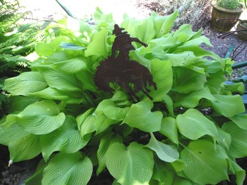
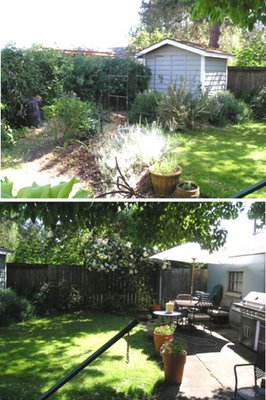
Bright and early the next morning the Joy Creek crew showed up to begin the process of breaking up the old, thick concrete pad next to the garage. It had never been an inviting space for entertaining or spending time outdoors. Large woody rosemary bushes were ripped out of the ground, all remnants of Ed's former vegetable garden disappeared, the existing irrigation system was removed and some plants were potted up to be included in the new garden design. By the end of the day several truck loads of concrete, rocks, dirt and plant material had been hauled away from our yard. All that remained were a variety of existing plantings under our large pink dogwood tree, some vegetation across the back by the fence, and a few mature plants (including my beautiful Sun Power hosta) up against the house that would give the new garden some sense of history.

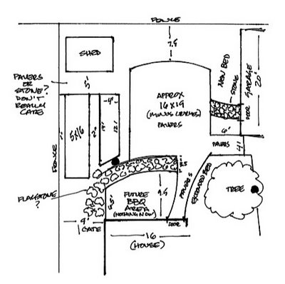
The next morning I walked out into what was now a blank canvas for our future outdoor entertaining space. Based on my discussions with Mike, I started taking measurements to determine how all the various elements would come together. Armed with a can of spray paint, I drew out a "floor plan," of where things would eventually be located, on the bare dirt. As no real plans existed for the project, the designer in me kicked in and I decided to rough out some additional details on paper. I was thrilled to be getting a new 6' x 20" flowerbed next to the garage. Ed was already looking forward to his 4' x 13' raised herb bed and 5' x 16' raised vegetable garden. My concern was that a large patio of tumbled pavers (approximately 16' x 20'), with a straight walkway from the backdoor of the house, might end up looking like a bumpy basketball court plopped in the middle of our yard. I sketched out curves on the walk from the house and at each end of the patio. Then, after emailing my rough plans to the nursery and taping a copy to the back door for the crew, we packed our bags and headed out of town for five days.

It was a bit odd leaving town and not really knowing what to expect when we returned home. The next day a phone call from Mike resulted in negotiations about the curves on my plans. I got my curves on the walkway, as a great way to introduce people to the patio, and the curves on each end of the patio were eliminated. Mike convinced me that my "basketball court" concern would be eased with plantings to soften the edges of the patio.

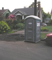
While in Seattle, celebrating my 50th birthday, I saw news reports of monsoons in Portland - with coverage of downed trees, power outages and flooded streets. I could just imagine the Joy Creek crew working in a mess of mud. I was really looking forward to getting home and seeing what had been accomplished in the inclement weather. Returning to Portland we immediately realized we were now living in a construction zone when seeing the porta-potty parked in front of our house (well, actually in front of our next-door neighbor's home), and piles of gravel, pallets of concrete pavers and a pile of Trex in our driveway. 
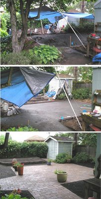
Most of our backyard was under a huge blue plastic tarp; allowing the workers to continue their efforts in the heavy rainstorms. With each day visible progress was made as things really began to take the shape of my rough plan. Ed had to leave town for business once again, so I was left to approve any minor changes to the project as the crew continued their great work. At the end of each day, I would take photos and email them to Ed for his review.

Last Friday the crew spent the morning finishing up their work on the hardscape. Final touches included fine-tuning the irrigation system - Ed's gardening toy that is all set on timers. I'd been busy working when I realized it was completely quiet outside for the first time in a couple weeks. I stepped outside into a beautiful and serene backyard space that seemed much larger than before the renovation.

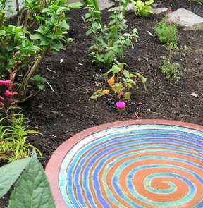
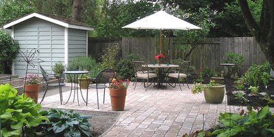
On Saturday, Mike came by with several flats of plants for the new beds. We also took a little field trip to a couple rock yards to check out stones for a bench to go in front of Ed's raised herb bed and a basalt pillar water feature that will be at the edge of the patio near the path to the backdoor. When I got back home most of the afternoon was spent planting the selection of new fuschias, Abyssinian Stars, anemones, arroyo lupine, black mondo grass, small hostas, dahlias, diascias and penstemons. Ed returned from his business trip that evening and seemed a bit stunned as he walked into the newly completed garden space. The next evening we entertained our first guests, friends Mary and Kate, in our new garden.

The Joy Creek Nursery crew did an incredible job on our garden project. There's still a bit of work to be done prior to the upcoming graduation party. Ed needs to get his raised beds planted. I'm going to a couple nurseries this afternoon for some annuals to fill the many large pots that will be placed on the patio. Phase I of our backyard renovation is done. Still to come are the French doors out of our bedroom and a deck for the hot tub. That will be followed by an outdoor kitchen area, with a sink and prep station, making space for Ed's large stainless steel grill (commonly referred to around our house as "the penis extender").

We're looking forward to getting a lot of use out of our new backyard garden. In fact, I sat out at the table working on my PowerBook much of the morning yesterday.

© 2006 Jeff Fisher LogoMotives

Font fun from Fonthead

OK, I'll admit it - I'm a bit of a typography geek. I think it all stems from college type classes where it was necessary to render entire typeface families in pencil to study the letterform shapes and interactions with each other. Those studies 30 years ago have helped a great deal throughout my career and, as I moved to using the computer as a design tool about 15 years ago, I had an understanding that there's a lot more to typography than just digital type manipulation.

One of the great things about my focus on identity design is the freedom it often allows me when selecting type for my projects. Fun logos, for non-traditional businesses or events, require fun, non-traditional type. Several years ago I discovered a great resource in the typeface creations of Fonthead Design. With much of my identity work being done for a less than boring clientele, the selections from Fonthead have been excellent design challenge solutions for me.

For example, the typeface Circus Dog was used in my designs for Harrison Flowers, the triangle productions! theatrical presentation The Dream State, the greeting card company Good Pig, Bad Pig and the local St. Johns Window Project art event. Very Merry is the font I selected for use in the images for Black Dog Furniture Design, Oregon Family OUTings and the Portland retail development Heart of the Pearl. The identity for publisher Buttonberry Books and the James John School reading program featured the typeface Carnation.

Fonthead's offering of Bonkers was used in the symbols for triangle productions! Twelfth Anniversary, Buckman School, and a campaign for the Buckman Arts Magnet - and as a secondary typeface (to one I myself have been designing for about 15 years!) in a Fall Thesis image for Reed College. The option Hot Coffee found its way into the logos for the Caring Community of North Portland, and the additional theatre productions The Big Bang and Shopping and F***ing.

The body of the human form in the Big Daddy identity is made up of the font Blue Moon. The typeface used in the triangle productions!: 14 Years of Tears & Jeers image is the Fonthead creation Asimov Sans. When designing the logo for the Portland Iron Chef fund-raising event, an annual benefit for the Portland Relief Nursery, I was pleased to find the typeface Stiltskin, which seemed to work in conveying an Asian influence.

I really appreciate the designs of smaller type producers like Fonthead. The unusual letterform designs add a unique quality to my logos. When I have used the same font in a number of logo designs, the type takes on different qualities when used in different formats. The end results have made for happy clients - and received a great deal of additional attention as well. Several of the designs shown have won American Graphic Design Awards or were selected for inclusion in the Print Regional Design Annual. In addition, a number of the logos are included in the books American Corporate Identity 2002, Logo Design for Small Business 2, Letterhead and Logo Design 7, Graphically Speaking, Global Corporate Identity, The Big Book of Logos 3, The Big Book of Logos 4 and Graphis Logo 6. Quite a few of the designs appear in the Japanese book New Logo World and the Spanish volume Logos From North to South America.

Fonthead Design does deserve some of the credit, for creating the type I've used in producing my logo designs. I hope that you will check out what they have to offer. Besides the very reasonably priced font volume offerings, they do offer a selection of freeware fonts on their site. Right now they also are offering a free font of your choice in a "Buy None, Get One Free" promotion. (Thanks to Tamar on the About.com Graphic Design Forum for bringing it to my attention and to Fonthead for allowing me to post the info on bLog-oMotives.) Take a look at what Fonthead has to offer. Select and download a free font. Then, do me a favor and send them a little note of thanks.

© 2006 Jeff Fisher LogoMotives