Yikes! The holidays are here...

Tomorrow is December 1st - and I just realized I'd better get my rear-end in gear and do some holiday shopping. As usual I will be doing most of mine online. Here are some of my favorite places to shop - or places I may shop this year - online and in person, for holiday gifts:

Archie McPhee - Seattle WA • BabyStyle.comBad Byron's Butt Rub - Santa Rosa Beach FL • Bay View Farm Coffees - Kona HI • Blue Raccoon - New Hope PA • Cafe Du Monde - New Orleans LA • CD Baby - Portland, OR • Chef's CatalogChocolate Flower Farm - Langley WA • Chronicle Books - San Francisco CA • Clos du Val Wine Company - Napa CA • Despair, Inc.Cornucopia - Napa CA • Cry Baby RanchDesperado - Portland, OR • Erath Vineyards - Dundee OR • Elephant Dung PaperFireworks - Seattle WA • Fitzsu.comFlax Art & Design - San Francisco, CA • Garnet HillGeribi Ceramics - Deruta, Italy • Hip CHICKS do Wine - Portland OR • J.K. Carriere Wines - Newberg OR • Joy Creek Nursery - Scappoose OR • Kenspeckle Letterpress - Duluth MN • Laughing Elephant - Seattle WA • Lime GreenPeter Miller Books - Seattle WA • Mitchell Larsen Studio - Christiansted, St. Croix • Mobile State of Grace, Inc.MossNew Dimension Seed - Scappoose OR • New Seasons Markets (great gift sections!) - Portland, OR • Oakville Grocery - Oakville CA • Oblation Papers & Press - Portland OR • Powell's Books - Portland OR • Raindogs - Yachats OR • Ravenna Gardens - Seattle WA • Red EnvelopeRejuvenation - Portland, OR • SFMOMA MuseumStore - San Francisco CA • Square Deal Wine Company - Portland, OR • Stonewall Kitchens - York ME • Sundance - Sundance UT • Sur La Table - Seattle WA • Ten Thousand VillagesTerritory AheadThe Conran ShopThe Hard-To-Find GrocerThe Monkey & The Rat - Portland OR • The Museum Shop of The Art Institute - Chicago IL • Uncommon GoodsWipe Your Tush With Bush - Portland OR

Happy shopping!

© 2005 Jeff Fisher LogoMotives

How much should I charge?

Think before you ask the question "How much should I charge?" The answer is in the specific questions you need to ask yourself about a project.

The question of pricing often comes up in online-forums, or in face-to-face discussions between designers, as if there is one cut-and-dried answer to all design project-pricing issues. It’s unrealistic to expect that there is one definitive answer to the question of what to charge for any given project. Many elements play into the equation resulting in a final cost estimate for a potential client, including some of the following:

• What is your experience in the field of graphic design or with a specific type of project?

• What is the amount you are currently charging as a hourly/project rate for similar projects?

• What do you feel the final project will be worth?

• What are the exact project specifications the particular client has provided?

• What is the estimated amount of time such a project will take for completion?

• What are the methods to be used to execute the project?

• What do you need to charge to cover your overhead cost and expenses on such a job?

• How badly do you want the project?

• What prices will the local geographic market will bear?

• What are competitive rates in your local area for similar work?

• How much is the client is willing to pay? (It doesn’t hurt to ask if they have a budget)

• What are you providing the client in the way of rights to use the design for future purposes?

• Is the client a for-profit or nonprofit entity, and do you price such work differently?

• And many, many more considerations...

Read the rest of my article on this topic on the Creative Latitude web site.

© 2005 Jeff Fisher LogoMotives

The Design of Dissent:
One of Amazon's 50 Best Books of 2005

Each year the editors at Amazon.com select their 50 best books of the year. I always check out the selections while making my holiday gift list (as mandated by my partner's mother) and it's not surprising that design books usually don't make the top 50. That's different this year on the Best Books of 2005 listing - right there at number 46 is The Design of Dissent : Socially and Politically Driven Graphics, by Milton Glaser and Mirko Ilic, with a foreward by Tony Kushner. The Rockport Publishers book is an incredible archive of designs focusing on social/political concerns from around the globe. This past July, designs from the book were in an exhibition, curated by Glaser and Ilic, at the School of Visual Arts in Manhattan. The web site TheCreativeForum.com has an interview with Milton Glaser about the book.

One of my own designs, a graphic in support of same-sex marriage, is included in The Design of Dissent. I created the “I DO!” image and distributed it via email for use by those supporting the legalization of same-sex marriage when Multnomah County Commissioners authorized the issuing of marriage licenses to same-sex couples in Portland. Flyers, stickers, and buttons were produced and displayed in the windows of business and homes, on the bumpers of cars, and at public hearings on the topic. Images were also designed for campaigns in Oregon's Benton County, California, Massachusetts, New York, and New Mexico. The New York image is featured in the book. The “I DO!” graphic was part of the Multnomah County Wedding Album Project exhibit earlier this year and is now part of the Oregon Historical Society's permanent collection.

In addition, I was invited to submit the designs to the archives of the Center for the Study of Political Graphics. The Center for the Study of Political Graphics (CSPG) is an educational and research archive that collects, preserves, documents, and circulates domestic and international political posters relating to historical and contemporary movements for peace and social justice. CSPG demonstrates the power and significance of these artistic expressions of social change through traveling exhibitions, lectures, publications, and workshops. Through diverse programs, CSPG is reclaiming the power of art to inspire people to action. The archive currently contains more than 50,000 posters and is the largest collection of post World War II social justice posters in the U.S. It includes works produced by offset, lithography, linocut, woodblock, silkscreen, stencil, and photocopy. In the last sixteen years, CSPG exhibitions have toured to more than 280 venues nationally and internationally. Collection pieces are frequently loaned to other institutions, such as the Smithsonian, Getty Institute, the Los Angeles County Museum of Art, and the Centre Pompidou in Paris.

© 2005 Jeff Fisher LogoMotives

Design studio housecleaning - excavated artifact #1

I'm not sure when I first started getting paid for actual design work. I remember earning income from some of my illustration work while still in junior high about 1970. I did have a paid, sit-at-a-desk, design job while in college as the designer for the advertising department of the University of Oregon college newspaper, the Oregon Daily Emerald. Using that 1978 job as a marker I've been working as a professional designer for nearly 30 years - and I have nearly every design project I've ever done saved in my personal archives.

I've initiated the process of trying to organize those files, boxes, drawers and piles of past design jobs. I'm learning just how little I've thrown away over the years. In the process of excavating my career I've found many little rough sketches for logo projects on napkins, envelopes, meeting notes, Post-It notes and other scraps of paper. Many of those initial, quickly-drawn creative thoughts evolved into final identity designs for my clients.

One such project was the personal logo design for the guy who began cutting my hair over a decade ago. In 1995 Jeff Maul asked if I could come up with an identity for his work as a Portland hair stylist. One day I scribbled a rough concept for his logo on a torn scrap of paper. When I finalized the design, it was the one and only design concept I presented to a very pleased client. I did follow the K.I.S.S. (Keep It Simple, Stupid) principle and eliminated the fingers elements I had included in the rough sketch. I was paid for the completed project in future haircuts.

The logo bought a great deal of attention to my design work, and became an important element in the focus of my design work changing to the creation of logos. One of the most recognized identities I've produced in my career, the logo appears in the books International Logos & Trademarks 3, Letterhead and Logo Design 5, New Logo & Trademark Design (Japan), Bullet-Proof Logos: Creating Great Designs Which Avoid Legal Problems, The Best in World Trademarks 1- Corporate Identity (Korea), LogoLounge, Volume 1, The Best of Letterhead and Logo Design, Logo Design for Small Business 2, and New Logo: One (Singapore). The logo also appeared in the 1996 PRINT Regional Design Annual. One simple, one-color logo has been marketing my design efforts, and appearing in new books, for ten years now.

In coming bLog-oMotives entries I'll share other rough design concepts (along with the final design) I find while digging in my home-based studio

© 2005 Jeff Fisher LogoMotives

Review: Logo Design for Small Business 2 - A Designer’s Reference Guide to Practical Logo Design

It may be a bit odd for me to reviewing a book that includes quite a few examples of my own work. However, with my own logo designs in over 70 books at this point. my selection of logo design volumes to consider for review might end up being somewhat limited.

Dan Antonelli does not disappoint the logo designer with Logo Design for Small Business 2, the follow-up to his first book, Logo Design for Small Business. Antonelli preaches what he practices. I appreciate the fact he is educated as a designer, has worked in the industry for a number of years and is in business as a sign maker. He understands, and is able to convey, what a designer needs to accomplish – and, from his own unique perspective, what a vendor needs as a final product. The author provides a great deal of advice in regards to the business of logo design for small businesses, as well as displaying examples from a variety of designers for inspiration.

Don’t be put off by the rather short length of this book – it’s 72 pages of useful information. Those just starting out in logo design will benefit from the excellent advice of Antonelli. For seasoned pros the book is a reminder of many things we should consider in our day to day designing of identities. All logo designers will recoup the cost of the book on the first project produced after reading the book – and it should be on the reference bookshelf of anyone interested in the design of logos.

My designs highlighted in the volume include the identity for my own company Jeff Fisher LogoMotives and numerous Portland businesses, including Balloons on Broadway, Black Dog Furniture Designs, the hair salon Diva, Janet Loughrey Horticulture Photography, hair stylist Jeff Maul,Joy Creek Nursery, Monroe Orthodontics, the North Bank Cafe, Thomas F. Fallon Architect, TraveLady Media, W.C. Winks Hardware and the personal chef/catering firm What's for Dinner? Seattle small businesses represented include the restaurant Glo's Broiler and writer Kimberly Waters. The identities for restaurants Crossings at the Riverhouse, located in Bend, OR, and New York's former Indies Restaurant & Bar are also displayed. Other featured businesses include DataDork (Fontana, CA), DesignEire (Dublin, Ireland), Buttonberry Books (Lebanon, NJ) and KidstuffPR.com (Black Earth, WI).

© 2005 Jeff Fisher LogoMotives

Calls for entries: Fast approaching design competition & book submission deadlines

Don't let the following design competition deadlines get lost in the hectic holiday season or the start of the new business year. All present great opportunities to showcase your design efforts, market your work on an international scale through the published books, and "toot!" your own horn to clients, peers and the media:

Best of Brochure Design 9 (Rockport Publishers)
Deadline: December 1, 2005

American Corporate Identity 22 (David E. Carter)
Deadline: December 12, 2005

Anatomy of Design: Constructing and Deconstructing Graphics (Rockport Publishers)
Deadline: December 27, 2005

Summit Creative Awards
Deadline: January 30, 2006

Best Layouts (David E. Carter)
Deadline: January 31, 2006

Best of luck!

New "Just Out" look comes out of the closet

Just Out, the statewide monthly newsmagazine for the lesbian, gay, bisexual and transgender communities, celebrates 22 years of publication by bursting out the closet with a new look today. Part of that new image is a sleeker, updated logo design from Jeff Fisher LogoMotives. Even prior to the makeover, I've always felt that Just Out was one of the best LGBT papers in the country - in content and design.

Publisher and Managing Editor Marty Davis writes, "With this issue we’re shaking things up a bit—moving this, moving that. It’s a sign of the strength and stability that we celebrate and bring to you with this anniversary issue. The Just Out staff abounds with skill and expertise, and we start our 23rd year of publishing by being the strongest we’ve ever been."

It was a pleasure to work with Marty on the logo redesign - besides, it gave us a good excuse to get together for coffee at the NorthStar Coffee House near our North Portland homes. She wasn't seeking a whole new "look" with the logo, but rather a refined - possibly redefined - treatment of the existing identity. The hope was to maintain the readers' immediate recognition developed at newsstands over the years, while making the paper's flag fresh and a bit more flexible in cover design applications.

Just Out has been good to me over the years. The paper has mentioned my work on many occasions, promoted my favorite causes, sent a few fun projects my way, featured an announcement of the marriage of my partner and I, and in June 2000 published a great feature story (that I've yet to live down) about my business. In that article, On The Right Track, writer Marc Acito publicly announced that I sometimes work in my underwear. I will admit, as I sit here in a LogoMotives T-shirt, boxers and white crew socks, that some things do not change.

Happy anniversary and congratulations on the new image, Just Out. I'm honored that I could be a small part of the process.

© 2005 Jeff Fisher LogoMotives

Designs on a North Portland neighborhood

The “international headquarters” of the graphic design firm Jeff Fisher LogoMotives has been located in the Arbor Lodge neighborhood of North Portland for the past nine and a half years. In that time, from my home-based studio, I have made quite an impression on the local community. While I often find myself designing logos for businesses and organizations across the U.S. and around the world, some of the greatest satisfaction has come from creating identities for clients in my own neighborhood.

One of the major landmarks in the area, the majestic St. Johns Bridge, has found its way into logo designs for the North Portland Business Association, James John School, Project Safe Summer and community activist Mike Verbout. The Peninsula Community Development Corporation, Portsmouth Neighborhood Association, Peninsula Clean Team, Caring Community of North Portland, and Kenton Neighborhood Service Center have all been given the LogoMotives treatment. Area events being identified with my images include the annual Portland Iron Chef fundraiser of the Children's Relief Nursery, the St. Johns Window Project art exhibit, the North Portland Pride B.B.Q. and Festival sponsored by the University Park United Methodist Church and others. Business sector logos I have designed for neighborhood companies include the North Bank Cafe, Coyner's Auto Body and Lampros Steel.

One of my favorite North Portland projects was the logo design for the North Bank Cafe. When discussing the logo project, the restaurant owner mentioned she wanted the image to convey a cross between the old television show "Northern Exposure" and the feeling of the St. Johns neighborhood. She also asked that I include a moose as a graphic element if possible, as she hoped to have a giant moose head hanging on the wall. Not taking herself too seriously, she suggested that the moose have long eyelashes and be winking. It seemed to be a large order for one logo image - and I saw the moose with large antlers from my initial concept. Only one problem -a female moose doesn't have the familiar large rack. Still, the owner was thrilled with my solution and we decided that the moose in the logo was a cross-dressing or drag queen creature. Unfortunately, the life of the cafe was limited, but the logo's reach continues to be worldwide.

The North Bank Cafe logo is just one of the many neighborhood images having a life of its own far beyond the local area. It is among the North Portland logos have brought me numerous design awards, including those of the American Graphic Design Awards, LOGO 2001, LOGO 2002, LOGO 2004 and the Summit Creative Awards. The Peninsula Community Development Corporation and Lampros Steel logos appear in the book Logos Redesigned: How 200 Companies Successfully Changed Their Image and on the Creative Latitude design site's GRAPHIC makeovers section. Other logos appear in the books The Big Books of Logos, The New Big Book of Logos, The Big Book of Logos 3, Logo Design for Small Business 2, and the Japanese book New Logo World. All the exposure has added a great deal to my marketing efforts around the world.

It's not unusual for a designer to set their sights on big buck, corporate clients as they map out a career. However, at times the best - and most appreciative - clients may be the smaller businesses and organizations right outside your front door.

© 2005 Jeff Fisher LogoMotives

The most wonderful time of the year?

The holidays are sneaking up on us - quickly. Yikes! What do you get that client, co-worker or vendor as a gift? What's appropriate - and what may be totally inappropriate? A couple years ago The Creative Group eZine posted the article Client Gift-Giving: The Good and the Gaffes, featuring the advice of Ilise Benun and myself. The advice is still very valid today and might result in a "brain fart" for that perfect solution to your gift-giving quandry.

Some other great options include a gift certificate to your favorite nursery for that gardener you know, gift cards (or online gift certificates) for the reader on your list, a similar certificate for a nice restaurant, or a box of blank letterpress notecards from a shop like Portland's Oblation Papers & Press.

© 2005 Jeff Fisher LogoMotives

Review: A great design book - for kids of all ages!

Not often does one come across a great new design book that would be the perfect holiday, or birthday, gift for your kids, nieces, nephews, grandkids or that creative kid of any age you may know. That book is A Book About Design: Complicated Doesn't Make it Good by designer Mark Gonyea. (Gonyea is also a cartoonist known for his Mr. Oblivious character.) With its bright colors, simple design and easy-to-read text this book would be great for the young artist/designer in your life - especially those of grade school age. Basic principles of design – often forgotten by many in the profession – are presented in a very entertaining manner. I'll be ordering copies for some of the budding designers I know, as well as some of the seasoned pros who will appreciate getting this book in the spirit of the holiday season. What a fun book!

© 2005 Jeff Fisher LogoMotives

Inspiration, imitation or innovation - how do designers create unique identities?

In September of this year, with great public relations fanfare, the software company Quark introduced their new corporate identity. In presenting the new image, Quark corporate communications director Glen Turpin touted it as a “fresh, inviting and open” symbol representing a “q” letterform. My first thought upon seeing the image was - that's not a "q," that's a lower-case "a." The second impression I had of the "fresh, inviting and open" symbol was - I've previously seen that image elsewhere. I was not alone. Designers from around the world began posting similar logos from a variety of companies and organizations.

The rollout of the new Quark image resulted in some praise as well. CreativePro.com Editor in Chief Terri Stone wrote a column about the identity, ending it with "Brand beauty is in the eye of the beholder, of course, but to my eye, Quark's new identity system is a winner. I applaud the company for pulling it off." Not being one to keep my mouth shut, or my keyboard still, I sent an email off to Stone expressing my feeling about the new symbol not being as "fresh" as touted. That email led to me being interviewed for Gene Gable's followup article, Sometimes a Logo is Just a Logo.

When questioned for the piece, I mentioned David E. Carter's book, Bullet-Proof Logos: Creating Great Designs Which Avoid Legal Problems as a great resource for any identity designer wanting to create an original logo. Wanting to expand on the issue a bit, I wrote about the topic for the November update of Logo Notions on the site Creative Latitude. While researching the article, Carter, John Wingard of John Wingard Design, and Tim Frame of Tim Frame Design were all kind enough to provide some input.

The "Logo Notions" article also gave me the opportunity to feature my logo for the Seattle restaurant Glo's Broiler, which is included in "Bullet-Proof Logos." I've always taken great pleasure in the fact that, in designing the logo, I placed the coffee cup and plate imagery in a manner that creates a subliminal lower-case "g" as a secondary identifying icon for the eating establishment. It was one of those "happy accidents" in design that help make an identity unique. The namesake and former owner of the restaurant, Glo Raineri - who I've always called my "second Mom" - recently passed away. The restaurant and the logo live on as part of her legacy.

© 2005 Jeff Fisher LogoMotives

Blocked in Palm Beach County School District?

It's a long ways from Portland, Oregon to Palm Beach County, Florida - in more ways than one.

I recently received the following email from a student in one of the county's schools:

"SUBJECT: Your Site Blocked: Just recently we were doing a project on logos in my computer graphics class and when I tried entering your site I realized it had been blocked with the reason: Gay/Lesbian oriented. I'm a student in high school and I was pretty upset because I love your site and their is nothing offensive or obscene on it. No reason at all for it to be blocked from all Palm Beach county students. Well, just thought I'd let you know. Take care."

I was initially kind of stunned - until I took into consideration the politics and other issues in the State of Florida. Still, I was curious about how the school district would explain the situation. I sent the following email to Nat Harrington, the Chief Public Information Officer in the Public Affairs office of The School District of Palm Beach County:

I recently received the following email from one of your students: (and I included the text of the above message) I was wondering if you could shed some light on this situation?

I am a gay individual. Some of the logos featured on my site are for Gay/Lesbian organizations. However, my site - often used by school districts for educational purposes - is not a specifically "Gay/Lesbian oriented" web presence. In addition, my book "The Savvy Designer's Guide to Success" is now used for educational purposes in many high school and college classrooms. With exposure to my book, and articles written for web sites and magazines, many students then wish to visit my site for additional information and design inspiration.

Thank you for any feedback you may be able to provide.

This morning I got what appears to be a somewhat stock response, without the courtesy of even a salutation or signature, from Mr. Harrington. Very simply, the message stated:

The decision to block in these types of cases are related more to security and age-appropriate access than to curriculum. Students as young as first graders are using the District's computers and have access to the Internet. There is no way of segregating high schools from elementary schools for Internet usage. Thanks.

I don't know that the response really addresses my question - but I suppose I shouldn't be surprised.

© 2005 Jeff Fisher LogoMotives

Designs on dining: Restaurant logos as a graphic invitation to a meal and an experience

Over the years some of my own most enjoyable, challenging and visible identity design projects have been those for restaurant industry businesses. Much of the pleasure comes from an ability to push the creative envelope a bit and not be limited by the often-conservative boundaries of much more corporate identity design. I usually have an opportunity to be more playful with restaurant logos and have more fun with color. In addition, the architecture of the buildings, the design of the interiors, the type of food to be served and other elements come into play. The challenges of such projects most often raise their ugly heads in the form of budget limitations and the lateness of some restaurant owners to initiate the logo/identity design process for their new business in a timely manner – especially when the scheduling of projects for other vendors are overlooked. The visibility, and multiple uses, of the completed eating establishment image is a valuable marketing tool for a designer as easily recognizable public exposure of one’s design work. Unfortunately, with something like 50% of all restaurants closing in the first two to three years in business the visibility of such design examples often is limited in duration. (That figure is not necessarily more dramatic than the failure rate of other start-up businesses – the boarding up of a local dining establishment is often just more evident to the average person viewing from the street.)

The above is the introduction to a "Logo Notions" column I recently wrote on the topic of restaurant identity. You can check out the entire article at CreativeLatitude.com

© 2005 Jeff Fisher LogoMotives

Looking at the "before and after" in design

Often I am hired to redesign or update the logo of a business or organization. One law firm has hired me to recreated their corporate identity three times due to company name changes. Several such projects have ended up in the book Logos Redesigned: How 200 Companies Successfully Changed Their Image, by David E. Carter. From Harper Design International, the volume features great examples of “before and after” identities for 200 companies including professional sports organizations, major corporations, products, restaurants, educational institutions and “mom and pop” businesses. The designs presented include logo recreations from numerous design firms, including Hornall Anderson Design Works, Rickabaugh Graphics, Sayles Graphic Design, Alexander Isley, Inc., Dotzero Design, yours truly and many others. Each identity representation is accompanied by a brief explanation, written by the designers themselves, adding to the reader’s understanding of the visually displayed transition from old to new logo.

If the book has any shortcoming, it is that the reader is left wanting even more information about the projects presented – or additional concept visuals of the process of getting from previous to current identity. Still, the volume is an excellent resource for any identity designer who may need a creative “jumpstart” in taking on the overhaul of a client’s current logo.

Online you will find examples of identity, web and print redesigns on the Creative Latitude site, in a section called GRAPHIC makeovers. Designer Alina Hagen contributes her observations to the submitted design projects. Quite a few of my own redesign efforts, several from the "Logos Redesigned" book, are posted at GRAPHIC makeovers.

© 2005 Jeff Fisher LogoMotives

A blog about "Designers who Blog"

Tired of blindly searching for individual blogs about the world of design, illustration, photography, the web, advertising and branding? You need to check out the collective blog about those in the industry who finding the time and energy to share their expertise, experiences, Internet finds and more through their own blogs: Designers who Blog. Suggest your own blog, or others you've come across, for future updates.

Coordinator "Cat" Morley, a founding member of the Creative Latitude team, also features specific blogs, comments from their creators and her own observations at Cat's Fancy. Be sure to check out her incredible design and illustration efforts at Katz-i Design.

Keep an eye on the rotating banner on the "DWB" site - a number of designers whose blogs are featured have found their photos at the top of the page.

© 2005 Jeff Fisher LogoMotives

The client is always right - except when REALLY wrong


This past weeek, in preparing a proposal for a potential corporate identity project client, I was going through my archives and came across one of the great blunders that occurred in a past effort. The 1992 project, for The Governor Hotel in Portland, was one of the last times I kept my mouth shut when within my head I was screaming "silly client, you're making a huge mistake!" It made me realize that the adage "the customer is always right" is not always true.

My first visit to the hotel site required donning a hard hat to tour the historic structure, which was already being renovated. Director Gus Van Sant had recently filmed a scene featuring transients around a bonfire for "My Own Private Idaho" in what was to be the lobby and, for those who recall that movie scene, the building actually looked worse when I was touring it than it did in the film. I brushed the dust off the paneling on one dark,, dirty wall to get a better look at the beautiful Arts & Crafts bell ornament inlay. I mentioned that the shape would make a great icon for the logo and the response, from one of the hotel development team, was "Oh, no, we don't want to draw attention to the Art and Crafts elements of the building. Huh? Hmmm...after numerous attempts to create a logo the final selected identity incorporated the bell-shaped image I saw on the wall that first day. Lesson learned #1: The client is not always right.

After a lengthy debate about whether the official name was "Governor Hotel" or "The Governor Hotel" it was finally decided, at the last minute, the drop "The" as an identifier. The project moved along well after that. I ended up designing more and more pieces for the hotel over a period of almost nine months. The design assignments included the stationery package, coasters, notepads, pocket inserts for the bathrobes to be in the rooms, notecards, signage, catering and event planning marketing materials, computer paper to be used by the reservations department, print ads, brochures, grand opening invitations, press passes for the opening, the hotel restaurant logo and much more. It was a great deal of fun to select the unique mixture of paper colors and textures that would be combined to create a beautiful identity system for the hotel.

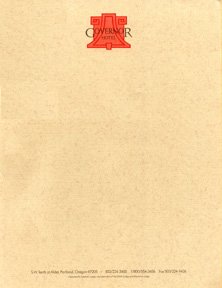
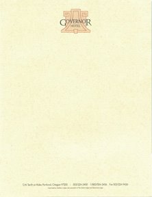
It then came time to select the final colors for the logo and printing of all materials. The hotel's interior designer stepped into the picture and basically demanded that specific colors be used. The PMS colors being suggested would compliment many of the interior elements of the hotel, but I knew they would look horrible on the printed materials. I could also see I was losing the battle and soon gave in out of frustration. My rep at the print house even shook his head when he saw the ink color selection. The stationery package was printed - in quantities of up to 10,000 pieces per item - and delivered to the hotel. The General Manager was stunned when he opened the box and saw the end result. He looked at me and said, "It looks like the Taco Bell Hotel!" (see above)

The manager recommended that all the printed materials be scrapped and the reprinting make use of the much more subtle color scheme I had originally suggested. We were able to salvage some of the letterhead stock to be used for printing the new half sheets. I grabbed a few samples of the "Taco Bell Hotel" stationery package before all the boxes were hauled off for recycling.

Lesson learned #2: When the client is wrong they may be REALLY wrong and, when you hear "silly client, you're making a huge mistake!" bouncing around inside your head, you may want to open your mouth and let your thoughts escape.

(Note: The identity project for The Governor Hotel lives on to this day in materials still used by the hotel, in the Japanese book American Hotel Identity Graphics, and in David E. Carter's volume The Big Book of Designs for Letterheads and Websites.)

© 2005 Jeff Fisher LogoMotives

Getting kicked up the design career ladder


The transition from member of an in-house design team to creative director is not always an easy one. The expectations of a staff designer moving into management, combined with the realities of the situation, can slap the newly-named boss up the both sides of the head. Writer Pat Matson Knapp takes on the topic in the HOW Magazine article Lost in Translation. In the piece, David C. Baker, principal of the design/communications management firm ReCourses, offers a five point strategy for effective leadership of the design team. Chris Gomersall, of Moxie Interactive, and some guy named Jeff Fisher also chip in with some advice.

© 2005 Jeff Fisher LogoMotives

Fresh and Inviting?

Yesterday I received my October issue of Graphic Design:usa and, with what must be the result of magazine production and mailing delays, what was old news appears to be new news again. There it is once more: Quark touting the virtues of their new identity - which, according to corporate communications director Glen Turpin is a "fresh, inviting and open" symbol representing a "q" letterform - in the news article Geometric Logo Signals Openness at Quark. The roll-out of the logo caught the attention of designers around the world, who were quick to find similar identities all over the Internet.

In late September, CreativePro.com published the piece Sometimes a Logo is Just a Logo offering their take on the situation. Watch this space for a mention of my upcoming CreativeLatitude.com column on how designers can attempt to avoid such identity problems.

By the way, Graphic Design:usa is an excellent freebie resource for industry professionals. I suggest you apply for their free subscription.

© 2005 Jeff Fisher LogoMotives

Creating a Buzz-Worthy Career

The Creative Group, the placement service for industry professionals seeking independent opportunities in the creative, advertising, marketing, web and public relations fields, offers designers a great online resource with their TCG eZine. The site includes interviews with those in design, feature stories, a career corner, information on trends and events, and a great archive of past selections. Creating a Buzz-Worthy Career is a recent interview with yours truly.

© 2005 Jeff Fisher LogoMotives