Showing posts with label Nonprofit. Show all posts

Jeff Fisher's neighborhood logo design efforts recognized at 'Celebrate North Portland' event

It's always nice to be recognized for one's work-related efforts, especially pro-bono activities in your own community - although it's never something to be expected. For me, the funny thing is that each time I've informed that I was to be publicly recognized at a neighborhood event, I've known I would miss the celebration due to traveling outside of the country. Such was the case in March 2011, while I was in on the island of St. Croix.

In late 2010, I learned that my volunteer neighborhood design efforts were to be acknowledged at a public dinner to be held on March 19th at the University of Portland. I was to be one of many residents to be honored at the event "Celebrate North Portland: Recognizing over three decades of activism in North Portland," hosted by my long-time friend and client, Mike Verbout.

Verbout, the former principal of James John School, also asked if I would create the logo to identify the dinner.

Schnitzer Steel, community activists Barbara Parmelee and Rich Recker, former Portland Mayor Vera Katz, columnist Steve Duin of The Oregonian and The Merck Family received plaques for their contributions to North Portland. Along with many businesses, organizations and individuals, I was honored to have a narrative describing my community work published in the evening's recognition book:

"Jeff Fisher, author of Identity Crisis!: 50 redesigns that transformed stale identities into successful brands (HOW Books, 2007), is the Engineer of Creative Identity for the North Portland-based firm Jeff Fisher LogoMotives. A 32-year graphic design veteran, he has been honored with over 600 regional, national and international design awards and is featured in over 140 books about logos, the design business, and small business marketing. His first book, The Savvy Designer's Guide to Success was released in 2004. Other book projects are currently in the works. He often travels – nationally and internationally – to present courses, seminars and workshops on design, branding, marketing and social networking.

In addition, Fisher is a nationally-recognized speaker, making numerous presentations each year to design organizations, design schools, universities and business groups. In 2009, Graphic Design USA magazine named Jeff Fisher one of its design industry “People to Watch.” Jeff Fisher LogoMotives is a past recipient of the Spirit of Portsmouth Award, Salvation Army’s North Portland Neighborhood Pride Award and the Portland Area Theatre Alliance B. Joe Medley Volunteer Award. Fisher is also Portland Rose Festival Character Clown Corps member Toots Caboose. Jeff and his partner, Ed Cunningham, have made Arbor Lodge their home for 15 years.

Past North Portland clients of Jeff Fisher LogoMotives have included James John School, Just Out, Peninsula Community Development Corporation, North Bank Cafe, Coyner's Auto Body, Lampros Steel, The Sentinel and DiPrima Dolci. The designer has donated his talents and abilities to create logos and other works for the North Portland Business Association, Project Safe Summer, Portsmouth Neighborhood Association, Peninsula Clean Team, Caring Community of North Portland, Kenton Neighborhood Service Center, Children's Relief Nursery, North Portland Neighborhood Services, St. Johns Window Project, Historic Kenton Firehouse Committee, The Salvation Army’s Moore Street Corps, and the North Portland Pride B.B.Q and Festival. He also designed the St. Johns street banners."

It's been a real pleasure to live and work in North Portland. I look forward to many more years of involvement in the vibrant community I call "home."

© 2011 Jeff Fisher LogoMotives

Anatomy of a logo design

Several years ago my friend, and long-time client, Anne Kilkenny contracted me to design a logo for a grass roots community effort to oppose the inclusion of a "big box" hardware store in a new development proposed for construction on the east side of Portland's Willamette River. The site, at the end of the Burnside Bridge, was within a few blocks of numerous owner-operated smaller home improvement stores. Residential neighborhoods were nearby. The construction of a large retail store could have a tremendous negative impact on local business, the quality of life for neighbors and traffic.

I had worked with this client for years - including designing the award-winning identity for the nearly 100-year-old W.C. Winks Hardware store and the logo for her Heart of the Pearl retail development in the city's Pearl District. Kilkenny didn't need to provide much initial input on the project. It's just the way we've worked together over the years. I'd read the newspaper reports of the community issue and was familiar with the area in question. She gave me the rather clever acronym for the organization and set me to work. My one directive was to create something "that might look cool on a T-shirt."

I did a couple doodles on a piece a paper and then went directly to my PowerBook to fine-tune my one and only concept for the logo (above). Recently a friend was looking at the design and said "that's a design that would look really cool on a T-shirt, but what is it?" I gave a brief explanation of the concept behind the design and then my friend commented that it was "a really cool design."

In dissecting the design (above), I explained that the squiggly blue line (A.) represented the east bank of the Willamette River and one boundary of the area being impacted. The color blue was another representation of the water. Within the logo there are four abstract human forms (B.) representing the local community activists, the small business owners, other concerned citizens, and the public officials siding with the group. Together these four human forms created a circle (C.) signifying the unity of the various groups on this emotional community issue. Together the elements also created squares (D.) representative of Portland's grid system of small commercial and residential blocks in the area. I used upper and lower case letterforms on the AFriend element (E.), an acronym for Association for Responsible Inner Eastside Neighborhood Development, to make it seem friendlier and a little more neighborly for the group going up against the big corporations (and their lawyers) and city planners in dealing with the issue. A little last minute treatment was coloring the dot over the "i" blue to symbolically remind those involved that a single drop of water in a bucket can make a difference in the end result.

I don't know if my "cool" design had much of an impact on the outcome, but the developers of the project did end up going back to the drawing board to remove the "big box" retailers from their architectural plans.

The AFriend logo appears in The Big Book of Logos 5 and 100s Visual Logos & Letterheads (UK).

© 2010 Jeff Fisher LogoMotives

Re-Design: Childpeace Montessori Community

In 1999 I was contracted to create a new identity for the Childpeace Montessori Community. The existing geometric logo seemed somewhat cold and impersonal in representing the education facility. I was asked to design an image that was softer, more inviting and played upon the school location on Portland's North Park Blocks.

With the school and its playground equipment so connected to the treed city park location, I chose to make leaves the primary graphic element in the design. A trio of elm leaves was positioned over the word "Childpeace," creating a situation where the descender of the "p" letterform hinted at being part of a tree branch. By extending that descender a bit, space was made available for the words "Montessori" and "Community" to fit in easily, forming a tight identity for the facility.

Making use of a gradation in the leaf elements gave the image a sense of warmth and energy. However, for ease of reproduction in some applications the logo was also produced in a version with solid leaves.

The Childpeace Montessori Community identity received a 2000 American Graphic Design Award.

With a move to a new location in the summer of 2003, and adoption of the name Childpeace Montessori School, the short-lived logo was retired.

(Note: My book, Identity Crisis!: 50 Redesigns That Transformed Stale Identities Into Successful Brands, contains case studies from 35 designers and firms located around the world. Learn more about the book on the Identity Crisis! blog.)

© 2008 Jeff Fisher LogoMotives.

Re-Design: B.A.S.I.C.

In the early 1990's. my very first design project for the Portland Trail Blazers was the re-design of the identity for the Blazer/Avia Scholastic Improvement Concepts program, commonly referred to as B.A.S.I.C. Blazer Clyde Drexler was chairman of the effort, a statewide literacy project sponsored by the Trail Blazers, Avia and - at that time - Seafirst Bank. The program offered hands-on help for children to improve their academic achievement.

The logo I was asked to improve upon (below left) was a confusing conglomeration of a book, the Blazers icon, the Avia logo with tagline, the Blazers logotype and the text spelling out the B.A.S.I.C. name - all within a circle. Then the Seafirst Bank identity was dropped in below to add to the sensory overload.

I was very pleased with my simplified treatment for the identity (above center). The design was primarily made of up collegiate looking letterforms that I had drawn myself to give them a kid-friendly appearance that would appeal to the young target audience. I replaced the "I" with a stylized human figure reading a book - after all, this was a literacy program. What most kids zeroed in on immediately was that the figure was wearing athletic shoes. Across the bottom of the illustration was the name of the organization in simple and tasteful type - with the word "Blazers" plural.

Everybody loved the design - and then it was time to stick in the Blazers' fancy schmancy, new slanted icon and type treatment - and the Avia logo (thankfully without the tagline) - and the Bank of America identity (above right). Suddenly, my clean and simple design didn't appear so clean and simple. When major corporate sponsors want their logo bigger within a design, you make the logo bigger. However, I do think it was still an improvement over the design used previously.

(Note: My book, Identity Crisis!: 50 Redesigns That Transformed Stale Identities Into Successful Brands, contains case studies from 35 designers and firms located around the world. Learn more about the book on the Identity Crisis! blog.)

© 2008 Jeff Fisher LogoMotives

Design studio housecleaning - excavated artifact #17

This past week I received the latest issue of Flying House Magazine, the current publication of the Seattle Men's Chorus and Seattle Women's Chorus. An article in the magazine reminded readers that the 2009-2010 will mark the 30th anniversary of the Seattle Men's Chorus (SMC). I'm pleased to have been part of the graphic history of the SMC for quite a few years and recently, as I continue to archive my 30 years of project elements, I came across a large file of design concepts for the group.

As mentioned in a previous "excavated artifact" entry, I once shared office space in Seattle with the performing arts organization. Back in 1987, one of the first projects I executed for the Chorus was an identity.

In my old project files I found a number of black felt pen concepts, sketched on sheets of typing paper, for what would become the Seattle Men's Chorus logo. My first doodle included a little black bow tie as a design element over the "M" in a "SMC" representation. As is the case in about 80-85% of my logo design projects, this initial "brain fart" would remain a constant throughout much of the logo creation process and end up playing a major role in the final image.

Some other rough concepts (above) included an image of a man in a tuxedo (which I would incorporate into a future season ticket brochure design for the SMC), a bolder treatment of the SMC/bow tie idea, and a silhouette of a conductor using the Space Needle as a baton. Additional ideas (below) included more Space Needle imagery, an elegant intertwined monogram image, a clef note flipped to represent the "S" letterform, and an emerald-shaped border (a reference to Seattle's "Emerald City" nickname and the gay community's attachment to the film The Wizard of Oz).

With an office staff, good-sized Board of Directors and large membership of singers, this project could have become a "design by committee" nightmare. However, I worked one-on-one with the SMC marketing director, who seemed to steer the project effortlessly through the process by submitting a very limited number of concepts to decision-makers. In my files I found his own feedback in the form of a doodle suggesting that my heavy "SMC" image, with the bow tie, be incorporated within an emerald shaped border. The result, hand-drawn in the pre-computer time - with spray glued typesetting dropped into place, was finalized as the logo for the Seattle Men's Chorus (below).

The identity was very successful in one color (sometimes black; sometimes emerald green), as a metallic foil image, foil-stamped in gold on some items and in a variety of treatments on wearables. It served the Seattle Men's Chorus well until the organization was rebranded by the Phinney/Bischoff Design House in 2005 - nearly two decades later.

My association with SMC continued through the early 1990's; even after I had moved back to Portland. During that time I designed several season ticket brochures, designed and produced numerous event programs, created print ads and invitations, did design work for the international GALA Choruses Festival when held in Seattle, and much more.

I also created a number of additional identities for SMC (above). A logo was produced to represent the major donors' organization, the Seattle Men's Chorus Director's Circle. I designed the initial SMC donor publication, Chorus Quarterly, and its identity. As SMC moved into publishing of programs for other performing arts organizations, I adapted the organization logo to brand its new Emerald City Arts department. My favorite has always been the identity for Philandros, a sub-group of the Seattle Men's Chorus.

I always look back on my work with SMC fondly. It was an incredible opportunity to work with a dynamic arts organization and all the wonderful people involved.

© 2008 Jeff Fisher LogoMotives

Toot! Toot!*:

Jeff Fisher LogoMotives honored with three

2007 American Graphic Design Awards

Jeff Fisher, the Engineer of Creative Identity for the Portland firm Jeff Fisher LogoMotives has received three 2007 American Graphic Design Awards for his identity design efforts. Over the past decade Fisher has been honored with 18 of the awards in the annual national competition coordinated by the trade publication Graphic Design: usa and sponsored by Adobe Systems Incorporated.

The logo for the Portland delicatessen Balaboosta was selected for an award. The eating establishment has since been renovated by the owner and re-opened under a new name.

The identity for the Native Youth Internship Program, of the Holland+ Knight Charitable Foundation, was also recognized. The intern and scholarship program, for Native high school students, was initiated by the designer's partner Ed Cunningham, Business Manager of the national law firm's Portland office. The Holland+Knight Charitable Foundation is headquartered in Tampa, FL.

Fisher's logo design for the AIDS residential care facility Our House of Portland was also honored. The new identity was introduced in conjunction with the grand opening of the organization's new facility this past year.

Jeff Fisher has received over 575 regional, national and international graphic design awards for his logo and corporate identity efforts. His work is featured in nearly 100 books on the design of logos, the business of graphic design, and small business marketing.

Fisher is a member of the HOW Magazine Editorial Advisory Board, the HOW Design Conference Advisory Council and the UCDA Designer Magazine Editorial Advisory Board. His first book, The Savvy Designer’s Guide to Success, was released by HOW Design Books in late 2004. His new volume, Identity Crisis!, will be on bookshelves in October 2007.

(* If I don’t "toot!" my own horn, no one else will.)

© 2007 Jeff Fisher LogoMotives

Theatre Logos Agency gives designer

theatrical images a new high-profile life

Throughout my career, the logo designs I have been asked to create for live theatre presentations have been my favorite creative exercises. From designing for my high school's theatre performances (over 30 years ago), through an on-going 17-year relationship with playwright, director and producer Don Horn and his triangle productions! theatre company, the opportunity to put a graphic face on plays and musicals has never failed to get my creative juices flowing. I previously wrote about topic in my Logo Notions article The logo’s the thing – identity design takes the stage, on the Creative Latitude website.

One of the unique aspects of creating identities for live theatre is that the logos often have a lifespan as short as the run of the show - usually a few weeks or, at the most, a few months. Luckily, from being recognized with design industry honors or being published in various graphic design books, many of my theatre graphic images have experienced some longevity.

The Theatre Logos Agency is giving new life to the work many designers have created for live theatre, through the sublicensing of the designs to other theatre companies.


Just over a week ago, I was contacted by Michael Q. Fellmeth, the founder of Theatre Logos Agency (TLA), after he read the Logo Notions article mentioned above. Fellmeth expressed interest in taking on Jeff Fisher LogoMotives as a client for the sublicensing of some of the theatre logos I have produced over time. After doing some reseach, getting the blessing of my client, and reviewing the agreement sent to me by TLA, I have opted to enter into a business relationship with TLA.

Theatre Logos Agency was founded in 2006. This past month the company "officially" opened with their web presence going live, and it's a valuable resource for designers interested in participating in the effort - in addition to being a great destination for the theatre production company seeking high quality designs to promote productions. In defining TLA, the following is posted on the website:

"Theatre Logos Agency (TLA) was established to service the growing demand from producing organizations for high-quality artwork. Prior to the formation of TLA, no central clearinghouse existed for the rights to use original artwork from Broadway, Off-Broadway, West End, and regional productions. TLA is pleased to bring together our clients' artwork with producing organizations that can utilize it in the promotion of their productions. TLA associates, made up of experienced theatrical-licensing professionals, are ready to service both the needs of our clients and producing organizations."

TLA has selected a number of my designs to include in the offerings to theatre production companies. Some of my favorite images (above) are among those to be presented for licensing. The theatrical logos have served my client, and myself, well in the past.

A few of the chosen logos have been recognized with awards from the PRINT Regional Design Annual, American Graphic Design Awards and Summit Creative Awards. The theatre logos have also been featured in the books New Logo & Trademark Design (Japan), The New Big Book of Logos, The Big Book of Logos 3, and The Big Book of Logos 4. Letterhead and Logo Design 7, Graphically Speaking, LogoLounge - Volume 1, Logo & Trademark Collection (Japan), and New Logo: Two (Singapore) have also showcased some of the designs.

It will be fascinating to see if the images are given even greater exposure through the efforts of TLA. I encourage other designers, who have created logos and other promotional materials for live theatre productions, to take a look at what the Theatre Logos Agency has to offer.

© 2007 Jeff Fisher LogoMotives

Re-Design: Holocaust Remembrance Project

The Holocaust Remembrance Project is a program of the Holland+Knight Charitable Foundation, Inc - the charitable giving organization of the Holland+Knight law firm. The project is a national essay contest for high school students that is designed to encourage and promote the study of the Holocaust. Participation in the activity encourages students to think responsibly, be aware of world conditions that undermine human dignity, and make decisions that promote the respect and value inherent in every person. The project serves as a living memorial to the millions of innocent victims of the Holocaust.

The existing identity for the Holocaust Remembrance Project seemed depressing, dark and oppressive to me - especially when printed on a dark gray T-shirt given to student participants and essay judges. While those descriptive qualities may apply to that particular period of history, I felt the project identity should be celebrating those who have overcome the negatives of the Holocaust to inspire others to live exemplary lives.

The Holocaust impacted a wide variety of people, not just those of the Jewish faith. The triangle-shaped uniform badges assigned to those in the concentration camps were color-coded to identify the individuals. The color codes were:

• Red: Political prisoners - including Poles, Czechs and members of the Armed Forces

• Green: Those considered to be criminals

• Blue: Emigrants

• Yellow: Jews (two triangles were overlapped to form the Star of David)

• Purple: Jehovah’s Witnesses

• Pink: Gay males

• Black: Vagrants, gypsies, and “anti-social” women (lesbians, prostitutes, women using birth control)

In my initial mental design concept, I felt that those impacted by the Holocaust should take "ownership" of those negative identitifying triangle symbols. I inverted the geometric shapes to point to the sky and form colorful rays of a strong, positive sun image. The result is a graphic identity that has been given a sense of light, while making use of the representative colors and projecting an image of honor and respect in regards to the issue of the Holocaust.

The logo is the third in a series I have created for the Holland+Knight Charitable Foundation. The first was the identity for the Young Native Writers Essay Contest, a project I wrote about in an earlier bLog-oMotives entry. The second identifies the Native Youth Internship Program, initiated in the law firm's Portland office Business Manager, my partner Ed Cunningham.

© 2007 Jeff Fisher LogoMotives

Toot! Toot!*:

Jeff Fisher LogoMotives recognized by

American Corporate Identity 23 awards

The Portland graphic design firm Jeff Fisher LogoMotives has been honored with two awards in the American Corporate Identity 23 design competition. The winning entries will be featured in David E. Carter's book, American Corporate Identity 2008, to be released later this year. Designer Jeff Fisher has received 27 of the ACI honors over the past 10 years.

The logo for the North Portland Pride BBQ and Festival, sponsored by the University Park United Methodist Church, was one of the images honored. The annual summer event, promoting the diversity and inclusivity of both the church congregation and North Portland neighborhood, is represented by a traditional picnic graphic - including ants. The identity for the Emerge Medical Spa at Bridgeport in Tigard OR, with a dragonfly icon centerpiece, was also recognized.

Recently both logos also received LOGO 2007 awards and, as a result, will be featured in the upcoming book The Big Book of Logos 5. In addition, the two designs will be included in the future logo book Branded, from United Kingdom publisher Début Publications Ltd.

Jeff Fisher has received nearly 550 regional, national and international graphic design awards for his logo and corporate identity efforts. His work is featured in more than 85 books on the design of logos, the business of graphic design, and small business marketing.

Fisher is a member of the HOW Magazine Editorial Advisory Board, the HOW Design Conference Advisory Council and the UCDA Designer Magazine Editorial Advisory Board. His first book, The Savvy Designer's Guide to Success, was released by HOW Design Books in late 2004. His new volume, Identity Crisis!, will be on bookshelves in late 2007.

(* If I don't "toot!" my own horn, no one else will.)

© 2007 Jeff Fisher LogoMotives

Design studio housecleaning - excavated artifact #8

I am continuing to sort through and archive over 30 years of design projects as I organize my home studio. It amazes me how much concept and process documentation I have filed away over the years. I seems a possible book on my 30+ years is evolving as I find more such materials all the time - and I haven't even started converting years of floppy disks to more stable archival vehicles.

Recently I came across the original planning meeting notes for a 1995 AIDS organization fundraising event to be called "Coffee Cares." The sheet of notebook paper listed a variety of possible event names and taglines. As the meeting progressed I scribbled out a possible logo design in ball point pen - based in part on the design of my own previous logo design for the Seattle restaurant Glo's Broiler. By the time the meeting was adjourned the event identity was created in my mind and on my page of notes.

My rough sketch included a roughed out intrepretation of the font Frankfurter Highlight for that retro cafe look, a checkerboard pattern above and below the event name, a space for the yet-to-be-determined tagline and steam coming off the coffee cup in the form of the AIDS ribbon.

Within a day my final logo concept was created, presented and accepted by the event planners. Little changed from the original scribble. I did drop the checkerboard pattern above "Coffee Cares" and the space reserved for the tagline was moved from the left to the right - now filled with the message "Baristas, bakeries & bistros supporting people with AIDS."

The image was very successful in drawing attention to the city-wide event in Portland and the fundraiser added to the coffers of local AIDS organizations. The logo was also featured in the books Restaurant Graphics 2, Typography and Blue is Hot,Red is Cool: Choosing the Right Color for Your Logo.

Note: In previous bLog-oMotives entries I took a look back at excavated artifacts 1, 2, 3, 4, 5, 6, and 7.

© 2007 Jeff Fisher LogoMotives

Logo competition upsets local graphic designers

I was pleased to read of the position being taken by 11 graphic designers in Cleveland in response to the Cleveland Foundation conducting a "contest" to select a new logo. HOW Design Forum member "dougler" brought the article Logo competition upsets local graphic designers to the attention of forum visitors earlier today.

I think many in the design industry have reached a point of "we're mad as hell and not going to take it anymore" in regards to calls for speculative work being masked as "contests." The NO!SPEC movement was launched for the purpose of taking on the issue of graphic design industry "spec" work. Some argue that "spec" requests have always existed in the design industry. That doesn't mean such situations are acceptable or should continue.

The letter written by the designers to The Plain Dealer newspaper, and the follow-up article, are a welcome addition to the ongoing design industry effort to educate businesses, organizations, other designers and the general public about the value of professional graphic design and the processes that may help any design client get the best end result. My previous well-circulated article and bLog-oMotives post, When a "contest" is not a contest, and efforts such as the Graphic Artists Guild's published Suggested Guidelines for Art Competitions and Contests, also are part of that education process.

I seriously doubt that the Cleveland Foundation intended, or expected, to find themselves in the middle of a controversy when announcing the organization's logo design contest. Perhaps the "contest" should have been researched further before putting the specifications out to the public. The newspaper article comments of James Lubetkin, senior communications editor at the foundation, suggest that the organization does have a sensitivity to the situation - after the fact.

I've been involved in situations in the past where an entity seeking a new identity has initially reviewed a great many portfolios. From reviewing past work, a few designers/firms are selected to submit presentations. Those design professionals are compensated with "x" number of dollars for the time spent in preparing and presenting proposals. The business, agency or organization then bases their hiring decision on those presented ideas. I appreciate the search process being conducted in such a manner. As a designer, it conveys to me that the potential client understands the value of the professional graphic design process and the results.

Congratulations to the "Cleveland 11" for putting a public spotlight on the issue.

© Jeff Fisher LogoMotives

Design studio housecleaning - excavated artifact #7

I'm continuing the ongoing process of going through 30+ years of files as I organize and catalog all my old graphic design files. Numerous times I have opened a folder or envelope to find an original doodle of what would eventually become a completed logo for a client.

In 1995 I sketched out a rough concept for a pro bono logo for the Portland nonprofit organization Esther's Pantry. Esther’s Pantry was founded in 1985 to provide individuals living with AIDS access to food and personal care items they themselves might not be able to afford. The organization was named in memory of Chester "Esther" Brinker, one of the first people in Portland to die of complications from AIDS.

Still, my take on "Esther" was meant to cause people to smile through the suffering and pain of the continuing AIDS crisis. I saw Esther as a bit of a "flasher," opening her jacket to reveal what was on the shelves of the "pantry." The female character in the design is actually a fairly good graphic representation of my late great-grandmother Osie Saltmarsh Cantrall Norris - a Southern Oregon pioneer and one of the most incredible people in my life.

In March 2000, the pantry transferred its operation to MCC Portland (I designed their logo in 1995 as well) and I was asked to redesign the logo as a grocery bag image that I never liked much. In fact, I've never even included that design in my portfolio. It was determined that my "Esther" - used in a limited fashion for a while - was a bit glib and possibly controversial.

I was very pleased when my Esther's Pantry logo was honored in the 1995 PRINT Regional Design Annual. I still smile each time I come across the image - and I'm sure that great-grandma gets a kick out of it, too.

It's great that Esther's Pantry continues on - with, it appears, an even newer logo. Each month 150 to 200 clients are allowed to select their groceries and personal care items from well-stocked shelves, rather than being handed a pre-packed box of food.

Note: In previous bLog-oMotives entries I took a look back at excavated artifacts 1, 2, 3, 4, 5 and 6.

© 2006 Jeff Fisher LogoMotives

Milton Glaser creates Darfur poster

"What Happens in Darfur Happens to Us” is the theme of a poster recently created by legendary designer Milton Glaser. This awareness campaign will benefit the International Rescue Committee, driving people to the IRC website to learn more about Darfur, the work of the IRC around the world, and how to support the organization in efforts to deliver lifesaving aid, protect women and girls, and speak out for global action on behalf of the Sudanese people.

Glaser created the campaign to call attention to what he describes as “one of the great humanitarian crises of our time.” The poster concept takes the seemingly distant crisis and personalizes it, relating Sudanese family members being killed every day to members of our own families. The design incorporates the hand imagery from Glaser's previous "We Are All African" poster which brought conditions in Africa, and world poverty issues, into the public spotlight.

Milton Glaser is among the most celebrated graphic designers in the world. He co-founded the revolutionary Pushpin Studios in 1954, founded New York Magazine with Clay Felker in 1968, established Milton Glaser, Inc. in 1974, and teamed with Walter Bernard in 1983 to form the publication design firm WBMG. Throughout his career, Glaser has been a prolific creator of posters and prints and produced iconic designs, such as the famed “I Love NY.” The industry icon is also the author of Graphic Design and Art is Work, and co-author of The Design of Dissent.

Funded by School of Visual Arts (SVA), where Glaser has been an instructor and board member since 1961, the poster campaign currently appears on a 28 x 38 foot banner outside the SVA headquarters in New York City. It will also be present on subway platforms and the insides of 250 subway cars throughout January.

The Darfur poster can be purchased at www.miltonglaser.com. All proceeds from the sales go directly to the International Rescue Committee.

UCDA designer poster auction under way on eBay

The University & College Designers Association (UCDA) is currently conducting an eBay auction of designer posters. Most of the posters are signed by the designer. All proceeds from the auction will benefit the UCDA Foundation which supports scholarships and programming and helps elevate the image of designers and design educators in education.

The current auction items include:

Spring Poster (signed), by Michael Manwaring

Summer Poster (signed), by Michael Manwaring

Winter Poster (signed), by Michael Manwaring

Wolfgang Weingart: Misc. Thoughts on Typography Poster (signed), by Chris Pullman

Wine Graphics Letterpress Poster (signed), by Mo Lebowitz

Earth Day 1990 Poster (signed), by Seymour Chwast

Mountain Laurels Poster (signed), by Lanny Sommese

Seasons Greetings Double-sided Vintage Postcard Poster (signed), by Deborah Sussman

Ohio Arts Council Grants in Design Arts Poster (signed), by Gordon Salchow

Fish Gulfstream Poster, Savage Design Group; Illustration by: Jack Unruh

Cooperstown Chamber Music Festival 2006 Poster, by Milton Glaser

Holocaust Museum Poster (Ten Years: Remembrance.), by Milton Glaser

Illustration: Mountain Laurels Poster, by Lanny Sommese

(Hey, they may have spelled my last name wrong - but I'm thrilled that UnBeige picked this entry up and mentioned it in their graphic design category on Monday. Hopefully more creative types will participate in the bidding.)

© 2006 Jeff Fisher LogoMotives

World AIDS Day 2006:

A day of reflection and a call to action


Just over 25 years ago a small article in The New York Times reported the outbreak of a rare "cancer" among 41 gay men in New York and California. No one could have predicted the impact that news item would eventually have on the world.

Today, an estimated 22-25 million men, women and children have died of AIDS or AIDS-related illnesses, and an estimated 40 million individuals are living with HIV. AIDS impacts people of all ethnicities, ages, genders and sexual orientations. AIDS is devasting generations in Africa. The United Nations AIDS agency estimates that India has the largest caseload for a single country with 5.7 million individuals infected with HIV. AIDS continues to impact Americans in huge numbers.

World AIDS Day, December 1st, is a time for all people worldwide to unite in the ongoing fight against AIDS. It is up to all of us to stop the spread of HIV - and prejudice - through education, prevention programs, assisting in the care of those with HIV/AIDS, and doing what we can to help find a cure. World AIDS Day also offers a time to reflect on the personal impact of AIDS in our lives.

In December 1985 I got the news that one of my best friends had AIDS - one of the earliest cases in Oregon. Still, I was not prepared for what was to come. Over the next decade so many people I knew died of AIDS, including my college roommate, a fraternity brother, teachers, friends, clients, vendors, neighbors, other roommates, a distant cousin and others. I literally lost count as the number of people I personally knew who died from AIDS neared 100. My cousin, promising playwright and director Bradford O'Neil, was HIV-positive and committed suicide after caring for his partner until his death. This past year my best friend, Brad Hall, - who was diagnosed HIV-positive many years ago - died from what had extended his life. The "cocktail" of medications he'd taken for quite some time destroyed his liver and he did not live to get a proposed transplant. I've thought about many of these individuals with recent AIDS, and World AIDS Day, news.

As "creative types" - designers, photographers, writers and others - we are in a unique position to take action in the ongoing battle against AIDS. It's hard to believe that it has been 20 years since I first started doing design work related to HIV and AIDS. The projects have included logos for AIDS Walks, fundraising events, AIDS organizations, theatrical presentations about AIDS, a food bank for people with HIV, hospices and related clients. I've also created posters, newsletters, banners, ads, education booklets and other collateral items used in informing the public about the prevention of AIDS and the care of those with HIV.

I encourage - or challenge - others in the creative professions to do the same. Contact your local AIDS organizations, health departments, hospices and related groups to offer your services as a designer, photographer, writer, or even as person with some time to donate in providing any service needed.

The following resources may be helpful in locating organizations needing your assistance:

amFARKnowHIVAIDS.orgMTV/Staying AliveUNAIDSBill & Melinda Gates FoundationClinton Foundation HIV/AIDS InitiativeThe Elizabeth Glaser Pediatric AIDS FoundationDesigners Without BordersONEWe All Have AIDSWorldAIDSDay.orgBroadway Cares/Equity Fights AIDSDoctors Without BordersGuideStarDesign for Social ImpactAIDS Healthcare Foundation

© 2006 Jeff Fisher LogoMotives

Design studio housecleaning - excavated artifact #6

In his recent Right Brain Reader piece, Away from the sketch pad; away from the struggle, Philip Bailey mentioned the logo I had designed for the theatrical production Fat Men in Skirts. Having done the logo about a decade ago, I had not thought about the image in some time - and then the other day I came across my original sketch for the identity on a scrap of laser paper that I had filed away.

I've been designing logos for triangle productions! theatre presentations for over 16 years. Producer/director Don Horn has been a dream client. He'll throw some odd play or musical name my way and leave me alone to create the identity for the show. He seldom even requests any changes in the designs. In this case, the production was to be playwright Nicky Silver's show Fat Men in Skirts.

I almost immediately had an image for the logo in my mind - kind of a cross between a middle-aged thick manly man and someone's pleasantly plump grandmother - with curly black chest hair. I quickly sketched out a rough design and then proceeded to take the image to the computer. In my digital design I wanted to maintain some of the qualities of the rough drawing - without giving the "fat man" too much detail.

The show was yet another successful local theatre production. My logo design had some success as well. It was recognized by the PRINT's Regional Design Annual at the time and was published in the Japanese design book New Logo & Trademark Design - which was recently republished in paperback as Logo and Trademark Collection.

My latest assignment: Create the logo for Tonya & Nancy: The Opera (Yes, that Tonya and Nancy!).

© 2006 Jeff Fisher LogoMotives

Cultural considerations in designing the

Young Native Writer's Essay Contest logo

I recently was asked to design a logo for the Young Native Writers' Essay Contest sponsored by the Holland + Knight Charitable Foundation. The foundation, funded through contributions from the Holland + Knight law firm, its attorneys and staff - as well as external sources - underwrites a variety of education-related programs. One of those programs is the Young Native Writers' Essay Contest, which is designed to inspire honest portrayals of the richness of Native American life and history. In 2006 the writing contest was dedicated to Native American high school students within the Red Lake community in the state of Minnesota. Expansion into additional Native American communities is slated for the 2006-2007 school year.

With the upcoming expansion into other Native American communities came the desire to create an identity for the program that would convey a graphic message not limited to one Native American nation. Symbols and graphic elements specific to any one tribe would not work. My immediate thought was to incorporate an eagle feather into the design as a writing pen. Still, I wanted to know if such a graphic would be appropriate.

My friend Myra Donnelley, a Portland playwright and one of my Thursday morning "koffee klatch" buddies, works with the local Native American Youth & Family Center and the Young Native Playwrights Project. I thought she'd be able to provide some great resources.

One email to Myra put me into contact with the incredible Jeanne Givens. She's a member of the Native American Stewardship Council at the Autry National Center, Chairperson for the Institute of American Indian Arts (IAIA) in New Mexico, and a member of the Coeur d'Alene Tribe. We had a great visit and she did confirm that my idea of the eagle feather would be appropriate and non-offensive to all tribes. She did mention that the feather should be shown horizontally - which I had already planned. It was recommended that I not incorporate any other Native symbolism into the design to make it as all-inclusive as possible.

The eagle feather conveys many symbolic messages. Being half black and half white, it projects graphic imagery of daylight and darkness, peace and war, and summer and winter. Such feathers symbolize trust, honor, strength, wisdom, power, freedom and a closeness to the heavens. The symbol also conveys good luck to both the giver and receiver. The powerful image of the eagle feather is used in many ceremonial rites, and for healing purposes, by many tribes. For those reasons and more, the eagle feather seemed like the perfect graphic to represent a writing program for Native youth writing about their heritage.

A simplified eagle feather image (exhibited as a writing pen) was combined with the font Ashwood Condensed, from The Walden Font Co., and the existing foundation identity to create the logo. The earthy color was adopted from the H+K corporate color palette and I selected the purple to project the additional qualities of creativity, richness, fun, mysticism and mystery.

I sent the final design off to Angela Ruth, Executive Director of the H+K Charitable Foundation, and received a quick response that she, the Marketing Materials Manager, and others within the organization "loved it!" With the approval of the group's Native lawyer the logo was a "go." The image will be used on T-shirts for essay contest participants and on marketing/promotion materials for future years.

© 2006 Jeff Fisher LogoMotives

Re-Design: North Portland Business Association

The re-design of identities has been a common bLog-oMotives topic. Last fall I made my thoughts known on the new Quark image - or at least the old, new Quark identity (it has since been re-designed again). Earlier this year Fortune Magazine published my thoughts on several new major corporate identities. I've also posted entries about my new interpretations of the logos for the publication Just Out and Seattle's Laugh Lover's Ball, in addition to the recent facelift for the AIDS residential care facility Our House of Portland.

Re-designing a business or organization identity can be a challenging process. In addition to attempting to produce a strong new graphic symbol for the entity, it is necessary to take the possible emotional attachment to a prior image into consideration. Adding the design-by-committee aspect of working with a nonprofit organization, or large corporation, to the mix can make such a job much more complicated. My local neighborhood business association was a dream client when it came to considering a new logo. There was little vested interest in the previous identity and the decision makers of the group were quick, clear and concise in selecting a design to represent their efforts.

The original identity for the North Portland Business Association (above) was a simple and amateur graphic representation of the acronym NPBA. It was usually only evident in the flag of the organization’s monthly newsletter.

The new logo, which reproduces well in one or two colors, projects images symbolic of the North Portland business neighborhood – simplified illustrations of the St. Johns Bridge, the Fremont Bridge and the blue herons that are native to the area. By not conveying images specific to certain industries or businesses of the region, the logo successfully represents all business entities in North Portland. The identity is used on decals for member business, signage for events, the newsletter and membership marketing materials and gives the organization a polished, professional image in the community.

The new North Portland Business Association identity appeared in the recently released Spanish book Logos; From North to South America.

You will find additional examples of identity, web and print redesigns on the Creative Latitude site, in a section called GRAPHIC makeovers. Designer Alina Hagen contributes her observations to the submitted design projects. Quite a few of my own redesign efforts are posted at "GRAPHIC makeovers." Creative Latitude is always looking for other before and after design examples to display on the web site - do consider submitting some of your own efforts.

© 2006 Jeff Fisher LogoMotives

Our House of Portland opens new facility

with unveiling of fresh graphic identity

In my previous bLog-oMotives entry, Designing pro bono efforts for "win-win" results, I mentioned a client relationship with an AIDS residential care facility that began with donated design services. That client was Our House of Portland. Kimberly Webster (now Waters), a previous client of mine, had become Development Director for the nonprofit organization in 1994. In doing a graphics inventory for the group, Webster found there were no existing digital files for the Our House logo being used at the time. She asked if I could clean up the logo and create the digital imagery (above). Her request was the beginning of a long-term relationship with Our House.

Over the next few years I designed a great deal for the facility. My efforts included the design of many logos for Our House fundraising events and internal programs, T-shirt graphics, stationery packages, print ads, invitations, direct mail pieces, banners, annual reports, the organization newsletter and many more development and marketing materials (below).

Webster moved on to other career opportunities in Seattle. My working relationship with Our House continued. In the late 90's a redesign of the organization's identity was proposed. I invested a great deal of time in creating and presenting possible new logos based on feedback from staff, volunteers and others. As is often the case in logo redesign projects - especially with nonprofit organizations - one of the greatest challenges was to get beyond the emotional attachment to the old logo design and the question of why it was necessary at all to change things from "they way they have always been." The frustration of organization personnel and myself (especially as it was being done pro bono) resulted in the new logo project never being completed. It was also time for me to re-evaluate my five-year relationship with the organization, and I decided to move on to possible relationships with other nonprofits - primarily in my own new neighborhood of North Portland.

In late May of this year, out of the blue, I received an email from John Oules, an individual I had known for quite a few years in his roles of actor, director and producer of local performing arts events. Oules informed me he was the new Marketing Director of Our House of Portland. His email was a request for any information I might have on the history of the Our House logo. A new identity had been instituted recently (above), incorporating a complicated, multi-colored graphic of a circle of people, and those required to use the image were running into many reproduction difficulties. Oules was interested in the possibility of revisiting and updating the original logo for the organization. Our House was nearing completion of a new building, on the location of the previous facility, and he felt it might be an appropriate time to put a new identity in place.

In my initial meeting with Oules, and new Development Director Sally Dadmun Bixby, their hopes for the new identity were conveyed. The identity needed to hint at the old logo, while being more contemporary and cleaner. No longer the grassroots organization founded in 1988, Our House needed to project a more polished and professional image. The font "City of" (based on the type used by the Union Pacific Railroad and created by RailFonts) had already been selected for use on the new building's signage and the lobby donor board. I was asked to consider using the font for the new identity to give the image the contemporary look of the new structure, interiors and other elements of the project. A new Our House tagline, "Inspiring People with HIV/AIDS to Live Well," was another element I was to possibily include in the new logo. I was provided the color palette of the the interior design firm and painting contractor as an additional reference.

I visited the nearly complete construction site to photograph the facade and roofline of the new building. With an immediate visual image of the icon in my head, I returned to my home studio and created three variations of logo concepts. Two were stacked versions of the required elements and one was a horizontal treatment - and the logo was basically designed. The almost immediate response from Oules was "Awesome job. We love the logo!" From Dadmun Bixby came "I am thrilled at how you took what we envisioned and turned it into the logo!"

Staff, volunteers and others were a bit more hesitant in accepting the new image - as I had predicted earlier in the process. That emotional attachment to the original logo was strong and some were concerned about losing the "warm and fuzzy" feeling associated with the original design. One staff member relayed to me that when she initially saw the design in black and white she felt it was a little "cold." As soon as she was shown the logo in chocolate brown and the green of the exterior paint she really liked the image.

It was decided that using the logo in one of the more vertical formats, and also making use of the horizontal version, (above) might best serve the needs of the organization. With days to go before the grand opening of the new home of Our House, embroidered shirts for the staff and volunteers, fridge magnets, banners and some additional signage were ordered.

Yesterday, under sunny skies, the new building was opened to the public for viewing. It's a beautiful and functional space for the facilities' residents, visitors and the administration staff. The new logo was introduced to the public with a banner in front of the building (flanked by balloons provided by friend/long-time client Ron Pitt of Balloons on Broadway). Hundreds of people toured the new building, guided by staff wearing their color-coordinated shirts embroidered with the logo. I received many compliments on the new identity. The best came from Development Director Dadmun Bixby, when she said "You nailed it!"

Now, the process of a complete branding will begin.

© 2006 Jeff Fisher LogoMotives

Designing pro bono projects for "win-win" results

It can happen to almost any "creative type" on a daily or weekly basis. When you least expect it you are asked to produce a project for a nonprofit client - for free! Your response to the request may depend on a variety of issues. Often you will react emotionally with an immediate "out of the goodness of your heart" positive answer. However, when it comes right down to the nitty-gritty, the decision may be based on the age-old question: "What's in it for me?" Rather than being posed as a selfish self-query, the question is a matter of determining if one has the time (and energy) to take on such efforts - and a review of how pro bono projects can benefit both parties.

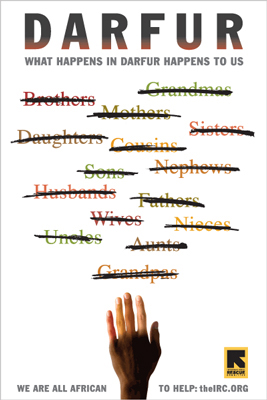
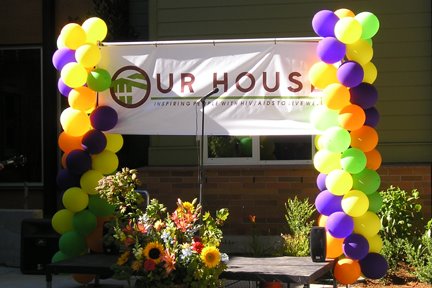
Given that you have the time and desire to assist a nonprofit in their marketing and promotion efforts, you need to establish the personal value and rewards of doing such work. I have determined that to do my best work for such a group I require a passion for their cause. With the large number of requests I received for pro bono work I also realized I needed to create some personal guidelines in regards to donated time. I now only consider donating my services if the project is related to education, smaller nonprofit performing arts groups, children's causes, or specific issues in which I have a strong personal interest. For example, I have designed graphics for AIDS organizations and events since 1985. I will also only take on a limited number of pro bono projects in any one calendar year.

Unfortunately, our friends at the Internal Revenue Service don't see a great deal of value in the gifting of time, talent or services. The Internal Revenue Service states: "Contributions you cannot deduct at all include the value of your time or services. Although you cannot deduct the value of your time or services, you can deduct the expenses you incur while donating your services to a qualified organization.

Even so, there are tremendous profits and benefits (above and beyond those warm, fuzzy feelings) in donating your services to nonprofit organizations.

Taking (or getting) credit for your efforts
Doing creative work for a local nonprofit organization can be a great way to promote your talents and abilities. For the student or newbie designer, doing pro bono work may be a great way to beef up a portfolio with some "real world" design work. I actually look at such projects as part of the marketing plan for my business.

When a nonprofit asks you to donate services, don't be shy about asking for credit in return for your efforts. This may simply be a credit line on a photograph or graphic; or a byline on an article you have written. It may be in the form of an acknowledgement in the program for an event or a mention in the group's newsletter. You may want to receive a verbal "thank you" from the organization at one of their public gatherings or dinners.

If the nonprofit has a membership directory, newsletter or event program, an appropriate expression of their appreciation might be a print ad in the publication. A link from the client's web page to your own can be a very profitable gesture. If the organization is of personal interest a complimentary membership, or admission to an event, is often a welcome gift.

Completing a donated project for a nonprofit organization is the perfect opportunity to "toot my own horn" and send out one of my "Toot! Toot!" press releases. Many local publications, or those related to the purpose of the nonprofit industry involved, will be pleased to print the information. The resulting publicity is positive exposure for your business and the organization.

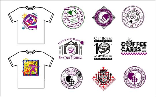
The donation of my services has also led to greater creative freedom in many cases. The individuals involved in the projects are often very willing to admit the creative aspects of such an effort are not within their area of expertise. They are pleased to give creative individuals free rein to produce the best result - and often the work I consider my personal best. Over one third of the international, national and regional design awards I have received have been for the projects of nonprofit groups. Many of these projects have been published in design annuals or graphic design books. Each award has given me even more reason to promote myself through press releases.

Making friends and meeting influential people
One of the major benefits of doing pro bono work is the people with whom you come in contact during the course of the projects. Many of these people may become strong advocates and allies for your business efforts.

The staff of a nonprofit organization is the best source of word-of-mouth promotion following a successful project. Over the years I have developed long-term business relationships with individuals who have moved from one nonprofit to another throughout the course of their career. With each move comes the potential for a renewed client relationship.

Most groups will have a Board of Directors, made up of civic-minded business people, who may also have a need for your services. These same Board members also travel in a variety of business and social circles. I have been hired for projects because my name came up in a conversation an individual had with a Board member of a client organization - in some situation totally unrelated to my client. On several occasions I have been contacted directly by Board members to produce projects for their own business ventures.

Having participated in the design of materials for fundraising activities my work will get a great deal of exposure to those attending the event du jour. Numerous clients have commissioned me to design projects for their business after attending fundraising events and seeing examples of my work.

The prospect of future work from the client
Often the donating of services to a nonprofit client will lead to paid work at a later date. When contributing my services to any group I always make them aware of the fact they will qualify for a 20% discount off the estimated cost of any future contracted projects. One year I donated my services to design the logo for the summer school program of a local elementary school. Later the PTA of the school hired me to create the image for the school itself. For over 16 years I have executed pro bono work for a local nonprofit theater company. One year the group received a grant to cover the costs of my work in producing their marketing materials. A local AIDS residential care facility was the beneficiary of my design skills for several years during the 1990's. They then took it upon themselves to get funding for a monthly stipend to cover my services. Each year the stipend was reviewed, and increased, as the financial situation of the organization improved. Just today I completed the design of their redesigned identity for a new facility opening this next week.

Is a simple "thank you" too much to ask?
Having executed pro bono work for over 30 years I have learned that you must often make the recipient aware of the value of your work. I have repeatedly run into situations when nonprofit clients have no appreciation for donated services. Getting something for "free" occasionally translates into a perception that your work has no value.

First of all, I suggest having the client sign a contract or project agreement to outline all aspects of the project. Even if they are not paying for your services the project should be treated as a "real" job to avoid potential misunderstandings or miscommunication. I also have created a "project value sheet" to present to pro bono clients upon completion of their project. Basically it is an invoice-like form, showing the value of the time spent on the project at my billable rates for each task involved. Of course, there is no balance due. However, conveying this information to the clients has resulted in a greater appreciation of my work.

Still, I am stunned by the number of nonprofits who approach a creative individual with a request for donated services and don't make the slightest effort to express appreciation when the project is complete. All I expect is a simple "thank you," whether it is a handwritten note, in person, via a phone call or by email. The fact my work is appreciated will go a long way toward establishing a long-term client relationship and the possibility of additional pro bono efforts in the future. I've been surprised at the number of nonprofits who, after no sign of appreciation at all for previous donated work, will ask me to donate my services again. Not only will I not work with them again; I let them know precisely the reason I've made the decision.

A win-win situation
Conducted with professionalism and respect the relationship between a writer, photographer, graphic designer or other creative, and a nonprofit needing the services of such an individual, can result in a beneficial situation for both parties. The organization can obtain quality creative work not otherwise affordable, and establish a positive relationship with a talented individual. The "creative type" can feel good about assisting the nonprofit group in the marketing or promotion efforts, create a new audience for their work and promote their own business in the process.

This article appeared in its original form on StickyIdeas.com in April 2001 and in part in my book, "The Savvy Designer's Guide to Success"

© 2006 Jeff Fisher LogoMotives