Happy 30th Anniversary MCC Portland

Today the Metropolitan Community Church of Portland is celebrating 30 years of welcoming gay, lesbian, bisexual, transgendered and straight worshipers to its services. In that time it has grown from a congregation of 12 in 1976 to a membership of over 300 members who now regularly meet in their Arts and Crafts-inspired church in Northeast Portland. Both Just Out and The Oregonian have recently published great feature stories on the church, its history and the congregation.

At various times over the years MCC Portland has been a client of mine. Back in 1995 I was hired to created the logo for the church's capital campaign and the center of that design - featuring an illustration of the building's steeple - has been used as an identity since then. In addition to designing past church brochures, ads, and flyers, I also created logos used to promote Esther's Pantry - which since 1985 has been providing food and personal care items to those living with AIDS.

Happy 30th anniversary to MCC Portland - a very valuable resource to the local community.

© 2006 Jeff Fisher LogoMotives

Graphic Design: usa -

"The Most Influential Graphic Designer of the Era"

In celebrating their 500th issue Graphic Design: usa has published the findings of a readership survey asking for input on a variety of questions. One such question was the naming of the "Most Influential Graphic Designer of the Era." The rankings were as follows:

1. Milton Glaser
2. Paul Rand
3. Saul Bass
4. Massimo Vignelli
5. David Carson
6. Stefan Sagmeister
7. Herb Lubalin
8. Tibor Kalman
9. Paula Scher
10. Margo Chase
11. Lou Dorfsman
12. Ivan Chermayeff
13. Joe Duffy
14. Neville Brody
15. Walter Landor

It's obvious from which "era" I came - with my "design heroes" Glaser, Rand, Bass, Vignelli, Lubalin, Dorfsman, Chermayeff, Brody and Landor making the list. These days when I ask younger designers what they know about these industry icons I most often get a "huh?"

Glaser is probably the one individual most responsible for me choosing graphic design as a career. As an artistic teenager, my "I want to be an artist when I grow up" desire was often shot down by anyone to whom it was mentioned. Most often it was followed with the comment "You will never be able to make a living as an artist." In 1974, while a high school senior, I came across the book Graphic Design, by some guy named Milton Glaser, and it was as if the sky had opened up for a ray of light to shine down on me from above (cue "heavenly" music). What I truly wanted to be had the name "graphic designer" and someone was actually making a living in this wonderful profession that was a mystery to me. Finding that book initiated a wonderful journey and passionate pursuit of a career in design.

I became a huge fan of Glaser's work - especially his identity designs. His book Art is Work is an incredible resource for any designer and I'm very pleased to have an example of my own work in his latest volume, The Design of Dissent.

Nearly 30 years later, the first time I was asked to speak at the HOW Design Conference, I walking down a hallway at a conference hotel in New Orleans and there he was - Milton Glaser. I suddenly became that goofy, socially inept, somewhat lost teenage kid finding that book in the library back in 1974. I was literally shaking as I went up to introduce myself. I explained to Mr. Glaser that it was his "fault" I became a designer. He could not have been a more gracious man - and he didn't look at me like I was a complete idiot (although I was feeling like one at that moment). Later, while I was writing my own book, The Savvy Designer's Guide to Success, Glaser was kind enough to respond to a couple emailed questions and direct me to some great possible content. It was an honor having him contribute to my book. One day I need to treat myself to one of his beautiful Italian landscape silkscreen prints as a reward for lasting 30 years in this line of work.

For me personally, Milton Glaser is truly "the most influential graphic designer of the era."

Check out the rest of the Graphic Design: usa 500th issue survey results on their site. You'll find lists of the most influential design firms, most influential graphic designers today, most influential ad agencies, favorite (legal) stimulants and much more.

© 2006 Jeff Fisher LogoMotives

When a "contest" is not a contest

It may bark like a dog and look like a dog but, is it really always a dog? A similar query may arise with many “design contests,” especially those popping up all over the Internet on a daily basis. Businesses and organizations, with the ability to pay going rates for professional graphic design services, have found the lure of winning a “contest” will reel in large numbers of designers for the chance of a few minutes of fame, a little glory and perhaps cash or prizes not nearly worth the value of the design effort on the open market. In return, those conducting these design lotteries often get a virtual menu of design options, and the rights to use all entries as they please, with little need of valuable prize options or the outlay of much cash.

Some blame for the proliferation of “design contests” must fall on the design community itself. For a great many designers, such activities appear to be an opportunity to gain some quick income. In the excitement of the moment it is often forgotten that winning is not a sure thing and the “fine print’ of the competition rules may be even more detrimental to a designer. The only thing worse than a client, or potential client, who does not value the efforts of a professional graphic designer, is a designer who doesn’t appreciate the value of their own time and work. Participation in such “competitions” certainly devalues the efforts of the creative individual and encourages others in the business community to seek inexpensive design work in a similar manner.

Read the rest of this article at Creative Latitude.

Note: I thought I would post this article on bLog-oMotives as I have seen links to it being posted on various forums more and more lately. The article has also appeared on the site of the Society of Graphic Designers of Canada, on TheCreativeForum.com, at Commpiled.com and on other Internet sites.

© 2006 Jeff Fisher LogoMotives

Review: Wordless Diagrams by Nigel Holmes

I’ve been a fan of the work of designer Nigel Holmes, the former Graphics Director for Time magazine and principal of the firm Explanation Graphics, for many years. His 1985 book Designing Pictorial Symbols was very helpful in teaching me, early in my career, to distill concepts down to their simplest forms.

With his newest book, Wordless Diagrams from Bloomsbury Publishing, Holmes continues the entertaining form of education for which he is known through his publications and public speaking engagements. While not directly related to the practice of identity design, this volume is an excellent creative concepting tool for any designer interested in the creation of logos. Actually, any designer could benefit from the included lessons – and have a few chuckles in the process.

The book reinforces the old K.I.S.S. (Keep It Simple, Stupid) principle of design I learned in college three decades ago. In simple graphic forms, chronologically numbered for ease of use, Holmes clearly illustrates nearly 100 tasks such as how to wave like a Royal, how to make a snowman, how to pierce a tongue, and how to cremate a body. In addition, readers will also learn how to milk a cow, pour a beer and keep a low-cut dress in place as they are taken on this wordless, visual adventure. “How to train for and then eat 53 1/2 hot dogs” immediately reminded me of the lesson in simplicity, visually and verbally conveyed by Holmes, in a past HOW Design Conference presentation: “Always line up your sausages.”

Note: This review originally appeared in a Logo Notions column on the design industry site Creative Latitude.

© 2006 Jeff Fisher LogoMotives

Toot! Toot!*:

Jeff Fisher LogoMotives biz card designs recognized

Three business card designs by the firm Jeff Fisher LogoMotives have been published in new graphic design books. The identifying card for Jeff Fisher LogoMotives is featured in the book The Big Book of Business Cards from David E. Carter. The letterpress card, produced by the Portland company Oblation Papers & Press, features Fisher's train-themed logo which has been honored with many international design awards.

The other design recognized in the The Big Book of Business Cards is the two-sided business card for Pearl Real Estate. Although the logo designed by Jeff Fisher LogoMotives is still in use in the signage on the company's headquarters, a new logo and business card now represents the firm.

Japanese publisher PIE Books has included the calling card for Portland hair salon Slick in their latest book, World Business Cards Today. The card features the a silver foil stamp of the logotype on the front and limited contact info on the back. The rectilinear card, with rounded corners, mimicks the actual logo for the company. The logo is also featured in the books LogoLounge: 2,000 International Identities by Leading Designers, the Japanese book New World Logo and The Big Book of Logos 4.

* If I don't "toot!" my own horn, no one else will

© 2006 Jeff Fisher LogoMotives

Did your employer (or potential employer) make the list of best places to work?

The other day I was talking with sister and mentioned that I has just been interviewed by a writer for Fortune magazine - for a possible future article on the rash of major corporation identity make-overs (I'll keep you posted if anything is actually published). My comment prompted her to remember she had some news about Fortune herself. Valero Energy, for which she is the community relations person in Benicia, CA, was just named the #3 company to work for by the magazine.

For graphic designers, seeking employment in the corporate world, the article The 100 Best Companies to Work For 2006 provides some great insight into such companies. Most are large enough to have an in-house design department or staff designers. You can even check out the entire list for more information about that potential employer - or to see how the firm for which you now work ranks.

The West Coast can claim 24 of the top companies in the United States. Nike is the only Oregon firm making the list.

© 2006 Jeff Fisher LogoMotives

Good article, shame it's not Helvetica

In the Sunday New York Times, on New Year's Day, writer Peter Edidin's article Good Film, Shame About the Helvetica highlighted a still photograph from the movie "Good Night, And Good Luck" showing stars George Clooney, Robert Downey Jr. and David Strathairn standing in a television newsroom with "CBS News" on the wall behind them.

Edidin wrote: "It appears that the CBS News sign, prominently displayed in the film's carefully reconstructed New York newsroom, uses the typeface Helvetica. But Helvetica was not designed until 1957, the year McCarthy died. The movie takes place in the early 1950's."

Designer Michael Beirut, of the Pentagram Studio, was quoted as saying, "I thought it was a bit jarring...After all, even in 1957, Helvetica was an exotica Swiss import."

The article pointed out several situations where major motion pictures made use of historically inaccurate type in scenes requiring new historical perfection for many other aspects of the film. The Typecasting: The use (and misuse) of period typography web page of type designer Mark Simonson was mentioned in the piece as a resource for information on such cinematic bloopers, including errors in the movies "Chocolat" and "L.A. Confidential."

Beirut also pointed out in the New York Times article that Helvetica was used on 1912 ship dials in the movie "Titanic." He compared that inappropriate type usage to "taking out a Palm Pilot on the deck of the Titanic."

Designer Scott Stowell, of the new York design firm Open, was quoted in the article saying "The thing that bugs me is that they create these elaborate period pieces for films. They put old cars on the street and get the hairstyles right, but typography, it seems like they don't know or care."

After reading the article I tore it out of the paper and put it aside as a future blog entry topic. Last night i was searching online for any additional information about the story and came across a Google link to a Mark Simonson "Notebook" entry in regards to receiving an email from the art director of "Good Night, And Good Luck" following the appearance of the newspaper article. According to Simonson "She pointed out that Helvetica was not used in the film, contrary to what was claimed in the article. She said, rather, that the sign shown in the example frame was set in Akzidenz Grotesk, a face which predated (and in fact was the basis for) Helvetica, and that this choice was based on extensive research of CBS’s graphic design during the period depicted in the film."

Further discussions by ,what the New York Times article referred to as, "militant typography fans," about the type used, on both Typofile.com and Design Observer, provided additional insight (and examples) to the actual usage of the typeface Akzidenz Grotesk.

Moral of the story: Filmmakers, New York Times writers and (God forbid) even graphic designers can make mistakes given the right set of certain circumstances.

Photo credit: Melinda Sue Gordon/Warner Independent Pictures

© 2006 Jeff Fisher LogoMotives

New HOW Design Forum goes live

The long-awaited launch of the new-and-improved HOW Design Forum took place this morning. How Magazine created the forum to serve as an online community that offers support and advice for and from creatives around the globe. Monitored on a daily basis by the HOW staff, the forum is an online home-away-from-home for many professional designers of all levels.

Online design forums have become a valuable education, business and therapy resource for many graphic designers around the world. At Creative Latitude you can read my most recent article Funny things happen on the way to the forums.

© 2006 Jeff Fisher LogoMotives

Re-Design: Laugh Lover's Ball
(Get your tickets for Feb. 14, 2006)

It's that time of year again - time to put the annual Laugh Lover's Ball - An Evening of Sophisticated Silliness! on your calendar for Valentine's Day in Seattle. The Laugh Lovers Ball involves a host of national and local comedians performing a number of comic genres including: sketch, stand-up, poetry, music and some audience participation gags. Funds raised by this event benefits youth education programs onboard the historic Puget Sound schooner Adventuress. Tickets for the evening may be purchased through Ticketmaster.

In late 2001 Seattle comedian David Crowe contacted me to redesign the identity for the comedy event held each Valentine's Day. For the previous six years a collage of art elements, photo imagery and distorted type had been combined in a logo representing the night of comedy. Crowe felt it was time to create a strong, simple, cleaner symbol to represent the fundraising event from year to year. I was asked to create a new identity that would maintain elements of the logo already in use. While continuing to use their signature font Harrington, I incorporated the arrow tip as the "A" letterform in the word "BALL." A more graphic representation of the "Groucho Marx" glasses/nose combo was used to illustrate a face on the heart idea "borrowed" from the original design and the tagline for the evening was included in the new logo. Years later the revamped logo is still representing this great event.

You will find additional examples of identity, web and print redesigns on the Creative Latitude site, in a section called GRAPHIC makeovers. Designer Alina Hagen contributes her observations to the submitted design projects. Quite a few of my own redesign efforts are posted at "GRAPHIC makeovers." Creative Latitude is always looking for other before and after design examples to display on the web site - do consider submitting some of your own efforts.

© 2006 Jeff Fisher LogoMotives

Preaching what you practice: Speaking in graphic tongues to the masses

Outside of the creative industries, graphic design is seldom a religious experience for most people in the business world. In fact, a great number of professionals in other industries probably don't have a clue what you, as a designer, do for a living - or what you may be capable of contributing to the success of their own businesses. Yes, it's sacrilege.

One of the most effective, inexpensive and under-used methods of converting these naivetes - or total disbelievers in some cases - is putting yourself in front of a congregation to speak about what your profession entails and how those in the pews can benefit from the knowledge you are willing to share.

Read the rest of this article, about promoting your design business through public speaking, at Creative Latitude.

© 2006 Jeff Fisher LogoMotives

The proper care and feeding
of the in-house graphic designer

We often hear horror stories of bosses who make the life of a staff designer miserable. Such situations make creativity and productivity very difficult, if not impossible. Years ago, while I was the art director of the Multnomah County Medical Society in Portland, I had the most incredible supervisor I have ever experienced. She respected her staff, didn't stifle the day-to-day operations of the publications design department with micro-management, and constantly rewarded and thanked staff members for jobs well done.

In appreciation for putting in long hours, to note the finalizing a major project effort, or to celebrate the department receiving some outside recognition, she would put what she referred to as a "creative hall pass" into action. Staff would be given extra time off, sent out of the office to "recharge" their creativity, or told to head down to a local pub for a "coffee break."

Over the years I have expanded on the idea of, what I now call, the "Creative Freedom Pass." I have also come up with 10 tips for those responsible for the proper care and feeding of the in-house graphic designer. The following was first presented at a CreativeBloc conference sponsored by the Marketing, Advertising & Communication Professionals of Northeast Iowa.

A Designer User's Manual

Ten simple tips, presented as a primer to clients, employers and those supervising design staffs, to encourage improved performance from their graphic designers.

1. Avoid Smothering

Your designer does most often realize who is the boss. Don’t over-manage, or smother, your “creative type.” Allow your designer the time to create without constant progress checks and over-the-shoulder design input.

2. Supply Needed Tools

An ill-equipped designer is not necessarily going to lead to stellar results. Provide your designer with up-to-date equipment and tools. Trust your designer to provide the expert input on what is required to do the best job for you.

3. Nurture and Educate

The design industry is changing dramatically daily. Your designer needs to be “upgraded” on a regular basis. Workshop or conference attendance, continuing education courses and magazines subscriptions help a designer stay healthy.

4. Encourage Interaction

The natural habitat of the designer is not the office in the back - isolated from all others in the company. Present opportunities for interaction and brainstorming with the rest of the staff, including those initially concepting projects and the end users of a given piece.

5. Allow Creative Freedom

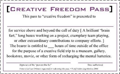
Let your designer out of their box, or cubicle, on a regular basis, Creativity can’t be turned on like a computer or light switch. Designers need outside stimuli for a productive life span. (The “Creative Freedom Pass” below is a great idea.)

6. Coach Your Designer

Designers do not respond well to “training” preparing them to “sit,” “heel” and “roll over.” Invest the time to coach, (rather than train) your designer in a positive manner about the culture, history and philosophies of your business.

7. Provide ALL Information

Being “selfish” with project specifications, client feedback, budgetary restrictions and other information will not be of benefit to you or your designer. Sharing all information openly will allow your designer to do their best job.

8. Define REAL Deadlines

“When you get around to it” or “ASAP” are not realistic definitions of project deadlines. Establish actual timelines with your designer for the delivery of concepts, presentation of revisions and the completion of needed designs.

9. Critique Constructively

Telling a designer their project “sucks” or you “just don’t like it” is not feedback that will lead to a successful end result. Explain your reasoning in detail and offer possible solutions. Offer praise or encouragement when earned.

10. Recognize and Reward

A happy designer is a productive designer - and a very valuable asset to your company. A simple ‘thank you” for a job well done, sponsorship of a design competition entry, blatant praise in front of other staff, and other signs of acknowledgment are great investments. (Again, a “Creative Freedom Pass” is a nice reward.)

© 2006 Jeff Fisher LogoMotives

Hot art and design in a book about cool jazz

I'm fascinated by great children's books - especially children's books that are for kids of all ages. Books that are well designed or incredibly illustrated always catch my eye. I recently came across the beautifully designed and illustrated book Jazz ABZ: An A to Z Collection of Jazz Portraits, a collaboration of jazz great Wynton Marsalis, illustrator Paul Rogers and graphic designer Jill von Hartman. The book, published by Candlewick Press, includes text and graphic tributes to Louis Armstrong, Sonny Rollins, Count Basie, Charlie Parker, Sarah Vaughan, Art Blake and many others. It's a wonderful treat for any jazz enthusiast, a fan of the stylized illustration of first half of the last century, or a kid being introduced to jazz and design.

© 2006 Jeff Fisher LogoMotives

Jeffism #2

"It's better to be a smart-ass than a dumb-ass." - Jeff Fisher

Typographica's favorite fonts of 2005: Part 1

I've always loved type. My love affair with letterforms began back in college with the study of type as part of my journalism and design courses. While others bitched and moaned about the hand-rendering of type forms, I was fascinated by the difficult assignments (Don't even bother submitting your assignment with graphite smears!). Getting new type catalogs in the mail is as exciting to me as the joy expressed by Steve Martin's character Navin R. Johnson, in the film The Jerk, with the arrival on the new telephone directory when he exclaimed, "The new phone book's here! The new phone book's here!"

Typographica: A Journal of Typography recently published the first half of their annual list of Favorite Fonts of 2005 and I've really enjoyed reviewing their selections. In the Typographica recap of the best releases during the first half of 2005, the editors note the trends of the year: Independent font foundries are putting out some great type offerings - two-thirds of the 15 fonts featured are the work of one-man design studios. OpenType is an option in nearly all the fonts named, even though the design software industry is slow to support the format. Designer Xavier Dupré, creator of the font Zingha illustrating this blog entry, has three designs among the 15 recognized offerings.

Each featured font is presented with a visual "tease," a review from an industry expert and links to where you may find the type for your own use. In addition to the top 15, the editors single out nearly four dozen other notable font releases from early 2005. If you are looking for a great distraction from that frustrating project, grab yourself an espresso drink, sit back, relax and be prepared for some incredible visual stimulation. (I'll post a link to Part II of the Typographica list when it goes live later this month.)

© 2006 Jeff Fisher LogoMotives

Review: Design-it-Yourself Graphic Workshop: A step-by-step guide

"This is not a design theory book – it is a design instruction book." With the first line of his introduction to Design-It-Yourself Graphic Workshop designer, marketing specialist and writer Chuck Green has defined his recently released book succinctly. Rockport Publishers has wisely repackaged Green’s earlier books Design-It-Yourself Logos, Letterheads & Business Cards and Do-It-Yourself Newsletters into one handsome, all-inclusive hardback resource that will be a great addition to the design library of any wannabe, newbie or seasoned design professional. The book provides you immediate desk-side access to that favorite design instructor at school who always had the suggestion of how to tackle any creative challenge.

Green belittles no reader as he conveys the hows, whys, shoulds and musts in making use of basic graphic design principles on a variety of projects. The messages throughout Graphic Workshop are clear, straightforward and gently challenging. The design is clean, colorful and inspiring. Some design professionals may cringe at the “do-it-yourself” portion of the title (as I admittedly did with the earlier books), which seems to unconsciously bring the controversial “anyone with a computer can be a graphic designer” school of thought into play. However, if a potential reader can get past that descriptive title element, and concentrate on the phrase Graphic Workshop, the price of admission will be well worth the ride Chuck Green provides. When that young student in your life expresses an interest in the field of graphic design, Graphic Workshop would be the perfect gift. For those starting their careers, opening their own firms, or just needing a gentle kick in the rear-end, the book should be a welcomed source of encouragement. Every corporate, or organization, in-house designer should have copy at hand. In reading the book, I also realized Graphic Workshop would be a great tool to use in explaining to clients why something has been designed for them in a specific manner.

(P.S.: Happy New Year!)

© 2006 Jeff Fisher LogoMotives