


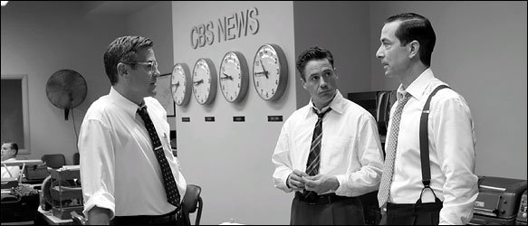
 In the Sunday New York Times, on New Year's Day, writer Peter Edidin's article Good Film, Shame About the Helvetica highlighted a still photograph from the movie "Good Night, And Good Luck" showing stars George Clooney, Robert Downey Jr. and David Strathairn standing in a television newsroom with "CBS News" on the wall behind them.
Edidin wrote: "It appears that the CBS News sign, prominently displayed in the film's carefully reconstructed New York newsroom, uses the typeface Helvetica. But Helvetica was not designed until 1957, the year McCarthy died. The movie takes place in the early 1950's."
Designer Michael Beirut, of the Pentagram Studio, was quoted as saying, "I thought it was a bit jarring...After all, even in 1957, Helvetica was an exotica Swiss import."
The article pointed out several situations where major motion pictures made use of historically inaccurate type in scenes requiring new historical perfection for many other aspects of the film. The Typecasting: The use (and misuse) of period typography web page of type designer Mark Simonson was mentioned in the piece as a resource for information on such cinematic bloopers, including errors in the movies "Chocolat" and "L.A. Confidential."
Beirut also pointed out in the New York Times article that Helvetica was used on 1912 ship dials in the movie "Titanic." He compared that inappropriate type usage to "taking out a Palm Pilot on the deck of the Titanic."
Designer Scott Stowell, of the new York design firm Open, was quoted in the article saying "The thing that bugs me is that they create these elaborate period pieces for films. They put old cars on the street and get the hairstyles right, but typography, it seems like they don't know or care."
After reading the article I tore it out of the paper and put it aside as a future blog entry topic. Last night i was searching online for any additional information about the story and came across a Google link to a Mark Simonson "Notebook" entry in regards to receiving an email from the art director of "Good Night, And Good Luck" following the appearance of the newspaper article. According to Simonson "She pointed out that Helvetica was not used in the film, contrary to what was claimed in the article. She said, rather, that the sign shown in the example frame was set in Akzidenz Grotesk, a face which predated (and in fact was the basis for) Helvetica, and that this choice was based on extensive research of CBS’s graphic design during the period depicted in the film."
Further discussions by ,what the New York Times article referred to as, "militant typography fans," about the type used, on both Typofile.com and Design Observer, provided additional insight (and examples) to the actual usage of the typeface Akzidenz Grotesk.
Moral of the story: Filmmakers, New York Times writers and (God forbid) even graphic designers can make mistakes given the right set of certain circumstances.
Photo credit: Melinda Sue Gordon/Warner Independent Pictures
© 2006 Jeff Fisher LogoMotives

No comments:
Post a Comment