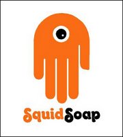
 Every once in a great while a new product comes along that jumps off the shelves, or page of some publication, and makes you take note. The recently released children's product SquidSoap is just such an item - from the standpoint of product design, intended use of the product and graphic identity.
SquidSoap is a liquid soap dispenser that puts a small, kid-safe ink mark on the child's hand when the pump is pushed. The mark can be removed only by washing the hands for 15 to 20 seconds, the amount of time often recommended by experts in infectious disease control. Developed by John Lynn, a chemical engineer in Austin, Texas, SquidSoap ink is made with FDA-approved ingredients; it's even edible, according to the company. The dispenser is refillable, but the inkpad eventually empties. The soap is ordinary liquid hand soap, not the antibacterial kind.
 The blue plastic bottle comes with an inviting orange squid with eyes draped over the pump top and down its sides. The brilliant logo makes use of the often-cliche child's handprint in a unique and clever manner. The graphic hand is down-turned and orange, with a blue eye representing the product's ink mark. To any kid, or fun-loving adult, the image will immediately resemble a cartoonish squid. The packaging and logo were designed by the Austin office of Pentagram. DJ Stout and Julie Savasky were the designers.
Where was SquidSoap when I was a kid and my mother was constantly hounding all her children to wash their hands? Still, it will fit nicely into the grown-up "Little Mermaid" themed bathroom of my current home.
SquidSoap may be purchased at select grocery stores, pharmacies and through the the company's web site.
Photo: SquidSoap
© 2006 Jeff Fisher LogoMotives


2 comments:
That's the funnest thing I've seen in a while. My wife (who's really just a big 13-year-old at heart (in the good way, the good way) might like that. The logo is sheer brilliance.
I showed a bunch of people this post and there wasn't one person who didn't say I want that! The best part is they are all adults ranging from 28 - 50. The logo is genious and the stamp to teach kids to wash their hands is outstanding. Sometime people make something that just makes you smile and give it two big thumbs up. Well this is definitely one of those things.
Just a thought but maybe this great design work should be nominated for the Three Thumbs Up award?
Post a Comment