


 I'm not sure when I first started getting paid for actual design work. I remember earning income from some of my illustration work while still in junior high about 1970. I did have a paid, sit-at-a-desk, design job while in college as the designer for the advertising department of the University of Oregon college newspaper, the Oregon Daily Emerald. Using that 1978 job as a marker I've been working as a professional designer for nearly 30 years - and I have nearly every design project I've ever done saved in my personal archives.
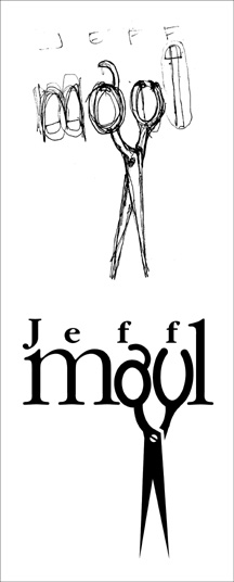
I've initiated the process of trying to organize those files, boxes, drawers and piles of past design jobs. I'm learning just how little I've thrown away over the years. In the process of excavating my career I've found many little rough sketches for logo projects on napkins, envelopes, meeting notes, Post-It notes and other scraps of paper. Many of those initial, quickly-drawn creative thoughts evolved into final identity designs for my clients.
One such project was the personal logo design for the guy who began cutting my hair over a decade ago. In 1995 Jeff Maul asked if I could come up with an identity for his work as a Portland hair stylist. One day I scribbled a rough concept for his logo on a torn scrap of paper. When I finalized the design, it was the one and only design concept I presented to a very pleased client. I did follow the K.I.S.S. (Keep It Simple, Stupid) principle and eliminated the fingers elements I had included in the rough sketch. I was paid for the completed project in future haircuts.
The logo bought a great deal of attention to my design work, and became an important element in the focus of my design work changing to the creation of logos. One of the most recognized identities I've produced in my career, the logo appears in the books International Logos & Trademarks 3, Letterhead and Logo Design 5, New Logo & Trademark Design (Japan), Bullet-Proof Logos: Creating Great Designs Which Avoid Legal Problems, The Best in World Trademarks 1- Corporate Identity (Korea), LogoLounge, Volume 1, The Best of Letterhead and Logo Design, Logo Design for Small Business 2, and New Logo: One (Singapore). The logo also appeared in the 1996 PRINT Regional Design Annual. One simple, one-color logo has been marketing my design efforts, and appearing in new books, for ten years now.
In coming bLog-oMotives entries I'll share other rough design concepts (along with the final design) I find while digging in my home-based studio
© 2005 Jeff Fisher LogoMotives

No comments:
Post a Comment