


 Just Out, the statewide monthly newsmagazine for the lesbian, gay, bisexual and transgender communities, celebrates 22 years of publication by bursting out the closet with a new look today. Part of that new image is a sleeker, updated logo design from Jeff Fisher LogoMotives. Even prior to the makeover, I've always felt that Just Out was one of the best LGBT papers in the country - in content and design.
Publisher and Managing Editor Marty Davis writes, "With this issue we’re shaking things up a bit—moving this, moving that. It’s a sign of the strength and stability that we celebrate and bring to you with this anniversary issue. The Just Out staff abounds with skill and expertise, and we start our 23rd year of publishing by being the strongest we’ve ever been."
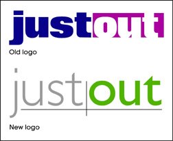
It was a pleasure to work with Marty on the logo redesign - besides, it gave us a good excuse to get together for coffee at the NorthStar Coffee House near our North Portland homes. She wasn't seeking a whole new "look" with the logo, but rather a refined - possibly redefined - treatment of the existing identity. The hope was to maintain the readers' immediate recognition developed at newsstands over the years, while making the paper's flag fresh and a bit more flexible in cover design applications.
Just Out has been good to me over the years. The paper has mentioned my work on many occasions, promoted my favorite causes, sent a few fun projects my way, featured an announcement of the marriage of my partner and I, and in June 2000 published a great feature story (that I've yet to live down) about my business. In that article, On The Right Track, writer Marc Acito publicly announced that I sometimes work in my underwear. I will admit, as I sit here in a LogoMotives T-shirt, boxers and white crew socks, that some things do not change.
Happy anniversary and congratulations on the new image, Just Out. I'm honored that I could be a small part of the process.
© 2005 Jeff Fisher LogoMotives

2 comments:
Great job on that new logo. I'm way gone on Gill Sans, and anything that uses it well is a work of art, as far as I'm concerned.
I particularly enjoy the way you hint at the old structure (with the rules and the different type weights) but clean it up, open it and let the white space in, and do away with that extremely dated font that was being used before.
Congratulations on the new logo for Just Out, Jeff. It looks awesome!
Post a Comment