Showing posts with label Advertising. Show all posts

Laughing their asses off at Derrie-Air

On a day that saw the largest single day Dow Jones industrials drop in 2008 (so far), the highest one-month jump in unemployment in 22 years and a new record high in oil prices, we all need something to laugh about. Thankfully, that giggle and snicker has been provided by way of ads, running in The Philadelphia Inquirer and Philadelphia Daily News, announcing the new airline Derrie-Air.

The ads promote the new airline's policy of "The more you weigh, the more you pay." Readers are directed to the Derrie-Air website.

However, before people get their panties in a bunch they should read the fine print and perhaps do a little research. The fictitious airline simply won't be flying. It's a one-day advertising campaign about a fake airline by Philadelphia Media Holdings, the papers' owner, and Gyro Worldwide Advertising, Inc.

Jay Devine, spokesman for Philadelphia Media Holdings spokesman said the goal of the highly visible campaign is to "demonstrate the power of our brands in generating awareness and generating traffic for our advertisers, and put a smile on people's faces."

A visitor to the Derrie-Air site learns of the claim that it is the world's only carbon-neutral luxury airline; justifying its fare policy by saying that it takes more fuel to move heavier objects. Derrie-Air posts rates from $1.40 per pound to fly from Philadelphia to Chicago to $2.25 per pound to fly from Philadelphia to Los Angeles. The site includes the airline's pledge to plant trees to offset every pound of carbon released into the atmosphere by its planes.

The one thing I noticed immediately is that the corporate identity and branding of Derrie-Air beats the pants off of many of the real world corporate rebrandings seen recently.

© 2008 Jeff Fisher LogoMotives

Imaginary friend on GDUSA Magazine cover

In my home studio I am surrounded by a couple hundred of my best "imaginary friends." No, these are not my graphic design forum pals - throughout my studio are the numerous advertising character collectibles that I have been amassing over the past two decades.

It was great to recently receive the April 2008 issue of Graphic Design: USA magazine and have my friend Speedy, of Alka Seltzer fame, as the cover boy. He's actually been in the news lately. At the age of 57, Speedy is making a comeback as a working advertising spokesperson in a new campaign from BBDO New York. The "plop, plop, fizz, fizz" guy has even got his own interactive "Where's Speedy?" game.

You can learn a bit more about Speedy, and the friends he hangs out with in my office, at the site of the future Advertising Icon Museum.

© 2008 Jeff Fisher LogoMotives

Toot! Toot!*: Jeff Fisher LogoMotives design
receives 2008 Summit Creative Award

Jeff Fisher LogoMotives has been awarded a Silver in the 2008 Summit Creative Awards, in the category of PSA Logo, for an identity concept for the Cat Adoption Team. The awards were created 14 years ago to recognize and celebrate the creative accomplishments of small and medium sized advertising agencies and other creative companies throughout the world with annual billings of under $25 million. Thousands of entries, from 25 countries, were submitted for consideration this year. Since 1998, Fisher has received 17 of the Summit Creative Awards honors, in a variety of categories.

The design for the Cat Adoption Team - a facility offering cat shelter, adoption, foster, hospice, and veterinary services - was a pro bono concept effort created as a replacement for the organization's original logo. Unfortunately, in the end, it was not adopted by the group; being deemed not "warm and fuzzy" enough as a representative symbol.

The 2008 panel of Summit Creative Award judges includes professionals from Oglivy & Mather, LXB Communication Marketing, brandUNITY, Wayne State University, Pizza4all, Mfx Interactive, Inc., Saatchi & Saatchi, The Halo Group, Upshot, EvoLogue, Gorman Consulting, Velocity Designworks, Paragon Marketing Communications, Stellar Debris Creative Studios, and Elevator.

Jeff Fisher has received nearly 600 regional, national and international graphic design awards for his logo and corporate identity efforts. His work is featured in nearly 100 books on the design of logos, the business of graphic design, and small business marketing.

Fisher is a member of the HOW Magazine Editorial Advisory Board, the HOW Design Conference Advisory Council and the UCDA Designer Magazine Editorial Advisory Board. His book, Identity Crisis!: 50 Redesigns That Transformed Stale Identities into Successful Brands, was recently released by HOW Books. His first volume, The Savvy Designer’s Guide to Success, appeared on bookstore shelves in late 2004.

(* If I don’t "toot!" my own horn, no one else will.)

© 2008 Jeff Fisher LogoMotives

George Lois - an advertising legend

I recently came across the web presence of advertising industry legend George Lois. As a student, back in the mid-1970's in the Journalism School at the University of Oregon, we were studying the design and art direction work of George Lois - especially his work in publication design creating memorable Esquire Magazine covers. His advertising campaigns were presented to students as among the best of the best.

The George Lois website is a "work in progress," but it provides a lot of great eye-candy for those interested in graphic design or the business of advertising. Three decades after I was studying the work - and reading the writings - of this industry powerhouse, he's still at it today. I look forward to the expansion of the packaging and logo design sections of the site.

Books by Lois were recommended reading for students in the advertising program 30+ years ago. In recent years his $ellebrity: My Angling and Tangling With Famous People and his lastest book, Iconic America: A Roller-Coaster Ride through the Eye-Popping Panorama of American Pop Culture (written with fashion icon Tommy Hilfiger), have been added to my ever-growing design and advertising library.

© 2008 Jeff Fisher LogoMotives

What were they stinking?

The other day the last of my holiday online shopping arrived from Amazon.com. I was thrilled that the box was delivered with time to spare before our scheduled Christmas Eve gift exchange, as it had been difficult to find one of the items enclosed.

I opened the box and was immediately hit with a good dose of a strong sweet cinnamon apple scent. My eyes, skin and nose reacted instantly to whatever was in the package. I know that a friend of mine, experiencing the same situation, would have reacted so strongly a hospital visit would have been necessary.

Over the years I have developed increasing strong allergic reactions to scents. When going to department stores I need to plan a route around the perfume counters and I always avoid candle or potpourri retailers. Magazines that arrive with scent samples pages must have the offending pages removed, and the publications aired out for several days, before I can read the issue. I'm even allergic to the scent of the ink used to print The New York Times - but still read it; scrubbing myself down afterwards as if I am going into a sterile surgical procedure. I have a limited selection of laundry detergents, bath soaps and deodorants I am able to use without reactions. When we have dinners, or parties, at our home we remind guests that these are "fragrance free" events. These are all situations I have learned to be prepared for in advance over time.

I was not prepared for an unexpected Glade scent promotional bookmark to be shipped in my package of purchases from Amazon. The congestion in my nose, constriction in my throat, headache and itchy skin were not in my plans for the day.

The little protective "condom" over the scent patch on the bookmark appeared to have been partially removed in shipping, causing the box to fill with the gaggy odor.

Far from being "A Little Holiday Joy," the advertising insert was a major annoyance and health issue. One the back side of the bookmark was the text "We'd love your opinion" - and both Glade and Amazon got mine.

I went to the Glade website and filled out the survey sharing my feelings. I also wrote to customer service at Amazon to explain the situation and suggest that they consider other methods of dealing with such promotional efforts in their packaging. From Amazon I got the following response:

I'm sorry for the problem you faced with the promotion we sent to you. I hope your health is fine now. Thank you for suggesting that we don't send promotions which may lead to customer health problems. Customer feedback like yours is very important in helping us continue to improve the selection and service we provide. I appreciate your thoughts and I will be sure to forward your suggestion to the concerned department. Rest assured that we won't be sending such type of promotions to you.

(To scan the promotion I had to handle it with gloves and be careful to not inhale while it was out in the open.)

What were Amazon and Glade thinking? I guess I'm surprised that a scented promotion would be sent in such a manner in the first place. It might have been wise to have it sealed in a secondary plastic bag - rather than loose in the box. I can't be the only person negatively impacted by the smelly promotion. Several days later my body is still a bit tweaky following a chain of allergic events started by the scented bookmark. Possible reactions like mine need to be a consideration when planning similar marketing or advertising pieces.

Update - 12.30.07: As Mark commented below there is always the danger of a "magazine ambush" in regards to scent. On Saturday the new Bon Appetit magazine arrived in my mailbox - with a scent page for Calvin Klein's Eternity fragrance. Huh? One of the most offensive colognes is always the first thing I think of when it comes to fine cooking. The magazine is banished from my reading materials until it airs out.

© 2007 Jeff Fisher LogoMotives

Advertising Icon Museum to open in 2008

As I've mentioned in past bLog-oMotives entries, I am a collector of a variety of items - enamel advertising signs, cowboy memorabilia, salt and pepper shakers, cookie jars, character teapots and more. However, my primary habit (requiring a regular fix on a semi-regular basis) is the collecting of advertising character figures. Over 200 of the ad icons have found a home in my design studio.

Being interested in the history of the imaginary advertising "spokes models," I often find myself doing a bit of online research for background information on various ad characters - or for characters I might ad to my collection.

I recently came across the website for the Advertising Icon Museum. The facility is set to open in Kansas City in the fall of 2008. The museum, founded by Robert Bernstein, is now under construction as part of the West Edge development on the west side of the city's fashionable Country Club Plaza district. The interior of the museum is being designed by Abbott Miller of Pentagram. Thousands of ad icon character items will remain on permanent display in the unique environment. Various temporary exhibits will be offered throughout the year as well as a complete range of educational programs, conferences and events.

The Advertising Icon Museum web presence has been coming together in recent months. More information can be found on the FAQ page. There's a fun, interactive, exhibit gallery page providing great information when clicking on character images. Links pages are provided to some of the enshrined icons.

The museum will also become the the permanent home of Advertising Week's Madison Avenue Walk of Fame, with plaques added for new honorees voted in by the public each year. (In fact, you may currently vote for your favorite, through September 24th, on the official voting webpage).

I'm sure that my ad character collection members (about 100 are shown above), who I refer to as my real imaginary friends, are thrilled that so many of their peers will find a permanent home in the new museum. I look forward to visiting the facility after it opens next year.

© 2007 Jeff Fisher LogoMotives

Hi, I'm Jeff - and I'm addicted to collecting

(All together now: Hi Jeff!)

Over the years I have created collections of a variety of items including design books, advertising characters, salt and pepper shakers, cookie jars, character teapots, advertising signage, cowboy collectibles, art, fish-related items and more. Supposedly a moratorium has been placed on my "stuff gathering" activities, but I am still able to occasionally sneak an item into the house unnoticed until a much later date. Thankfully, friends are always happy to contribute to my habit and then I can't be blamed for the new additions.

Not long ago I realized that I don't have an archive of the sometimes very valuable items and, if for no other reason, I should have complete record for insurance purposes. The process of recording my collections began with starting to catalog the 300+ design books I have acquired since my high school senior year of 1974 - and that is still continuing. The ongoing spring cleaning of my home studio has required carefully dusting or cleaning many of my collectible items. While fresh and shiny, the inanimate objects have been pleased to pose (and many of them do look like they are posing) for my camera.

I'm never completely alone while working in my design studio. About 20 years ago I started collecting advertising character figures - beginning with Bob's Big Boy items. I've found items such as Snap, Crackle and Pop, Tony the Tiger, Sprout, Mr. Bubble,, Bibendum (The Michelin Man), Fred Fossil and many others in antique shops, at garage sales and flea markets, and on eBay. At one point my collecting got so out of control I was on a first name basis with the UPS man who was delivering my online purchases. The amassing of advertising characters came to a crawl when I ran out of room in my office. I think I have over 200 of the little figures. I'll eventually find out the size of collection as I continue the cleaning and mug shots.

Rather than just hoarding items for one's personal pleasure, I do think collections should be shared with others. Online sites such as Flickr and Facebook have provided me an opportunity to initially share small portions of the results of my habit. At this point 60 of my advertising characters and 28 sets of advertising-related salt and pepper shakers are getting a little public exposure. I've also started another advertising character album.

One of the interesting aspects of collecting is getting to learn the stories behind the collectible items. Many others share the collecting "bug' and have written about a wide variety of items gathering dust in people's homes and places of work. My collection of advertising characters has provided a great education about the company histories of the businesses and products represented, through books such as Meet Mr. Product, What a Character!, Advertising Character Collectibles and others. If you are collecting something, you can be sure that someone has written a book on the item.

As my cleaning, and archiving, frenzy continues I will post links to future galleries of collectible images. Have fun collecting out there!

(Images: Top - Mr. Bubble, 1990; Center - Millie & Willie, Kool Cigarettes, 1950's; Bottom: Nugget Sam, The Nugget Casino - Carson City, NV, 1950's)

© 2007 Jeff Fisher LogoMotives

Toot! Toot!:

Jeff Fisher LogoMotives design

awarded Summit Creative Award

Jeff Fisher LogoMotives has been awarded a Bronze in the 2007 Summit Creative Awards, in the category of Consumer Magazine Full Page+, for a two-page spread created to promote the VanderVeer Center. The awards were created 13 years ago to recognize and celebrate the creative accomplishments of small and medium sized advertising agencies and other creative companies throughout the world with annual billings of under $25 million. Thousands of entries, from 23 countries, were submitted for consideration this year. Since 1998, Fisher has received 16 of the honors.

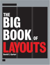
A new identity and total branding package was implemented for the VanderVeer Center, a Portland, OR anti-aging and cosmetic procedure medical clinic, during 2006. The recognized print advertisement introduced the design and branding elements that were then used throughout the creation of all collateral, advertising, packaging, direct mail, outdoor, television and website projects. The one-page version of the magazine ad appears in the recently released book The Big Book of Layouts. Fisher's design for the company's logo has already been selected to appear in the books The Big Book of Logos 5 and Branded. The VanderVeer Center stationery package is featured in the book The Big Book of Letterheads. The rebranding of the firm is one of the case studies to be featured in the designer's own future book Identity Crisis!

(Ironically, Vanity Fair magazine recently refused to print the full-page version of the ad in a special regional Portland edition - but more about that in a future bLog-omotives entry.)

Designer Jeff Fisher, the Engineer of Creative Identity for the design firm, also served on the international panel of judges for the 2007 Summit Creative Awards. Other professionals participating in the judging process - from the United States, Kuwait, Denmark, Dubai, Canada, Germany, and Japan - represented the firms Paragon Marketing Communications, SP3, Turner studios, Stormhouse Partners, TBWA, Door Number 3, Ilan Geva & Friends, Olgivy & Mather, Tantramar Interactive Inc., Stellar Debris Creative Studios, Marketel, Velocity Design Works, Promoseven Network Inc., Quantum Advertising and Jeff Fisher LogoMotives. When it came time to review and score the some entries, Fisher found it necessary to excuse himself from judging his own work and familiar logo design submissions from several other designers.

Jeff Fisher has received nearly 550 regional, national and international graphic design awards for his logo and corporate identity efforts. His work is featured in more than 85 books on the design of logos, the business of graphic design, and small business marketing.

Fisher is a member of the HOW Magazine Editorial Advisory Board, the HOW Design Conference Advisory Council and the UCDA Designer Magazine Editorial Advisory Board. His first book, The Savvy Designer's Guide to Success, was released by HOW Design Books in late 2004. He is currently writing Identity Crisis, also for HOW Design Books, which is expected to be on bookshelves in the fall of 2007.

(* If I don't "toot!" my own horn, no one else will.)

© 2007 Jeff Fisher LogoMotives

Subvertisements: Using Ads and Logos for Protest

The Center for the Study of Political Graphics (CSPG) is exhibiting images from their archives in the politcal graphics show Subvertisements: Using Ads and Logos for Protest at the California State University Northridge Art Galleries in Northridge, CA through April 21. The exhibition, of nearly 90 posters by artists, graphic designers and students, explores how consumerism and branding have shaped a foundation of cultural identity.

In describing the exhibit, Los Angeles CityBeat notes: "Two years in the planning, the show hosts work from the 1960s through just last week. Topics include vegetarianism, the environment, globalization, and human rights. Most of the posters were culled from the CSPG’s extensive collection; others were donations made specifically for this exhibit."

Items displayed in the exhibition are divided into three main categories, with some inevitable overlap: posters that appropriate ad imagery to address separate issues; product boycotts; and event posters with overtly political illustrations.

“Posters still have a real cost-effective and visual function,” says CSPG director Carol Wells. “To convey an idea to someone to get them thinking about a problem … artists can do that better than anyone else.”

The exhibition is funded in part by the Department of Cultural Affairs, City of Los Angeles.

Image: "iRaq," Forkscrew Graphics, Silkscreen, 2004, Los Angeles, CA

© 2007 Jeff Fisher LogoMotives

Reflections on judging a design competition

Last week I was once again a judge for the international Summit Creative Awards. My cohorts in judging the primarily print category entries were Ilan Geva, of the new firm Ilan Geva & Friends, and Simon Coffin of Turner Studios. We spent two full days reviewing, commenting and rating hotel conference rooms full of logos, identity packages, packaging designs, self-promotion, annual reports, brochures, advertising, signage, copywriting, ideas never produced, and other items created by students, designers and creative firms from around the world.

A couple weeks ago I was asked by another designer if I would have the opportunity to travel for the judging. As a matter of fact, I did get to travel - to a hotel about four miles from my North Portland home studio.

Competition results will not be announced until the judging of broadcast, interactive media and emerging media is completed in the next month. Email or letter notification is scheduled to go out to all entrants by April 23 according to competition staff.

While somewhat fresh in my mind, I wanted to post some comments about the competition and my third Summit Creative Awards judging experience:

• Over the course of the Summit Awards history, design work from over 50 countries, on five continents, has been submitted. It is fascinating to see the scope of international work - especially the pieces submitted annually from designers in countries such as Dubai and Kuwait. It sure would be helpful to the judges if all the foreign entries included translations of the project text.

• The new rebranding/logo re-design category was very well received and I enjoyed seeing the many design solutions submitted. Unfortunately, not all submitters thought to include the "before" images for comparison to the final new identity.

• Hundreds of logos were submitted in the various identity categories. (I only had to excuse myself from judging one design I knew a bit too well.) Again, it would have been very helpful to those judging the design if all had included a short description of the type of business being identified - as requested in the call for entries. Taken completely out of context, it was difficult to give some well-designed images the credit probably deserved as a communication vehicle.

• The competition category that disappointed me was direct mail. It would seem that many designers do not understand how to create effective direct mail pieces. Paper folds didn't necessarily work well within the some designs, image/text placements were very awkward in some cases, and the required message often got lost in over-designed or cluttered pieces.

• The previous two years, when judging the Summit Awards, I walked into rooms full of pieces designed using lime green and orange as ink colors. Obviously, those colors were an over-used trend of the years prior to the submission deadlines. This year there was much more variety in the color treatment of materials in all categories. There did seem to be a greater use of earth tones, or subtle colors, that did not "scream" at the target audience.

• Paper textures, special ink treatments, unique bindings, the actual size of some submitted pieces, and even the smell of inks, always give the judges a wide variety of aspects to take into consideration when reviewing a piece of work. While the Internet upload option for competition entries is a valuable convenience for some designers - especially those in other countries who need to take shipping costs into consideration - and works well for logos, ads, and some stationery packages, many pieces lost so much being presented as a flat, color laser print.

• There is hope for the future of the design profession. Some of the student work submitted was incredible. Although the students are not creating projects in a "real world" atmosphere of clients, budgets, unrealistic deadlines and the like, the creativity, execution and presentation - swooshes, bevels, drop shadows and Photoshop effects - was all "there" in many of the university submissions

• Designers do have a lot of fun when it comes to creating their own stationery packages, promotion pieces and holiday promotions. (Again, I did need to excuse myself from judging two pieces in these sections, as there will be showcased in my future book.) Creativity oozed from some of the submitted work created with the designer, or creative firm, as their own client.

• Simple is good! When design work is presented in the competition setting next to hundreds of other pieces, the well-designed, beautifully executed, simple work stands out every time. Designers should consider that fact when sending pieces they are creating for clients - the end result needs to stand out in the sensory-overload world in which we live.

Judging such competitions is a great way to network with other design professionals while participating in a industry event, and possibily be inspired as a designer at the same time. I encourage others to contact industry design competitions in your area to offer your services as a judge or competition staff.

In the interest of full disclosure I should also mention that I participate annually in the Summit Creative Awards as a submitter. Since 1998 I have won 15 Summit Creative Awards, including two golds for identity design. Other designers should consider submitting their work to such competitions. My most recent list of design competitions is posted in an earlier bLog-oMotives entry.

I do want to thank Summit Creative Awards Executive Director Jocelyn Luciano and her excellent staff. The organization puts on a good show and treat the competition judges very well each year. It's a pleasure being associated with the organization.

Photo: Myself, Simon Coffin and Ilan Geva at the Marrakesh Moroccan Restaurant during the judging weekend

© 2007 Jeff Fisher LogoMotives
Bibendum: "Puffed up and provocative"

I've always loved advertising characters. In fact, I have a collection of over 200 advertising figures in my home studio. Bob's Big Boy hangs out on my desk with Toucan Sam, Sprout, Mr. Bubble, Cap'n Crunch and Chinese versions of Tony the Tiger. Colonel Sanders, Marky Maypo, the Trix Rabbit, Frankenberry, Sleepy, Snap, Crackle, Pop, Tillie the Tillamook cow, and many others look on from around the room. With the increasing value of the growing collection, I somewhat jokingly refer to it as "my retirement fund."

One of my favorites has always been Bibendum, better known to most as "the Michelin Man." As a kid, I remember seeing him on billboards, in the form of large roadside statues, and even sitting on an ashtray at my grandparents' house. He stands tall (and in other forms) among all the characters in my studio gathering.

Recently, with the popularity of the traveling exhibition “Nunc est Bibendum, An Iconographic Legend Since 1898,” Bibendum has been getting a lot of international news coverage. The exhibit is currently at the Conde Duque Museo Municipal de Arte Contemporaneo in Madrid until January 14, 2007. Additional locations in Europe, and eventually the United States and Japan, will be announced in the future. Michelin has a fun, abbreviated version of the exhibition on their corporate website.

The Michelin Man was first created in 1898 by French entrepreneurs AndrĂ© and Edouard Michelin in cooperation with the artist O’Galop (pseudonym of Marius Rossillon). Edouard noticed how a display of tires, stacked one on top of the other at an exhibition in Lyon, resembled the shape of a portly restaurant reviewer he knew. He told his brother Andre, who commissioned O'Galop to recreate Edouard's vision. The new character appeared in a 1898 poster showing him offering a toast, "Nunc est bibendum" (“It’s time to drink,”- or "Cheers" - in Latin), to his competitors with a glass full of highway dangers such as jagged glass. Nearly 100 years later, in 2000, Bibendum was selected as the "most recognized corporate symbol" by an international panel at the Financial Times.

Hopefully I will be able to see the exhibition in person at some location in Europe or when it comes to the U.S. I'll post any exhibit location updates in future bLog-oMotives entries.

One of my own Bibendums (in the photo above) is a 1980-81 French representation of a slim and trim Michelin Man. There's even an entire book about such Michelin items: The Michelin Man: An Unauthorized Advertising Showcase. I'll introduce you to some of my other advertising "friends" later. For more information about iconic advertising characters you might want to take a look at the books Meet Mr. Product: The Art of the Advertising Character or What a Character: 20th Century American Advertising Icons

© 2006 Jeff Fisher LogoMotives.

Fisher's VanderVeer Center ad design

featured in The Big Book of Layouts

A full-page magazine ad for the VanderVeer Center, a Portland- area provider of anti-aging medicine and cosmetic procedures, is featured in the upcoming book The Big Book of Layouts. The ad design, by Jeff Fisher of Jeff Fisher LogoMotives, is one element of the total rebranding of Dr. Elizabeth VanderVeer's medical facility. In this volume, prolific graphic design author David E. Carter highlights layout design efforts from graphic designers around the world.

Following Fisher's design of the VanderVeer Center identity, the immediate need in the branding of company was the creation of four-color print ads. The ad, featuring one of Dr. VanderVeer's own paintings, introduced the new logo, the tagline "The Art & Science of Image Enhancement," a new color palette and the photos of Loma Smith. The advertisement initially appeared in Affluent Living, Portland Monthly and regional editions of Better Homes & Gardens. Versions of the ad, including black and white adaptations, also appeared in area newspapers. The design concept was then used in the creation of all collateral for the VanderVeer Center and on the firm's website. The stationery package designed for the firm will appear in the upcoming volume The Big Book of Letterheads. The rebranding effort will also be featured in Fisher's book, Identity Crisis!, when it is released by HOW Design Books in 2007.

Since 1998, hundreds of examples of the design work of Jeff Fisher LogoMotives have appeared in over 20 books from David E. Carter, including the American Corporate Identity series, the Big Book of Logos collection and Global Corporate Identity. Fisher design efforts are also featured in the volumes Bullet-Proof Logos, Blue is Hot, Red is Cool, The Big Book of Designs for Letterheads and Websites, The Big Book of New Design Ideas, Logos Redesigned, and The Big Book of Business Cards.

© 2006 Jeff Fisher LogoMotives

A beautiful, simple and powerful

social message appears in New York City.

A few days ago I received an email, with the subject line "Ali Forney Foundation," from my friend Mark who lives and works in New York City. A couple graphics were attached to the email and he explained that he'd started seeing the images in the subways on his way to work.

The beautiful, simple and powerful posters from the Ali Forney Center, the nation's largest lesbian, gay, bisexual and transgender (LGBT) youth homeless services center, were part of the launch of a print and outdoor advertising campaign to ask a simple question: "Would you stop loving your child if you found out they were gay or lesbian?"

Telephone kiosk ads began appearing in Brooklyn, Queens, Manhattan and the Bronx on June 16, followed by print ads in publications such as the Caribbean Times, Hoy, Manhattan Times, Afro Times and New American Times. In addition, over 1000 subway ads began appearing on June 26, the day of the annual LGBT Pride celebration and parade in New York City. The campaign was created to send a strong message to parents of lesbian, gay, bisexual and transgender (LGBT) youth during Gay Pride Week in New York City.

In commenting on the campaign, Carl Siciliano, Executive Director of the Ali Forney Center, said, "This ad campaign speaks to a universal human experience, the love between a parent and a child,"

"Our goal is to address the rising rate of LGBT youth homelessness, particularly in communities of color," he continued.

The Ali Forney Center was started in June of 2002 in response to the lack of safe shelter for LGBT youth in New York City. AFC is dedicated to promoting awareness of the plight of homeless LGBT youth in the United States with the goal of generating responses on local and national levels from government funders, foundations, and the LGBT community.

The mission of the organi- zation is to help homeless LGBT youth be safe and become independent as they move from adolescence to adulthood. According to Siciliano, from his Advocate.com commentary Do we reject our LGBT children?, "a recent study indicated that 25% of teens who come out experience rejection by their families. And many of these rejected teens find themselves out on the street, homeless and vulnerable. Surveys of homeless youths in cities across our country consistently show LGBT teens making up 25% to 50% of the entire homeless youth population."

The center is committed to providing homeless LGBT youth with the services they need to thrive, including emergency and transitional housing, medical and psychiatric care, street outreach and drop-in services, and a vocational training program.

The campaign was created by Double Platinum, a full-service marketing communications agency that specializes in messaging related to the GLBT community and for the gay and lesbian market.

© 2006 Jeff Fisher LogoMotives

What advertising is working?: Perception vs. reality

I recently asked a new Portland client how she tracked the success of her advertising, marketing and promotion efforts. She told me that she didn't. I then asked how she knew what was drawing customers to her business. She told me she "didn't have a clue." This woman was spending beaucoup bucks each month to promote her business. She was doing radio, television, print (magazine image ads and newspaper "call to action" ads) and outdoor; yet she didn't have a clue what was working. However, she did seem to have a problem saying "no" to any advertising representative calling on her business to present promotion possibilities.

As she was stuck in contracts of several future months with most forms of media, I immediately suggested that she only promote certain specials on one given media at a time. Potential customers seeking the special for a specific service would help her start the process of being able to track what was best serving the business as an advertising vehicle. I also suggested that she educate her entire staff about the specials being featured each week. Previously, most didn't know what was being advertised at any time. In each weekly staff meeting employees began to receive printouts of all ads being run and a schedule of broadcast media efforts. A notepad was created, providing a checklist of all advertising being done, for personnel answering the phones. When the phones were answered, the caller was first asked how they had learned about the business , with the response being recorded on the notepad. Far from an exact science, this did help the business owner begin to get an idea of what advertising dollars were bringing clients to the company. When her current contracts expire it will not be necessary for some to be renewed.

This whole excercise reminded me of the experience of a friend/client who owned a high-end men's clothing store in Seattle some years ago. We had the opportunity to make use of the talents of a great fashion photographer for a photo shoot of models wearing the clothing while walking through Pike Place Market. I developed a series of print ads to run every other week, in only the freebie publication Seattle Weekly. The business owner was quite savvy when it came to his marketing and promotion. He decided to make sure his employees asked each customer how they learned about his store.

Over a period of a couple months, the majority of customers said store advertising had resulted in their first visit to the establishment. (The other top answers were word-of-mouth and simply walking by the store) Most then said they first learned about the store through ads in one of the city's daily papers - in which no ads were ever placed. Many others recalled seeing television commercials or hearing radio spots - no broadcast media was ever used. Others commented on seeing outdoor signage or bus boards promoting the store - additional vehicles never even considered in the original advertising plan. A somewhat small number accurately remembered seeing the ads in the Seattle Weekly. Still, most of those seemed to remember the ads running every week, when the placements were actually only every other week.

Although the answers were not what he expected, my client/friend was thrilled that he was getting such broad perceived advertising exposure for the reality of a limited advertising dollar expenditure.

How are customers/clients finding your business? What is the perception? What is the reality? How do you track the results of your advertising efforts?

Note: This piece originally appeared as a forum posting on the StartupNation community forum.

© 2006 Jeff Fisher LogoMotives

Kevin Carroll and a cup of "joe"

While not a huge fan of Starbucks, the mega-corporation gulping up the coffee business around the world (I will never forgive them for what they did in buying my favorite coffee company, Torrefazione Italia, and shutting down all the cafes. I can't even bring myself to buy the beans now marketed in grocery stores under the name. And don't get me started about their corporate grinding of Astoria, OR coffee shop owner Sam Buck...), I have always been able to appreciate the company's effective use of graphic design. advertising and marketing. And now, a quote from someone I've met is on coffee cups at Starbucks.

Kevin Carroll is a force of nature. If you've never seen him speak, find out where he will be next and attend. This guy will "suck the air out of the largest room" (a term a friend once used to describe my sister's energy level) with his passion, enthusiasm and verbalized thoughts. If you haven't read his book, Rules of the Red Rubber Ball: Find and Sustain Your Life's Work, get yourself a copy as soon as possible. In fact, go to the web site of his company, The Katalyst Consultancy for all kinds of great information and to sign up for his monthly newsletter.

Kevin is full of words of wisdom. Now, a morsel of his advice is part of a campaign initiated by Starbucks to encourage conversation and interaction between its customers. Through their "The Way I See It" program, quotations by notable figures have been printed on cups and distributed via 17 million coffee drinks across North America. The Kevin Carroll quote, on cup #77, is:

The human catalysts for "dreamers" are the teachers and encouragers that "dreamers" encounter throughout their lives.� They are invaluable in the quest to turn ideas into reality.� So here's a special thanks to all of the teachers - especially my teacher, Miz Lane!

I've got my own Kevin story. Kevin made me famous - or perhaps, infamous. At the 2004 HOW Design Conference in San Diego, I was lamenting (OK, I was bitching and moaning) to Kevin and my friend Karen Larson (of design firm Larson Mirek) about the fact that my presentation was the last one of a long day. Known for occasionally working in my home office in my underwear, I said "Maybe I should do my presentation in my underwear to wake people up." Kevin's eyes lit up, and he flashed his famous grin, as he yelled "Do it!" Karen soon joined his enthusiasm after initial head-shaking. Then Kevin gave me one additional little piece of advice: "Have one glass of wine before making your presentation to take the edge off." Later that day I got rid of that "edge" - and then my shoes, shirt and pants as I made my presentation. My performance was a huge hit -and to this day I take great pleasure in blaming (and crediting) Kevin Carroll for my actions. I also thank him for his encouragement.

Damn...I may even need to go get a grande latte at Starbucks to support Kevin's thought about teachers...and my thanks to elementary school teacher Tom Tyler, high school art instructor Ken Collins and university journalism/design professor Roy Paul Nelson.

Photo: The Katalyst Consultancy

© 2006 Jeff Fisher LogoMotives