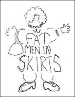
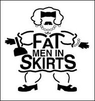
 In his recent Right Brain Reader piece, Away from the sketch pad; away from the struggle, Philip Bailey mentioned the logo I had designed for the theatrical production Fat Men in Skirts. Having done the logo about a decade ago, I had not thought about the image in some time - and then the other day I came across my original sketch for the identity on a scrap of laser paper that I had filed away.
I've been designing logos for triangle productions! theatre presentations for over 16 years. Producer/director Don Horn has been a dream client. He'll throw some odd play or musical name my way and leave me alone to create the identity for the show. He seldom even requests any changes in the designs. In this case, the production was to be playwright Nicky Silver's show Fat Men in Skirts.
I almost immediately had an image for the logo in my mind - kind of a cross between a middle-aged thick manly man and someone's pleasantly plump grandmother - with curly black chest hair. I quickly sketched out a rough design and then proceeded to take the image to the computer. In my digital design I wanted to maintain some of the qualities of the rough drawing - without giving the "fat man" too much detail.
The show was yet another successful local theatre production. My logo design had some success as well. It was recognized by the PRINT's Regional Design Annual at the time and was published in the Japanese design book New Logo & Trademark Design - which was recently republished in paperback as Logo and Trademark Collection.
My latest assignment: Create the logo for Tonya & Nancy: The Opera (Yes, that Tonya and Nancy!).
© 2006 Jeff Fisher LogoMotives


No comments:
Post a Comment