Showing posts with label letterhead design. Show all posts

Toot! Toot!*:

The Big Book of Letterheads features

designs from Jeff Fisher LogoMotives

Two stationery package designs by Jeff Fisher, the Engineer of Creative Identity for the design firm Jeff Fisher Logo- Motives, appear in the recently released book The Big Book of Letterheads. Designs for the VanderVeer Center and Pearl Real Estate are among over 330 examples featured in the volume from author David E. Carter and the publisher Collins Design.

The letterhead design for the VanderVeer Center, a Portland- area provider of anti-aging medicine and cosmetic procedures, is just one element of the total rebranding of Dr. Elizabeth VanderVeer's medical facility. The creation of a new logo led to the design of print ads with an immediate publication deadline, followed by stationery, signage, outdoor advertising, the website format and specialty items. The stationery package will also be featured in Fisher's book, Identity Crisis!, when it is released by HOW Design Books in 2007.

The letterhead, envelope and business card for Pearl Real Estate, another Portland firm, are also presented in the book. Ironically, since submission of the designs for possible inclusion in the book, the residential real estate company has been rebranded by another firm. The company's business card also appears in The Big Book of Business Cards.

Jeff Fisher has received nearly 570 regional, national and international graphic design awards for his logo and corporate identity efforts. His work is featured in nearly 100 books on the design of logos, the business of graphic design, and small business marketing.

Fisher is a member of the HOW Magazine Editorial Advisory Board, the HOW Design Conference Advisory Council and the UCDA Designer Magazine Editorial Advisory Board. His first book, The Savvy Designer’s Guide to Success, was released by HOW Design Books in late 2004. His new volume, Identity Crisis!, will be on bookshelves in late 2007.

(* If I don’t "toot!" my own horn, no one else will.)

© 2007 Jeff Fisher LogoMotives

Fisher's VanderVeer Center ad design

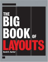
featured in The Big Book of Layouts

A full-page magazine ad for the VanderVeer Center, a Portland- area provider of anti-aging medicine and cosmetic procedures, is featured in the upcoming book The Big Book of Layouts. The ad design, by Jeff Fisher of Jeff Fisher LogoMotives, is one element of the total rebranding of Dr. Elizabeth VanderVeer's medical facility. In this volume, prolific graphic design author David E. Carter highlights layout design efforts from graphic designers around the world.

Following Fisher's design of the VanderVeer Center identity, the immediate need in the branding of company was the creation of four-color print ads. The ad, featuring one of Dr. VanderVeer's own paintings, introduced the new logo, the tagline "The Art & Science of Image Enhancement," a new color palette and the photos of Loma Smith. The advertisement initially appeared in Affluent Living, Portland Monthly and regional editions of Better Homes & Gardens. Versions of the ad, including black and white adaptations, also appeared in area newspapers. The design concept was then used in the creation of all collateral for the VanderVeer Center and on the firm's website. The stationery package designed for the firm will appear in the upcoming volume The Big Book of Letterheads. The rebranding effort will also be featured in Fisher's book, Identity Crisis!, when it is released by HOW Design Books in 2007.

Since 1998, hundreds of examples of the design work of Jeff Fisher LogoMotives have appeared in over 20 books from David E. Carter, including the American Corporate Identity series, the Big Book of Logos collection and Global Corporate Identity. Fisher design efforts are also featured in the volumes Bullet-Proof Logos, Blue is Hot, Red is Cool, The Big Book of Designs for Letterheads and Websites, The Big Book of New Design Ideas, Logos Redesigned, and The Big Book of Business Cards.

© 2006 Jeff Fisher LogoMotives

Best of Letterhead and Logo Design

hits the bookselves in paperback

The other day I was browsing the shelves of the design section at Powell's City of Books and came across the Rockport Publishers offering The Best of Letterhead and Logo Design in its new paperback version. (The Amazon site says the book has not yet been released - but I also saw it at Borders that same day.) The new small-format edition is a collection of many designs previously presented the long-running Letterhead and Logo Design book series from the publisher. It's a great inspiration resource for any designer interested in creating identities for businesses, products, organizations or events.

Jeff Fisher LogoMotives is represented in the book with eight designs. The logos featured include those for Portland firms Carmen Schleiger Architecture, City Laundry Northwest, law firm Samuels Yoelin Kantor Seymour & Spinrad, Denny Shleifer Marketing Communications and hairstylist Jeff Maul. The image for the nonprofit group Love Makes A Family was also selected for the book. The logo for the San Francisco nonprofit Laugh Line Productions is also displayed. In association with his sister’s Bend, Oregon firm TriAd, the designer created the included identity for the company Gina’s Italy. The designs are from volumes in the book series from the 1990's.

With both the original hardback and the new paperback volumes, I've noticed that "No. 1" is incorporated into the book cover design. I hope this is a sign of future volumes to come.

© 2006 Jeff Fisher LogoMotives

Review: Letterhead & Logo Design 9 - the best yet

Rockport Publishers continues their long-running design book series with Letterhead & Logo Design 9, this volume by Christopher Simmons and his San Francisco design firm MINE. The designs presented in the book were selected from over 3000 submissions from identity designers in 38 states and 40 countries. With a new spin on the publication series, the nearly 300 examples of logos, stationery packages, and other promotional items presented in this volume are organized by attributes, rather than the usual categorization by industry or type of client. The selection of designs exhibited was based on beauty, wit and whimsy, simplicity, subtlety, virtuosity, typography, materiality and miscellany. The latest, and freshest, addition to the on-going Rockport collection will elicit many “damn, why didn’t I think of that?” thoughts and provide a great deal of inspiration to any graphic designer with even the slightest interest in logo design. Simmons is having a banner publishing year, having released the book Logo Lab earlier in 2005. Logo Notions also did a profile on the designer earlier this year with the title “What a ‘little birdy’ told me about identity design.”

© 2005 Jeff Fisher LogoMotives