WaMu - I see frustration and stupid people...

(BEWARE: This is a rant - because I'm in a mood and I can)

Every small business person wants to do business with friendly, convenient and reliable service providers in the course of day-to-day operations. Associating with businesses where "everybody knows your name" is also an advantage.

After years of impersonal service from a major banking institution having some of my accounts, and dealing with a small bank that was not convenient for business purposes, I was thrilled when Washington Mutual opted to open a new branch at the corner of Lombard and Burrage near my home studio. I'd heard nothing but good feedback from others banking at WaMu. As I traveled I found branches near a convention center in San Diego, within walking distance of a resort in Rancho Santa Fe, CA, and a couple blocks from my hotel in San Francisco. The many locations were a selling point. A good friend, who worked for WaMu at the time, even took me in to meet the branch manager at the new location. It seemed a great fit for the banking needs of my little one-person business. I liked the "small town" feel of the branch and the fact I was recognized every time I went in to do my banking. If there was any particular issue, which was rare, I could call, email or visit the manager to get it resolved quickly and personally. As I don't keep what one might call "banking hours," I appreciated having the ATM nearby to do my banking if necessary. In fact, there were times when went to the bank, made a deposit and by the time I got back home the transaction was already noted in online account information.

I guess the honeymoon is over. Has WaMu become yet another oversized, uncaring, impersonal financial institution when it comes to dealing with individual and small business customers?

This past fall I made a couple sizeable deposits (sizeable for my business anyway) of local (Portland) checks via the ATM and thought nothing more about them. As I do most of my bill payments online, I just took it for granted that the deposits had been credited to my account and my bills were being paid electronically as scheduled. Imagine my surprise when going online a couple days later to find that neither deposit had been fully credited to my account. Both had "holds" on them according to the online account summary.

Contacting the less-than-helpful "customer service" department resulted in a response telling me that a two-day hold had been placed on the checks - which was actually a three-day hold in the case of one deposit. No explanation. The representative also apologized "for any inconvenience caused." That was it.

I immediately contacted the always helpful branch manager and let her know about the situation. She very quickly responded with: "Whenever you make a deposit into the ATM there will be a hold on the checks. (Note: Which had never been the case previously) Our ATM's have different hold regulations due to the checks being processed through an outside department and not within the branch. If you need to make a deposit when we're not open, try to use the Night Drop - these deposits are processed each morning when we open and are looked at by branch employees instead of an outside department." She then overrode the "hold," making all funds available, and all was right with the world.

Since that day I have always stood in line in the branch to deal directly with a teller, or used the night deposit box in the lobby, to make deposits. None of this, two (or three) day "hold" nonsense for me as punishment for making use of ATM convenience.

Then in January I returned to from a trip out of town during a snow storm. After a visit to my PO Box I had checks that I knew needed to be desposited. I went to the branch on that snowy day to make a deposit. The branch was closed due to the storm. All ATM deposit envelopes, deposit slips and night deposit envelopes in the lobby were gone - and I was unable to make a deposit in any way due to that situation. The next morning I returned - luckily bringing a deposit envelope/slip from home - because the branch was still closed due to the bad weather and all deposit material supplies in the ATM lobby were still exhausted. As snow doesn't stop Internet scheduled payments to other accounts, a scheduled payment was made and I incurred an overdraft charge due to the fact I was unable to make a deposit. "Customer service" basically blew me off and never addressed the situation. Let me get this straight; the bank can close due to snow, I am unable to make a deposit because the branch in closed and there are no deposit supplies in the secure lobby, and I'm simply out of luck? It's my problem - not WaMu's? Yep, that's a bank providing "customer service" to their valuable clientele.

That brings us to this last week when, as advised by the previous manager, I made an early morning deposit on Friday via the night deposit drop. Supposedly that would mean the deposit would be handled efficiently by a real person and credited to my account that same day. Silly me, I had no reason to check my balance online until yesterday - six days later. The deposit had never been credited to my account and I was incurring overdraft charges left and right.

In the "olden days," of true customer service, a financial institution would have called a customer with a bit of curiosity about the state of the customer's account and the problem would have been dealt with much sooner. Well, obviously that's not how things are done these days.

It turns out that bank did get my deposit in the night deposit box last Friday morning - but the individual processing the deposit couldn't read one of the handwritten account numbers on my deposit slip. With my name on both the check and the deposit slip they couldn't look up my account in any manner? Someone in the small neighborhood branch couldn't ask "Does anyone know this Jeff Fisher guy?" to tellers who have sometimes seen me several times a week and know me by name? I guess it would take too much effort to contact the individual who wrote me the check in question to determine my contact information if all else failed.

A branch employee actually let me know that the first numeral of of my account number looked like a "J" rather than a zero and "We had kept your check and deposit slip hoping you would call us." So, basically they must have been waiting for me to start receiving overdraft notices in the mail (which I have yet to receive) as a sign to me that something was very wrong with my account.

Last night the deposit, which was actually made nearly a week ago, was finally credited to my account. Funny, none of the overdraft charges (including yet another today) has been credited back to my account - although I have requested that action from the branch and WaMu "customer service." "Customer service" ignored my requests for the name of someone higher up in the company who might be able to help me (I understand that this is a common complaint of supposedly valuable WaMu customers experiencing account problems). I did get a copy of an email from the branch manager in which he requested that his assistant manager take care of the situation. Nothing has happened.

My rant is over. I guess the days of a bank that treats small businesses like a small town neighbor are also over. Maybe WaMu has gotten a little too big for it's britches. I suppose I expected more from the company because that is what the bank offered. Early on I would often recommend WaMu to a small business owner looking for an appropriate bank. That would not be the case today. Perhaps I should have kept my banking with the smaller, three-branch, truly customer service-oriented - but less convenient - community bank with which I had done business for years.

Update 03.12.07: This is the response received from "customer service" today in a form letter response (I know it is a pre-fabbed response due to submitting two individual complaints and getting exactly the same response to each submission.):

I understand these fees can be costly and regret that they cannot be refunded. As a courtesy, WaMu has paid the items that overdrew your account to the merchant, which prevents you from incurring additional charges for them.

Washington Mutual takes responsibility for bank errors and will work with customers to resolve issues arising from those errors. Your concern has been researched, and as no bank error was found, the fee cannot be refunded.

Update 03.23.07: Still no action from Wamu in crediting the overdrafts as a result of their mishandling of my night drop deposit. I do know that the situation has cost the bank a few potential business customers - which may prevent others from going through similar situations.

The manager of another WaMu branch told me that the Lombard & Burrage manager should have made the situation right. A customer service person for U.S. Bank told me that their personnel would have made more of an effort to contact me initially upon not being able to read the account number, to avoid such a situation getting out of control - and then they would have refunded the unnecessary overdraft charges. The U.S. bank individual said they would treat a customer better when dealing with justified overdraft charges - first offering the customer the bank's overdraft protection product and then, as a courtesy, refunding the most recent overdrafts.

Update: 03.27.07: Yesterday I learned from another WaMu manager that I should have received at least a couple "courtesy overdraft refunds" in this matter. I had no idea there was such a thing

Today I received notification from the assistant manager of my branch that the overdraft charges incurred due to this situation were being refunded. In addition, she emailed me the following:

"I do apologize for the inconvenience and the confusion on this account. I do take full ownership of this situation and agree that it should not have happened. We do value your business and the relationship we have established. I assure you that this type of situation will not happen again. My staff is now fully trained on how to handle these particular situations. If you would like to discuss anything further I would love to hear from you. We do strive to give great customer service and hope we can redeem ourselves in the future if you are willing to give us that opportunity. Thank you for bring this to our attention and again I do apologize for this situation and the time it took out of your day."

Thank you WaMu.

Update: 04.07.07: Just a little more "WAMU weirdness." So this week I notice an unusual deposit to my account on 04.02.07 and I can't figure out what the hell is going on. Turns out a deposit I made to my account - via the infamous Lombard & Burrage night deposit box - back during the last week January (that's over two months ago!), drawn on a local Portland bank, was just deposited to my account. Huh? Was the check just laying around the branch somewhere? No wonder my account was screwy this past month - I guess I need to keep an even closer eye on the happenings at my WAMU branch.

Update: 05.12.07: Another cute little "WAMU trick." There was a line at my WaMu branch this Saturday morning - so I deposited a check via the ATM. Just noticed online that the deposit is already posted to my account - with a posting date of 5/14/07 rather than today. No notification online that the check is being held or anything. I guess WaMu can do things like that when they just don't give a hoot about providing quality customer service to their customers.

Update: 05.13.07:It's a Sunday evening and I just got a "canned" response from WaMu "customer service about the above issue. It said:

Thank you for your email. I understand your concern and apologize for any inconvenience caused.

Dates listed on your statements and through the Online Banking Service reflect the posting date for transactions. Transactions can only reflect posting dates that correspond with business days. Saturdays, Sundays, and federal holidays are not business days.

Any transaction that takes place on a non-business day reflects a posting date that corresponds with the next business day. For instance, transactions processed on a Saturday will reflect on your statement with Monday's date. If Monday is a holiday, then the transaction will reflect Tuesday's date.

Hmmm... that's funny; if Saturday is not a business day then why is the branch open? When a deposit is made at an open branch are they not open for business, with business being conducted? And why am I getting an email from "customer service" on a Sunday evening? I thought Sunday was not a business day. Looks like WaMu makes up the rules to whatever beneifts them the most...

© 2007 Jeff Fisher LogoMotives

Logo competition upsets local graphic designers

I was pleased to read of the position being taken by 11 graphic designers in Cleveland in response to the Cleveland Foundation conducting a "contest" to select a new logo. HOW Design Forum member "dougler" brought the article Logo competition upsets local graphic designers to the attention of forum visitors earlier today.

I think many in the design industry have reached a point of "we're mad as hell and not going to take it anymore" in regards to calls for speculative work being masked as "contests." The NO!SPEC movement was launched for the purpose of taking on the issue of graphic design industry "spec" work. Some argue that "spec" requests have always existed in the design industry. That doesn't mean such situations are acceptable or should continue.

The letter written by the designers to The Plain Dealer newspaper, and the follow-up article, are a welcome addition to the ongoing design industry effort to educate businesses, organizations, other designers and the general public about the value of professional graphic design and the processes that may help any design client get the best end result. My previous well-circulated article and bLog-oMotives post, When a "contest" is not a contest, and efforts such as the Graphic Artists Guild's published Suggested Guidelines for Art Competitions and Contests, also are part of that education process.

I seriously doubt that the Cleveland Foundation intended, or expected, to find themselves in the middle of a controversy when announcing the organization's logo design contest. Perhaps the "contest" should have been researched further before putting the specifications out to the public. The newspaper article comments of James Lubetkin, senior communications editor at the foundation, suggest that the organization does have a sensitivity to the situation - after the fact.

I've been involved in situations in the past where an entity seeking a new identity has initially reviewed a great many portfolios. From reviewing past work, a few designers/firms are selected to submit presentations. Those design professionals are compensated with "x" number of dollars for the time spent in preparing and presenting proposals. The business, agency or organization then bases their hiring decision on those presented ideas. I appreciate the search process being conducted in such a manner. As a designer, it conveys to me that the potential client understands the value of the professional graphic design process and the results.

Congratulations to the "Cleveland 11" for putting a public spotlight on the issue.

© Jeff Fisher LogoMotives

Tharp Did It: A retrospective exhibit

At the 2005 HOW Design Conference in Chicago the news spread quickly through the gathered design professionals: Designer Rick Tharp was missing. It was later learned that the man whose work I admired so much had taken his own life. At the time, as a contribution to my Logo Notions column, I wrote the well-received tribute piece An introduction - and farewell tip of the hat — to Mr. Tharp. Through that article I cyberly met many people who cared deeply for Tharp, including family, friends and design industry peers.

This evening one of those individuals, Lourdes Pollard of the Phoenix Data Center, contacted me to make me aware of an exhibit honoring Rick Tharp and his work.

The exhibit, THARP DID IT: GRAPHIC WORK - A Retrospective Exhibit, opened this past week at the Art Museum of Los Gatos in California. The show of Tharp's work will continue through March 30, 2007. On Saturday, March 24, from 6:00 to 9:00 p.m., there will be a Gala Reception, and silent auction, to benefit the Rick Tharp Design Scholarship.

The museum's website states:

Rick Tharp came to Los Gatos in 1974, and maintained a studio in Old Town for 30 years. He designed the masthead, mascot, and the first few issues of the Los Gatos Weekly in 1982.

Rick’s firm, Tharp Did It, specialized in corporate identity, package design and environmental design. Renowned for his humorous designs, his work ranged from wine labels, business logos, and award-winning advertising campaigns for companies such as Brio, a European toymaker.

Local Tharp customers include: Steamer's, Le Boulanger, Carrie Nation, Domus, Bears in the Wood, The Wooden Horse, Valeriano's Restaurant and Old Town among others.

In 1988 Tharp received a CLIO Award, often referred to as the "Oscar" of the advertising world, in New York for wine packaging design for Mirassou Vineyards. He designed street signs and banners for the Town of Los Gatos. His philosophy was "Don't break rules just to be breaking rules, but, on the other hand, don't let them get in the way either." and "Always have fun doing it."

Anyone having the opportunity should see the exhibit, which is sure to be a collection of incredible creative inspiration for any designer.

Photo: Saratoga News/George Sakkestad

© 2007 Jeff Fisher LogoMotives

A reading list for poolside enjoyment - Part deux

Last year when I returned from two weeks in St. Croix I posted the list of books I'd read by the pool. This year, before I even left for the annual trip, people were already asking what I planned on ready. To be honest, the stack of books for this trip came together at the last minute with trips to Powell's and Borders the day before we left for the Caribbean.

For the most part, the reading list for 2007 was made up of books about food, about wine, about travel, or about food, wine and travel. Although I didn't leave the beachfront house for an initial period of seven days, I was not quite the reading maniac this year. Part of my vacation, with PowerBook as carry-on luggage, was spent finishing my own upcoming book, Identity Crisis! Somehow I ended up coming home with several books that had not even been cracked open.

Just prior to the trip, my friend Mary suggested that I read A Thousand Days in Venice, by Marlena De Blasi. Venice is one of my favorite places in the world. We plan on visiting the city again this fall. The author's writing took me there - I could smell the food, flowers and stinky canal water; I had been to many of the locations mentioned, and I'd walked the streets the author traveled. In her second book De Blasi and her husband move to a small village in Tuscany. A Thousand Days in Tuscany transports the reader there. As I usually stay in similar villages in Umbria, near the border of Tuscany, I could relate to many of the events and experiences described in the book - and look forward to being there again this year.

Our friend Carol (who has been our housecleaning person for over 12 years) recommended that I read Eat, Pray, Love: One Woman's Search for Everything Across Italy, India and Indonesia, by Elizabeth Gilbert, even though she considered it a bit of a "chick book." She thought I would find the writing about food, travel, culture and spirituality interesting. It was a great book about the author's stays in each of the geographic locations. The reader can almost gain the 30+ pounds the writer put on while eating her way through Italy by reading of her experiences. Still, I'm not sure I can forgive GIlbert for not personally liking Venice. Having only been to Bombay (now Mumbai) in India, I found the writer's search for spirituality on a remote ashram a great contrast to my own experiences. I've always wanted to visit Bali and surrounding islands. Gilbert provided an excellent introduction to the culture of the island. Although I did occasionally want to yell "Snap out of it!" at the author, for being whiny about her life, I did enjoy the book and her search for solutions to the personal issues she was facing.

Two years ago, while in St. Croix, I read J. Maarten Troost's hilarious book The Sex Lives of Cannibals: Adrift in the Equatorial Pacific, about living on Tarawa, a remote South Pacific island in the Republic of Kiribati, for two years. This year I packed, and thoroughly enjoyed, his follow-up book, Getting Stoned with Savages: A Trip Through the Islands of Fiji and Vanuatu. In this segment of his life, Troost and his wife, Sylvia, move from Washington, D.C., to Vanuatu, a nation made up of 83 islands in the South Pacific. "Getting stoned" refers to the altered state and pleasure he gets from drinking kava with the locals (I've had it before and the "high" is a bit bizarre.). The adventures, and misadventures, of the couple make a great read.

I interrupted the travel and food literary itinerary long enough to finally read Caffeine for the Creative Mind: 250 Exercises to Wake Up Your Brain, by Stefan Mumaw and Wendy Lee Oldfield. Yes, I actually took a graphic design book on vacation with me. A few years ago, in San Diego, Wendy interviewed me for the book at the HOW Design Conference. I was honored to be included in the book as one of a dozen industry professional profiles surrounded by great creative exercises. It was great to finally have the opportunity to read the book without the static of my normal work life. Every designer should get themselves a copy.

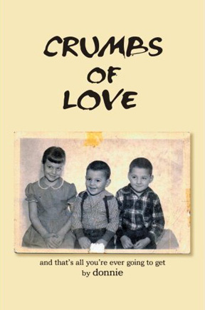
Many years ago I read a very rough draft of my friend Don Horn's book, Crumbs of Love: And That's All You're Ever Going To Get. He gave me a copy of the published book just after the first of the year. It's an amazing story of his early life, growing up in an incredibly dysfunctional family. The travel in the book is in the form of long-distance road trips, the food is far from gourmet and the accommodations are certainly not luxurious. I'm so proud of him for getting the book completed and out there for others to read. My partner Ed, and out travel companions Lisa and Bev, were all stunned and fascinated by the book.

I've always loved great writing and the New York Times restaurant reviews of critic Ruth Reichl were always a feast of words. Her book, Garlic and Sapphires: The Secret Life of a Critic in Disguise, was the most enjoyable I read on my vacation this year. In addition to be an excellent writer, Reichl is a fantastic storyteller. I'm looking forward to a visit to Powell's to pick up her other books.

At a movie in January I saw the previews for a film called The Namesake and it caused me to seek out the book on which the film is based. Jhumpa Lahiri, who won the Pulitzer Prize for her book Interpreter of Maladies, is the author of the novel The Namesake. It's an incredible look into the cultural conflicts within one family, with one root of the family tree in India and another in the United States. As in many of the books I read while in the Caribbean, food and travel play a large role in the story. Lahiri's writing is so fine, I'm no longer sure I want to see the movie. I think any film adaptation may ruin the experience I had reading the book.

Shortly before leaving for our trip, Ed and I had a wonderful evening with our friends Bob and Norma. The conversation usually turns to books when we get together as Bob is an accomplished writer in his own right, having published his holiday story collection Mardi Gras at the Monastery And Other Stories, and the historical non-fiction books Fire Mission!: The Siege at Mortain and Enemy North, South, East, West. When Norma asked what I was currently reading, I explained that I was in the middle of the excellent Thomas Jefferson on Wine by John Hailman. She replied that I simply must read what she was currently enjoying - Wine and War: The French, the Nazis, and the Battle for France's Greatest Treasure by Donald and Petie Kladstrup. I took the book on the trip and it is an amazing history lesson on war, wine and French life.

Another book I read while in the Caribbean two years ago was Running with Scissors: A Memoir by Augusten Burroughs. In fact, the film was one of six or seven movies we watched while in St. Croix this year. The oddest, and funniest, book I read on this trip was Burroughs' novel Sellevision. Take somewhat sick and twisted characters like those in Scissors and put them all together working at a cable shopping network and just about anything can happen. Sellevision would make a fun film.

Now I am reading the book I began prior to our 13+ hours on planes coming back to Portland. Barack Obama is the most fascinating politician today and his book, The Audacity of Hope: Thoughts on Reclaiming the American Dream, details his thoughts on improving our country. If the election were held today, I'm not sure Obama would get my vote. However, I am enjoying learning more about him and I look forward to what will be a very interesting presidential campaign over the next year.

As I mentioned, several books didn't even get opened during our travels. I have not yet read Arthur & George by Julian Barnes, The Noodle Maker by Ma Jian, and Salt: A World History by Mark Kurlansky. Heat: An Amateur's Adventures as Kitchen Slave, Line Cook, Pasta-Maker, and Apprentice to a Dante-Quoting Butcher in Tuscany by Bill Buford, My Life in France by Julia Child and Alex Prud'Homme, and Michael Pollan's The Omnivore's Dilemma: A Natural History of Four Meals never even made it off my nightstand and into my luggage.

Oh well, there will be other vacations...

© 2007 Jeff Fisher LogoMotives

Jeff Fisher LogoMotives featured at LogoPond

For some time I've been working on putting together a bLog-oMotives piece on the variety of online portfolio and directory sites available to designers - especially those working in the area of identity design. LogoPond, a logo design inspiration and critique site, was one of the resources to be included in that future piece. This morning my blog was getting a great deal of traffic from LogoPond so I thought I would investigate what was going on.

It turns out that my logo design work is the new "Featured Showcase" on the site. Over the past couple months I've been adding examples of my identity efforts to my own LogoPond showcase page. In fact, later today I plan to spend a bit of time adding a few more examples.

LogoPond allows designers, of all experience levels, to upload samples of their work at no cost. Some logos are works-in-progress for which designers specifically request critiques from site members (although members often seem to provide criticism whether requested or not). Other examples, as in my case, are finalized designs being posted as a source of possible inspiration for design students or those already active in the profession. In addition, site members may create their own profile page.

One of my pet peeves about the site, and many other online design critique venues, is that LogoPond allows individuals to post criticism anonymously while hiding behind a screenname with no public profile displaying any credentials to back up their supposed expertise. Posting of random comments, with no constructive design-related value, is of little use to a designer who may be requesting legitimate input. I actually had a cowardly anonymous poster refer to me as a "homo" in a recent personal attack masquerading as a "critique." Such comments reflect poorly on the design profession in a very public way. It felt to me as if a very professional design industry web presence had been reduced to little more than a middle school playground.

With my individual logo uploads I include a brief description of the specific logo project featured, list any awards the design may have received and mention books in which the design has been published. I then post a link to a bLog-oMotives entry, Creative Latitude article, or other online resource related to the logo.

LogoPond also has its own online forum for the discussion of identity, or design, related topics. Recent online discussions have hinted at a future LogoPond book and the possibility of a similar site focusing on illustration. The web presence also provides a page of additional related resources.

More on other Internet design portfolio sites and directories in the future.

© 2007 Jeff Fisher LogoMotives

Calls for entries:

Upcoming design competition deadlines

All of the following competitions deadlines present great opportunities to showcase your design efforts, market your work on an international scale through the published books, and "toot!" your own horn to clients, peers and the media:

Brochures from North to South America
(Index Book - Spain)
Deadline: No specific date published
No entry fees charged

Hungry Design
(Index Book - Spain)
Deadline: No specific date published
No entry fees charged

Packaging Identity
(Index Book - Spain)
Deadline: No specific date published
No entry fees charged

CA Illustration Annual
(Communications Arts - USA)
Deadline: March 13, 2007
Entry fees charged

CA Photography Annual
(Communications Arts - USA)
Deadline: March 13, 2007
Entry fees charged

American Inhouse Design Awards
(Graphic Design: usa - USA)
Deadline Extended: March 16, 2007
Entry fees charged

The Best of Business Card Design 8
(Rockport Publishers - USA)
Deadline Extended: March 16, 2007
No entry fees charged

1000 Music Graphics
(Rockport Publishers - USA)
Deadline Extended: March 31, 2007
No entry fees charged

HOW Promotion Design Awards
(HOW Magazine - USA)
Deadline Extended: April 2, 2007
Entry fees charged

Information Design Workbook
(Rockport Publishers - USA)
Deadline Extended: April 9, 2007
No entry fees charged

LogoLounge 4
(LogoLounge - USA)
Deadline: March 31, 2007
LogoLounge membership required

PRINT Regional Design Annual
(PRINT Magazine - USA)
Deadline Extended: April 2, 2007
Entry fees charged

STEP's Best of Web
(STEP Inside Design - USA)
Deadline: April 2, 2007
Entry fees charged

HOW InHOWse Design Awards
(HOW Magazine - USA)
Deadline: April 13, 2007
Entry fees charged

Design Matters: Packaging
(Rockport Publishers - USA)
Deadline: April 13, 2007
No entry fees charged

Celebrity Logos
(Index Book - Spain)
Deadline: April 21, 2007
No entry fees charged

Grids: 100 Creative Solutions for Designers
(Rotovision - UK)
Deadline: April 30, 2007
No entry fees charged

Big Book of Design Ideas 3
(David E. Carter - USA)
Deadline: May 4, 2007
Entry fees charged

European Logo Design Annual
(Eulda - Italy)
Deadline: May 18, 2007
Entry fees charged

The Create Awards
(Create Magazine - USA)
Deadline: June 1, 2007
Entry fees charged

Print & Production Finishes for Packaging
(Rotovision - UK)
Deadline: June 30, 2007
No entry fees charged

Print & Production Finishes for Sustainable Design
(Rotovision - UK)
Deadline: June 30, 2007
No entry fees charged

Communicating with Pattern: Signs & Symbols
(Rotovision - UK)
Deadline: August 31, 2007
No entry fees charged

Squares, checks & grids
(Rotovision - UK)
Deadline: August 31, 2007
No entry fees charged

You may want to read my article about participating in design industry competitions: A Winning Strategy. It has appeared on the Creative Latitude and NO!SPEC web sites. A list of design competition links appears at the end of the article.

Design competition calendars are also available at Icograda and Workbook. DesignTaxi and Dexinger post competitions of great value to industry professionals - however designers need to be aware that some of the listings are for "spec" work as a requirement for submission. Requests for new, or speculative, work as a condition of entering a "contest" are much different than legitimate design competition "calls for entries," in which previously created works are judged for possible awards, exhibition, or publication in an annual or other book.

Good luck!

© 2007 Jeff Fisher LogoMotives

BoDo launched as design professional resource

BoDo - the Business of Design Online - has launched its internet presence as an information resource for design professionals. BoDo’s aim is to provide a focused wealth of information, tools and techniques for successfully managing and marketing a design practice. Designers will find continuously updated resources for running a design shop, including select e-books, business forms, excellent articles and more on BoDo.

Created as an extension of the highly successful Creative Latitude design industry website, BoDo was conceived and developed by the team of Catherine Morley, Neil Tortorella and Jeanette Wickham. The trio will contribute regular blog posts and the occasional article series. A major strength of BoDo will be the growing list of visiting authors and content contributors.© 2007 Jeff Fisher LogoMotives

Toot! Toot!*: Jeff Fisher LogoMotives designs

chosen for The Big Book of Logos 5

Jeff Fisher, the Engineer of Creative Identity for the firm Jeff Fisher LogoMotives, has been notified that 31 of his identity designs will be included in the book The Big Book of Logos 5 as a result of the LOGO 2007 design competition. The book, from prolific graphic design author David E. Carter, is to feature hundreds of logos from design professionals around the world and is scheduled to be released in late 2007.

Designs from Jeff Fisher LogoMotives to be featured in the book include those for the Benicia Historical Museum (Benicia, CA), Four Rivers Community School (Ontario, OR), the annual golf tournament and auction events for Residence XII (Kirkland, WA), Twisted Elegance Interactive (Seattle, WA), The Parenting Alliance, and the Young Native Writer's Essay Contest sponsored by the Holland+Knight Charitable Foundation (Tampa, FL). An icon produced as part of the international Fluerons of Hope - Font Aid III effort, benefiting those impacted by the tsunami of 2004, was also selected.

Portland clients to be highlighted in the volume include interiors firm NoBox Design, the VanderVeer Center anti-aging clinic, the City of Portland's Neighborhood Service Center program, Bella Terra Landscape Designs, the AIDS residential care facility Our House of Portland, and architect Thomas Fallon.

Logos for the community activist organization Association for Responsible Inner Eastside Neighborhood Development (AFriend), the Reed College Fall Thesis programs for 2004 and 2005, The Spring Showcase presented by the Philoptochos of the Holy Trinity Greek Orthodox Church, and the now closed Balaboosta Delicatessen were also recognized.

Identities honored for North Portland individuals, organizations or events included those for community organizer Mike Verbout, St. Johns Window Project, Portsmouth Neighborhood Association, North Portland Business Association and University Park United Methodist Church's annual North Portland Pride BBQ and Festival.

Selected designs include images created for George Fox University's Tilikum Center for Retreats & Outdoor Ministries (Newberg, OR) and the Emerge Medical Spa at Bridgeport (Tigard, OR).

Gay/Lesbian community logo images to be in the book include designs for Just Out newsmagazine (Portland, OR) and the Diversity Training program of DiversityBuilder.com (Brentwood, TN). In addition, Fisher's "I DO!" image, in support of same-sex marriage, and the logo for his own marriage to his partner Ed Cunningham are celebrated.

The designer's logo for his presentation at the 2004 HOW Design Conference was also honored.

Since 1998, hundreds of examples of the design work of Jeff Fisher LogoMotives have appeared in over 20 books from David E. Carter, including the American Corporate Identity series, the Big Book of Logos collection and Global Corporate Identity. Fisher design efforts are also featured in the volumes Bullet-Proof Logos, Blue is Hot, Red is Cool, The Big Book of Designs for Letterheads and Websites, The Big Book of New Design Ideas, Logos Redesigned, The Big Book of Business Cards, The Big Book of Layouts, and The Big Book of Letterheads.

Jeff Fisher has received nearly 550 regional, national and international graphic design awards for his logo and corporate identity efforts. His work is featured in more than 85 books on the design of logos, the business of graphic design, and small business marketing.

Fisher is a member of the HOW Magazine Editorial Advisory Board, the HOW Design Conference Advisory Council and the UCDA Designer Magazine Editorial Advisory Board. His first book, The Savvy Designer's Guide to Success, was released by HOW Design Books in late 2004. His new volume, Identity Crisis!, will be on bookshelves in late 2007.

(* If I don't "toot!" my own horn, no one else will.)

© 2007 Jeff Fisher LogoMotives

Il bel far niente - the island way

We're halfway into our two week vacation on the island of St. Croix. It's been six days since I've even found the need to leave "the compound" on the beachfront. You know immediately that you are staying at a nice house when it is referred to by others as "the compound." It's private and gated. It has a beautiful pool and the ocean view is incredible. In addition to my partner Ed, and our travel companions, the only other humans I've seen have been the pool boy, the Terminex man, and Carl (an abbreviation of a much longer local name that is impossible to pronounce) the gardener.

The gardener first came by yesterday to remove large palm fronds and numerous coconuts from the grounds; debris from the wild weather of the day before. He explained to us that it had just been a "big wind" rather than a "storm." Carl also mentioned that he would line up all the fallen coconuts for us and he then explained how we needed to place one sharp end of a pickaxe in the ground and bring the coconuts down on the other point of the tool to break the husk off the coconut. Our friend Lisa told him she would check the tool supply to see if we had a pickaxe.

This morning Carl was back, while we were all still in bed, cutting the large area of lawn with a weed-eater. The noise woke Ed and I. Soon we were up and around. Carl came through the gate yelling "good morning" with his thick Caribbean accent. Ed went out to greet him and was handed a number of religious tracts. Carl explained that we could read them later if we wished and he was asking for no money. (The exchange seemed oddly appropriate as we had just watched the movie Jesus Camp the night before. Oh, that Rev. Ted Haggard is a wild and crazy guy!)

What excited me was seeing that Carl was dragging a pickaxe. He quickly went to work husking our collection of coconuts. You know you are truly in vacation mode when someone husking your coconuts is the most exciting event of the day.

With a hammer and a screwdriver, Lisa then cracked the coconuts and salvaged all the milk for tropical cocktails. We had fresh coconut meat with our coffee as a pre-breakfast snack. Lisa and Bev then went for their morning walk. Ed was is the gourmet kitchen preparing a crustless Florentine quiche. I was on the beach doing my daily harvest of multi-colored beach glass for the jewelry I hope to design. (Hey, it's only been over 30 years since I've designed any jewelry pieces.)

This is how we've learned to vacation over the years - and we usually take two or three incredible trips annually. I've never experienced more pleasure than when we are really doing a great deal of nothing.

In the book I am currently reading, Eat, Pray, Love (Carol, our long-time cleaning lady, recommended it due to all the travel and food content - even though it is kind of a "chick" book), the author Elizabeth Gilbert writes that Americans don't know how to vacation and do nothing. In discussing this with an Italian, by the name of Luca Spaghetti, he explains that in Italy people do not have this problem as they "are the masters of il bel far niente" - the beauty of doing nothing.

Gilbert writes, "The beauty of doing nothing is the goal of all your work (for the Italians), the final accomplishment for which you are most highly congratulated. The more exquisitely and delightfully you can do nothing, the higher your life's achievement."

Ed, our friends, and I seem to have mastered this art form. I remember that years ago Ed was telling his mother about the fact we had rented a 300-year-old Italian villa with eight friends and we were going to be gone for a month. Her immediate response was, "But what about work?"

Ed's answer was, "That's why I work, Mom."

And so we really do enjoy our vacations. We don't need to visit every tourist site. With numerous great cooks among our friends we seldom need to go out for a meal. None of us must be doing something all the time.

Several years ago we traveled to Italy with a woman who needed to be doing something from sunrise to late in the evening. No tourist site went unvisited. No hilltown left unexplored. She had two days of her trip scheduled for a visit to Rome. I asked what she intended to do while in the city and she took a sheet of notebook paper out of her backpack. On both sides of the paper was a list of all the sites she planned to visit - in two days! My first thought was: I'm sure glad I'm not going to Rome with her. A second realization made me kind of sad - I finally understood that her crazed schedule of events was due to the fact she had no intention of ever coming back to Italy. See it once, say you've been and then there's no need to ever return. We haven't traveled with this individual since.

Today Ed and I went skinnydipping in the pool, waving to the occupants of the seaplane flying a little too low over the neighborhood to check out the houses. Cranky phone lines and a dial-up connection make the desire to go online less than when at home. Each morning Ed performs his duty as "Crab Rescue 911" - saving the crustaceans that have fallen into the pool during the night. Our breakfast discussion was menu planning for future meals. Ed went online to see that it will be raining through the weekend at home in Portland. Naps were had by all. We played dominoes at the table on the patio. Ed spent some time as a chemist, making up a tropical cocktail concoction. We all read from the library of books brought with us - most on the topics of food, travel, or both. (I think I've read seven books so far this trip) An amazing dinner of pan-fried fresh sole (with my homemade tartar sauce), fries made from locally grown white sweet potatoes, Cowboy Jeffie's cole slaw (I'll post the recipe in the future) and assorted beverages is currently being prepared. After dinner we may watch a movie. Tomorrow it will start all over again. What we don't accomplish on this adventure may get done on our next visit to the island.

For some, it might be somewhat exhausting finding the beauty in doing nothing. For others it could easily become a way of life.

© 2007 Jeff Fisher LogoMotives

Why do I say "I like to travel?"

I'm writing this entry from a beautiful house located on the beach of the Caribbean island of St. Croix. Each February my partner and I, along with our travel companions Lisa and Bev, make the journey from Portland to St. Croix - to stay for two weeks or more at the house owned by Bev's sister and brother-in-law. We arrived mid-day on Valentine's Day and I feel as if I am just now recovering from the trip to get here. It's been three days of great meals, tropical cocktails, early-to-bed evenings and daily multiple naps poolside or in our bedroom overlooking the ocean.

When asked about my passions, I usually include "travel" on my list of pleasures. The journey earlier this week made me realize, it's not the travel I enjoy - it's the being at the final destination. I don't enjoy getting to the airport a couple hours early for any flight. I detest the lines to check bags, to get through security, to have boarding passes checked to gain admittance to the jetway, and then waiting to get on the plane for the pleasure of sitting in a seat too crowded for my 6" 1" height.

The inconsistencies of airline security from airport to airport bug the hell out of me. Some want you to remove your shoes before going through the screening equipment. Others want shoes removed afterwards to then be put on the conveyer belt to be x-rayed. This past trip included a debate about the tahini and almond butter being transported in the carry-on of one of the women in our group. Were they solids or liquids? In the end the TSA powers-that-be determined that almond butter was a solid and permissable as carry-on item. However, tahini appeared to be a liquid and, as the jar contained more than three ounces, required confiscation. In reality the contriband tahini was more of a solid than the almond butter.

Portlander's are lucky to have a beautiful, efficient, well-organized airport. The facilities in other cities are not quite as nice.

Unfortunately, many of our flights seem to require going through Miami International Airport. There's a reason it's called "MIA." A traveler could get lost in the rat maze of corridors and never be seen or heard from again. It's got to be one of the most poorly organized airports I've even had to visit. In all my years of journeys through Miami, I don't think a flight has ever left the gate initially posted on the departures monitors, and the luggage for arriving flights has never been delivered to the announced baggage claim carousel. Departing passengers are never told that the security checkpoint for one gate is closed and lugging your bags halfway across the terminal to another gate will be necessary if you wish to make your flight. All require additional trekking through the rat maze. Someone must be watching from above in a scientific study of the impact of messing with the minds and patience of exhausted travelers.

While wandering through yet another part of the maze I came upon the sign above: "It's all about design." The remainder of the text reads: "These stimulating works of art celebrate the elements and principles of design through line, color, shape, value, space, texture, form, balance, rhythm, movement, harmony, contrast and unity. The result is a sophistication of masterpieces that are pleasing to the eye."

I realize I was tired after over nine hours of airplane travel the day before, another hour of tracking down our bags from the furthest carousel in the airport to the first we passed by, yet another hour waiting for the shuttle to our Miami hotel, and only three hours of sleep before heading back to the airport for two additional legs of plane trips - but all evidence of art of art or design was MIA. The only things in sight were the three waiting area seats in front of the poorly designed sign. It was a cruel trick to play on a travel-weary and cranky designer.

© 2007 Jeff Fisher LogoMotives

Toot! Toot!*: Jeff Fisher LogoMotives

featured in Creatively Self-Employed

Jeff Fisher, the Engineer of Creative Identity for the design firm Jeff Fisher LogoMotives, is featured in the recently released book Creatively Self-Employed: How Writers and Artists Deal with Career Ups and Downs, by writer Kristen Fischer. In the book, more than 65 creative types - writers, designers, painters, illustrators and others - speak out about dealing with rejection, coping with loneliness and building strong businesses. Any creative professional, either starting an new business venture or looking to give their existing efforts an infusion of inspiration, will find the volume a valuable resource.

The author says she included Fisher as "a Creative Profile in a chapter about support, and also to discuss how to stay physically healthy - and what can happen when we don't."

Jeff Fisher has worked independently as a graphic designer, specializing in logo design, for all but three years since moving to Portland, Oregon in 1980. Since then he has received over 500 regional, national and international design awards for his logo design efforts, and his work is featured in over 80 books about logos, the business of design, and small business marketing. He shared many of his own business experiences in his initial book, The Savvy Designer's Guide to Success, which was released in 2004. A second book, Identity Crisis!, is currently in production and will be on bookstore shelves in the fall of 2007.

Other "creative types" featured in the book include "real world" industry friends Ilise Benun, Von Glitschka, Cat Morley - founder of Designers Who Blog, and Neil Tortorella. The experiences of cyber acquaintances Art Javid, Kristen King (also a recent client), Calvin Lee, Chris Tomlinson, and Tamar Wallace are also highlighted.

Kristen Fischer is a New Jersey copywriter with a wide range of print and Web copywriting experience. More information about the author, and her first book, is available at her Creatively Self-Employed website

Creatively Self-Employed is available through online booksellers such as Barnes & Noble and Amazon.com.

Note: Photo courtesy of Kristen Fischer

(*If I don't "toot!" my own horn, no one else will.)

© 2007 Jeff Fisher LogoMotives

Design on the fly - literally

I get a lot of magazines sent to me on a regular basis at no cost - publications on fashion, architecture, interior design, graphic design, business, travel, food, wine, music and other topics. There's usually a stack of them in my living room, and on my night- stand, waiting to be read. This morning, while having my second latte, I was flipping through the latest issue of SPIN. Visually, it's really an appealing magazine - lots of great photos, intriguing illustrations, excellent writing, attention-getting ads and interesting typography (and the ink smells good, too). Then I started laughing...

The article "Stitch at the Devil," in the publication's "NOISE" section, is the story of the latest venture into the fashion industry by Motley Crue bassist Nikki Sixx. His Royal Underground line, created in collaboration with fashion veteran Kelly Gray of the clothing concern St. John, has made its way in Neiman Marcus and Bloomingdales. Among the photos of T-shirts, sweatshirts and jackets was a shot of a pair of jeans - the subject of my giggles.

The image of a seven-inch tape measure is sewn into the flap of the zipper fly. I suppose it gives new meaning to the measure of a man being determined by the clothes he wears.

Still, there seems to be no reason for any man to be concerned, or uncomfortable, when wearing the pants. In the article Sixx confesses, "It's weighted in the guys favor."

Give a guy an inch...

Image courtesy of SPIN

© 2007 Jeff Fisher LogoMotives

In memoriam: Walt Nixon

This weekend my partner Ed and I learned of the death of our good friend Walt Nixon. We first met Walt, his wife Sharon and their teenage son Walter, when we all were living in the same Pearl District loft building in the early 90's. The loft building, commonly referred to as "the dorm for adults," provided the residents an incredible living experience, and valuable friendships that continued after the building went condo and all moved on to other homes - in Portland and throughout the U.S.

While living in the building, the community of friends supported the Nixon family through the cancer illness, and eventual death, of Walter. In 2005, everyone again came together to offer support to Sharon and Walt as Sharon battled breast cancer. The day after their 30th wedding anniversary Sharon lost her battle with the disease. The close knit group of friends rallied around Walt in his time of renewed grief. Today we are offering each other solace in dealing with Walt's own death.

Walt was a brilliant and talented man. He was an accomplished web designer/developer and an amazing amateur photographer. His photos can be viewed on his personal site: The Photography of Walt Nixon (Update 06.22.09: Unfortunately Walt's personal photography site was not maintained and I have not come across an archive of all of his incredible photos. However, I have found some images posted on his Flickr page). In addition, Walt was a wonderful friend and will be missed greatly by all who knew him.

In accordance to the wishes of Sharon and Walt, their ashes were combined with those of their son and scattered in a beautiful and beloved location overlooking their adopted home of Portland.

Photo: Sharon & Walt Nixon at our wedding ceremony in 2004

© 2007 Jeff Fisher LogoMotives

A small garden "jump start" for spring

I'm living in a construction zone. Nearly two weeks ago a landscape crew, from Joy Creek Nursery, arrived on Monday to begin the renovation of the seven-year-old garden in the front of our home. Word was that our place was to be on a garden tour this summer for a regional landscape designer association conference and some changes needed to implemented. Some major pruning took place and the lawn was totally removed. The next day it snowed five inches and the ground was frozen solid. Thankfully most of the 700+ bulbs planted in the garden haven't noticed the weather much.

Last week a contractor was here all week sheetrocking, plastering and finishing the wall in our bedroom where Ed and I had installed French doors out to our new garden in the back (which was unveiled last summer). The deck is still to built for the hot tub and cafe table. I need to get in gear and order the wood mini-blinds, paint the bedroom and reconfigure the layout of all the furniture in the room.

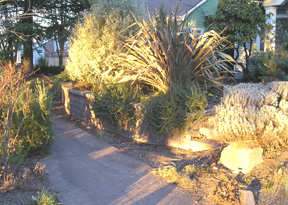
This week the Joy Creek crew is again here and all the neighbors are wondering what the hell is going on. The garden cleanup has been fairly drastic. The old, woody lavenders (which were taking over the sidewalk) have been removed and will be replaced with new plantings. A new tumbled paver patio is now being installed where the lawn once was. Large flagstone steps will connect the patio with the driveway and the steps to the sidewalk. With the mature plantings blocking the view from the street, the patio will be another great place to sit and privately visit with guests. I plan to accesorize it with large pots of plants, a couple great Adirondack chairs and a table. Unfortunately, or perhaps fortunately, we also learned that our garden will not be toured until the summer 2008 conference.

The garden in the back is getting a major cleanup as well. A sick, damaged lilac was removed. A huge, old rhododendron was taken to its new home among others in the 4.5 acres of show gardens at Joy Creek. The squirrels are ticked off because the pink dogwood has been pruned - making their jump from the garage roof to the tree to the roof of the house a bit of a challenge. In the past the route has been a squirrel highway.

The planning of Ed's outdoor kitchen area is on the fast track as the crew will be here most of next week. All the plantings have been pulled out of the area, exposing part of the house we've never seen before, and we need to formulate a plan in the next couple of days. A "parking area" needs to be designed for Ed's manly stainless steel barbeque - commonly known as "The Penis Extender." We also must consider the installation of an outdoor sink and electrical. With the new kitchen area comes the planning for additional planting beds and a garden water feature.

Over the next ten days, lots of changes will be taking place. Then, upon return from a vacation, it will be time for my gardening passion to kick it - after all, it is my job to "make things pretty." I look forward to working with the existing plants, as I add new annuals and perennials to the mix. (The previous plantings are mentioned in bLog-oMotives entries here and here.) The new additions should include some interesting plants as we continue to serve as a Joy Creek test garden. I'll post some "after" images later.

Of course, all of this work creates additional projects for me. I now need to rid the yard of all cyclone fencing, and design new gates for the side of the house and the driveway. It's always something...

© 2007 Jeff Fisher LogoMotives

Making a logo design concept your own - Part deux

In a recent bLog-oMotives entry I wrote about identity designers making logo design concepts their own through the incorporation of graphic images as letterforms. Replacing a letter of type with a graphic element is a tool I often use to make a client's logo design unique.

One recent such example is the identity I created for a friend's startup interior design business, NoBox Design. In explaining her plans for the business, the friend told me that the name referred to the fact she didn't want clients thinking "out of the box;" she wanted them to realize that there was "no box" when it came to conceptulizing interior spaces. I immediately thought of round forms, especially the rounded shapes of a 1980's Donghia chair. Back in 1984 I produced a set of two silkscreen prints making use of a Donghia-like over-stuffed chair - one of my favorite furniture shapes. (The prints were sold in Portland galleries and made an appearance as set decoration on the soap Days of Our Lives.)

The two "O" letterforms in the word "NoBox" were prefectly placed to become the round arms of the chair illustration. With my friend's first name beginning with the letter "B," I felt a stylized graphic representation of a monogrammed throw, of blanket, made an appropriate centerpiece in the design.

This past year the NoBox Design logo was recognized with a 2006 American Corporate Identity Award and it appears in the book American Corporate Identity 2007.

The identity for Black Dog Furniture Design is one of my favorite logo projects. Brett Bigham, commonly known as my "evil devil pig friend from hell," provided me with a piece of paper covered with a collection of puppy footprint drawings and sketches of his little black dog, Adobo. He wanted me to create an identity for his startup furniture business of creating new pieces from found objects and old furniture. The font Very Merry, from Fonthead Design, was my first choice to compliment the primative quality of the dog illustration. For me, replacing the letter "o" with the tail "wag marks" was a natural consideration in making the logo unusual.

From the perspective of being recognized in the design industry, the Black Dog Furniture Design logo has been one of my most successful. The logo appears in the books The Big Book of Logos 3, Letterhead and Logo Design 7, Graphically Speaking, American Corporate Identity 2003, Global Corporate Identity, PRINT's Regional Design Annual, Logo Design for Small Business 2 and Graphis Logo 6. It also received an American Graphic Design Award from Graphic Design: usa magazine.

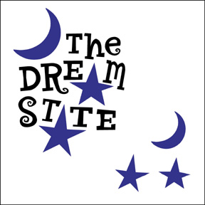
Over the past 16 years I've designed over 100 logos for the triangle productions! theatre company in Portland. Many have involved combining graphics and type to produce a concise and unique graphic symbol. Creating the logo for the theatrical production The Dream State was such a case. In playing with the shape of the letters on my computer screen I saw that star shapes would work to replace the "A" letterforms in the words "dream" and "state." I tried a couple different fonts in making the image light and playful; settling on Circus Dog, also from Fonthead. The crescent moon image was added as an afterthought to give the logo some balance.

The Dream State identity was also recognized with an American Graphic Design Award. It is featured in the book The Big Book of Logos 4 and the Spanish volume Logos from North to South America.

Principal Mike Verbout asked me to create a logo the James John Elementary School in a effort to boost student and community pride in the institution. He'd recently had some colorful flags installed on the school structure and hoped that I could include that imagery in the design. The school is located near the historic St. Johns Bridge, a major landmark in the Portland area. In my mind I saw one of the towers from the bridge replacing the "H" in the school's name - and banners could be attached to the spires of the bridge image. The result was a design appealing to children and adults, and an image that worked well on signage, T-shirts and other promotional items.

The James John School identity was honored with an American Graphic Design Award and a Silver in the Summit Creative Awards. The logo also appears in the books The New Big Book of Logos and Logos from North to South America..

By stepping back from logo design projects, and looking at possible graphic elements as potential letterform shapes, a designer can put their personal stamp on a creative identity concept.

© 2007 Jeff Fisher LogoMotives

Artist/prankster Danny Finegood loses cancer battle

This past June I posted an entry on bLog-oMotives about my friend David Batterson writing a song celebrating art student Danny Finegood's legendary 1976 alteration of the famous Hollywood sign - making it read "Hollyweed." This past week my blog was getting numerous visits through Internet searches for "Danny Finegood" and "Daniel Finegood." Late Thursday night I learned that Finegood passed away on Monday, due to multiple myeloma, at the age of 52. The Los Angeles Times posted an updated tribute on the paper's website earlier today.

This afternoon I had a very nice email from his daughter Natalie, asking if I would post the sad news. She said that her father "was an awesome guy." In responding to her email I wrote: "From everything I've read and heard about (your father), he was a man with an incredible spirit and an individual I would have thoroughly enjoyed knowing personally."

Finegood coordinated the alteration of the Hollywood landmark three other times. Once the sign was changed to read Holywood for Easter. In 1987, during the Iran-Contra hearings, it was altered to read "Ollywood" to protest the hero worship of Marine Lt. Col. Oliver North. Another brief change was made by Finegood in 1990 when the sign read "Oil War" before police removed the plastic draping the structure.

In a 1983 letter to the Los Angeles Times, Finegood and his cohorts wrote: "We broke no laws and did no damage to the sign. An artist's role throughout history has been to create representations of the culture he exists in. By hanging four relatively small pieces of fabric on the landmark, we were able to change people's perception of the Hollywood sign."

For many, that perception will include fond memories of artist and prankster Danny Finegood. Posters of the Hollyweed image may still be ordered at Hollyweed.net. Donations may be made in Finegood's memory to the Institute for Myeloma & Bone Cancer Research, 9201 W. Sunset Blvd., Suite 300, West Hollywood, CA 90069.

© 2007 Jeff Fisher LogoMotives

'The ditch between white trash

and trailer trash is called hope'

"My momma always used to say, 'The ditch between white trash and trailer trash is called hope.'"

So reads a line from the book Crumbs of Love: And That's All You're Ever Going To Get, by Donnie (the pseudonym of my friend and long-time Portland client Don Horn). I want to congratulate Horn for writing and publishing his memoir, which publisher iUniverse describes as "an unforgettable story of love, betrayal, and one father’s need to always be in control."

Don Horn, a playwright and theatrical producer, has been a friend and client since I met him opening night of his first play nearly 17 years ago. Over those years I've designed over 100 logos for his triangle productions! theatre company, in addition to posters, ads, playbills, T-shirts, an occasional prop and more. I even designed a paper doll book called Dressin' With Divine for the company. A decade ago, he trusted me enough to allow me the opportunity to spend a summer directing the play Party!, with its cast of a gaggle of nude men (including Peter Paige who went on to fame as Emmett on Queer as Folk.). He has always been a great friend and for about six years we've had a Thursday morning theraputic "koffee klatch" with several others. Horn also played host for the wedding of my partner and I at his theater in 2004.

Years ago I read the rough draft of Horn's memoir. The man has led an incredibly fascinating life. I really look forward to reading the book in its final form.

Crumbs of Love is available in book form from Amazon and from iUniverse as an Adobe eBook download.

© 2007 Jeff Fisher LogoMotives

Corita Kent - artist, designer, activist - gets her due

In my college years, and after first moving to Portland in 1980, my favorite artist, graphic designer, political activist and wise woman just happened to also be a Roman Catholic nun. Corita Kent blended her faith, political beliefs, art, graphic design, typography and sometimes the headlines of the day into some of the most recognizable, and unsung, imagery of the 1960's, 1970's and early 1980's. Now, over 20 years since her death in 1986, she is getting the attention I always personally felt she deserved as a female graphic communicator in what was primarily a good old boys' club.

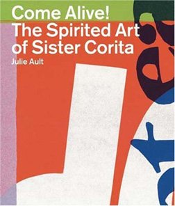
Much of the renewed interest in Corita Kent comes with the release of the book Come Alive!: The Spirited Art of Corita Kent by Julie Ault. I was thrilled to learn of the book from a recent entry at UnBeige. That blurb led me to Lorraine Wild's piece, Sister Corita: The Juiciest Tomato, at Design Observer and Mark Kingsley's Speak Up article, Corita. (This is a fascinating woman who ended up on the cover of Newsweek back in 1967.)

With the London release of Come Alive!, from Four Corners, there was an exhibit of Corita's work at the Between Bridges gallery, which got the attention of The Guardian newspaper. Nun Like Her was the Creative Review response to the exhibition and book release. The exhibit, Sister Corita: The Joyous Revolutionary is currently available for touring and I do hope it gets more exposure in the U.S. Six Corita prints are part of the exhibit DISSENT!, on display at Harvard University's Fogg Art Museum through February 28, 2007.

If I sound a bit excited about the March release of this book, I am. As a designer new to the profession in the early 80's, I received a signed Corita as a gift and was able to purchase another from a gallery that would later end up selling my own silkscreen efforts. Each morning I wake up to the graphic representation of the Corita Kent quote, "Life is a succession of moments, to live each one is to succeed." There's a bit of irony that my other Kent piece, Yes #3 (a large red heart over the word "love"), went to the other party when I got divorced in 1985.

Today the Immaculate Heart Community is the home to the Corita Art Center. The center's online presence includes an archive of Corita Kent's serigraphs and pieces for sale. The U.S. release of the book Come Alive! is currently available for pre-sale.

Update - 05.22.07: I just got the book for myself with a birthday gift card. It's an incredible resource for anyone interested in the work of Corita Kent. I would highly recommend it.

Print image © The Corita Art Center

© 2007 Jeff Fisher LogoMotives

Calls for entries:

Upcoming design competition deadlines

All of the following competitions deadlines present great opportunities to showcase your design efforts, market your work on an international scale through the published books, and "toot!" your own horn to clients, peers and the media:

Brochures from North to South America
(Index Book - Spain)
Deadline: No specific date published
No entry fees charged

Hungry Design
(Index Book - Spain)
Deadline: No specific date published
No entry fees charged

Packaging Identity
(Index Book - Spain)
Deadline: No specific date published
No entry fees charged

CA Interactive Media Design
(Communications Arts - USA)
Deadline Extended: January 26, 2007
Entry fees charged

TDC53 - Typography
(Type Directors Club - USA)
Deadline Extended: January 23, 2007
Entry fees charged

Summit Creative Awards
(Summit Awards - USA)
Deadline Extended: February 19, 2006
Entry fees charged

The Art Directors Club Annual Awards
(The Art Directors Club - USA)
Professional Deadline Extended: January 26, 2007
Student Deadline: January 31, 2007

Entry fees charged

Identity: Best of the Best 2007
(Identity Magazine - Russia)
Deadline: January 31, 2007
No entry fees charged

American Inhouse Design Awards
(Graphic Design: usa - USA)
Deadline: February 28, 2007
Entry fees charged

European Design Awards
(Europe)
Submission period: January 1 - February 28, 2007
Entry fees charged

PRINT Regional Design Annual
(PRINT Magazine - USA)
Deadline: March 1, 2007
Entry fees charged

The Best of Business Card Design 8
(Rockport Publishers - USA)
Deadline: March 1, 2007
No entry fees charged

1000 Music Graphics
(Rockport Publishers - USA)
Deadline: March 1, 2007
No entry fees charged

365: AIGA Annual 28
(AIGA - USA)
Deadline: March 2, 2007
Entry fees charged

50 Books/50 Covers
(AIGA - USA)
Deadline: March 2, 2007
Entry fees charged

CA Illustration Annual
(Communications Arts - USA)
Deadline: March 13, 2007
Entry fees charged

CA Photography Annual
(Communications Arts - USA)
Deadline: March 13, 2007
Entry fees charged

HOW Promotion Design Awards
(HOW Magazine - USA)
Deadline: March 19, 2007
Entry fees charged

LogoLounge 4
(LogoLounge - USA)
Deadline: March 31, 2007
LogoLounge membership required

HOW InHOWse Design Awards
(HOW Magazine - USA)
Deadline: April 13, 2007
Entry fees charged

Grids: 100 Creative Solutions for Designers
(Rotovision - UK)
Deadline: April 30, 2007
No entry fees charged

Print & Production Finishes for Packaging
(Rotovision - UK)
Deadline: June 30, 2007
No entry fees charged

Print & Production Finishes for Sustainable Design
(Rotovision - UK)
Deadline: June 30, 2007
No entry fees charged

Communicating with Pattern: Signs & Symbols
(Rotovision - UK)
Deadline: August 31, 2007
No entry fees charged

Squares, checks & grids
(Rotovision - UK)
Deadline: August 31, 2007
No entry fees charged

You may want to read my article about participating in design industry competitions: A Winning Strategy. It has appeared on the Creative Latitude and NO!SPEC web sites. A list of design competition links appears at the end of the article.

Design competition calendars are also available at Icograda and Workbook. DesignTaxi and Dexinger post competitions of great value to industry professionals - however designers need to be aware that some of the listings are for "spec" work as a requirement for submission. Requests for new, or speculative, work as a condition of entering a "contest" are much different than legitimate design competition "calls for entries," in which previously created works are judged for possible awards, exhibition, or publication in an annual or other book.

Good luck!

© 2007 Jeff Fisher LogoMotives
"My Kid Could Design That Restaurant Logo!"

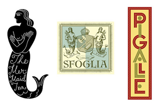
That odd headline, from a recent entry on the New York Magazine blog Grub Street, popped up on my Internet radar this morning. When I checked out the link I was thrilled to find the work of Louise Fili (a designer whose restaurant identity work I truly admire) featured in a blurb about her designs being included in the Society of Illustrators' current exhibition at the Museum of Illustration in New York. You need to hurry if you want to see the exhibit in person as it ends on January 27th. I'd previously read about the exhibit, but had done little to check out what it was all about (I've been a little busy writing a book in recent months...).

Luckily the exhibit "Letter As Image,Image As Letter," described as "six designers reinventing lettering and creating new vocabularies of design," also has a great online presence. Check out the incredible restaurant logos by Fili - including the design for one of my favorite restaurants, The Pink Door in Seattle. The site also allows you to view the beautiful illustrative efforts of Michael Doret, Gerard Huerta, Tom Nikosey, Daniel Pelavin, and Tom White.

I'm glad that headline caught my attention this morning - although I'm now distracted checking out the work of some fascinating designers and illustrators. It's very satisfying to know that some kids do grow up to create restaurant logos the calibre of Louise Fili's work.

© 2007 Jeff Fisher LogoMotives

Sign your rights away for fame and glory

Over the past week the MyBlogLog stats for bLog-oMotives have shown a large number of visitors from Craigslist users around the United States. As I don't use the community classified ad site to promote my work I thought I would investigate a bit. In each case the Craigslist postings are to artists around the country criticizing the magazine design cover "contest" currently (?) being conducted by American Artist magazine. (To be perfectly honest, due to the conflicting dates on the website and downloadable PDF entry form, I can't tell if the "contest" is current or just on-going and the publication has not corrected the specified dates - it really doesn't alter the issue) The messages include the text of a past bLog-oMotives entry, which also appeared on the NO!SPEC site, regarding a somewhat similar arts industry situation and how it was resolved.

It annoys the hell out of me when the organization conducting the "contest" is an arts organization, design industry group, art publication, or some other related entity that should know better. The American Artist magazine cover competition is (was?) an example. While this "contest" is not necessarily a request for speculative, or "spec," work - unless, I suppose, an artist chooses to create new work specifically for submission - it does bring up the rights issues of so many "contests." In part, the "rules and regulations" state:

As consideration for being permitted to enter the contest and win a prize, you hereby grant to American Artist, its affiliates and subsidiaries and their successors and assigns, an unlimited, royalty-free license to use your name, images, and artwork in any print, electronic, or other medium now existing or developed in the future including, by not limited to, use on the www.myAmericanArtist.com website, without restriction as to the frequency or duration of usage.

That alone should be enough for any professional artist to be insulted and angry. I'd be really pissed off if I was one of those submitting artwork for consideration with the additional requirement of paying $50 per entry to sign my rights away.

I would hope that artists would contact the publication (and other entities attempting to take advantage of artists/designers in similar situations) and (to quote a favorite movie line) let them know they are "mad as hell and I'm not going to take this anymore!" now and in the future.

Note: Illustrative element from American Artist call for entries.

© 2007 Jeff Fisher LogoMotives