


 In a previous bLog-oMotives entry, and Creative Latitude article, I wrote about designers creating truly unique identities. The process involves so much more than just slapping a graphic, or icon, up next to a block of text or a word. With the vast majority of my logo designs I try to envision a graphic element, appropriate to the message to be conveyed in the design, as a possible letterform representation within the name. Combining the two often results in an incredibly individual and memorable symbol to identify the client.
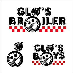
One of my personal favorites has always been the logo I designed for the Seattle breakfast establishment Glo's Broiler. It's a good example of a well thought out concept coming together with a "happy accident" to produce a strong identifying image. In designing the logo, I knew I wanted a coffee cup and plate to represent the "o" letterforms in the name. Then, as I rotated the coffee cup illustration a bit, a lower-case "g" appeared within the design.
 The same treatment then worked in a secondary image for the restaurant. The owner wanted to have a complimentary logo to represent the athletic teams the eatery sponsored and the "Glo's Boys" imagery was the second "happy accident" in the branding process.
The Glo's Broiler image appears in the books Bullet-Proof Logos, Logo Design for Small Business 2 and the Japanese volume New Logo and Trademark Design (which was recently re-released as the paperback Logo and Trademark Collection).
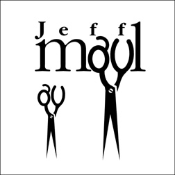
 While archiving logo design work I have done over the past 30 years, I've been coming across many other projects where I have used graphic elements as substitutes for letterforms with a variety of results. One of the earliest successes was the logo design for hairstylist Jeff Maul. By just taking the time to look at hair-cutting scissors in a different way, I was able to see possible letter shapes in the holes used for fingers.
The St. Johns Window Project is a local event where North Portland artists are asked to create works of art to be displayed in the windows of area businesses. When asked to create a logo for the annual event, I immediately visualized window frames as replacements for letters in the name - before the organization's contact could even finish explaining what they hoped for in an identity. The effort received a 2003 American Graphic Design Award from Graphic Design: usa magazine.
 Personal chef and caterer Jim Crabtree wanted a simple and distinctive identity for his business. In researching catering logo images, I kept coming across graphic representations of dinner plates, waiters, picnic baskets, fruits and vegetables, serving trays, bottles of wine, and other fairly common items. None of the examples gave me the impresson of being unique to the industry. Jim himself was one of the most unique aspects of his business - with his spiky hair and angular features. That's when I realized a "W," the first letter in his company name, could easily be adapted to represent a portion of a man's body. The final design resulted in many of the owner's friends and clients saying "it looks just like him."
The "What's For Dinner?" logo is also featured in the Logo Design for Small Business 2, New Logo and Trademark Design and Logo and Trademark Collection.
When tackling logo design challenges, designers should take into consideration that letterforms may resemble applicable graphic imagery - and graphic elements may be excellent replacements for particular letter shapes. By expanding on an initial concept the result may be a truly unique design solution. Other such examples will be highlighted in future bLog-oMotives entries.
© 2007 Jeff Fisher LogoMotives

1 comment:
i think what's for dinner is great. it doesn't look forced at all.. good job!
Post a Comment