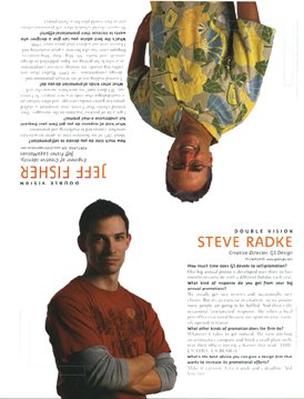
Yesterday the Self-Promotion Design Annual issue (October 2006) of the design industry publication
HOW Magazine appeared in my post office box. There, on the last page of the issue, is a photo of yours truly hanging upside down. It's the "
Double Vision" feature of the magazine, in which the editors ask two design professionals the same questions on a given topic. With this being an issue on self-promotion, the questions are about marketing and promotion efforts.
As subscibers began receiving their magazines it was posted on the HOW Design Forum that I was in the issue - upside down. Bryn Mooth, editor of the publication, posted "Jeff, we just HAD to put you upside down!" Yes, the HOW staff know me just a bit too well - and, I should mention in the interest of "public disclosure," I am on the HOW Editorial Advisory Board.
My responses to the questions asked include references to the fact I spend about 20% of my business time on marketing efforts, my "Toot! Toot!" press releases are an effective promotion tool, bLog-oMotives has become a major part of my self-promotion, and designers need to schedule their own promotion projects as they would any client job.
By the way, photographer Vicki Grayland got the gig to shoot my photo as a direct result of her own self-promotion efforts. For several years she sent me her "Metropolitan Refrigerator of Art worthy" marketing postcards. I posted them above my desk as a reminder of Grayland's beautiful work. When HOW needed me to suggest a photographer to take my photograph she was the first person that came to mind.
Grayland was coming down from Seattle and wondered if I had any suggestions for a location. A couple ideas didn't pan out and at the last minute I thought about the great lobby at the Art Institute of Portland - the whole facility, in the heart of Portland's Pearl District, is incredible. Having been a speaker at the school, I attempted to contact people I knew there by email and phone the day before the scheduled shoot. I was out of luck as it was a day the staff and instructors were off. So, I left a message for the school's career advisor that we were going to use the lobby for the shoot and if anyone asked I'd say he approved it. I mentioned in my voice email that I would accept any consequences later.
The photographer and I showed up in the lobby that Saturday. We told the receptionist we had permission to do a photo shoot at the school. She didn't question a thing. And then, for the couple hours we were there, not a single person (including security) ever asked what we were doing. That following Monday I got an email from my school contact suggesting that I might want to be on their professional advisory committee. Not really a bad "payback" for use of a great location.
A large number of people have commented on the shirt I'm wearing in the photo - in person, via email and on design forums. It's a Tommy Bahama that my partner Ed bought me this year on our annual vacation to St. Croix. It seems that others in the design industry think I'm very easy to find at conferences and professional gatherings when I'm sporting an item from my ever-growing tropical shirt collection.
The Self-Promotion Design Annual will soon be hitting your neighborhood newsstand. Check it out for great examples of recent promo designs, informative articles (including those written by my friends Ilise Benun and Neil Tortorella, writer Pat Matson Knapp - who wrote about my business in the past HOW articles Shedding Stress and Lost in Translation, and fellow "HOWie" Nikita Prokhorov) and other information of value to graphic design firms of any size. I probably should also mention that the "non-upside down" guy on the Double Vision page is Steve Radke, Creative Director of the firm GS Design.
...guess I'd better get to work and start "tooting!"
© 2006 Jeff Fisher LogoMotives


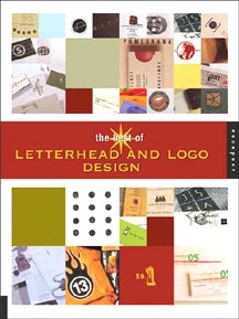 The other day I was browsing the shelves of the design section at Powell's City of Books and came across the Rockport Publishers offering The Best of Letterhead and Logo Design in its new paperback version. (The Amazon site says the book has not yet been released - but I also saw it at Borders that same day.) The new small-format edition is a collection of many designs previously presented the long-running Letterhead and Logo Design book series from the publisher. It's a great inspiration resource for any designer interested in creating identities for businesses, products, organizations or events.