


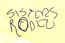
It's amazing what I've saved over the years in regards to projects I've been contracted to design. The simple Post-It note scribble at the left is just one example of the many preliminary concepts I have come across recently in archiving past projects.
Since I was a kid I have spent a great deal of time in the small Central Oregon town of Sisters, Oregon. The favorite backpacking destination of my family was the nearby Three Sisters Wilderness area. In the 1970's my parents bought property in Sisters, eventually building a vacation home that has been their primary residence for the past 15 years. For many years the Sisters Rodeo, "The Biggest Little Show in the World," has been a family tradition - with an annual weekend party at my parents' home that has become somewhat legendary.
To celebrate the 60th anniversary of the Sisters Rodeo it was determined that it might be time for the organization to finally have an official logo. The Sisters Rodeo Association was already working with my sister's advertising agency, TriAd in nearby Bend, for their advertising, marketing and public relations needs. Sue's firm was asked to take on the identity project and she hired me to create the initial image for the rodeo. In one of our telephone discussions I jotted down a rough type treatment - for a logo that I hoped would convey a hint of the 1940's and be a lasting symbol for the Professional Rodeo Cowboys Association event.
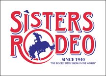 From the beginning of the project I had no doubt the symbol representing this live-action piece of Western Americana would end up being red, white and blue in color. The flags, banners, music and patriotism associated with the rodeo immediately dictated that color palette. I also knew that I wanted a cowboy on a bucking bronco, or bull, as the primary element. Having seen many a cowboy hat fly through the air at previous rodeos, I felt graphically representing that would add a little implied movement - and my own little brand of humor - to the logo. The cowboy graphic fit well into the "O" of my original scribble, and the airborne cowboy hat became the dot of the "i" letterform in the word "Sisters," as the symbol almost designed itself.
The logo has served the event well the past six years - and received several honors. In 2000, the identity was included when the Sisters Rodeo was inducted into the Library of Congress “Local Legacies” archive. The following year the logo was honored with an Award of Merit in the Ad Federation of Central Oregon's annual Drake Awards, a Silver Award in the Summit Creative Awards, and received a LOGO 2001 honor (resulting in the design being published in the book The New Big Book of Logos). The design was also published inLogo Lounge : 2,000 International Identities by Leading Designers.
© 2005 Jeff Fisher LogoMotives

No comments:
Post a Comment