Showing posts with label retail logos. Show all posts

Toot! Toot!*:

Jeff Fisher LogoMotives designs featured in

1000 Restaurant Bar & Cafe Graphics

The identity design work of Jeff Fisher, the Engineer of Creative Identity for the Portland-based firm Jeff Fisher LogoMotives, is featured in the new book 1000 Restaurant Bar & Cafe Graphics: From Signage to Logos and Everything in Between from Rockport Publishers, The book, featuring a wide variety of design images from around the world, was compiled, designed and edited by the Luke Herriott of the U.K. design firm Studio Ink.

The images selected include the identities for Seattle eatery Glo's Broiler, and Portland establishments North Bank Cafe, Balaboosta, and La Patisserie. The menu design for Indies Restaurant & Bar in New York City is also recognized.

Jeff Fisher has received over 575 regional, national and international graphic design awards for his logo and corporate identity efforts. His work is featured in nearly 100 books on the design of logos, the business of graphic design, and small business marketing.

Fisher is a member of the HOW Magazine Editorial Advisory Board, the HOW Design Conference Advisory Council and the UCDA Designer Magazine Editorial Advisory Board. His first book, The Savvy Designer’s Guide to Success, was released by HOW Design Books in late 2004. His new volume, Identity Crisis!, will be on bookshelves in October 2007.

(* If I don’t "toot!" my own horn, no one else will.)

© 2007 Jeff Fisher LogoMotives

Design studio housecleaning - excavated artifact #10

The sorting through backed-up digital files, filing cabinets and boxes continues in my home studio as I archive over 30 years of design work. Recently I came across a somewhat mangled photocopy of a page from an old PRINT Regional Design Annual. In looking over the images on the page, I had no idea why I might have made a copy of this particular selection of design images. However, when I looked on the backside of the piece of paper, two pencil sketches of what would become the logo for the Seattle restaurant Glo's Broiler were evident.

When living in Seattle in the late 1980's, I developed a personal connection with the Capital Hill eatery. The late Glo Raineri, the founder of the breakfast and lunch cafe - and the mother of one of my closest friends - was also my roommate. I was one of a number of young men who, at various times, rented rooms in her house, which was sometimes referred to as "Glo's Home for Wayward Boys." Her restaurant became a natural extension of that life and I ate many meals in the place. That I would eventually design the logo for the place was no surprise.

I especially enjoy designing restaurant identities. There's often an incredibly creative challenge in capturing the essence of an eating establishment in an eye-catching and concise logo image to represent a business entity that conveys a very specific theme or food style. In the past, I wrote about such design projects in the Logo Notions article Designs on dining: Restaurant logos as a graphic invitation to a meal and an experience.

For me, Glo's Broiler had the feeling of an old-fashioned diner and that type of imagery came to mind as possible logo elements - neon, sytlized illustration, chrome, a checkerboard tablecloth, and red vinyl upholstery. My first pencil sketch (above) tilted a square border into a diamond shape, and introduced a steaming coffee cup as a replacement for the "o" in the word "Glo's;" while a plate of a common breakfast entree became the "o" in "Broiler." The second doodle (at right) eliminated the confining border and hinted at the type treatment - which I already knew would make use of the font Frankfurter Highlight. It's interesting that in the revised concept the addition of a checkerboard base can barely be seen on the paper. I erased it from the drawing whole working on the logo creation.

As the identity design developed, the bacon, eggs and toast graphic took inspiration from a similar image in a silkscreen print I had produced, and sold through several galleries, years earlier. In a "happy accident," the placement of the coffee cup and plate created a lower-case "g" - a secondary representation of "Glo." The checkerboard imagery then returned to give the logo some balance and weight.

With the completion of the logo, it was decided to do T-shirts to market the restaurant. A snide comment from a guy in a bar, referring to me as one of "Glo's boys," resulted in an additional "Glo's Boys" logo being creating and it became the identity for a bowling team the restaurant sponsored.

Glo, given the name of "Mother of Capital Hill" by Seattle newspapers, passed away in October of 2005. The restaurant remains open, although the logo has not been used for some time. Still, the image lives on in the books Bullet-Proof Logos, Logo Design for Small Business 2 and the Japanese volume New Logo and Trademark Design (which was recently re-released as the paperback Logo and Trademark Collection).

Note: In previous bLog-oMotives entries I took a look back at excavated artifacts 1, 2, 3, 4, 5, 6, 7, 8, and 9.

© 2007 Jeff Fisher LogoMotives

Toot! Toot!*:

Jeff Fisher LogoMotives design

to appear in LogoLounge, Volume 4

Jeff Fisher, the Engineer of Creative Identity for the Portland-based firm Jeff Fisher LogoMotives, has been informed his personal logo design for hairstylist Micki King will be featured in the upcoming book LogoLounge, Volume 4. While working at the Chameleon Salon in Portland, King commissioned the designer to create the identity incorporating the reptile, a yin yang reference, possible swirl imagery and Celtic letterforms. The selected design was the result of that unusual list of creative ingredients.

An international panel of judges, including Louis Lygo of Wolff Olins, Jerry Kuyper of Jerry Kuyper Partners, Jason Schulte of Jason Schulte Design, Gaby de Abreu of Switch Branding & Design, Haley Johnson of Haley Johnson Design, Neville Brody of Research Studios, Janet Martin of Communication Arts, Inc., and Chris Campbell of Interbrand selected the designs to be included in the winter 2008 book release, to be produced by Rockport Publishers. Over 28,000 logos were judged; with 2,000 being chosen for the new volume. The membership website LogoLounge allows designers to easily share their ideas and concepts with peers and clients through logo design uploads to the site. The logos are categorized, providing members ease in researching design concepts, and viewing the work of designers and firms from around the world. Submissions are then judged for inclusion in future LogoLounge volumes.

Jeff Fisher LogoMotives was previously represented with a total of 11 logo designs published in LogoLounge, Volume 1 and LogoLounge, Volume 2.

Jeff Fisher has received nearly 550 regional, national and international graphic design awards for his logo and corporate identity efforts. His work is featured in more than 85 books on the design of logos, the business of graphic design, and small business marketing.

Fisher is a member of the HOW Magazine Editorial Advisory Board, the HOW Design Conference Advisory Council and the UCDA Designer Magazine Editorial Advisory Board. His first book, The Savvy Designer’s Guide to Success, was released by HOW Design Books in late 2004. His new volume, Identity Crisis!, will be on bookshelves in late 2007.

(* If I don’t "toot!" my own horn, no one else will.)

© 2007 Jeff Fisher LogoMotives

Toot! Toot!*:

Jeff Fisher LogoMotives design

featured in 1000 Retail Graphics

The identity for the Portland-based business institution W.C. Winks Hardware is featured in the new design book 1000 Retail Graphics: From Signage to Logos and Everything In-Store from Rockport Publishers, Jeff Fisher, the Engineer of Creative Identity for the firm Jeff Fisher LogoMotives, designed the logo. The book, featuring a wide variety of design images from around the world, was compiled and edited by the design firm JGA. (A Spanish edition, 1000 Diseños Comerciales has been released by Index Book.)

For nearly a century the hardware retailer did not have a business identity at all - although nearly everyone in the city was aware of Winks Hardware due to its reputation as the hardware store. Client Anne Kilkenny, grand-daughter of founder W.C. Winks, requested a logo that would look as if it had been in use since the day the store opened in 1909. Fisher created a stylized illustration of Winks from the only existing photo of the man and made use of typefaces appropriate to the early 1990's.

The Winks Hardware logo has previously been published in the books American Corporate Identity/14, New Business Card Graphics 2 (Japan), Letterhead and Logo Design 7, Graphically Speaking, LogoLounge, Volume 1, Logo Design for Small Business 2, and Logos from North to South America (Spain).

Jeff Fisher has received nearly 550 regional, national and international graphic design awards for his logo and corporate identity efforts. His work is featured in more than 85 books on the design of logos, the business of graphic design, and small business marketing.

Fisher is a member of the HOW Magazine Editorial Advisory Board, the HOW Design Conference Advisory Council and the UCDA Designer Magazine Editorial Advisory Board. His first book, The Savvy Designer’s Guide to Success, was released by HOW Design Books in late 2004. His new volume, Identity Crisis!, will be on bookshelves in late 2007.

(* If I don’t "toot!" my own horn, no one else will.)

© 2007 Jeff Fisher LogoMotives

Design studio housecleaning - excavated artifact #9

The design studio housecleaning continues. There are boxes of old design concepts and projects that haven't been touched in at least a decade. Here's another example of a logo design concept I recently came across.

Back in 1997 a close friend was discussing the possibility of opening a retail store that focused on outdoor bird houses, various bird seed products and related items for the gardener looking to invite wild birds into their landscapes. During an afternoon conversation a brain-fart resulted in the name "For the Birds" being realized for the venture. I told the friend I would be thrilled to create the logo for the business while she did necessary further research on the business.

A few days later I scribbled out a potential design, with a black ballpoint pen, on the back of a folded piece of laser paper from my recycle bin (actually a printout of my own then recently completed Jeff Fisher LogoMotives identity is on the other side of the sheet). The scribble has a bird house graphic as its centerpiece, with the opening to the residence as the letterform "O" in the word "FOR." Little doodles of bird images sit on top of the letters "B" and "S" from "BIRDS."

I obviously wasn't completely pleased with the concept. On the reverse side of a fax printout, along with a collection of phone messages and client appointment notes, is an additional rough sketch of the design idea. This one has a bird as the "B" letterform in the word "BIRDS."

The two concept drawings were combined - with the addition of a leafy tree branch for balance - to create the final logo design, which has always been a personal favorite. In the end, my friend never opened her bird house store as her career went off in another direction. However, the logo design has lived on in the books New Logo & Trademark Design (Japan), Bullet-Proof Logos, The New Big Book of Logos and Logo & Trademark Collection (Japan).

Note: In previous bLog-oMotives entries I took a look back at excavated artifacts 1, 2, 3, 4, 5, 6, 7, and 8.

© 2007 Jeff Fisher LogoMotives

Re-Design: Joy Creek Nursery

With gardening season upon us (at least in the Pacific Northwest with improvements in the weather), I look forward to pushing myself away from the computer much more for some playing in the dirt as "garden therapy." My partner Ed, family and friends still marvel, and snicker, at the fact I've become a such a gardener since moving to our North Portland house. Part of my enthusiasm is due to the efforts of Joy Creek Nursery in preparing an incredible palette for the digging, planting, weeding and enjoyment of my garden. As Joy Creek Nursery celebrates a 15th year in business I'm taking a look back at their logo redesign project.

The original logo for Joy Creek Nursery was created by a local print shop out of an immediate need when the business started. A “brand” for the company was then established by using the existing identity on signage, business cards, print ads, catalogues and other items. For designing other marketing and promotion items, and use by the owners, a digital logo was provided in the resolution shown.

In 1998, my thoughts about the existing logo, and its reproduction issues, were conveyed to the owners, who are friends of mine. The inconsistent weight of the letters in the text, the haphazard computer manipulation of the letterforms, the poor quality of the only existing digital imagery, and the two typefaces used in the design blended to convey a graphically unprofessional image for the high-end specialty nursery.

The client expressed concern about introducing a “new” logo after having been in business for some time. They were informed that a “revised” design could maintain a sense of the existing brand, while projecting more professionalism.

The new logo, using a more elegant type, still says “Joy Creek Nursery” to the firm’s clients and vendors. The flowing form between the words hints at the actual creek flowing through the nursery property when presented in blue and conveys an image of the rolling hills of the area when the logo is printed produced as a one-color design in green.

The Joy Creek identity has received its fair share of recognition. The design received a LOGO 2001 award and, as a result appears in the book The New Big Book of Logos. It also is featured in the volumes Logo Design for Small Business 2, Logos Redesigned: How 200 Companies Successfully Changed Their Image and New Logo World (Japan).

Previous bLog-oMotives entries featured additional identity re-designs: Benicia Historical MuseumOur House of PortlandNorth Portland Business AssociationJust OutLaugh Lover's Ball. Redesigns from designers around the world are the focus of my next book, Identity Crisis!, to be released in the fall of 2007.

You can read the latest from Joy Creek Nursery on their blog, The Joy Creek Times

© 2007 Jeff Fisher LogoMotives

Toot! Toot!*: Jeff Fisher LogoMotives designs to be

in "Branded" book from Début Publications Ltd

The logo design work of Jeff Fisher, the Engineer of Creative Identity for the firm Jeff Fisher LogoMotives, will be represented with 27 identity examples in the upcoming book Branded from United Kingdom publisher Début Publications Ltd. Logo designs of over 130 international graphic designers, design firms and agencies will be included in the book to be published later this year. Fisher has also been asked to contribute text about an aspect of identity design for the book.

Designs from Jeff Fisher LogoMotives to be featured in the book include those for the Benicia Historical Museum (Benicia, CA), Four Rivers Community School (Ontario, OR), Twisted Elegance Interactive (Seattle, WA), and the Young Native Writer's Essay Contest sponsored by the Holland+Knight Charitable Foundation (Tampa, FL). Logos for DataDork (Fontana, CA), the Valles Caldera National Preserve (New Mexico) and the Seacoast AIDS Walk (Portsmouth, NH) were also selected.

Portland clients to be highlighted in the volume include interiors firm NoBox Design, the VanderVeer Center anti-aging clinic, the City of Portland's Neighborhood Service Center program, Bella Terra Landscape Designs, the AIDS residential care facility Our House of Portland, architect Thomas Fallon and Balloons on Broadway. Designs for the Just Out newsmagazine, Black Dog Furniture Design,the greeting card company Good Pig, Bad Pig and TraveLady Media will also be in the book. Logos for the community activist organization Association for Responsible Inner Eastside Neighborhood Development (AFriend), Pearl Real Estate, and the now closed Balaboosta Delicatessen were also recognized.

Identities honored for North Portland businesses, organizations or events include those for the St. Johns Window Project, North Portland Business Association, Coyner’s Auto Body, and University Park United Methodist Church's annual North Portland Pride BBQ and Festival.

Selected designs also include images created for George Fox University's Tilikum Center for Retreats & Outdoor Ministries (Newberg, OR) and the Emerge Medical Spa at Bridgeport (Tigard, OR).

Jeff Fisher has received nearly 550 regional, national and international graphic design awards for his logo and corporate identity efforts. His work is featured in more than 85 books on the design of logos, the business of graphic design, and small business marketing.

Fisher is a member of the HOW Magazine Editorial Advisory Board, the HOW Design Conference Advisory Council and the UCDA Designer Magazine Editorial Advisory Board. His first book, The Savvy Designer's Guide to Success, was released by HOW Design Books in late 2004. His new volume, Identity Crisis!, will be on bookshelves in late 2007.

* If I don't "toot!" my own horn, no one else will.

© 2007 Jeff Fisher LogoMotives

Toot! Toot!*: Jeff Fisher LogoMotives designs

chosen for The Big Book of Logos 5

Jeff Fisher, the Engineer of Creative Identity for the firm Jeff Fisher LogoMotives, has been notified that 31 of his identity designs will be included in the book The Big Book of Logos 5 as a result of the LOGO 2007 design competition. The book, from prolific graphic design author David E. Carter, is to feature hundreds of logos from design professionals around the world and is scheduled to be released in late 2007.

Designs from Jeff Fisher LogoMotives to be featured in the book include those for the Benicia Historical Museum (Benicia, CA), Four Rivers Community School (Ontario, OR), the annual golf tournament and auction events for Residence XII (Kirkland, WA), Twisted Elegance Interactive (Seattle, WA), The Parenting Alliance, and the Young Native Writer's Essay Contest sponsored by the Holland+Knight Charitable Foundation (Tampa, FL). An icon produced as part of the international Fluerons of Hope - Font Aid III effort, benefiting those impacted by the tsunami of 2004, was also selected.

Portland clients to be highlighted in the volume include interiors firm NoBox Design, the VanderVeer Center anti-aging clinic, the City of Portland's Neighborhood Service Center program, Bella Terra Landscape Designs, the AIDS residential care facility Our House of Portland, and architect Thomas Fallon.

Logos for the community activist organization Association for Responsible Inner Eastside Neighborhood Development (AFriend), the Reed College Fall Thesis programs for 2004 and 2005, The Spring Showcase presented by the Philoptochos of the Holy Trinity Greek Orthodox Church, and the now closed Balaboosta Delicatessen were also recognized.

Identities honored for North Portland individuals, organizations or events included those for community organizer Mike Verbout, St. Johns Window Project, Portsmouth Neighborhood Association, North Portland Business Association and University Park United Methodist Church's annual North Portland Pride BBQ and Festival.

Selected designs include images created for George Fox University's Tilikum Center for Retreats & Outdoor Ministries (Newberg, OR) and the Emerge Medical Spa at Bridgeport (Tigard, OR).

Gay/Lesbian community logo images to be in the book include designs for Just Out newsmagazine (Portland, OR) and the Diversity Training program of DiversityBuilder.com (Brentwood, TN). In addition, Fisher's "I DO!" image, in support of same-sex marriage, and the logo for his own marriage to his partner Ed Cunningham are celebrated.

The designer's logo for his presentation at the 2004 HOW Design Conference was also honored.

Since 1998, hundreds of examples of the design work of Jeff Fisher LogoMotives have appeared in over 20 books from David E. Carter, including the American Corporate Identity series, the Big Book of Logos collection and Global Corporate Identity. Fisher design efforts are also featured in the volumes Bullet-Proof Logos, Blue is Hot, Red is Cool, The Big Book of Designs for Letterheads and Websites, The Big Book of New Design Ideas, Logos Redesigned, The Big Book of Business Cards, The Big Book of Layouts, and The Big Book of Letterheads.

Jeff Fisher has received nearly 550 regional, national and international graphic design awards for his logo and corporate identity efforts. His work is featured in more than 85 books on the design of logos, the business of graphic design, and small business marketing.

Fisher is a member of the HOW Magazine Editorial Advisory Board, the HOW Design Conference Advisory Council and the UCDA Designer Magazine Editorial Advisory Board. His first book, The Savvy Designer's Guide to Success, was released by HOW Design Books in late 2004. His new volume, Identity Crisis!, will be on bookshelves in late 2007.

(* If I don't "toot!" my own horn, no one else will.)

© 2007 Jeff Fisher LogoMotives
Toot! Toot!*:

Logos: From North to South America features

Jeff Fisher LogoMotives in a big way

The identity design work of Portland, OR firm Jeff Fisher LogoMotives is represented in a big way in the new Index Book release Logos; From North to South America by Pedro Guitton. The Spanish publisher has included 46 of designer Jeff Fisher's logos in the 478-page volume, which contains hundreds of identity examples and comments about logo design from many of the professionals featured.

Small business logos from the designer featured in the book include that of his own business Jeff Fisher LogoMotives, and Portland businesses Balloons on Broadway, Big Daddy Marketing Specialties, Coyner's Auto Body, the Diva salon, greeting card company Good Pig - Bad Pig, retail development Heart of the Pearl and W.C. Winks Hardware. The identities for Harrison Flowers (Hood River, OR), Cooke Stationery (Salem, OR), writer Kimberly Waters (Seattle, WA), Kay Johnson's Sing Out Productions (Littleton, CO), the New England Firewood Company (Lancaster, MA), Walk Your Talk (Silver Springs, MD), Lone Star Site Design (Texas) and Buttonberry Books (Lebanon, NJ) were also showcased.

Education images exhibited in the volume include the logos for James John Elementary School in North Portland and the school's reading program, Buckman Elementary School's annual auction (Portland, OR), and an admissions program identity for George Fox University (Newberg, OR). Each year Fisher creates a graphic for the Fall Thesis celebration at Reed College (Portland, OR) and the images from 1999 through 2002 are in the book.

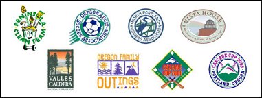
Organization logos for North Portland's Peninsula Clean Team, the Oregon Adult Soccer Association, the North Portland Business Association, the restoration campaign for the Vista House in Oregon's Columbia River Gorge and the Valles Caldera National Preserve in New Mexico are also highlighted. Gay/lesbian community identities in the book include those for Oregon Family OUTings (Eugene, OR) and the 2001 and 2003 logos for the annual Cascade Cup softball tournament.

The Hospice of Humboldt (Eureka, CA), Monroe Orthodontics (Aloha & Rainier, OR), the Seacoast AIDS Walk (Portsmouth, NH) and the designer's own safe sex message graphic A Rubber's Ducky are featured in the section on health-related logos.

Entertainment identities in the collection include several from the triangle productions! theatre company in Portland. Those include the play The Dream State, the company's 11th anniversary icon, the musical Naked Boys Singing, the 12th season image, and the shows When Pigs Fly, Veronica's Position, As Bees in Honey Drown, Caught in the Net, and Girls' Night Out. In addition, the logo for the Broadway Rose Theatre Company (Tigard, OR) production of Will Rogers Follies is presented.

Jeff Fisher has received nearly 500 regional, national and international graphic design awards for his logo and corporate identity efforts. His work is featured in more than 80 books on the design of logos, the business of graphic design, and small business marketing.

Fisher is a member of the HOW Magazine Editorial Advisory Board, the HOW Design Conference Advisory Council and the Board of Directors of Proscodi: Professional Society of Communication Design. His first book, The Savvy Designer's Guide to Success, was released by HOW Design Books in late 2004. He is currently writing "Identity Crisis," also for HOW Design Books, which is expected to be on bookshelves in 2007.

(* If I don't "toot!" my own horn, no one else will.)

© 2006 Jeff Fisher LogoMotives

Review: Logo Design for Small Business 2 - A Designer’s Reference Guide to Practical Logo Design

It may be a bit odd for me to reviewing a book that includes quite a few examples of my own work. However, with my own logo designs in over 70 books at this point. my selection of logo design volumes to consider for review might end up being somewhat limited.

Dan Antonelli does not disappoint the logo designer with Logo Design for Small Business 2, the follow-up to his first book, Logo Design for Small Business. Antonelli preaches what he practices. I appreciate the fact he is educated as a designer, has worked in the industry for a number of years and is in business as a sign maker. He understands, and is able to convey, what a designer needs to accomplish – and, from his own unique perspective, what a vendor needs as a final product. The author provides a great deal of advice in regards to the business of logo design for small businesses, as well as displaying examples from a variety of designers for inspiration.

Don’t be put off by the rather short length of this book – it’s 72 pages of useful information. Those just starting out in logo design will benefit from the excellent advice of Antonelli. For seasoned pros the book is a reminder of many things we should consider in our day to day designing of identities. All logo designers will recoup the cost of the book on the first project produced after reading the book – and it should be on the reference bookshelf of anyone interested in the design of logos.

My designs highlighted in the volume include the identity for my own company Jeff Fisher LogoMotives and numerous Portland businesses, including Balloons on Broadway, Black Dog Furniture Designs, the hair salon Diva, Janet Loughrey Horticulture Photography, hair stylist Jeff Maul,Joy Creek Nursery, Monroe Orthodontics, the North Bank Cafe, Thomas F. Fallon Architect, TraveLady Media, W.C. Winks Hardware and the personal chef/catering firm What's for Dinner? Seattle small businesses represented include the restaurant Glo's Broiler and writer Kimberly Waters. The identities for restaurants Crossings at the Riverhouse, located in Bend, OR, and New York's former Indies Restaurant & Bar are also displayed. Other featured businesses include DataDork (Fontana, CA), DesignEire (Dublin, Ireland), Buttonberry Books (Lebanon, NJ) and KidstuffPR.com (Black Earth, WI).
© 2005 Jeff Fisher LogoMotives
Designs on dining: Restaurant logos as a graphic invitation to a meal and an experience

Over the years some of my own most enjoyable, challenging and visible identity design projects have been those for restaurant industry businesses. Much of the pleasure comes from an ability to push the creative envelope a bit and not be limited by the often-conservative boundaries of much more corporate identity design. I usually have an opportunity to be more playful with restaurant logos and have more fun with color. In addition, the architecture of the buildings, the design of the interiors, the type of food to be served and other elements come into play. The challenges of such projects most often raise their ugly heads in the form of budget limitations and the lateness of some restaurant owners to initiate the logo/identity design process for their new business in a timely manner – especially when the scheduling of projects for other vendors are overlooked. The visibility, and multiple uses, of the completed eating establishment image is a valuable marketing tool for a designer as easily recognizable public exposure of one’s design work. Unfortunately, with something like 50% of all restaurants closing in the first two to three years in business the visibility of such design examples often is limited in duration. (That figure is not necessarily more dramatic than the failure rate of other start-up businesses – the boarding up of a local dining establishment is often just more evident to the average person viewing from the street.)

The above is the introduction to a "Logo Notions" column I recently wrote on the topic of restaurant identity. You can check out the entire article at CreativeLatitude.com

© 2005 Jeff Fisher LogoMotives

Looking at the "before and after" in design

Often I am hired to redesign or update the logo of a business or organization. One law firm has hired me to recreated their corporate identity three times due to company name changes. Several such projects have ended up in the book Logos Redesigned: How 200 Companies Successfully Changed Their Image, by David E. Carter. From Harper Design International, the volume features great examples of “before and after” identities for 200 companies including professional sports organizations, major corporations, products, restaurants, educational institutions and “mom and pop” businesses. The designs presented include logo recreations from numerous design firms, including Hornall Anderson Design Works, Rickabaugh Graphics, Sayles Graphic Design, Alexander Isley, Inc., Dotzero Design, yours truly and many others. Each identity representation is accompanied by a brief explanation, written by the designers themselves, adding to the reader’s understanding of the visually displayed transition from old to new logo.

If the book has any shortcoming, it is that the reader is left wanting even more information about the projects presented – or additional concept visuals of the process of getting from previous to current identity. Still, the volume is an excellent resource for any identity designer who may need a creative “jumpstart” in taking on the overhaul of a client’s current logo.

Online you will find examples of identity, web and print redesigns on the Creative Latitude site, in a section called GRAPHIC makeovers. Designer Alina Hagen contributes her observations to the submitted design projects. Quite a few of my own redesign efforts, several from the "Logos Redesigned" book, are posted at GRAPHIC makeovers.

© 2005 Jeff Fisher LogoMotives