On several online forums, in recent face-to-face discussions with designers, and in numerous emails the past few weeks, the question has been the same: "How should an independent graphic designer go about marketing themselves?"
I don't pretend to have all the answers for every business. However, the most successful methods for promoting my business are listed below. Hopefully others will find some valuable advice and tools for bringing clients their way.
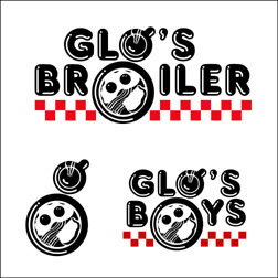
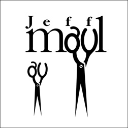
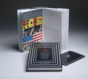
Industry design competitions: The majority of my marketing budget goes to cover entry fees in industry design competitions. Having pieces honored results in work being printed in design annuals and other design books. I have at least one potential client a week contact me because they have seen my work in a design book at their local bookstore. It also gives you "bragging rights" for press releases announcing your career accomplishments. Do be cautious of "design contests" that are nothing more than "spec" work in disguise.
Press releases: One of my major methods of marketing/promotion is sending out press releases about my work. Make a list of newspaper and magazine editors in your area, and the editors of design and business publications you wish to contact, and send out releases about your business - announcing a new business, new clients, completed projects, design awards and other accomplishments. Seek out press release distribution opportunities online as well such as PRweb.com or PRleap.com. Developing relationships with editors, and design or business editors, creates a number of possibilities for future media exposure of one's work and business. I also send out my press releases in email format to past clients, current clients, potential clients who have contacted me, vendors, friends and family. You never know when someone needs to be "reminded" that your services are available.
 Networking: Make EVERYONE you know aware of what you are doing - family, friends, neighbors, former clients, local businesses, and others. Join a local business organization, Chamber of Commerce, industry related organization (International Association of Business Communicators, local ad federations, marketing associations, Women in Communications, public relations organizations, AD2, etc.) and network with people who may need your services. ALWAYS carry your biz card with you. Part of networking is participating in online forums specific to design or business.
Blog: These days my most effective marketing tool is my blog - which is done a no cost. Still, it gets me a great deal of exposure and brings a large number of clients my way. It also directs writers and editors my way who want to use me as a resource or write about my blog. (I just did a Google search for my blog's name and 65,400 references were found.)
Website: I am surprised at the number of independent designers I come across who do not have a web presence. If you don't have a website you had better get one established. Your potential clients will EXPECT it. Most of my clients come to me by way of my website - after reading about me or seeing my work elsewhere - and 80-85% are from outside my home state.
Online directories: Make use of free and paid online directories to get your name and contact info out to possible clients. (Watch for a blog entry about online directories in the near future.)
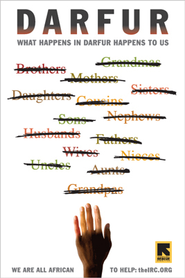
Work with nonprofits: A good way to promote your business is to do pro bono, or discounted, work for nonprofit causes you support. You should get a credit on all the pieces being produced for the organization. You also have the opportunity to meet a lot of business leaders in the community who serve of the board of directors or are involved with the group. I discourage designers from ever doing free work for "for profit" ventures. In doing so you convey that your work has little or no value - and that's what they will remember if you go back to them for future projects.
Being the expert: Writing articles for publications, making yourself available to the media as an industry expert and being a speaker are all excellent methods of promotion. I was once contacted by a potential client who was given my name by someone who had heard me speak to a group of Small Business Development Center educators FOUR YEARS earlier! Establishing relationships with editors has been a great marketing tool for me. I was recently contacted by a writer for a major business magazine. He remembered me being quoted in an article on a website five years ago and sought me out. Such exposure always results in new client possibilities. When editors or writers contact me for quotes or illustrative content I usually drop everything to make what they need happen. Most such offers have a limited "shelf life."
Direct Mail: Target the businesses with which you would like to work and send them a postcard, brochure or flyer about your services. It's been over 15 years since I've done so, but when I did I had ten new clients over a period of several weeks and I was still getting work from the one 750-piece mailing five years later.
For me it's all about spending as little as possible to market/promote my efforts for maximum exposure and results. My work is constantly promoting itself - with minimum effort by me. I do dedicate at least half of each Friday - the day each week that I have no client contact - to marketing and promotion.
As I mentioned earlier, this is not the "be all, end all" list of marketing and promotion possibilities for the independent designer. Still, the suggestions should be helpful in getting you started with some marketing efforts.
© 2006 Jeff Fisher LogoMotives


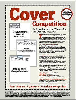 Over the past week the MyBlogLog stats for bLog-oMotives have shown a large number of visitors from Craigslist users around the United States. As I don't use the community classified ad site to promote my work I thought I would investigate a bit. In each case the Craigslist postings are to artists around the country criticizing the magazine design cover "contest" currently (?) being conducted by American Artist magazine. (To be perfectly honest, due to the conflicting dates on the website and downloadable PDF entry form, I can't tell if the "contest" is current or just on-going and the publication has not corrected the specified dates - it really doesn't alter the issue) The messages include the text of a past bLog-oMotives entry, which also appeared on the NO!SPEC site, regarding a somewhat similar arts industry situation and how it was resolved.