Showing posts with label Museum. Show all posts

Advertising Icon Museum to open in 2008

As I've mentioned in past bLog-oMotives entries, I am a collector of a variety of items - enamel advertising signs, cowboy memorabilia, salt and pepper shakers, cookie jars, character teapots and more. However, my primary habit (requiring a regular fix on a semi-regular basis) is the collecting of advertising character figures. Over 200 of the ad icons have found a home in my design studio.

Being interested in the history of the imaginary advertising "spokes models," I often find myself doing a bit of online research for background information on various ad characters - or for characters I might ad to my collection.

I recently came across the website for the Advertising Icon Museum. The facility is set to open in Kansas City in the fall of 2008. The museum, founded by Robert Bernstein, is now under construction as part of the West Edge development on the west side of the city's fashionable Country Club Plaza district. The interior of the museum is being designed by Abbott Miller of Pentagram. Thousands of ad icon character items will remain on permanent display in the unique environment. Various temporary exhibits will be offered throughout the year as well as a complete range of educational programs, conferences and events.

The Advertising Icon Museum web presence has been coming together in recent months. More information can be found on the FAQ page. There's a fun, interactive, exhibit gallery page providing great information when clicking on character images. Links pages are provided to some of the enshrined icons.

The museum will also become the the permanent home of Advertising Week's Madison Avenue Walk of Fame, with plaques added for new honorees voted in by the public each year. (In fact, you may currently vote for your favorite, through September 24th, on the official voting webpage).

I'm sure that my ad character collection members (about 100 are shown above), who I refer to as my real imaginary friends, are thrilled that so many of their peers will find a permanent home in the new museum. I look forward to visiting the facility after it opens next year.

© 2007 Jeff Fisher LogoMotives

A sneak peak at BODY WORLDS 3 -

opening today at OMSI

Last night my partner Ed and I attended a private reception for at Oregon Museum of Science & Industry (OMSI) for Dr. Gunther von Hagens, the creator of the exhibit BODY WORLDS 3 (opening at the museum today). It was an incredible opportunity to get a sneak preview of the amazing exhbition that will be in Portland at OMSI until October. Nearly 20 million visitors in 35 cities across Asia, Europe, and North America have seen BODY WORLDS since its debut in Japan in 1996, and more than 6800 donors including 208 Americans have bequeathed their bodies to von Hagens' Institute for Plastination in Heidelberg, Germany.

My friend (and client when working on past Portland Trail Blazers, Seattle Seahawks and Action Sports Media design projects) Sara Perrin is the Portland Marketing Manager for BODY WORLDS 3, so I had recently learned a lot about the exhibition from her. I'd also heard very positive comments from others who have viewed the displays in various U.S. cities. Still, I really didn't know how I would react to the graphic presentation of real human bodies - and organs, bones, nerve systems and more - preserved through Dr. von Hagen's process of "Plastination."

After schmoozing with guests (including Sara, her husband Rick, and long-time friends - and OMSI staffers - Brenda Jacobs and Andrea Middleton), having a couple glasses of wine, and noshing on a plate of great "poo poos," Ed and I were ready for our appointed time to start viewing the exhibit. I was immediately impressed by the artistic beauty of the displays. Juxtaposed against wall-mounted two-dimensional presentations of artistic and science anatomy images from throughout history, the three-dimensional sculptural beauty of the various human bodies presented was fascinating to me. Ed, being a self-confessed "science geek," was repeatedly saying "cool!" as he took it all in from his own geeky perspective.

It was great to hear the very postive comments of others as they toured the exhibit - especially from the kids present. As I was standing by an artistically dissected javlin thrower, I overheard two young boys discuss the piece as they viewed it with intensity.

"It would be really freaky if these were real human bodies," said the first boy.

"They are real human bodies," the second boy responded.

"Freaky!" was all the first boy said in reply, as the two continued to investigate all aspects of the human form before them.

One of the highlights of the evening for me was actually meeting Dr. von Hagens. I thanked him for bringing the exhibit to Portland and told him I thought it was incredibly beautiful. He was very gracious in expressing his appreciation of my comments and said he hoped many others felt the same way.

As our BODY WORLDS 3 visit came to an end, after about 90 minutes, I was feeling some regret that I couldn't view the entire thing again. I mentioned this to Ed and, in agreement, he told me that he'd already made plans to borrow our "rental children" (the kids of some friends) to bring them to OMSI to see the exhibit - which would allow us another look as well.

I highly recommend that everyone make plans to see this incredibly beautiful and educational exhibit. Tickets for the exhibition, predicted to be one of the most attended in Portland history, are available through the OMSI website.

Illustration: Front panel of OMSI invitation

© 2007 Jeff Fisher LogoMotives

The Magic of View-Master exhibit in Portland

As a kid I was fascinated with my View-Master. It took me on travels around the world and gave incredible dimension to some of my favorite cartoon characters. I also thought it was really cool that the company was based in Oregon - and, on our station wagon adventures, my family occasionally went by the factory where the magic was taking place.

My childhood flashed back to me the other day with an article in The Oregonian about the new exhibit at the The 3D Center of Art and Photography. This past Thursday the exhibition The Magic of View-Master opened in the gallery/museum. The show will run through May 27, 2007.

From the Center's website:

The Magic of View-Master will take a stroll through the history of the View-Master company. The exhibition will included numerous pieces of View-Master history, such as cameras, viewers, reels and projectors.

A highlight of the exhibition will be original sculptures from View-Master artist, Joe Liptak. Mr. Liptak hand-crafted many of the best View-Master sets in the 1970's including Cinderella, the Jungle Book and the Flintstones. A selection of Mr. Liptak's creations will be on display in the Gallery.

During the run of the exhibit, a digital stereo slide show, View-Master Through the Ages, will be presented in the Stereo Theater. On the evenings of April 19th and May 19th there will be discussions with sculptor Joe Liptak and former View-Master employee Rich Dubnow.

The 3D Center of Art and Photography, a non-profit museum/gallery, features the best in antique and contemporary 3D imagery. The Center houses everything from antique stereocards to View Master, contemporary 3D photography, lenticulars, anaglyphs, and computer generated 3D art. The facility is located at 1928 NW Lovejoy Street in Portland, Oregon.

Hmmm...I wonder what happened to the View-Master and reels that my siblings and I enjoyed as kids. I suppose our parents sold it all at some point, along with our Lionel train set, because they felt we were no longer interested in the toys of our childhood.

Photo of View-Master sculptor Joe Liptak from The 3D Center of Art and Photography website

© 2007 Jeff Fisher LogoMotives

The great disappearing museum logo mystery

I'm a longtime fan - and, when I remember, a paying member - of the Portland Art Museum. I've been visiting the galleries and exhibitions for nearly 40 years.

I always liked the look of the old PAM logo, with its Greek key icon. The design was clean, simple, classic and "museum-like."

With the major renovations of the museum facility over the past few years, it was not surprising that a new identity, and rebranding effort, were to come. This last year I remember getting a museum mailing sporting a new logo image. My immediate response was "Eeewww!" (That's a professional graphic design term for "Oh no, this is just not going to work!") A second, more critical, look at the fugly new symbol brought about thoughts that the logo made the viewer work too hard in attempting to read the actual name "Portland Art Museum."

The design was trying to be too clever for its own good. Most viewers were going to read the identity as PORT LAND MUSEUM. The letters that supposedly make up the word "ART" were not in the right order as most people read - the result is "RT A." My impression was that many people seeing the logo would completely miss the somewhat hidden, misspelled "ART" treatment, and I just don't remember anyone ever referring to the art exhibition structure as the "Portland Museum." It's always been labeled by its full name or the abbreviated "PAM."

This past November I came across the blog PORT article Welcoming PAM's new chief, in which artist/writer Jeff Jahn suggested a possible museum plan of action to new director Brian Ferriso. I was giggling to myself as I came across the "Short Term Fix" that read: "What is with the new museum logo? In a city with so many designers this just doesn't cut it."

Hmmm...I was not alone in my thoughts on the image.

And then the logo seemed to disappear. I hadn't seen it again during the several months since my initial strong reaction to its appearance.

While at the beach this past weekend I was catching up on my newspaper and magazine reading. I was flipping through the latest issue of Willamette Week and there was the "missing in action" PORT LAND MUSEUM logo - with the caption PAM LOGO SPURNED: Found buried on the art museum's website. The supporting text, in the Arts & Culture section's SCOOP - Gossip Should Have No Friends column read:

"LOGO NO-GO Nothing wrong with museums wanting to put their best face forward with a fancy-shmancy logo—which is why insiders say Portland Art Museum spent tens of thousands of dollars in 2005-2006 redesigning and relaunching their new brand (which, if you ask Scoop, is just plain hard to read). Apparently new PAM Exec Director Brian Ferriso agrees, which is why they say he's decided to chuck the logo and spend even more bucks for yet another new PAM logo to be unveiled in the next year or two."

Well, that explains the mystery of the logo that is no more. The image seems to have been banished to the island of unwanted logos - or perhaps logo hell. I had a really tough time finding an example of it to post in this bLog-oMotives entry. (It is in use on this web page.) The Portland Art Museum seems to be having a major identity crisis.

The continuing design journey to find the eventual identity for the new and improved PAM should be interesting.

Update Note - 04.04.07: Read more about this and related issues on the blog NameWire

© 2007 Jeff Fisher LogoMotives

Re-Design: Benicia Historical Museum

I seem to be surrounded by identity re-designs right now. This morning I was sitting on the porch of Joy Creek Nursery - a company for which I did an identity re-design quite a few years ago - reading and enjoying the incredible gardens, and contemplating the updating of some of the firm's branding elements. I'm now at home putting the finishing touches on the text for my new book on the topic - Identity Crisis! - which is scheduled to be published in the fall. I'm also working on a reworking of a logo for a client whose identity I have already updated twice from my original design due to name changes, and the logo for another client I've also revamped twice previously. In addition, this past week I was dealing with issues of my logo re-design for the Benicia Historical Museum being incorporated into new signage.

The museum in Benicia, CA is located in the historic Benicia Arsenal structures, where camels were housed after a failed U.S. Military experiment to use them as pack animals in 1850's and 1860's. Initially, the museum seemed to have a split personality with two graphic elements being used for the facility's identity. The simplistic circular logo incorporated a camel and arches representing the buildings. An almost cartoon-ish camel image was used for online identification of the museum. The images were used in one-color; usually black or dark brown.

The museum requested an identity that graphically conveyed a historical perspective for marketing and promotion purposes. A bit more focus on the locally recognized historic structures was desired, while maintaining some reference to the camels of post Civil War times.

The oval shape, with banners, presented a more "antique" look for the identity. The font trio of Horndon, PanAm and Copperplate added to the image. The camel image used was borrowed from an antique etching of the historic facility. Stars incorporated into the design hint at the military history of the site. The colors used reflect the sandstone buildings and the red in the original flag used when Benicia was California's state capitol.

The new identity is serving the museum very well in drawing much more attention to its presence in the local community and surrounding area. It's also bringing recognition to the museum on a national and international level. Last year the logo received an American Corporate Identity 22 award and, as a result, is featured in the book American Corporate Identity 2007. Recently it was announced that the image also received a LOGO 2007 honor and will be in the upcoming book The Big Book of Logos 5. In addition, it will be featured in the volume Branded from United Kingdom publisher Début Publications Ltd.

Previous bLog-oMotives entries featured additional identity re-designs: Our House of PortlandNorth Portland Business AssociationJust OutLaugh Lover's Ball

© 2007 Jeff Fisher LogoMotives
Subvertisements: Using Ads and Logos for Protest

The Center for the Study of Political Graphics (CSPG) is exhibiting images from their archives in the politcal graphics show Subvertisements: Using Ads and Logos for Protest at the California State University Northridge Art Galleries in Northridge, CA through April 21. The exhibition, of nearly 90 posters by artists, graphic designers and students, explores how consumerism and branding have shaped a foundation of cultural identity.

In describing the exhibit, Los Angeles CityBeat notes: "Two years in the planning, the show hosts work from the 1960s through just last week. Topics include vegetarianism, the environment, globalization, and human rights. Most of the posters were culled from the CSPG’s extensive collection; others were donations made specifically for this exhibit."

Items displayed in the exhibition are divided into three main categories, with some inevitable overlap: posters that appropriate ad imagery to address separate issues; product boycotts; and event posters with overtly political illustrations.

“Posters still have a real cost-effective and visual function,” says CSPG director Carol Wells. “To convey an idea to someone to get them thinking about a problem … artists can do that better than anyone else.”

The exhibition is funded in part by the Department of Cultural Affairs, City of Los Angeles.

Image: "iRaq," Forkscrew Graphics, Silkscreen, 2004, Los Angeles, CA

© 2007 Jeff Fisher LogoMotives

Tharp Did It: A retrospective exhibit

At the 2005 HOW Design Conference in Chicago the news spread quickly through the gathered design professionals: Designer Rick Tharp was missing. It was later learned that the man whose work I admired so much had taken his own life. At the time, as a contribution to my Logo Notions column, I wrote the well-received tribute piece An introduction - and farewell tip of the hat — to Mr. Tharp. Through that article I cyberly met many people who cared deeply for Tharp, including family, friends and design industry peers.

This evening one of those individuals, Lourdes Pollard of the Phoenix Data Center, contacted me to make me aware of an exhibit honoring Rick Tharp and his work.

The exhibit, THARP DID IT: GRAPHIC WORK - A Retrospective Exhibit, opened this past week at the Art Museum of Los Gatos in California. The show of Tharp's work will continue through March 30, 2007. On Saturday, March 24, from 6:00 to 9:00 p.m., there will be a Gala Reception, and silent auction, to benefit the Rick Tharp Design Scholarship.

The museum's website states:

Rick Tharp came to Los Gatos in 1974, and maintained a studio in Old Town for 30 years. He designed the masthead, mascot, and the first few issues of the Los Gatos Weekly in 1982.

Rick’s firm, Tharp Did It, specialized in corporate identity, package design and environmental design. Renowned for his humorous designs, his work ranged from wine labels, business logos, and award-winning advertising campaigns for companies such as Brio, a European toymaker.

Local Tharp customers include: Steamer's, Le Boulanger, Carrie Nation, Domus, Bears in the Wood, The Wooden Horse, Valeriano's Restaurant and Old Town among others.

In 1988 Tharp received a CLIO Award, often referred to as the "Oscar" of the advertising world, in New York for wine packaging design for Mirassou Vineyards. He designed street signs and banners for the Town of Los Gatos. His philosophy was "Don't break rules just to be breaking rules, but, on the other hand, don't let them get in the way either." and "Always have fun doing it."

Anyone having the opportunity should see the exhibit, which is sure to be a collection of incredible creative inspiration for any designer.

Photo: Saratoga News/George Sakkestad

© 2007 Jeff Fisher LogoMotives
Smithsonian sponsors Museum Day -

Saturday, September 30, 2006

This Saturday, September 30, 2006, - for one day only - over 400 museums across the United States will join the Smithsonian Institution and Smithsonian Magazine in their long-standing tradition of offering free admission to visitors. Venues that agree to participate will extend free admission for two people when presented with a downloaded Museum Day Admission Card. The admission cards are good for general admission for two on September 30 only, and are not valid for special exhibits, IMAX screenings or for use with any other offer. Some participating museums may already have a free admission policy year round and are participating in the "spirit" of the day.The nationwide event is presented in association with TIAA-CREF Financial Services

Participating Oregon museums include the Jordan Schnitzer Museum of Art at the University of Oregon (Eugene), the Oregon Historical Society (Portland), the Pittock Mansion (Portland), the Science Factory Children's Museum & Planetarium (Eugene), the ScienceWorks Hands on Museum (Ashland), the University of Oregon Museum of Natural and Cultural History (Eugene), and the World Forestry Center's Discovery Museum (Portland).

For information about participating facilities in other states check out the Museum Day web site.

© 2006 Jeff Fisher LogoMotives

Musings on underwear and "tooting" in Spokane


Quite a few times a year I am asked to make presentations on various aspects of the design business to education or business groups around the country. This past week I was invited to make two presentations in Spokane, WA. The flight up to Spokane, on Tuesday evening, was beautiful. The plane left Portland on a crystal clear day and flew up between Mt. St. Helens and Mt. Adams - with St. Helens putting on a little show with a steam plume. I was surprised at the size of Spokane as we arrived in the city. I hadn't been in the area since I was a teenager and it's grown just a bit.

Spokane Advertising Federation President Dean Davis picked me up at the airport and delivered me to the beautiful Spokane Athletic Club - my home for the night. After getting settled I went for a walk around the vibrant downtown area; checking out the Spokane Falls and the historic Davenport Hotel. Back at the athletic club I took a quick steam bath to clear my allergy-stuffed head, grabbed an incredible burger in the bar and crashed for the night.

Bright and early I was picked up and driven to the Spokane Falls Community College campus. Design instructor Greg Stiles gave me a complete tour of the impressive design department facilities, showed me examples of great student work, and prepared me for my presentation. In addition to Spokane Falls design students, I was speaking to students from the Eastern Washington University Visual Communication Design program. It was pleasure to meet Assistant Professor Mindy Breen, who was responsible for writing the grant to cover my visit, and I enjoyed learning more from her (and department instructor Tom Couraud) about the EWU program. Hopefully I will be able to check out their facilities in person in the future.

The topic of my discussion was Designing in my Underwear: Briefs on a career, the original vetoed title proposal for my book The Savvy Designer's Guide to Success. I shared anecdotes about my career, online resources of value to students beginning their careers, portfolio suggestions for new designers and answered numerous questions posed by the attentive audience. Greg Stiles told me he was especially pleased when I told the students "As you leave school behind, the door of that learning experience will hit you in the ass and your actual design education will begin."

Then it was off to my next presentation at the stunning Northwest Museum of Arts & Culture. I wish I'd had time to check out the entire museum and its exhibits. After grabbing a quick sandwich, it was time to speak to the members of the Spokane Advertising Federation. My topic, Tooting Your Own Horn, was probably a refresher course for many of the attendees - but I gave it that "it's better to be a smart ass, than a dumb ass" spin. I really enjoyed the time spent with the group and met some great people.

Following the luncheon presentation, group president and professional photographer, Dean Davis (you really should check out his work) got to "babysit" me for a couple hours before I jetted back to Portland. He took me to his wonderful commerical condo space in a renovated brick produce warehouse. The studio was in a bit of turmoil as it was becoming a gallery for an exhibition of "tramp art" sculptures and installations by Spokane artist Tim Lord. Dean and I escaped the studio and went to scout a location for his photo shoot the next day of pollinating red oak trees (not that I really needed a good dose of pollen). It was a great opportunity to see more of Spokane and enjoy the warm spring day.

When we returned to his studio, Dean took me upstairs to the offices of Klündt Hosmer Design - where his very talented spouse, designer Judy Heggem-Davis, happens to work. (By the way, "Happy Birthday" Judy!). I had the opportunity to meet most of the Klündt Hosmer gang, including principles Rick Hosmer and Darin Klündt. Darin was responsible for me speaking in Spokane. He recommended me after having seen me speak at the 2005 HOW Design Conference. Thanks to everyone at Klündt Hosmer for making me feel so welcome, for the copy of your new direct mail piece and for the popsicle!

Back downstairs in his studio, Dean shared some of one of his 40th birthday bottles of wine with me and then it was off to the airport. My visit to Spokane was just about 24 hours. It seemed much longer as so much was packed into the limited stay. I look forward to returning again - and now have many reasons to do so. Thanks to everyone who made my visit so enjoyable. Special thanks to Greg Stiles, Mindy Breen and Dean Davis for their efforts in putting together my Spokane adventure.

Spokane Falls photo ©1997-present, Spokane Community College

© 2006 Jeff Fisher LogoMotives

Big surprises in a small art museum

When traveling - which I seem to do a lot (we've been spending a fourth to a third of recent years in hotels or other travel accommoda- tions) - I always like to check out the local art scene. I may visit local art galleries, pre-arrange visits to the studios of designers or artists, or take in current exhibits at a local art museum.

I hit the jackpot earlier this week in Tampa when I learned that the Tampa Museum of Art had featured exhibits of the works of Maurice Sendak and Keith Haring. I've always been fascinated by the work of both artists. To have exhibits focusing on both in one museum was almost sensory overload.

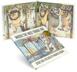
Many years ago I was introduced to Sendak's book Where The Wild Things Are. This exhibit, WILD THINGS: The Art of Maurice Sendak, displays preliminary drawings and final art for that book and so much more. Original book manuscripts, set designs, personal letters and over 100 other pieces of Sendak memorabilia are included in this beautiful exhibition. A detail description of the exhibit can be found on the site of The Jewish Museum New York, organizer of the traveling exhibition. The show will be available for viewing in Tampa until April 23, 2006.

My other purpose in visiting the Tampa Museum of Art was to view the installation Keith Haring: Art & Commerce, A Tribute to the Pop Shop. The exhibit is a tribute to Keith Haring’s Pop Shop, which closed its doors in 2005 after nearly 20 years in operation and 15 years after the artist’s death from AIDS. Keith Haring opened the Pop Shop in 1986 and sold inexpensive clothing and gift items that featured his unique designs, in a venture that critics viewed as crassly commercial, while Haring’s vision always had more to do with art than commerce. Over 100 examples of Haring's work are on display - from early high school drawings to his familiar T-shirt and poster designs. The show, organized by independent curator Jade Dellinger - in conjunction with the Keith Haring Foundation - for the Tampa Museum of Art, will be open through June 11, 2006.

A special treat was seeing works by designer and artist Ivan Chermayeff in a showing of print work in one of the museum galleries. Chermayeff is a principle in the Chermayeff & Geismar Studio, known for some of the most recognizable corporate identities and logos in the world.

The museum's ongoing permanent exhibit, The Classical World, is very much worth a good look as well. Across the Hillsborough River from the museum is the fascinating and imposing historic Tampa Bay Hotel structure - now the home of the Henry B. Plant Museum at the University of Tampa. Plant, honored by the museum in his name, built the incredible hotel in 1891. We were lucky enough to be given a tour of the beautiful building by Tampa designer (and HOW Design Forum member) Chris Baltzley. The museum and the old hotel are "musts" if you visit Tampa.

Haring Self Portrait © Estate of Keith Haring

© 2006 Jeff Fisher LogoMotives

Toot! Toot!*:

Jeff Fisher LogoMotives receives

American Corporate Identity 22 honors

The Portland graphic design firm Jeff Fisher LogoMotives has been honored with four awards in the American Corporate Identity 22 design competition. The winning entries will be featured in David E. Carter’s book, American Corporate Identity 2007, to be released later this year. Designer Jeff Fisher has received 25 of the ACI honors over the past nine years.

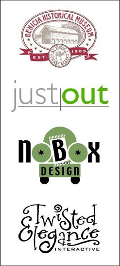
The identity for the Benicia Historical Museum - in Benicia, CA - was was among those recognized. Sue Fisher, of TriAd, was the art director on the project. The new logo for Just Out, the news- magazine serving the LGBT community of Oregon and SW Washington, was also honored. Marty Davis, publisher of the paper, worked closely with Fisher to establish the new look. Fisher's graphic image for NoBox Design, a Portland interiors firm, also received an ACI 22 award. In addition, Twisted Elegance Interactive's identity was honored. A previous business entity of Jason Holland Design in Seattle, the firm's logo was recognized earlier in the P22 Fonts In Use Competition.

Jeff Fisher has received nearly 500 regional, national and international graphic design awards for his logo and corporate identity efforts. His work is featured in more than 75 publications on the design of logos, the business of graphic design, and small business marketing.

Fisher is a member of the HOW Magazine Editorial Advisory Board and is also on the 2006 HOW Design Conference Advisory Council. His own book, The Savvy Designer's Guide to Success, was released by HOW Design Books in late 2004.

(* If I don't "toot!" my own horn, no one else will.)

© 2006 Jeff Fisher LogoMotives
