Jeff Fisher LogoMotives represented in

two new graphic design books

Yesterday my mail delivery brought me copies of two new graphic design books in which comments by me, or examples of my work, are featured. Today I am getting high off the fumes of printing ink as I flip through the fresh-off-the-press volumes

The first is Caffeine for the Creative Mind: 250 exercises to wake up your brain by Stefan Mumaw and Wendy Lee Oldfield. The book, from HOW Design Books, is a collection of over 250 brain- stretching creative exercises; feedback on exercises tried by designers, illustrators, photographers, professors and others; and interviews with industry professionals. Wendy Lee Oldfield interviewed me for the book about 17 months ago when I was speaking at the HOW Design Conference in San Diego. The result of that meeting is highlighted in the book, along with interviews of Terry Marks, Kevin Carroll, Denise Weyhrich, Brian Sack, Steve Morris, Mike Dietz, Peleg Top, John Sayles and Sheree Clark of Sayles Graphic Design, John Foster, and Von Glitschka.

The book is sure to be an instant hit with "creative types" around the world - and will most likely soon be found on the book lists of many design schools. Now, I just need to find the time to sit down and read it from cover to cover.

The second book in my mailbox yesterday was American Corporate Identity from David E. Carter. The design annual features the winning graphic design entries from the American Corporate Identity 22 competition. Four of my logo designs - for the Benicia Historical Museum, NoBox Design, Twisted Elegance Interactive and Just Out newsmagazine - are included in the volume. The designs were presented in a previous bLog-oMotives entry when the winning entries were announced by competition organizers.

Since 1998, when I first started entering the American Corporate Identity competitions, 24 logo designs and one marketing collateral package designed by Jeff Fisher LogoMotives have won the Awards of Excellence and been featured in the annual publications. The deadline for the next competiton will be in December of this year.

© 2006 Jeff Fisher LogoMotives

"Call for entries" confusion?

(Note: Over the weekend a thread developed on the Graphic Design Forum, initiated by the posting of a Rotovision "call for entries" for book submissions, making it clear that some design professionals are a bit confused about the difference between "spec" work and a legitimate book submission "call for entries" - and were not familiar with the graphic design book publisher. The following is my posted response to the thread issues.)

I do think it's great that design professionals are so quick to question "calls for entries" when so many posted online these days are for speculative work - or, in other words, requests for designers to create NEW work - without compensation - in competition with others for possible payment on a job or the use of the final art without any compensation at all. It shows that the NO!SPEC movement is making great strides. However, "calls for entries" for EXISTING work - for which a designer has already been paid - to be included in a design book or annual have been part of the industry as long as there has been a graphic design profession - and are a totally different beast.

Rotovision books are incredible design resources, and much better known on the other side of the "pond." Rotovision is a "sister company" of the much more familiar Rockport Publishers in the U.S. Still, the Rotovision logo on the spine of a book should be getting more and more recognizable to any designer spending time at any bookstore in the U.S. with a great graphic design section. I see more of them all the time.

My own work has now represented in over 80 design books and annuals in the last ten years. My work has been published in design books from Japan, Korea, Sinagapore, China, Brazil, Spain and the U.S., literally giving my work worldwide exposure. (The last time I was in Italy I came out of the Accademia, after seeing the statue of David, to see a design book in the store window across the street open to a page full of my logo designs) It is one of the best marketing tools I have ever used in the marketing and promotion of my work. The vast majority of people contacting me in regards to design work now say "I saw your work in a design book at my local bookstore..." It all about making your design efforts work for you, rather than working your ass off all the time to market and promote yourself - creating a high visible extension of your portfolio of great work.

As a result of being published in design books a lot of other things have happened in addition to new clients. I'm often asked for work to illustrate other books on design or small business marketing - and to be included in magazine articles. I've been asked to speak at conferences, write books and magazine articles, and even to submit works for inclusion in the archives of the Center for the Study of Political Graphics.

Such "call for entries" requests offer great opportunities to present what you consider your best work to an audience much wider than that originally seeing the work. The "damn I'm good" aspect of being included in such a book is great for yourself, your career AND the client for which you did the original work. (i.e. If you don't "toot! your own horn, no one else will) My client firms, and the direct contact with whom I've worked, love having their work showcased in design volumes as an unbiased verification that they did something right in producing the highlighted project.

In most cases the books required no entry fee, or publication fee, for the acceptance or publication of my work - and "free" is a very good price for world-wide advertising. Those requiring entry fees - to offset administration, production and publication costs - simply became part of my business advertising costs (and a much better use of those dollars). The inclusion of my work in such volumes doubles the promotion opportunities when it comes to sending out press releases about the work being published.Many designers do understand the business value of being included in such books, and the personal pride in having work presented in such a graphic arena. Those whose work was included in my first book, The Savvy Designer's Guide to Success, keep me posted about the results of their work being featured. Over 50 design firms are represented in my upcoming book, Identity Crisis!, and most jumped at the invitation to showcase their work in a book that is being sold on Amazon nearly 10 months before it is published. With my office being "closed" on Fridays, I find myself spending most of those days on such marketing efforts and opportunities to have my favorite project receive greater exposure.

One of the oddest things about this world of graphic design books is the number of times I have picked up a new book at a local bookstore - for which I have not submitted designs - only to find my work used in the book without my permission or any attribution of credits at all. It usually turns out that the designs have been "borrowed" from an existing book. Most often these books are published in countries where there is already little regard for copyright of any kind.

I noticed that (a regular forum poster) already posted one of my articles on this topic. I'll post it again - along with a couple other resources.

Article: A Winning Strategy

Article: When a "contest" is not a contest

I also do a bLog-oMotives entry every 60 to 90 days updating "calls for entries" from book publishers and writers from around the world. Here's the latest entry:

Calls for entries: Upcoming design competition deadlines

Good luck!

© 2006 Jeff Fisher LogoMotives

An introduction to Amazon Shorts

Recently, design educator and writer Robin Landa introduced me to Amazon Shorts. No, Amazon is not marketing their own brand of boxer underwear. Amazon Shorts are never-before- seen short works from a wide variety of well-known authors, available only on Amazon.com - for 49 cents each!

Landa, a brand and creative strategist - and Distinguished Professor in the Department of Design at Kean University of New Jersey - was gracious enough to provide some input for my upcoming book, Identity Crisis!. In one of her emails, she suggested I take a look at her just published "short," 10 Truths Behind Successful Brands. It's a great little resource and you can't beat the price.

If Landa's name seems a bit familiar; it should. She is the author of the design volumes Designing Brand Experiences, Graphic Design Solutions, Advertising By Design and Thinking Creatively. Landa is also co-author of 2D: Visual Basics for Designers and Visual Workout: Creativity Workbook.

So, in addition to checking out the writing of Robin Landa, take a look at the other offerings of Amazon Shorts. You will find a great selection of valuable (and inexpensive) writing on an incredibly wide variety of topics.

© 2006 Jeff Fisher LogoMotives

Right Brain Reader features Jeff Fisher LogoMotives

The Right Brain Reader, the online newsletter for the web presence Right Brain Resource, features Jeff Fisher Logomotives in their latest offering Portland - Independently Creative. In the October issue, writer Philip Bailey focuses on identity designer Fisher in the article Away from the sketch pad; away from the struggle, Jeff Pollard Design in the piece Boiling Down the Talent of Logo Design, and custom silk screen and design shop Modified Design

Fisher, the author of the book The Savvy Designer's Guide to Success and the upcoming 2007 release Identity Crisis!, has previously written for The Right Brain Reader. His article How Much Should I Charge? appeared on the site in January 2005.

Based in Portland, Oregon, Right Brain Resource is a creative staffing agency dedicated to supporting the creative community. The firm helps companies find creative individuals with all levels of talent within the six disciplines of graphic design, website development, copywriting, illustration, apparel design and photography.

© 2006 Jeff Fisher LogoMotives

Could you draw major logos from memory?

I came across an interesting web site the other day called Brandmarker. The art group monochrom attempted to evaluate the actual power of commercial brands by making people draw famous logos from memory. Austrian individuals were asked to draw a total of twelve logos (nine international, three typically European) from the memory of past interactions and sightings of the images - 25 people per brand. The identities selected included adidas, BP, Coca-Cola, Lacoste, Apple and others.

Brands, and logos, do seem to stick in people's minds. I thought it was interesting how many people drew the old BP shield rather than the newer flower-like image. Still, the shield is my one of my first memories of a major international logo. It was on a tanker truck in my Matchbox car collection when I was a kid. (In fact, I probably still have that particular toy vehicle as I have most of my collection stored away - many in their original boxes.) In several cases older versions of the featured logos were drawn.

Hmmm...I wonder why about half of the people got the Lacoste "critter" facing the wrong way?

monochrom is an international art-technology-philosophy group founded in 1993. Its offices are located at Museumsquartier/Vienna (at 'QDK'). The group works with different media and art formats and publishes the German book and magazine series monochrom. monochrom is known for its left-wing political work/civil society work. The group's website functions as a collaborative digital art community.

© 2006 Jeff Fisher LogoMotives

Wandering wine wings around the west

I really never thought we'd see our bottles of wine again after being told by Southwest Airline that the bag containing the wine was missing. Sunday afternoon Ed tried calling the airline to get more information and discovered that the central baggage office is only open 8:00 to 5:00, Monday through Friday (I'm sure that's always really convenient for a weekend traveler who has lost luggage issues).

He decided to review the Southwest website and found there is no information, or restrictions, regarding transporting wine in checked baggage. In again calling the airline's reservations number, he had to specifically ask the agent about the (new) policy before she would even research the restriction. The policy even specifies how thick the plastic bag must be in which the Styrofoam clad bottles of wine and box are placed. I doubt if any customers are even aware such "rules" exist until they experience a situation such as ours.

On Monday morning Ed got a call saying the bag had been found - in Ontario, CA. Which means the wine we could not have in our checked luggage had in fact been put on a plane to another city for some reason. No one could tell him why a bag with no destination label, ended up in Ontario. He was told the bag would be put on yet another plane and flown to Portland for an afternoon pick-up at the airport. Hey, weren't we originally trying to accomplish getting the wine to Portland when the bottles started this odd adventure?

Of course, we still didn't know the condition of the wine - or if all/any of the bottles were even in the bag.

Ed drove out to the airport Monday evening and picked up the bag, which contained four well-traveled bottles of wine in excellent condition - and I'm happy to have my etched bottle safe at home...

© 2006 Jeff Fisher LogoMotives

W(h)ining about Southwest Airlines

and the lost bottles of wine

I don't usually use my blog to bitch and moan about things - but sometimes dealing with the airlines can be so incredibly frustrating - especially when they lose something due to complete stupidity. So, I will w(h)ine a bit.

Last weekend we spent a few days visiting my sister (and client) in Benicia, CA. It's usually easier to fly into Sacramento, and drive the hour to Benicia, than it is to deal with San Francisco International and the drive to my sister's town or take the BART trip to a nearby station. When we do so, we usually book our trip on Southwest Airlines - and most of our experiences have been quite pleasant.

Part of the reason we were visting my sister was to finally take possession of four bottles of wine purchased on a trip to Napa when last visiting her in April of 2005. She'd been holding the wine "hostage" until we returned to get it in person. Two of the bottles were incredible whites (for me) from an wonderful private tasting party (arranged by our friend Greg from Atlanta) at the Clos Du Val winery, another was a red from Clos Du Val, and the final bottle was from the small boutique HaGafen Cellars.

Due to the new TSA restrictions on liquids in carry-on luggage, we came prepared to check the bottles of wine in our luggage - which we have done in the past with no issues - for the return trip. We packed an extra piece of luggage within another bag - a sturdy new bag bearing the logo of Holland+Knight law firm where my partner Ed is employed - and also packed to strong corrugated wine shipping containers we had used to bring bottles of wine back from a past trip to Italy.

We had a great visit with my sister and her new fiancé. Actually, last Saturday night the two bottles of red wine were consumed during an amazing dinner prepared by Ed. My sister supplemented our wine shipment with another bottle of red wine for Ed and a special gift for me - a limited edition commemorative bottle of wine with the logo I had designed for the Benicia Historical Museum etched in the glass. The thing was beautiful.

On Sunday afternoon, with all our luggage packed, we drove off to the Sacramento Airport for our flight back to Portland. When reaching the Southwest ticket counter the very nice agent asked if we had any wine in our luggage. We told her that we did and she asked to see how it was packaged. She took one look at the packaging and told us that Southwest did not allow for any wine to be shipped in checked luggage unless it was packaged in Styrofoam shipping containers and we needed to remove the wine from our bags. Of course, there was no facility at the airport (about an hour and a half away from Napa) to purchase such shipping materials or prepare a package for shipping in another manner. The ticket agent suggested that we put all the wine in the Holland+Knight bag, label it appropriately and have it left in the Southwest supervisor's office to be picked up by someone later. We phoned my sister and she agreed to drive the one hour to the airport on the following Saturday, or before, to pick up the wine and again hold it "hostage." Ed put one of his business cards into the piece of luggage and attached a label to the bag with my sister's name, her fiancé's name and my sister's cell phone number. We told the helpful ticket agent what was going on and she wrote on the label "will pickup on 10/07/06 or before." With the travel "speed bump" handled we headed for the security and our evening flight home to Portland.

Yesterday we had an email that my sister was heading to Sacramento to pick up the bag and our wine. Later we got a voice mail message to call her because when she got to the airport no one could find the bag in question at all. Ed called her and was told that the people at the Southwest counter "thought" that, due to the fact the bag had been unclaimed for five days, it had probably been sent to the airline's unclaimed baggage facility in Texas - even though a pickup date of 10/07 was marked on the bag's label. Excuse me, wouldn't that involve putting a bag of items that we were told could not be checked into the luggage hold of a plane? The airline made no attempt to call my sister - whose number was also clearly on the luggage tag. There was certainly no attempt to check inside the bag and find Ed's business card to call him at his office.

Instead, we now have a phone number for a facility in Texas and the search will begin for our bag o' wine. I've got to admit, with the recently released figures on lost luggage, I'm not too hopeful.

I'm probably pissed off about the loss of the bottle with my etched logo design more than anything else. To avoid such situations I have two scenarios of advice for fellow travelers:

1.) Just blatantly lie to the ticket agent if you are asked about wine in your luggage; or

2.) Use your car keys to poke the cork into the bottle (you certainly should not be carrying a corkscrew with you!), sit down on the floor of the airport lobby and drink the wine from the bottle. Perhaps you will be a bit more prepared to deal with the airlines, security, the crowded airports and your upcoming flight.

I'll keep you posted about the saga of the lost wine...

(Note: Here's the update on the wandering wine.)

©2006 Jeff Fisher LogoMotives

An evening at Jimmy Mak's with Jacqui Naylor

It was great to escape from the house last night - after a week of dealing with a flu bug while finalizing the manuscript of my new book - to spend an evening with friends at the "new and improved" Jimmy Mak's club listening to San Francisco based jazz vocalist Jacqui Naylor. My partner, Ed, and I first met Jacqui at the Sayulita, Mexico wedding of our mutual friends Shawn and Greg. When Jacqui was a child, Shawn was one of her babysitters. Jacqui sang at the wedding, with partner-in-crime Art Khu on guitar, and I fell in love with her music. I mentioned to Ed that I had to get a copy of her CD Shelter as soon as we got back to Portland. Later, at the wedding reception, I felt someone trying to put something in my pocket and turned around to find Jacqui attempting to put a copy of the CD in my pants. She smiled and said "A little bird told me you might like this." I was hooked on Jacqui. I often work on design projects with her incredible voice in the background.

When Jacqui comes to Portland, Shawn and Greg always get a group together to attend the show. Last night - the first time in the new "big city" venue - we joined them, along with Greg's mother Marcia, Shawn's sister Karen, and our friends Scott and Erika, for a wonderful evening of friends, food, music and a drink or two. Jacqui performed some old favorites and selections from her new CD, The Color Five. She was better than ever. It was also great to get the chance to visit with her for a bit, and say "hi" to Art. Unfortunately, the night ended way too early for us.

Jacqui has upcoming tour dates at several Blue Note jazz clubs in Japan, and at locations around the U.S. If you can't catch Jacqui in person, get yourself one of her CDs - or touch base with her on MySpace (where she and I bumped into each other a few months ago).

© 2006 Jeff Fisher LogoMotives

Jeffism #6

"I'm constantly amazed by the incredible number of design professionals who are willing to invest so much time, talent and energy in the CHANCE at so little - or nothing - in compensation. It's even more flabbergasting that they continue to accept such crap as an industry norm again and again."

- Jeff Fisher (in regards to speculative design efforts)

Calls for entries:

Upcoming design competition deadlines

All of the following competitions deadlines present great opportunities to showcase your design efforts, market your work on an international scale through the published books, and "toot!" your own horn to clients, peers and the media:

Tokyo TDC Annual Awards 2007
(Tokyo Type Directors Club - Japan)
Deadline: Interactive design category - October 10, 2006
Deadline: All other categories - October 20, 2006

No entry fees charged for international submissions

STEP inside design 100
(STEP inside design - USA)
Extended Deadline: October 16, 2006
Entry fees charged

Graphis Posters 2007
(Graphis, Inc. - USA)
Deadline: October 30, 2006
Entry fees charged

The Instore Graphic Design Awards
(Graphic Design: usa - USA)
Deadline: October 30, 2006
Entry fees charged

LOGO 2007
(David E. Carter - USA)
Deadline: October 31, 2006
Entry fees charged

A+C=D, PRINT’s International Art and Commerce Design Review
(PRINT - USA)
Deadline: November 1, 2006
Entry fees charged

designwire annual '06
(designwire - Australia)
Deadline: Initial submissions - November 3, 2006
No entry fees charged - but designwire forum membership required

D&AD Global Awards 2007
(D&AD - UK)
Earlybird Deadline: November 6, 2006
Entry fees charged

Branded
(Debut Publications - UK)
Extended Deadline: November 30, 2006
No entry fees

(Note: I should mention that while the request for submissions for the book "Branded" is a great opportunity for designers, I disagree with Debut Publications' concurrent "contest" for speculative cover design art. The situation is similar to the recent cover design "contest" which was canceled by the Creativity Awards - although, much to the credit of Debut Publications, the publisher does not seem to be assuming exclusive usage rights to all works submitted. Still, any request for a designer to execute "free" work for a for-profit entity just bugs the hell out of me. Designers should make their feelings about this issue known to the publisher.)

Restaurants Graphic Design
(Index Books - Spain)
Deadline: November 31, 2006
No entry fees

EXHIBITOR Exhibit Design Awards
(Exhibitor Magazine - USA)
Earlybird Deadline: December 1, 2006
Entry fees charged

I.D. Annual Design Review
(I.D. Magazine - USA)
December 1, 2006
Entry fees charged

Image Management and Reproduction
(Rotovision - UK)
Extended Deadline: November 30 2006
No entry fees

Instant Graphics
(Rotovision - UK)
Deadline: December 8, 2006
No entry fees

You may want to read my article about participating in design industry competitions: A Winning Strategy. It has appeared on the Creative Latitude and NO!SPEC web sites.

Good luck!

(Note: Thanks to NO!SPEC for mentioning this bLog-oMotives entry)

© 2006 Jeff Fisher LogoMotives

Best of Letterhead and Logo Design

hits the bookselves in paperback

The other day I was browsing the shelves of the design section at Powell's City of Books and came across the Rockport Publishers offering The Best of Letterhead and Logo Design in its new paperback version. (The Amazon site says the book has not yet been released - but I also saw it at Borders that same day.) The new small-format edition is a collection of many designs previously presented the long-running Letterhead and Logo Design book series from the publisher. It's a great inspiration resource for any designer interested in creating identities for businesses, products, organizations or events.

Jeff Fisher LogoMotives is represented in the book with eight designs. The logos featured include those for Portland firms Carmen Schleiger Architecture, City Laundry Northwest, law firm Samuels Yoelin Kantor Seymour & Spinrad, Denny Shleifer Marketing Communications and hairstylist Jeff Maul. The image for the nonprofit group Love Makes A Family was also selected for the book. The logo for the San Francisco nonprofit Laugh Line Productions is also displayed. In association with his sister’s Bend, Oregon firm TriAd, the designer created the included identity for the company Gina’s Italy. The designs are from volumes in the book series from the 1990's.

With both the original hardback and the new paperback volumes, I've noticed that "No. 1" is incorporated into the book cover design. I hope this is a sign of future volumes to come.

© 2006 Jeff Fisher LogoMotives

The Rise of the Copywriter/Designer

Soon after starting college I found myself in the awkward position of really detesting my chosen path of study within the graphic arts program, which was part of the Fine Arts School. A friend then suggested I look into the Journalism School and its program of publication and advertising design courses. To participate in the design class offerings I also was required to take a selection of typography, advertising, marketing, public relations, journalistic writing and copywriting classes. With the copywriting courses, I became a much more marketable commodity as a designer who could also be called upon to write a clever tagline, concise headline or complete sentence. The journalism portion of my education has served me very well over the past 30 years as a professional designer - and writer.

The valuable input of four talented copywriter/designers (or perhaps "designer/copywriters") is included in the recent Graphics.com article The Rise of the Copywriter/Designer. Written by copywriter, marketing consultant and communications manager Shaun Crowley, the piece features Dean Rieck, Ayd Instone, Mike Matera and (my Creative Latitude and online design forum buddy) Neil Tortorella.

Crowley introduces his article with:

"It's tough being a freelance designer these days. You need to be a shrewd businessperson. You need to spend as much energy on your marketing as you do on your design projects. There are lots of neat ways freelance designers in the marketing communications arena stay ahead of the game. Some offer a unique layer of service such as free proof-reading or liaison with printers. Some market themselves as specialists in a specific area, such as video-based Web sites or 3D design."

"And then there are a few other freelance pioneers who are integrating something entirely new into their creative services—copywriting—and finding a whole host of new clients banging at their door."

Check out the entire article at The Rise of the Copywriter/Designer. Even more advice on the topic is included in Crowley's downloadable book 100 Copywriting Tips for Designers and Other Freelance Artists.

In addition, take the time to stop by the blog Inside the Marketing Mind to see what else Tortorella has to share with his fellow "creative types."

© 2006 Jeff Fisher LogoMotives

Smithsonian sponsors Museum Day -

Saturday, September 30, 2006

This Saturday, September 30, 2006, - for one day only - over 400 museums across the United States will join the Smithsonian Institution and Smithsonian Magazine in their long-standing tradition of offering free admission to visitors. Venues that agree to participate will extend free admission for two people when presented with a downloaded Museum Day Admission Card. The admission cards are good for general admission for two on September 30 only, and are not valid for special exhibits, IMAX screenings or for use with any other offer. Some participating museums may already have a free admission policy year round and are participating in the "spirit" of the day.The nationwide event is presented in association with TIAA-CREF Financial Services

Participating Oregon museums include the Jordan Schnitzer Museum of Art at the University of Oregon (Eugene), the Oregon Historical Society (Portland), the Pittock Mansion (Portland), the Science Factory Children's Museum & Planetarium (Eugene), the ScienceWorks Hands on Museum (Ashland), the University of Oregon Museum of Natural and Cultural History (Eugene), and the World Forestry Center's Discovery Museum (Portland).

For information about participating facilities in other states check out the Museum Day web site.

© 2006 Jeff Fisher LogoMotives

bLog-oMotives "rattles the hell out of the keyboard"

Thanks to fellow Portland designer Samuel John Klein, of The ZehnKatzen Times blog and Designorati, for giving me a "heads up" about the local Daily Journal of Commerce giving bLog-oMotives a mention in the October issue of Commerce Magazine. The cover story for the publication is 26 Reasons why design rules in Portland: An A to Z guide to all things wild, weird and wonderful. In the "B" entry of the special feature, about the blogs of area "creative types," the publication states "Copy creatives in Portland may take home a paycheck for writing, but local designers can rattle the hell out of the keyboard, too, often turning to blogs to strut their verbal stuff."

In regards to my own efforts with bLog-oMotives, the writer continues with "Logo guru Jeff Fisher of Jeff Fisher LogoMotives pounds the keys at blog-omotives.blogspot.com, where he rolls out design news, commentary and resources, plus a tasty-sounding potato salad recipe and an occasional "Jeffism." (No 5: 'To err is human; to make something positive from the situation is design.')"

In addition to the The ZehnKatzen Times, the blogs singled out include Kamp Grizzly, Tim Coulter's Sport Bucket, PORT, and the Portland Institute for Contemporary Arts blog at Urban Honking.

Thank you Daily Journal of Commerce and Commerce Magazine.

© 2006 Jeff Fisher LogoMotives

HOW Magazine launches official blog

Early this morning I got an email from HOW Magazine Senior Editor Megan Patrick telling me that the official HOW Blog had been launched. The editors and staff of HOW are constantly adding new features to the magazine, the publication's website, the HOW online forum and other enterprises associated with HOW. It looks like they are have too much fun with the new blog. I look forward to checking it out on a regular basis.

In the interest of full public disclosure, I should mention that my involvement with HOW goes a bit beyond just reading the magazine. I'm a member of the publication's Editorial Advisory Board, I've written for the magazine, they've written about me, I've spoken at a few HOW Design Conferences, and I'm a member of the HOW Conference Advisory Council. HOW Design Books also published my first book, The Savvy Designer's Guide to Success. They will release my next book, Identity Crisis! in 2007.

It may all sound a bit incestuous - but, as a member of the "family," it doesn't mean I'm going to enjoy the HOW Blog any less. I hope you'll take a look, too.

© 2006 Jeff Fisher LogoMotives.

Design studio housecleaning - excavated artifact #5

Recently, while cleaning out a box of old unfiled business papers, I came across a doodle that was to become one of my most successful logo designs. As it is the identity for a law firm, it is somewhat appropriate that the sketch is on a piece of a yellow legal pad. Creating a logo for a law firm can bring about many challenges. In addition to the partners in the business name, there are usually at least a few other lawyers who desire to claim some ownership in regards to selecting a final design. In such situations a designer needs to tactfully perform the "design by committee" dance. It can also be tough to convince the members of a legal firm to stray from the traditional conservative designs often used to promote such a company. It is necessary to convey that creating an original image positions the firm as unique in the market.

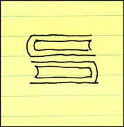
The identity process for the Portland law firm Samuels Yoelin Kantor Seymour & Spinrad went through numerous somewhat complicated iterations before one of the main partners in the firm suggested returning to an early, very simple concept. That design was a graphic interpretation of two thick law books creating the “S” letterform – representing the name Samuels, designated as the one constant in any future name changes. In a moment totally unrelated to meeting with the attorneys, while on the phone with another client, I drew out my initial thoughts with a felt tip pen. In fine-tuning the design I made the "books" come across as much more like the heavy legal volumes I'd seen in the firm's office bookcases. With some prodding by the one partner advocating the image, the icon was adopted by the firm and it has served them well over the past decade.

The design brought a great deal of attention to my identity creation efforts. The logo appeared in a PRINT Regional Design Annual, won a LOGO 2000 award, and received a Bronze in the Summit Creative Awards. The design was also published in the books International Logos & Trademarks 4, Letterhead and Logo Design 5, The Big Book of Logos, Global Corporate Identity, The Best of Letterhead and Logo Design, and the Japanese volume New Logo & Trademark Design (which has been re-released in paperback as Logo and Trademark Collection).

© 2006 Jeff Fisher LogoMotives

Toot! Toot!*: Jeff Fisher named to UCDA

Designer Magazine Advisory Board

Jeff Fisher, the Engineer of Creative Identity for the Portland-based firm Jeff Fisher LogoMotives, has been named to the University & College Designers Association (UCDA) Designer Magazine Advisory Board.

The UCDA was founded in 1970 as the nation's first and only association for professionals involved in the creation of visual communications for educational institutions. It has grown to an organization comprised of more than 1000 members throughout the United States and Canada. Designer is the official quarterly publication for the members of the organization.

The Designer Magazine Advisory Board was formed to assist UCDA in developing a high quality magazine. Board members also act as contributing editors by writing articles or assisting the editor with collecting articles for publication from other sources as well as suggesting topics for articles.

Fisher has contributed articles to the publication in the past, including an excerpt from his first book, The Savvy Designer's Guide to Success. He was also a speaker at a past UCDA conference.

Over the years, the designer has worked on graphic design projects for Willamette University, University of Oregon, George Fox University, Reed College and other education institutions across the country. Fisher has received over 500 regional, national and international graphic design awards for his logo and corporate identity efforts. His work is featured in more than 80 publications on the design of logos, the business of graphic design, and small business marketing. He shares his observations about the design industry in writing for various magazines and web sites, and on his blog, bLog-oMotives.

Fisher is also a member of the HOW Magazine Editorial Advisory Board, the HOW Design Conference Advisory Council, and the Board of Directors of Proscodi: Professional Society of Communication Design. His latest book, Identity Crisis!, will be released in 2007. More information about Jeff Fisher LogoMotives is available www.jfisherlogomotives.com.

* If I don't "toot!" my own horn, no one else will

© 2006 Jeff Fisher LogoMotives

Designer interaction, professional resources,

time-wasters and imaginary friends

In a current thread on the Graphic Design Forum, member Juggnoxalo asked others to post links to other forums they visit. I shared my forum list and thought it might be a good resource to post as a blog entry as well.

In a past bLog-oMotives entry I mentioned my Creative Latitude article Funny Things Happen on the Way to the Forums, in which I interviewed three moderators of online design forums. The Internet opened up a whole new world of interaction for designers - especially for the somewhat isolated one-person design shop like my own home-based studio in Portland. The forums are often an incredible information resource for designers, a great "time-waster" for the daydreaming design professional, and an excellent way to make what my partner refers to as my "online imaginary friends."

With many recent emails from designers wondering how they can interact with others in the graphic design field, I am posting links to some of the forums I visit as a reference. (Those in bold are the ones I frequent most often):

About.com Graphic Design • Anticubicle • Communication Arts • Core77 • Designate Online • designers4m • Designers Lounge • DesignersTalk • Designwire • Dexinger • Graphics.com • Graphic Design Forum • HOW • Lounge72 • Rookie Designer • ModMinds (fairly new) • The Creative Forum • The Designers Forum • Typophile

In addition, an excellent business-related forum is Startup Nation.

© 2006 Jeff Fisher LogoMotives

Identita/Identity: International fax/email design

exhibit on display in Czech Republic

The 22nd International Biennale of Graphic Design exhibit is currently on display in the Czech Republic city of Brno. The Brno Biennale Association invited colleagues, designers, illustrators, and graphic design students from around the world to participate by designing and submitting their own vision of Identita/Identity for the special exhibition.

The representations of personal, club, national, global, local, professional, philosophical, religious, sports and cultural identity, created in black and white only, were faxed or e-mailed to the event organizers. The selected designs are currently on exhibit at the Gallery HaDivadlo Brno and Gallery of the Brno Cultural Centre in Brno through October 4, 2006. The event was sponsored by the Czech Fund of Arts Foundation (NCFU), City of Brno and Ministry of Culture of the Czech Republic.

As many around the world will not be able to personally attend the exhibit, the event catalogue is available for download in PDF form from the organization's web site.

Note: Catalogue cover image courtesy of Brno Biennale Association.

© 2006 Jeff Fisher LogoMotives

The Identity Archives Project unveiled

The Identity Archives Project (IdAP) site went live this past week and the effort looks like a logo design inspiration resource to keep an eye on as it develops. The online reference hopes to be the premier online keyword-searchable database of logos and brand identity designs from around the world. It is a free and open resource, built upon the contributions of graphic designers and brand identity specialists. Submission guidelines, technical specifications and suggested keyword information are clearly defined on the site. There is no need to sign-up or register with IdAP in any way, and the database is always available for review.

IdAP was created by Gabe Ruane of Futuristo Design in Boston.

© 2006 Jeff Fisher LogoMotives

An initial "WOW!" for WOWIO

Design industry pal Kristin Ellison recently left her position as acquisitions editor at Rockport Publishers to become an editor at the new online freebie book source WOWIO. WOWIO went live as a resource for downloading free books a couple weeks ago. I received an email from Ellison earlier today suggesting I visit WOWIO and register, because the four original issues of Critique: The Magazine of Graphic Design Thinking had been posted in PDF format for downloading. She mentioned that more issues would be coming in the future.

I didn't need to be told twice.

A brief look at the site found classic fiction, articles and essays, historical nonfiction, comics and graphic novels among the first offerings on the site. Readers acquire ebooks via the WOWIO Web site by setting up an account, searching for the desired items and adding them to a shopping cart for checkout. I went through the relatively painless registration process and "ordered" the free Critique downloads. Within a few minutes I received an email containing a link to download the material and I was soon browsing through the issues on my PowerBook.

So, what's the catch? I don't think there is one. WOWIO makes a profit by selling advertising space in the book downloads. Advertisers place ads with WOWIO through corporate accounts with the company. Advertising campaigns are composed of full-page, full-color advertisements and a detailed profile of the target audiences. Advertisers create campaigns by targeting specific demographic groups and placing messages in ebooks ordered by customers who match the profile.

WOWIO is certainly in its infancy - but it's definitely worth an early look as a potential resource for great reading material. I know I'll be returning to check out future postings.

Trademarked logo is courtesy of WOWIO

© 2006 Jeff Fisher LogoMotives

Taking another look at a high profile "logo mill"

A tip of the engineer's cap to designer Robert Wurth and his Fresh Squeezed Droplets blog entry The LogoWorks Straw Man. As he mentions, about a year ago it was discovered that a number of the logos appearing on their site were actually plagiarized designs from other non-LogoWorks designers (including the the most amazing example to me - the Xerox digitized "X" - as in "I'd like to buy the most recognizeable 'X' in the world, please...") At the time the revelations started a flurry of activity within the design community.

Wurth responds to the company recently addressing the "myths" about their business and gets a personal response in return. I really appreciate Wurth's efforts in responsibly addressing this topic. It does make for very interesting reading.

NOTE: Check out Wurth's followup entry: Don't touch that logo!!

You've got to love a blog called FontLover

OK, I'll admit it; I'm kind of a "font geek." I'm often called by that name and will automatically respond to it. However, I'd much prefer to be called a "font lover" - and I recently came across FontLover.com in its revised blog form. I hadn't been to the URL in some time. In cleaning out my "favorites" I thought I'd check out the link. I think I've rediscovered font heaven. Recent font news, new releases, reviews of typography books and products, and links galore to great foundries have been collected in one great online design resource.

According to the the "about" page on the site:

"Fontlover.com began in November of 2000 as a brainstorm. That was when all the email-update services suddenly became pay services and sending out constant updates annoyed people so the idea was born that there should be a place to get updates at a website that you could visit daily and as a bonus not have your email box filled up. There was this new thing called blogging and I thought…. that’s it!"

Well, they did it right. I think I've rediscovered one of the most productive online time-wasters I've come across in a long time. This "font lover" looks forward to visiting the resource on a regular basis.

© 2006 Jeff Fisher LogoMotives

Winners of the European Logo Design Annual

(Eulda) 2006 showcased online and in future book

Eulda, (the European Logo Design Annual) a new high-profile graphic design award competition to recognize the finest logos designed in Europe, has announced its winning selections for 2006.

The “Best of Europe” selection is the identity for Grutas e Centro do Vulcanismo (shown at left), a volcano information center near Portugal's SĂŁo Vicente Caves. The image was created by designer JoĂŁo Pacheco of Shift Design. A detailed explanation of that design, and the “Best of Nation” selected identities, may be found on the organization's site. All the winning logos for 2006 will be published in a hard-bound volume to be released later this year. Copies of the book may be reserved through the Eulda web site.

In the inaugural Eulda event, 378 logos selected were selected from the nearly 1,000 entries representing 36 different countries. The competition was judged by an international three-tier jury consisting of 10 top design professionals, 10 marketing managers from major international clients and 10 members of the consumer public. This judging method reflects the actual process that turns any logo idea into a successful logo: the designers decide what to present to the clients, the clients decide what to present to the public, and in the end the public will determne if they like the logo and will embrace the new image of the service, organization or product.

Some of the winning logos are fun, refreshing and incredibly clever. In reviewing the displayed winning selections, I suppose the biggest surprise for me was seeing examples conveying a bit of the swoosh-o-locity of the past decade. I am curious, due to the multiple colors, gradients and overlays of some of the selected logos, if those making submissions were required to exhibit how their creations might translate to possible one-color applications a client might want or require. I look forward to seeing the complete collection of selected identities when the Eulda book is released later this fall.

© 2006 Jeff Fisher LogoMotives

Hey, I'm upside down!

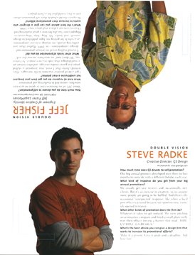
Yesterday the Self-Promotion Design Annual issue (October 2006) of the design industry publication HOW Magazine appeared in my post office box. There, on the last page of the issue, is a photo of yours truly hanging upside down. It's the "Double Vision" feature of the magazine, in which the editors ask two design professionals the same questions on a given topic. With this being an issue on self-promotion, the questions are about marketing and promotion efforts.

As subscibers began receiving their magazines it was posted on the HOW Design Forum that I was in the issue - upside down. Bryn Mooth, editor of the publication, posted "Jeff, we just HAD to put you upside down!" Yes, the HOW staff know me just a bit too well - and, I should mention in the interest of "public disclosure," I am on the HOW Editorial Advisory Board.

My responses to the questions asked include references to the fact I spend about 20% of my business time on marketing efforts, my "Toot! Toot!" press releases are an effective promotion tool, bLog-oMotives has become a major part of my self-promotion, and designers need to schedule their own promotion projects as they would any client job.

By the way, photographer Vicki Grayland got the gig to shoot my photo as a direct result of her own self-promotion efforts. For several years she sent me her "Metropolitan Refrigerator of Art worthy" marketing postcards. I posted them above my desk as a reminder of Grayland's beautiful work. When HOW needed me to suggest a photographer to take my photograph she was the first person that came to mind.

Grayland was coming down from Seattle and wondered if I had any suggestions for a location. A couple ideas didn't pan out and at the last minute I thought about the great lobby at the Art Institute of Portland - the whole facility, in the heart of Portland's Pearl District, is incredible. Having been a speaker at the school, I attempted to contact people I knew there by email and phone the day before the scheduled shoot. I was out of luck as it was a day the staff and instructors were off. So, I left a message for the school's career advisor that we were going to use the lobby for the shoot and if anyone asked I'd say he approved it. I mentioned in my voice email that I would accept any consequences later.

The photographer and I showed up in the lobby that Saturday. We told the receptionist we had permission to do a photo shoot at the school. She didn't question a thing. And then, for the couple hours we were there, not a single person (including security) ever asked what we were doing. That following Monday I got an email from my school contact suggesting that I might want to be on their professional advisory committee. Not really a bad "payback" for use of a great location.

A large number of people have commented on the shirt I'm wearing in the photo - in person, via email and on design forums. It's a Tommy Bahama that my partner Ed bought me this year on our annual vacation to St. Croix. It seems that others in the design industry think I'm very easy to find at conferences and professional gatherings when I'm sporting an item from my ever-growing tropical shirt collection.

The Self-Promotion Design Annual will soon be hitting your neighborhood newsstand. Check it out for great examples of recent promo designs, informative articles (including those written by my friends Ilise Benun and Neil Tortorella, writer Pat Matson Knapp - who wrote about my business in the past HOW articles Shedding Stress and Lost in Translation, and fellow "HOWie" Nikita Prokhorov) and other information of value to graphic design firms of any size. I probably should also mention that the "non-upside down" guy on the Double Vision page is Steve Radke, Creative Director of the firm GS Design.

...guess I'd better get to work and start "tooting!"

© 2006 Jeff Fisher LogoMotives

Mozilla Firefox logo is out standing in the field

Oregon State University helped the Mozilla Web browser company celebrate a milestone last weekend with a crop circle carved in the shape of the Mozilla Firefox logo. Students carved the logo in an oat field owned by a McMinnville, Oregon area farmer to celebrate 200 million downloads of the Mozilla Firefox browser. The university supports Firefox because it is so-called "open source" software — publicly available software that has challenged Microsoft for access to the Internet.

The "crop circle" crew included OSU senior Alex Polvi, a McMinnville High grad interning with Google in Manhattan. Polvi grew up on a farm in the Amity-Hopewell area, so his roommate suggested he might know of an appropriate field. Polvi quickly located the kind of tract the crew was searching for — a field owned by Monte Wood. The crop circle is at SE Amity Road and Lafayette Highway, southeast of McMinnville.

On Friday, using boards tied to lengths of rope, the students flattened the field according to a plan laid out on a grid. The project took 14 hours, including a marathon session that concluded Saturday morning. More information about the crop circle project can be found on the OSU Linux Users Group site - including a gallery of photos

Asa Dotzler, community coordinator for Mozilla, told the (McMinnville) News-Register newspaper that he laughed off the crop circle idea at first, but was swayed by the enthusiasm of the planners.

"That's something money can't buy," Dotzler said. "We have all these really loyal fans who do crazy antics."

OSU's Open Source Lab is the global download source for Firefox. The facility serves as a distribution, education and research center for the open-source community and receives support from Google, Red Hat, Linux and many other high-tech organizations.

Google, the Internet search company, arranged for a special satellite flyover so the 200-foot Firefox crop circle logo can be shown on Google Earth (download required), which features high-resolution photos from space.

Steven Garrity, creative director of the firm silverorange, led the Mozilla Visual Identity Team in developing the logo for Firefox. Read more about the process in his blog entry Branding Mozilla: Towards Firefox 1.0

Source: AP • Photo: Oregon State University

Calls for entries:

Upcoming design competition deadlines

All of the following competitions deadlines present great opportunities to showcase your design efforts, market your work on an international scale through the published books, and "toot!" your own horn to clients, peers and the media:

Call for Posters - Subvertisements: Approaching Logos for Protest. For more information visit the web site of The Center for the Study of Political Graphics
No entry fees

Call for Posters on Immigration - No Human Being is Illegal!: Posters on the myths and realities of the immigrant experience. For more information visit the site of The Center for the Study of Political Graphics
No entry fees

1,000 Restaurant, Bar, and Café Graphics (Rockport Publishers)
Deadline Extended: August 31, 2006
No entry fees

Creativity 36 (David E. Carter)
Deadline: September 1, 2006
Entry fees charged

HOW International Design Awards (HOW Magazine)
Deadline: September 1, 2006
Entry fees charged

1,000 Retail Graphics (Rockport Publishers)
Deadline Extended: September 15, 2006
No entry fees

Image Management and Reproduction (Rotovision)
Deadline: September 15, 2006
No entry fees

Step inside design 100 (Step inside design Magazine)
Deadline: October 2, 2006
Entry fees charged

LOGO 2007 (David E. Carter)
Deadline: October 31, 2006
Entry fees charged

You may want to read my article about participating in design industry competitions: A Winning Strategy. It has appeared on the Creative Latitude and No!Spec web sites.

Good luck!

Cultural considerations in designing the

Young Native Writer's Essay Contest logo

I recently was asked to design a logo for the Young Native Writers' Essay Contest sponsored by the Holland + Knight Charitable Foundation. The foundation, funded through contributions from the Holland + Knight law firm, its attorneys and staff - as well as external sources - underwrites a variety of education-related programs. One of those programs is the Young Native Writers' Essay Contest, which is designed to inspire honest portrayals of the richness of Native American life and history. In 2006 the writing contest was dedicated to Native American high school students within the Red Lake community in the state of Minnesota. Expansion into additional Native American communities is slated for the 2006-2007 school year.

With the upcoming expansion into other Native American communities came the desire to create an identity for the program that would convey a graphic message not limited to one Native American nation. Symbols and graphic elements specific to any one tribe would not work. My immediate thought was to incorporate an eagle feather into the design as a writing pen. Still, I wanted to know if such a graphic would be appropriate.

My friend Myra Donnelley, a Portland playwright and one of my Thursday morning "koffee klatch" buddies, works with the local Native American Youth & Family Center and the Young Native Playwrights Project. I thought she'd be able to provide some great resources.

One email to Myra put me into contact with the incredible Jeanne Givens. She's a member of the Native American Stewardship Council at the Autry National Center, Chairperson for the Institute of American Indian Arts (IAIA) in New Mexico, and a member of the Coeur d'Alene Tribe. We had a great visit and she did confirm that my idea of the eagle feather would be appropriate and non-offensive to all tribes. She did mention that the feather should be shown horizontally - which I had already planned. It was recommended that I not incorporate any other Native symbolism into the design to make it as all-inclusive as possible.

The eagle feather conveys many symbolic messages. Being half black and half white, it projects graphic imagery of daylight and darkness, peace and war, and summer and winter. Such feathers symbolize trust, honor, strength, wisdom, power, freedom and a closeness to the heavens. The symbol also conveys good luck to both the giver and receiver. The powerful image of the eagle feather is used in many ceremonial rites, and for healing purposes, by many tribes. For those reasons and more, the eagle feather seemed like the perfect graphic to represent a writing program for Native youth writing about their heritage.

A simplified eagle feather image (exhibited as a writing pen) was combined with the font Ashwood Condensed, from The Walden Font Co., and the existing foundation identity to create the logo. The earthy color was adopted from the H+K corporate color palette and I selected the purple to project the additional qualities of creativity, richness, fun, mysticism and mystery.

I sent the final design off to Angela Ruth, Executive Director of the H+K Charitable Foundation, and received a quick response that she, the Marketing Materials Manager, and others within the organization "loved it!" With the approval of the group's Native lawyer the logo was a "go." The image will be used on T-shirts for essay contest participants and on marketing/promotion materials for future years.

© 2006 Jeff Fisher LogoMotives

Jeffism #5

"To err is human; to create something positive from the situation is design.”

- Jeff Fisher (from his book "The Savvy Designer's Guide to Success")

Design studio housecleaning - excavated artifact #4

It's amazing what I find while cleaning out old files. I guess I should be pleased that I've seldom thrown anything away during my career. There, stuck in a totally unrelated file folder, was a piece of paper with couple of phone messages from sometime in 1986 when I was sharing office space with City Guide Magazine, the Seattle Men's Chorus, the Alice B. Theatre company and the Pride Foundation. The yellow paper has even more yellowed scotch tape on it and a thumb tack hole where I probably stuck it on a bulletin board at some point. The messages said "Jeff Hest called - will be at the Ritz @ 5 pm" and "Ken D. called." Jeff was one of my best buddies when I lived in Seattle, the Ritz Cafe (long since closed) was one of our favorite bars, and Ken D. (Decker - now long deceased) was a great friend and client.

The phone messages were not why I've saved the scrap of paper for about 20 years. Also on the paper were the doodles of what were to become a logo and T-shirt design.

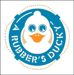
The late 80's found the U.S. dealing with the ever-growing AIDS crisis. At the time I was doing design work for a number of AIDS and health organizations in both Seattle and Portland. Part of my work involved getting safe-sex messages across to the general public. I'd been kicking around the idea of a graphic proclaiming "A Rubber's Ducky" - or, in other words, "a condom is a good thing" - for some time. Obviously, that idea manifested itself in the sketches on a message pad.

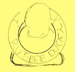
The original concept was for the traditional rubber ducky we played with as a kid to have its head sticking out of a nautical life preserver. The text "Rubber Ducky" appears in the first very rough sketch. The beginnings of what were to be the duck image, with a hint of rope, appear in the second rough.

As the design was fine-tuned, the life preserver took on the more realistic look of those on a friend's boat. The duck somehow developed the reservoir tip of a condom on the top of its head and - in the stencil type often seen on sea-going vessels - the text became "A Rubber's Ducky." The result is still one of my personal favorites in the vast collection of identities I've designed. In part, I'm sure due to the cute and clever incorporation of the serious safe-sex message. A few T-shirts were produced for friends back then. Mine has long since worn out. Perhaps it's time to produce a new batch for the current generation that might benefit from the message.

The image has kind of taken on an international life of its own. It appears in the Japanese book New Logo & Trademark Design (republished in paperback as Logo and Trademark Collection), the first book in the LogoLounge series and in the recent Spanish volume Logos from North to South America. It also was recognized with LOGO 2001 honors and, as a result was published in the book The Big Book of Logos.

The process of going through 30 years of design files is tedious and somewhat exciting. I'm cataloging and archiving all examples of my work - and certainly not throwing anything away. I'll be sharing more past projects in the future. You will also find past shared excavated artifacts in examples #1, #2, and #3.

© 2006 Jeff Fisher LogoMotives.

Creativity Awards closes book on cover "contest"

I've always been a huge fan of the design competitions conducted by David E. Carter, resulting in books such as the American Corporate Identity, The Big Book of Logos, and Creativity series. In addition to those volumes, works submitted are often considered for inclusion in other books Carter has written. Having my work included in 17 Carter books to date has been a great source of marketing and promotion of my design work

Last Thursday, I was somewhat stunned when opening an email with the subject line "Design the Creativity Cover" to find that a "contest" was being conducted to select the cover of the upcoming Creativity 36 volume. The email had the headline "Be the first on your block to design Creativity's cover." The text continued with:

"We are inviting you to show us how good the Creativity Annual covers can be. Because it is the first time, we know it is hard to resist.

There are zero entry fees, one winner and only two rules. The recognition you will receive for designing the Creativity 36 cover is immeasurable. If we have peaked (sic) your interest, click this link to creativityawards.com.

The winning design will be chosen this winter by Creativity Awards and HarperCollins, the book's international publisher. The winning designer or firm will be featured on our website and in our promotional campaign.

The Creativity Cover Competition deadline is October 15, 2006. Non-winning entries will be considered for subsequent Annuals."

As I read the email I could feel the hairs standing up on the back of my neck. I was really offended that a speculative "contest" was being conducted for such a purpose. I immediately responded with the following email:

"To whom it may concern:

I'm surprised that the Creativity Awards and Harper Collins are conducting a speculative design contest to select a cover for the Creative 36 publication. Being leading entities in the industry I would have thought both organizations would know better."

I also included the URL of the NO-SPEC! web site as a resource for more information. In addition, I brought the issue up on several online design forums for the discussion and reactions of others.

For me, the distinction between "design competition" and such "contests" is very simple. "Competitions" are conducted to evaluate and select graphic work already completed by a designer. Most so-called "contests" are requests for the creation of new work for possible review and selection - and that is "spec," or speculative, work. No designer should be asked to work for free as a condition for the chance of being selected as the "winner" or possibly being hired for future work.

Today I was surprised to receive an email from Tim Moran, the Director of Marketing for the Creativity Annual Awards. The subject line read "Creativity Cancels Cover Contest." The content of the email message was:

"Dear Creative Professionals,

Members of AIGA and several other graphic designers have expressed to Creativity Awards their disappointment over our cover contest. They have described this contest as speculative and against the profession’s code of ethics. They believe this kind of speculative work devalues graphic designers’ time, energy and creativity, all of which are crucial elements of the work we celebrate each year in the Creativity competition.

We agree.

Please accept our apology for this mistake. We are canceling the Creativity cover design contest immediately. We appreciate your caring enough to provide honest feedback to us, and will resume our policy of hiring a professional designer for this work."

I really appreciate the fact that the Creativity officials took the input of design professionals seriously in regards to this issue and re-evaluated the "contest" they were conducting. I'm impressed with the manner in which they have handled the situation. It instantly reconfirmed my faith in the professionalism of the Carter organization. I did take the time to send of a short "thank you" email to the Creativity Awards. I encourage others to do the same. You may send your messages to the attention of Tim Moran at info@creativityawards.com

Note: Thanks to No-Spec and The Zehnkatzen Times for their mentions of this blog entry.

© 2006 Jeff Fisher LogoMotives

Signing on the dotted line...

I often get email requests regarding my graphic design contract. First of all, I refer to mine as a "project agreement" - the term sounds a bit friendlier than "contract," but still shows that I mean business. I have found that my agreement has become a great "pre-qualifier" of clients. When sending out one of my promotional packets to potential clients I always include a copy of the document. Just including the agreement will show potential clients there is a seriousness to the possible business relationship.

My project agreement is created in a way that I can adapt it to the the specific requirements of a particular project. The basic document is below. Until recently it was posted on a graphic design forum site. With an overhaul of the content, the project agreement is no longer available on that site. I'm posting it here as a resource for other designers to "use and abuse."

.........................................................................................................

Client contact name:

Business name:

Address:

City/State/Country/Postal Code:

Phone/Email/Fax:

PROJECT DESCRIPTION:

(Insert your itemized description of the project here)

ESTIMATED COSTS:

__ Labor fees (design, art direction, production, copywriting, client services, etc.) are estimated at a total of $_________ or ____ see attached estimate sheet for specifications.

__ Consultation fees are estimated at a total of $ __________ or ____ see attached estimate sheet for specifications.

__ Materials costs (RC/film/neg output, scanning, project specific materials, etc.) are estimated at a total of $__________ or ___ see attached estimate sheet for specifications.

Total estimated cost of project: $____________

Project estimates are valid for 90 days from the date of estimate. Project may be reestimated if, upon receipt of all project elements, the designer determines the scope of the project has been altered dramatically from the originally agreed upon concept. Printing fees will be estimated separately and payment arrangements made between client and printer.

PAYMENT SCHEDULE:

__ A deposit in an amount equal to 35% of the total estimated cost is requested prior to execution of the project ($__________).

__ Payment in full or the remaining balance is to be paid upon delivery of the completed project. A cash discount of 5% of the total project labor and consultation cost is offered to clients paying upon delivery of the finished project.

__ Payment in full or the remaining balance is to be paid 15 days from receipt of the final invoice for the completed project. Finance charge of 1.5% per month (18% annually) on all overdue balances.

__ Additional payment arrangements:

REPRODUCTION OF WORK:

__ The client assumes full reproduction rights upon payment for completed project.

__ One time reproduction rights for the specified project, at the agreed fee, are granted to the client. Any other usage must be negotiated.

__ All reproduction rights on the copyrighted work are retained by the designer. The work may not be reproduced in any form without consent from the designer.

__ The designer retains personal rights to use the completed project and any preliminary designs for the purpose of design competitions, future publications on design, educational purposes and the marketing of the designer's business. Where applicable the client will be given any necessary credit for usage of the project elements.

REJECTION/CANCELLATION OF PROJECT:

The client shall not unreasonably withhold acceptance of, or payment for, the project. If, prior to completion of the project, the client observes any nonconformance with the design plan, the designer must be promptly notified, allowing for necessary corrections. Rejection of the completed project or cancellation during its execution will result in forfeiture of deposit and the possible billing for all additional labor or expenses to date. All elements of the project must then be returned to the designer. Any usage by the client of those design elements will result in appropriate legal action. Client shall bear all costs, expenses, and reasonable attorney's fees in any action brought to recover payment under this contract or in which (Insert your company name) may become a party by reason of this contract.

COMPLETION/DELIVERY OF PROJECT

The estimated completion date the project is ______________. Any shipping or insurance costs will be assumed by the client. Any alteration or deviation from the above specifications involving extra costs will be executed only upon approval with the client. Any delay in the completion of the project due to actions or negligence of client, unusual transportation delays, unforeseen illness, or external forces beyond the control of the designer, shall entitle the designer to extend the completion/delivery date, upon notifying the client, by the time equivalent to the period of such delay.

ACCEPTANCE OF AGREEMENT:

The above prices, specifications and conditions are hereby accepted. The designer is authorized to execute the project as outlined in this agreement. Payment will be made as proposed above.

Client's signature:

Designer's signature:

Date:

..........................................................................................................

Remember, the above is simply a guide to follow. Your own design business may have other specific issues to include in a final contract document. My agreement is kept to one page for the sake of simplicity. I would also suggest having an attorney take a look at your completed agreement prior to putting it in use.

Some additional valuable resources for project agreement/contract information include the Creative Latitude "Resources", CreativeBusiness, CreativePublic and the AIGA Design Business and Ethics web page.

Books providing excellent business advice include Business and Legal Forms for Graphic Designers, by Tad Crawford and Eva Doman Bruck (with a CD of business form templates); Graphic Artists Guild Handbook: Pricing and Ethical Guidelines; Graphic Designer’s Guide to Pricing, Estimating & Budgeting, by Theo Stephan Williams; The Business of Graphic Design, by Ed Gold; and Cameron Foote's books The Business Side of Creativity and The Creative Business Guide to Running a Graphic Design Business. Of course, The Savvy Designer's Guide to Success is a very good resource as well.

© 2006 Jeff Fisher LogoMotives

Marriage Matters.

They're committed. So are we.

We the undersigned will not stop until every American family is treated fairly, with dignity and equality under the law.

Rocky Anderson, Mayor • City of Salt Lake City, UT • Dr. Randall Bailey, Andrew W. Mellon Professor of Hebrew Bible • Interdenominational Theological Center • Julian Bond • Rev. John Boonstra, Executive Minister • Washington Association of Churches • Kate Brown, Majority Leader • Oregon State Senate • Christopher Cabaldon, Mayor • City of West Sacramento, CA • Christine Chavez • Granddaughter of Cesar Chavez • Former Political Director, United Farm Workers • Elizabeth Clark, Executive Director • National Association of Social Workers • Rev. Dr. Michael Eric Dyson, Avalon Foundation • Professor in the Humanities • University of Pennsylvania • Melissa Etheridge and Tammy Lynn Michaels • Rev. Dr. James A. Forbes, Jr., Senior Minister • The Riverside Church in the City of New York • Joe Fox, Capital District Area Labor Federation • AFL-CIO • Joe Fox, Vice President • NY State SEIU • Kim Gandy, President • National Organization for Women • Tim Gill, President • Gill Foundation • Mary Kay Henry, International Executive Vice President • SIEU • James C. Hormel • Former US Ambassador • Dolores Huerta • Co-Founder, United Farm Workers • President, Dolores Huerta Foundation for Community Organizing • Alice Huffman, President • California State Conference of NAACP • Norman Lear • Karen K. Narasaki, Executive Director • Asian American Justice Center • Ralph G. Neas, President and CEO • People For the American Way • Gavin Newsom, Mayor • City of San Francisco • Greg Nickels, Mayor • City of Seattle, WA • Tom Potter, Mayor • City of Portland, OR • Bruce Raynor, President • UNITED HERE! • Jesse Rios, Vice President • Labor Council for Latin American Advancement • Denis Rivera, President • 1199/SEIU Healthcare Workers East • Dr. Jack Rogers, Moderator • 213th General Assembly of Presbyterian Church (U.S.A.) • Anthony Romero, President • ACLU • Rev. Joan Salmon Campbell • Former Head Presbyterian Church (U.S.A.) • Founder, The Spiritual Spa and Holistic Healing Center • Bishop John Selders, Organizing Pastor • Amistad United Church of Christ • Chris Shelton, Vice President • Communications Workers of America District 1 • Ron Sims, Executive • Martin Luther King Jr. County, Washington • Rev. William Sinkford, President • Unitarian Universalist Association • Phyllis Snyder, President • National Council of Jewish Women • The Rev. John H. Thomas, General Minister and President • United Church of Christ • Urvashi Vaid and Kate Clinton • Antonio R. Villaraigosa, Mayor • City of Los Angeles • Randi Weingarten • President, United Federation of Teachers • Vice President, American Federation of Teachers • Nancy Wohlforth, International Secretary-Treasurer • Office and Professional Employees International Labor Union (OPEIU) • Rabbi Eric H. Yoffie, President • Union for Reformed Judaism

"For better or for worse." This week, that statement has special resonance. The Gay & Lesbian Alliance Against Defamation was instrumental in gaining visibility for a groundbreaking advertisement (above) that appeared in 50 newspapers across the country including the New York Times. The "Marriage Matters" ad was signed by more than 60 civil, religious, LGBT and human rights leaders who support marriage equality, and it featured same-sex couples who have been together for as long as 53 years.

On March 7, 2004 my partner Ed Cunningham and I were married in front an incredible gathering of friends and family. Our marriage was later struck down by the courts. However, in our minds, and the eyes of many more than just those attending our ceremony and reception, our marriage ceremony (and relationship of 16.5 years) was (and is) no less valid or important than that of any other couple in this country. We thank those who continue to show support to us personally, and to many other gay and lesbian couples throughout the United States. We are committed to continue to work for equal - not "special" - rights and protections for all people in this country.

For more information about the continuing issue of marriage for same-sex couples visit the web site of the Gay & Lesbian Alliance Against Defamation.