A small garden "jump start" for spring

I'm living in a construction zone. Nearly two weeks ago a landscape crew, from Joy Creek Nursery, arrived on Monday to begin the renovation of the seven-year-old garden in the front of our home. Word was that our place was to be on a garden tour this summer for a regional landscape designer association conference and some changes needed to implemented. Some major pruning took place and the lawn was totally removed. The next day it snowed five inches and the ground was frozen solid. Thankfully most of the 700+ bulbs planted in the garden haven't noticed the weather much.

Last week a contractor was here all week sheetrocking, plastering and finishing the wall in our bedroom where Ed and I had installed French doors out to our new garden in the back (which was unveiled last summer). The deck is still to built for the hot tub and cafe table. I need to get in gear and order the wood mini-blinds, paint the bedroom and reconfigure the layout of all the furniture in the room.
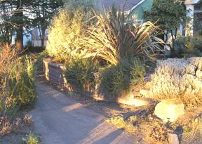
This week the Joy Creek crew is again here and all the neighbors are wondering what the hell is going on. The garden cleanup has been fairly drastic. The old, woody lavenders (which were taking over the sidewalk) have been removed and will be replaced with new plantings. A new tumbled paver patio is now being installed where the lawn once was. Large flagstone steps will connect the patio with the driveway and the steps to the sidewalk. With the mature plantings blocking the view from the street, the patio will be another great place to sit and privately visit with guests. I plan to accesorize it with large pots of plants, a couple great Adirondack chairs and a table. Unfortunately, or perhaps fortunately, we also learned that our garden will not be toured until the summer 2008 conference.

The garden in the back is getting a major cleanup as well. A sick, damaged lilac was removed. A huge, old rhododendron was taken to its new home among others in the 4.5 acres of show gardens at Joy Creek. The squirrels are ticked off because the pink dogwood has been pruned - making their jump from the garage roof to the tree to the roof of the house a bit of a challenge. In the past the route has been a squirrel highway.

The planning of Ed's outdoor kitchen area is on the fast track as the crew will be here most of next week. All the plantings have been pulled out of the area, exposing part of the house we've never seen before, and we need to formulate a plan in the next couple of days. A "parking area" needs to be designed for Ed's manly stainless steel barbeque - commonly known as "The Penis Extender." We also must consider the installation of an outdoor sink and electrical. With the new kitchen area comes the planning for additional planting beds and a garden water feature.

Over the next ten days, lots of changes will be taking place. Then, upon return from a vacation, it will be time for my gardening passion to kick it - after all, it is my job to "make things pretty." I look forward to working with the existing plants, as I add new annuals and perennials to the mix. (The previous plantings are mentioned in bLog-oMotives entries here and here.) The new additions should include some interesting plants as we continue to serve as a Joy Creek test garden. I'll post some "after" images later.

Of course, all of this work creates additional projects for me. I now need to rid the yard of all cyclone fencing, and design new gates for the side of the house and the driveway. It's always something...

© 2007 Jeff Fisher LogoMotives

Making a logo design concept your own - Part deux

In a recent bLog-oMotives entry I wrote about identity designers making logo design concepts their own through the incorporation of graphic images as letterforms. Replacing a letter of type with a graphic element is a tool I often use to make a client's logo design unique.

One recent such example is the identity I created for a friend's startup interior design business, NoBox Design. In explaining her plans for the business, the friend told me that the name referred to the fact she didn't want clients thinking "out of the box;" she wanted them to realize that there was "no box" when it came to conceptulizing interior spaces. I immediately thought of round forms, especially the rounded shapes of a 1980's Donghia chair. Back in 1984 I produced a set of two silkscreen prints making use of a Donghia-like over-stuffed chair - one of my favorite furniture shapes. (The prints were sold in Portland galleries and made an appearance as set decoration on the soap Days of Our Lives.)

The two "O" letterforms in the word "NoBox" were prefectly placed to become the round arms of the chair illustration. With my friend's first name beginning with the letter "B," I felt a stylized graphic representation of a monogrammed throw, of blanket, made an appropriate centerpiece in the design.

This past year the NoBox Design logo was recognized with a 2006 American Corporate Identity Award and it appears in the book American Corporate Identity 2007.

The identity for Black Dog Furniture Design is one of my favorite logo projects. Brett Bigham, commonly known as my "evil devil pig friend from hell," provided me with a piece of paper covered with a collection of puppy footprint drawings and sketches of his little black dog, Adobo. He wanted me to create an identity for his startup furniture business of creating new pieces from found objects and old furniture. The font Very Merry, from Fonthead Design, was my first choice to compliment the primative quality of the dog illustration. For me, replacing the letter "o" with the tail "wag marks" was a natural consideration in making the logo unusual.

From the perspective of being recognized in the design industry, the Black Dog Furniture Design logo has been one of my most successful. The logo appears in the books The Big Book of Logos 3, Letterhead and Logo Design 7, Graphically Speaking, American Corporate Identity 2003, Global Corporate Identity, PRINT's Regional Design Annual, Logo Design for Small Business 2 and Graphis Logo 6. It also received an American Graphic Design Award from Graphic Design: usa magazine.

Over the past 16 years I've designed over 100 logos for the triangle productions! theatre company in Portland. Many have involved combining graphics and type to produce a concise and unique graphic symbol. Creating the logo for the theatrical production The Dream State was such a case. In playing with the shape of the letters on my computer screen I saw that star shapes would work to replace the "A" letterforms in the words "dream" and "state." I tried a couple different fonts in making the image light and playful; settling on Circus Dog, also from Fonthead. The crescent moon image was added as an afterthought to give the logo some balance.

The Dream State identity was also recognized with an American Graphic Design Award. It is featured in the book The Big Book of Logos 4 and the Spanish volume Logos from North to South America.

Principal Mike Verbout asked me to create a logo the James John Elementary School in a effort to boost student and community pride in the institution. He'd recently had some colorful flags installed on the school structure and hoped that I could include that imagery in the design. The school is located near the historic St. Johns Bridge, a major landmark in the Portland area. In my mind I saw one of the towers from the bridge replacing the "H" in the school's name - and banners could be attached to the spires of the bridge image. The result was a design appealing to children and adults, and an image that worked well on signage, T-shirts and other promotional items.

The James John School identity was honored with an American Graphic Design Award and a Silver in the Summit Creative Awards. The logo also appears in the books The New Big Book of Logos and Logos from North to South America..

By stepping back from logo design projects, and looking at possible graphic elements as potential letterform shapes, a designer can put their personal stamp on a creative identity concept.

© 2007 Jeff Fisher LogoMotives
Artist/prankster Danny Finegood loses cancer battle

This past June I posted an entry on bLog-oMotives about my friend David Batterson writing a song celebrating art student Danny Finegood's legendary 1976 alteration of the famous Hollywood sign - making it read "Hollyweed." This past week my blog was getting numerous visits through Internet searches for "Danny Finegood" and "Daniel Finegood." Late Thursday night I learned that Finegood passed away on Monday, due to multiple myeloma, at the age of 52. The Los Angeles Times posted an updated tribute on the paper's website earlier today.

This afternoon I had a very nice email from his daughter Natalie, asking if I would post the sad news. She said that her father "was an awesome guy." In responding to her email I wrote: "From everything I've read and heard about (your father), he was a man with an incredible spirit and an individual I would have thoroughly enjoyed knowing personally."

Finegood coordinated the alteration of the Hollywood landmark three other times. Once the sign was changed to read Holywood for Easter. In 1987, during the Iran-Contra hearings, it was altered to read "Ollywood" to protest the hero worship of Marine Lt. Col. Oliver North. Another brief change was made by Finegood in 1990 when the sign read "Oil War" before police removed the plastic draping the structure.

In a 1983 letter to the Los Angeles Times, Finegood and his cohorts wrote: "We broke no laws and did no damage to the sign. An artist's role throughout history has been to create representations of the culture he exists in. By hanging four relatively small pieces of fabric on the landmark, we were able to change people's perception of the Hollywood sign."

For many, that perception will include fond memories of artist and prankster Danny Finegood. Posters of the Hollyweed image may still be ordered at Hollyweed.net. Donations may be made in Finegood's memory to the Institute for Myeloma & Bone Cancer Research, 9201 W. Sunset Blvd., Suite 300, West Hollywood, CA 90069.

© 2007 Jeff Fisher LogoMotives

'The ditch between white trash

and trailer trash is called hope'

"My momma always used to say, 'The ditch between white trash and trailer trash is called hope.'"

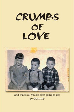
So reads a line from the book Crumbs of Love: And That's All You're Ever Going To Get, by Donnie (the pseudonym of my friend and long-time Portland client Don Horn). I want to congratulate Horn for writing and publishing his memoir, which publisher iUniverse describes as "an unforgettable story of love, betrayal, and one father’s need to always be in control."

Don Horn, a playwright and theatrical producer, has been a friend and client since I met him opening night of his first play nearly 17 years ago. Over those years I've designed over 100 logos for his triangle productions! theatre company, in addition to posters, ads, playbills, T-shirts, an occasional prop and more. I even designed a paper doll book called Dressin' With Divine for the company. A decade ago, he trusted me enough to allow me the opportunity to spend a summer directing the play Party!, with its cast of a gaggle of nude men (including Peter Paige who went on to fame as Emmett on Queer as Folk.). He has always been a great friend and for about six years we've had a Thursday morning theraputic "koffee klatch" with several others. Horn also played host for the wedding of my partner and I at his theater in 2004.

Years ago I read the rough draft of Horn's memoir. The man has led an incredibly fascinating life. I really look forward to reading the book in its final form.

Crumbs of Love is available in book form from Amazon and from iUniverse as an Adobe eBook download.

© 2007 Jeff Fisher LogoMotives
Corita Kent - artist, designer, activist - gets her due

In my college years, and after first moving to Portland in 1980, my favorite artist, graphic designer, political activist and wise woman just happened to also be a Roman Catholic nun. Corita Kent blended her faith, political beliefs, art, graphic design, typography and sometimes the headlines of the day into some of the most recognizable, and unsung, imagery of the 1960's, 1970's and early 1980's. Now, over 20 years since her death in 1986, she is getting the attention I always personally felt she deserved as a female graphic communicator in what was primarily a good old boys' club.

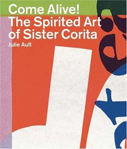
Much of the renewed interest in Corita Kent comes with the release of the book Come Alive!: The Spirited Art of Corita Kent by Julie Ault. I was thrilled to learn of the book from a recent entry at UnBeige. That blurb led me to Lorraine Wild's piece, Sister Corita: The Juiciest Tomato, at Design Observer and Mark Kingsley's Speak Up article, Corita. (This is a fascinating woman who ended up on the cover of Newsweek back in 1967.)

With the London release of Come Alive!, from Four Corners, there was an exhibit of Corita's work at the Between Bridges gallery, which got the attention of The Guardian newspaper. Nun Like Her was the Creative Review response to the exhibition and book release. The exhibit, Sister Corita: The Joyous Revolutionary is currently available for touring and I do hope it gets more exposure in the U.S. Six Corita prints are part of the exhibit DISSENT!, on display at Harvard University's Fogg Art Museum through February 28, 2007.

If I sound a bit excited about the March release of this book, I am. As a designer new to the profession in the early 80's, I received a signed Corita as a gift and was able to purchase another from a gallery that would later end up selling my own silkscreen efforts. Each morning I wake up to the graphic representation of the Corita Kent quote, "Life is a succession of moments, to live each one is to succeed." There's a bit of irony that my other Kent piece, Yes #3 (a large red heart over the word "love"), went to the other party when I got divorced in 1985.

Today the Immaculate Heart Community is the home to the Corita Art Center. The center's online presence includes an archive of Corita Kent's serigraphs and pieces for sale. The U.S. release of the book Come Alive! is currently available for pre-sale.

Update - 05.22.07: I just got the book for myself with a birthday gift card. It's an incredible resource for anyone interested in the work of Corita Kent. I would highly recommend it.

Print image © The Corita Art Center

© 2007 Jeff Fisher LogoMotives
Calls for entries:

Upcoming design competition deadlines

All of the following competitions deadlines present great opportunities to showcase your design efforts, market your work on an international scale through the published books, and "toot!" your own horn to clients, peers and the media:

Brochures from North to South America
(Index Book - Spain)
Deadline: No specific date published
No entry fees charged

Hungry Design
(Index Book - Spain)
Deadline: No specific date published
No entry fees charged

Packaging Identity
(Index Book - Spain)
Deadline: No specific date published
No entry fees charged

CA Interactive Media Design
(Communications Arts - USA)
Deadline Extended: January 26, 2007
Entry fees charged

TDC53 - Typography
(Type Directors Club - USA)
Deadline Extended: January 23, 2007
Entry fees charged

Summit Creative Awards
(Summit Awards - USA)
Deadline Extended: February 19, 2006
Entry fees charged

The Art Directors Club Annual Awards
(The Art Directors Club - USA)
Professional Deadline Extended: January 26, 2007
Student Deadline: January 31, 2007

Entry fees charged

Identity: Best of the Best 2007
(Identity Magazine - Russia)
Deadline: January 31, 2007
No entry fees charged

American Inhouse Design Awards
(Graphic Design: usa - USA)
Deadline: February 28, 2007
Entry fees charged

European Design Awards
(Europe)
Submission period: January 1 - February 28, 2007
Entry fees charged

PRINT Regional Design Annual
(PRINT Magazine - USA)
Deadline: March 1, 2007
Entry fees charged

The Best of Business Card Design 8
(Rockport Publishers - USA)
Deadline: March 1, 2007
No entry fees charged

1000 Music Graphics
(Rockport Publishers - USA)
Deadline: March 1, 2007
No entry fees charged

365: AIGA Annual 28
(AIGA - USA)
Deadline: March 2, 2007
Entry fees charged

50 Books/50 Covers
(AIGA - USA)
Deadline: March 2, 2007
Entry fees charged

CA Illustration Annual
(Communications Arts - USA)
Deadline: March 13, 2007
Entry fees charged

CA Photography Annual
(Communications Arts - USA)
Deadline: March 13, 2007
Entry fees charged

HOW Promotion Design Awards
(HOW Magazine - USA)
Deadline: March 19, 2007
Entry fees charged

LogoLounge 4
(LogoLounge - USA)
Deadline: March 31, 2007
LogoLounge membership required

HOW InHOWse Design Awards
(HOW Magazine - USA)
Deadline: April 13, 2007
Entry fees charged

Grids: 100 Creative Solutions for Designers
(Rotovision - UK)
Deadline: April 30, 2007
No entry fees charged

Print & Production Finishes for Packaging
(Rotovision - UK)
Deadline: June 30, 2007
No entry fees charged

Print & Production Finishes for Sustainable Design
(Rotovision - UK)
Deadline: June 30, 2007
No entry fees charged

Communicating with Pattern: Signs & Symbols
(Rotovision - UK)
Deadline: August 31, 2007
No entry fees charged

Squares, checks & grids
(Rotovision - UK)
Deadline: August 31, 2007
No entry fees charged

You may want to read my article about participating in design industry competitions: A Winning Strategy. It has appeared on the Creative Latitude and NO!SPEC web sites. A list of design competition links appears at the end of the article.

Design competition calendars are also available at Icograda and Workbook. DesignTaxi and Dexinger post competitions of great value to industry professionals - however designers need to be aware that some of the listings are for "spec" work as a requirement for submission. Requests for new, or speculative, work as a condition of entering a "contest" are much different than legitimate design competition "calls for entries," in which previously created works are judged for possible awards, exhibition, or publication in an annual or other book.

Good luck!

© 2007 Jeff Fisher LogoMotives

"My Kid Could Design That Restaurant Logo!"

That odd headline, from a recent entry on the New York Magazine blog Grub Street, popped up on my Internet radar this morning. When I checked out the link I was thrilled to find the work of Louise Fili (a designer whose restaurant identity work I truly admire) featured in a blurb about her designs being included in the Society of Illustrators' current exhibition at the Museum of Illustration in New York. You need to hurry if you want to see the exhibit in person as it ends on January 27th. I'd previously read about the exhibit, but had done little to check out what it was all about (I've been a little busy writing a book in recent months...).

Luckily the exhibit "Letter As Image,Image As Letter," described as "six designers reinventing lettering and creating new vocabularies of design," also has a great online presence. Check out the incredible restaurant logos by Fili - including the design for one of my favorite restaurants, The Pink Door in Seattle. The site also allows you to view the beautiful illustrative efforts of Michael Doret, Gerard Huerta, Tom Nikosey, Daniel Pelavin, and Tom White.

I'm glad that headline caught my attention this morning - although I'm now distracted checking out the work of some fascinating designers and illustrators. It's very satisfying to know that some kids do grow up to create restaurant logos the calibre of Louise Fili's work.

© 2007 Jeff Fisher LogoMotives

Sign your rights away for fame and glory

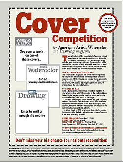
Over the past week the MyBlogLog stats for bLog-oMotives have shown a large number of visitors from Craigslist users around the United States. As I don't use the community classified ad site to promote my work I thought I would investigate a bit. In each case the Craigslist postings are to artists around the country criticizing the magazine design cover "contest" currently (?) being conducted by American Artist magazine. (To be perfectly honest, due to the conflicting dates on the website and downloadable PDF entry form, I can't tell if the "contest" is current or just on-going and the publication has not corrected the specified dates - it really doesn't alter the issue) The messages include the text of a past bLog-oMotives entry, which also appeared on the NO!SPEC site, regarding a somewhat similar arts industry situation and how it was resolved.

It annoys the hell out of me when the organization conducting the "contest" is an arts organization, design industry group, art publication, or some other related entity that should know better. The American Artist magazine cover competition is (was?) an example. While this "contest" is not necessarily a request for speculative, or "spec," work - unless, I suppose, an artist chooses to create new work specifically for submission - it does bring up the rights issues of so many "contests." In part, the "rules and regulations" state:

As consideration for being permitted to enter the contest and win a prize, you hereby grant to American Artist, its affiliates and subsidiaries and their successors and assigns, an unlimited, royalty-free license to use your name, images, and artwork in any print, electronic, or other medium now existing or developed in the future including, by not limited to, use on the www.myAmericanArtist.com website, without restriction as to the frequency or duration of usage.

That alone should be enough for any professional artist to be insulted and angry. I'd be really pissed off if I was one of those submitting artwork for consideration with the additional requirement of paying $50 per entry to sign my rights away.

I would hope that artists would contact the publication (and other entities attempting to take advantage of artists/designers in similar situations) and (to quote a favorite movie line) let them know they are "mad as hell and I'm not going to take this anymore!" now and in the future.

Note: Illustrative element from American Artist call for entries.

© 2007 Jeff Fisher LogoMotives
Building Letters Three: Tsumani Edition available

Following the devastating Indian Ocean tsumani of December 2004, many in the design and typography communities felt the need to do something to help those impacted by the natural disaster. The immediate response was the coordination of an effort by Building Letters and the Society of Typographic Aficionados (SOTA) in creating Font Aid III, a project uniting the typographic and design communities in raising funds to expedite relief efforts in the affected countries.

More than 220 designers worldwide submitted over 400 glyphs for a collaborative charity-ware typeface, Fleurons of Hope, which has since been available for a minimum donation of $20 at MyFonts. My own design (below left) was included in the Font Aid project result. In early 2005, 35 foundries donated proceeds from sales of their top-selling fonts through MyFonts for a 30-day period. More than $18,000 was raised through the Font Aid III effort.

This past fall the second phase of the project, the publication Building Letters Three: Tsunami Edition, was released at the ATypI Conference in Lisbon as part of the continuing design industry response to the tsunami. The publication includes articles by Tom de Gay, Nick Shinn, Max Kinsman, Fiona Ross, Donald Beekman, a piece on the Fleurons of Hope project, and a CD of 25 fonts by designers TomĂ¡Å¡ Brousil, David BÅ™ezina, Veronika Burian, Stefan Hattenbach, Richard Kegler, Ludmila Lorenz, JosĂ© Louis Coyotl Mixcoatl, Bram Pitoyo, Pieter van Rosmalen, JosĂ© Scaglione, JĂ¼rgen Weltlin, and Seonil Yun. The Fluerons on Hope font is also on the disk.

All proceeds from the sale of the publication go to Direct Relief International for distribution to those most in need of the continuing aid. Order your copy from the Building Letters website.

© 2007 Jeff Fisher LogoMotives
Making a logo design concept your own

In a previous bLog-oMotives entry, and Creative Latitude article, I wrote about designers creating truly unique identities. The process involves so much more than just slapping a graphic, or icon, up next to a block of text or a word. With the vast majority of my logo designs I try to envision a graphic element, appropriate to the message to be conveyed in the design, as a possible letterform representation within the name. Combining the two often results in an incredibly individual and memorable symbol to identify the client.

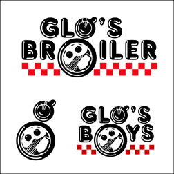
One of my personal favorites has always been the logo I designed for the Seattle breakfast establishment Glo's Broiler. It's a good example of a well thought out concept coming together with a "happy accident" to produce a strong identifying image. In designing the logo, I knew I wanted a coffee cup and plate to represent the "o" letterforms in the name. Then, as I rotated the coffee cup illustration a bit, a lower-case "g" appeared within the design.

The same treatment then worked in a secondary image for the restaurant. The owner wanted to have a complimentary logo to represent the athletic teams the eatery sponsored and the "Glo's Boys" imagery was the second "happy accident" in the branding process.

The Glo's Broiler image appears in the books Bullet-Proof Logos, Logo Design for Small Business 2 and the Japanese volume New Logo and Trademark Design (which was recently re-released as the paperback Logo and Trademark Collection).

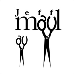
While archiving logo design work I have done over the past 30 years, I've been coming across many other projects where I have used graphic elements as substitutes for letterforms with a variety of results. One of the earliest successes was the logo design for hairstylist Jeff Maul. By just taking the time to look at hair-cutting scissors in a different way, I was able to see possible letter shapes in the holes used for fingers.

The St. Johns Window Project is a local event where North Portland artists are asked to create works of art to be displayed in the windows of area businesses. When asked to create a logo for the annual event, I immediately visualized window frames as replacements for letters in the name - before the organization's contact could even finish explaining what they hoped for in an identity. The effort received a 2003 American Graphic Design Award from Graphic Design: usa magazine.

Personal chef and caterer Jim Crabtree wanted a simple and distinctive identity for his business. In researching catering logo images, I kept coming across graphic representations of dinner plates, waiters, picnic baskets, fruits and vegetables, serving trays, bottles of wine, and other fairly common items. None of the examples gave me the impresson of being unique to the industry. Jim himself was one of the most unique aspects of his business - with his spiky hair and angular features. That's when I realized a "W," the first letter in his company name, could easily be adapted to represent a portion of a man's body. The final design resulted in many of the owner's friends and clients saying "it looks just like him."

The "What's For Dinner?" logo is also featured in the Logo Design for Small Business 2, New Logo and Trademark Design and Logo and Trademark Collection.

When tackling logo design challenges, designers should take into consideration that letterforms may resemble applicable graphic imagery - and graphic elements may be excellent replacements for particular letter shapes. By expanding on an initial concept the result may be a truly unique design solution. Other such examples will be highlighted in future bLog-oMotives entries.

© 2007 Jeff Fisher LogoMotives

Gastronomical orgasms in a pretty purple gift box

I was very flattered when I got an email from a design industry peer (you know who you are!) thanking me for my mentions and support of their design firm over the past year. I was even more surprised to read that a gift of appreciation was on its way - and that "for optimal flavor, the items should be consumed by the suggested date."

OK, now I was really curious. I anxiously awaited the "clank" of the lid of my mailbox each day. When the package arrived I opened it to a beautiful little purple folded envelope containing an even more stunning tiny purple and white self-promo piece. That envelope was sitting upon a gorgeous purple box, wrapped with a purple satin ribbon, and on top the box were the words "Vosges Haut-Chocolat." (The entire presentation was fan-frickin'-tastic!)

I honestly think I started to salivate - or perhaps I was foaming at the mouth.

I'd been told all about Vosges chocolates when in Chicago for the 2005 HOW Design Conference - and previously read some of founder Katrina Markoff's great press. However, with my crazed schedule I didn't have the time visit the Michigan Avenue boutique.

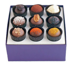
The chocolates were truly multiple orgasms in a purple gift box. I received an Exotic Truffle Collection box of amazing variety. My gift included the delectible Naga (sweet Indian curry powder, coconut and milk chocolate), Black Pearl (ginger, wasabi, dark chocolate and black sesame seeds), Absinthe (Chinese star anise, fennel, pastis, dark chocolate and cocoa powder), Ambrosia (macadamia nuts, Cointreau and white chocolate), Chef Pascal (kirsch, dark chocolate and dried Michigan cherry), Gianduia (crunchy hazelnut praline, milk chocolate and praline bits), Wink of the Rabbit (caramel milk chocolate and organic New Mexican pecan), Woolloomooloo (Australian macadamia nut,coconut and milk chocolate), and Budapest (sweet Hungarian paprika and dark chocolate). I'm drooling on my keyboard just remembering the unbelievable sensations and flavors.

I must compliment Vosges Haut-Chocolat, and their designer(s), for the beautiful packaging and company literature contained within. Additional thanks go out to the design professional who sent me the wonderful gift. It was enjoyed with many "oohs," "aahs" and assorted moans while following the "see," "lick," "snap" and "taste" instructions from the "How to eat a truffle" booklet.

I think I will follow the advice from the Vosges Haut-Chocolat website and my New year's resolution will be to "Eat Chocolate" - much more chocolate - in 2007.

© 2007 Jeff Fisher LogoMotives

The Pentagram Papers packaged and released

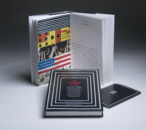
For years I've always been a big fan of the work - and writings - of the design industry powerhouse Pentagram. Since 1975 the firm has issued the Pentagram Papers, a limited edition series of booklets that examine “curious, entertaining, stimulating, provocative, and occasionally controversial points of view” related to design. Published once or twice a year, the Papers have been distributed exclusively to friends and clients. In recognition of the company's 35th anniversary, the Papers have been collected and make their public debut in a new book, The Pentagram Papers, recently released by Chronicle Books in the US, and to be followed by a February rollout from Thames & Hudson in the UK.

Each Pentagram Paper explores a unique topic of interest—from the lights of London’s famed Savoy hotel to the pop architecture of Wildwood, New Jersey; from the mailboxes of rural Australia to the classroom aids of Mexico. The Pentagram Papers includes a detailed discussion of the series’ origins, reproductions of the 35 entries so far, and tucked in the back, a complete new paper, Marks of Africa, number 36 in the series. The book was conceived and designed by Pentagram partner Kit Hinrichs.

Note: Photo courtesy of Pentagram

I'm so dizzy...but hopefully not forever

Many bLog-oMotives readers are aware of the fact that I have been dealing with vertigo since being diagnosed with an inner ear virus about two and half years ago. A couple months after having the virus I literally just fell over in the shower one morning, breaking several ribs in the process. I knew I hadn't slipped - I simply fell over.

Since that time I've had many issues with the vertigo. I have difficulty driving over bridges without feeling nauseous, heights of any kind are not my friend, and I've developed agoraphobia when it comes to being in large groups or public places where visual over-stimulation is a possibility. Watching some television shows or movies will cause me to feel ill. At times it's difficult to work while being dizzy and sitting at a computer for a number of hours. When driving and coming to a halt at a stoplight, or stop sign, I usually have the sensation that the car is still moving. Many times I've reached for the emergency brake to stop a vehicle that is actually not moving. Twice recently, while driving on the freeway, I've had panic attacks - something I had never experienced before. This condition can be somewhat debilitating at times and frustrating because, as my doctor told me, I am a very healthy sick person.

The vertigo has been controlled a bit by medications (some which have the side effect of dizziness), ear candling, and acupuncture. My love of travel has not been hampered too much by my dizziness. With motion-sickness medications I have been able to travel in cars, planes and boats. On a recent crabbing trip I was fine on the boat having taking Meclizine, but visually my brain saw the body of water standing still and the land moving. I could not focus on the horizon at all. Actually being in water is very disorienting - I sometimes can't tell which way is up - so I have avoided swimming or snorkeling.

For some this condition just disappears one day with no known or reasonable explanation. However, I recently talked to a woman who has been dealing with chronic vertigo for over 30 years. I know I don't want to lead that life.

Over that past couple years I've heard of a local doctor who has dealt with this issue successfully with many patients. This past Sunday our local newspaper, The Oregonian, had a lengthy article about Dr. John Epley and his work with those dealing with vertigo. Dr. Epley has developed a treatment, known as "The Epley Maneuvers," that repositions chalk-like particles collecting in the fluid-filled canals of the inner ear, and it seems to eliminate the false sensations of movement. Several alternative medicine professionals have suggested that perhaps the "crystals" in my inner ear need to be realigned - so this does make sense to me. Epley's own invention, the Omniax chair, is used to tilt and rotate the patient in a precise sequence of moves and the newspaper's website has a video demonstration of the equipment.

As I told my partner Ed, I'm willing to try anything at this point. Hopefully, I'll soon be able to get on the schedule for an initial consultation with the clinic to see if I qualify for the treatment. It would be so nice to no longer feel as if I was just going to fall over all the time.

© 2006 Jeff Fisher LogoMotives
Design studio housecleaning - excavated artifact #7

I'm continuing the ongoing process of going through 30+ years of files as I organize and catalog all my old graphic design files. Numerous times I have opened a folder or envelope to find an original doodle of what would eventually become a completed logo for a client.

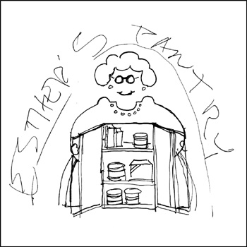
In 1995 I sketched out a rough concept for a pro bono logo for the Portland nonprofit organization Esther's Pantry. Esther’s Pantry was founded in 1985 to provide individuals living with AIDS access to food and personal care items they themselves might not be able to afford. The organization was named in memory of Chester "Esther" Brinker, one of the first people in Portland to die of complications from AIDS.

Still, my take on "Esther" was meant to cause people to smile through the suffering and pain of the continuing AIDS crisis. I saw Esther as a bit of a "flasher," opening her jacket to reveal what was on the shelves of the "pantry." The female character in the design is actually a fairly good graphic representation of my late great-grandmother Osie Saltmarsh Cantrall Norris - a Southern Oregon pioneer and one of the most incredible people in my life.

In March 2000, the pantry transferred its operation to MCC Portland (I designed their logo in 1995 as well) and I was asked to redesign the logo as a grocery bag image that I never liked much. In fact, I've never even included that design in my portfolio. It was determined that my "Esther" - used in a limited fashion for a while - was a bit glib and possibly controversial.

I was very pleased when my Esther's Pantry logo was honored in the 1995 PRINT Regional Design Annual. I still smile each time I come across the image - and I'm sure that great-grandma gets a kick out of it, too.

It's great that Esther's Pantry continues on - with, it appears, an even newer logo. Each month 150 to 200 clients are allowed to select their groceries and personal care items from well-stocked shelves, rather than being handed a pre-packed box of food.

Note: In previous bLog-oMotives entries I took a look back at excavated artifacts 1, 2, 3, 4, 5 and 6.

© 2006 Jeff Fisher LogoMotives
Having the same name can lead to

major differences in the blog-o-sphere...

With holiday gatherings, a nasty cold my partner and I seem to be sharing back and forth, previously scheduled home remodeling projects, and other commitments, I've been a bit lax about bLog-oMotives posts the past week. I've also been working behind the scenes dealing a bit with another "Jeff Fisher" from the cyber world.

Initially he started with multiple phone messages on my business voice mail stating how upset he was about my search engine rankings being higher than his - because we happen to share the same given name. The individual then began leaving messages that I must post specific Internet links on my blog to bring attention to the political and government issues he deemed important.

Several people in the design industry emailed me about some unusual online references to "Jeff Fisher," Jeff Fisher LogoMotives, bLog-oMotives, blogomotives, Creative Latitude, my "tips, trips, observations, clickety-clacks, & an occasional "toot!" along the tracks" tagline, and other references to my work or my blog. Sure, enough - the individual in question was creating new Blogger pages making use of such terms in the blog URLs and content, in an attempt to bring greater search engine attention to his personal political diatribes. Don't be surprised if you come across some odd findings in association to the terms on the Internet. No, I have not gone completely off my rocker - yet! Just thought I'd warn you what's out there.

Earlier this week the guy began posting multiple comments to various bLog-oMotives entries - totally unrelated to the topics I cover in my writings. After removing more than two dozen of his unnecessary messages and rants, I had to make the decision to monitor all future comments. I hope bLog-oMotives readers will continue to give me feedback on various topics when they wish. I apologize that it will be necessary for me to authorize the postings of comments now. Thank you for your understanding and patience.

Note: One quick reminder to those in search of new fonts - the P22 Type Foundry sale on boxed fonts ends December 31, 2006.

© 2006 Jeff Fisher Logomotives

Yazi - a great (and beautiful) holiday gift

Last weekend my partner Ed and I went to a great holiday party at the home of some friends in the small mountain community of Brightwood. A fresh, light coating of snow made the location perfect for a festive evening. One guest brought the party-givers a "hostess gift" of a bottle of Yazi - a ginger flavored vodka.

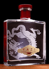
The beautiful packaging immediately caught my attention as many of the party guests "oohed" and "aahed" when the bottle was removed from the gift bag. It was passed around the room to numerous comments about the "gorgeous" and "exotic" design. The vodka is contained in an imported French bottle with rich red side panels, a shiny red neck wrap and a gorgeous dragon etching. To be honest, when what resembles an oversized perfume bottle got to me, I was surprised to see that Yazi is a product of Hood River Distillers, in Hood River, OR - located about an hour from my home studio. (I've always gotten a chuckle out of the fact the distiller is located across the street from the city's sewage treatment plant.)

Everyone at the party then wanted to taste the product. Small liqueur glasses were brought out and the "oohs" and "aahs" started up again as we all began sipping the beverage. The stuff was really good. Along with orange, lemon, cayenne and red pepper extracts, the natural ginger flavoring gives Yazi a sensual and slightly spicy taste. I wasn't surprised at all to later learn that Yazi had received a "Very Good" (85-89 points) from Wine Enthusiast Magazine.

It was interesting to read, at a variety of online resources, that Yazi was created with the female market in mind. From initial visual impressions it would appear that it was also produced for a target market of designers, and those who appreciate good design. Portland, Oregon-based Leopold Ketel & Partners created the elegant package. The design received a Gold Medal in the packaging category at the San Francisco World Spirits Competition in 2006.

I'm looking forward to trying Yazi in some mixed cocktails. Hood River Distillers has several recipes for Yazi drinks on their website.

I do think Yazi would be a great last-minute holiday gift - or the perfect "hostess gift" as you celebrate the season in the next week or so.

© 2006 Jeff Fisher LogoMotives
Milton Glaser creates Darfur poster

"What Happens in Darfur Happens to Us” is the theme of a poster recently created by legendary designer Milton Glaser. This awareness campaign will benefit the International Rescue Committee, driving people to the IRC website to learn more about Darfur, the work of the IRC around the world, and how to support the organization in efforts to deliver lifesaving aid, protect women and girls, and speak out for global action on behalf of the Sudanese people.

Glaser created the campaign to call attention to what he describes as “one of the great humanitarian crises of our time.” The poster concept takes the seemingly distant crisis and personalizes it, relating Sudanese family members being killed every day to members of our own families. The design incorporates the hand imagery from Glaser's previous "We Are All African" poster which brought conditions in Africa, and world poverty issues, into the public spotlight.

Milton Glaser is among the most celebrated graphic designers in the world. He co-founded the revolutionary Pushpin Studios in 1954, founded New York Magazine with Clay Felker in 1968, established Milton Glaser, Inc. in 1974, and teamed with Walter Bernard in 1983 to form the publication design firm WBMG. Throughout his career, Glaser has been a prolific creator of posters and prints and produced iconic designs, such as the famed “I Love NY.” The industry icon is also the author of Graphic Design and Art is Work, and co-author of The Design of Dissent.

Funded by School of Visual Arts (SVA), where Glaser has been an instructor and board member since 1961, the poster campaign currently appears on a 28 x 38 foot banner outside the SVA headquarters in New York City. It will also be present on subway platforms and the insides of 250 subway cars throughout January.

The Darfur poster can be purchased at www.miltonglaser.com. All proceeds from the sales go directly to the International Rescue Committee.

Selected sounds of the holiday season

'Tis the season. Preparations are underway for the holiday party for law firm where my partner, Ed, is employed. The event is going to be held at the beautiful Terwilliger Vista Bed & Breakfast. Live music will be provided by the local group The Rhythm Dogs. I'll be playing "corporate wife" at the event - and trying to be on my best behavior.

One of my assigned spousal duties was to select Christmas music to be played when the band is not performing. I was asked to select five to six CDs from our personal collection of over 50 holiday options.

There was no doubt of my first pick. Etta James' 12 Songs of Christmas (1996) is a must - especially for a party. That incredible voice, taking on traditional songs, is sure to be a hit.

The Sinatra Christmas Album, a compilation originally released in 1987, is a great musical gift package from "Old Blue Eyes." White Christmas (1996), from the late Rosemary Clooney, was another immediate selection. For me personally, it just wouldn't be the holidays without A Charlie Brown Christmas from the Vince Guaraldi Trio. I've been a longtime fan of The Manhattan Transfer and their release The Christmas Album (1992) has become a season classic in my home.

My final selection is also the most personal. In 1989 my friend Leslie McMichael released her CD Snowfall: Harp Solos for Christmas. Listening to it always brings back great holiday memories - especially of being in Seattle years ago and going to the Space Needle to hear Leslie perform live. In addition, Leslie (who co-founded the Vashon Island Harp School), and her significant other Marty Schafer, always celebrate the season by sending out an eagerly anticipated musical holiday card.

© 2006 Jeff Fisher Logomotives

Yikes! Suggestions for stressed out shoppers

The holidays are here! Last year many bLog-oMotives readers were thrilled when I posted my list of favorite places to shop - online and in person - for holiday gifts (and shopping year round!). I'll admit that I sometimes just slobber on my computer monitor while ogling some great products from some of the retailers. I've added some new suggestions this year:

Archie McPhee - Seattle WA • auto - New York NY • BabyStyle.comBad Byron's Butt Rub - Santa Rosa Beach FL • Bay View Farm Coffees - Kona HI • Blue Raccoon - New Hope PA • Cafe Du Monde - New Orleans LA • CD Baby - Portland, OR • Chef's CatalogChocolate Flower Farm - Langley WA • Chronicle Books - San Francisco CA • Clos du Val Wine Company - Napa CA • Coffee, Tea & Spice - Talihina OK • Cork - A bottle shop - Portland OR • Cornucopia - Napa CA • Cry Baby RanchDespair, Inc.Desperado - Portland, OR • Dippy Chick Company - Kingston NH eCookbooks.com - Newton Highlands MA • Eleni's Cookies - Long Island NY • Erath Vineyards - Dundee OR • Elephant Dung PaperFireworks - Seattle WA • Fitzsu.comFlax Art & Design - San Francisco, CA • Garnet HillGeribi Ceramics - Deruta, Italy • Hip CHICKS do Wine - Portland OR • In Good Taste - Portland OR • Inky Lips PressJ Peterman Company - Lexington KY • J.K. Carriere Wines - Newberg OR • Jacqui Naylor - San Francisco, CA • Joy Creek Nursery - Scappoose OR • Kenspeckle Letterpress - Duluth MN • Keyboard-Characters - Salem OR • Laughing Elephant - Seattle WA • Lime GreenPatina - Minneapolis MN • Peter Miller Books - Seattle WA • Mitchell Larsen Studio - Christiansted, St. Croix • Mobile State of Grace, Inc.MoMAstore - New York NY • Moonstruck Fine Chocolate - Portland, OR • MossMXYPLYZYK - New York NY • New Dimension Seed - Scappoose OR • New Seasons Markets (great gift sections!) - Portland, OR • Oakville Grocery - Oakville CA • Oblation Papers & Press - Portland OR • Office - Portland OR • Powell's Books - Portland OR • Raindogs - Yachats OR • Rogue Creamery - Central Point OR • Ravenna Gardens - Seattle WA • Red EnvelopeRejuvenation - Portland, OR • SFMOMA MuseumStore - San Francisco CA • The Spoon Sisters - New York NY • Square Deal Wine Company - Portland, OR • Stonewall Kitchens - York ME • Sundance - Sundance UT • Sur La Table - Seattle WA • Ten Thousand VillagesTerritory AheadThe Conran ShopThe Hard-To-Find GrocerThe Monkey & The Rat - Portland OR • The Museum Shop of The Art Institute - Chicago IL • Twig and Fig - Berkeley CA • Uncommon GoodsWipe Your Tush With Bush - Portland OR

Happy shopping!

© 2006 Jeff Fisher LogoMotives

Bibendum: "Puffed up and provocative"

I've always loved advertising characters. In fact, I have a collection of over 200 advertising figures in my home studio. Bob's Big Boy hangs out on my desk with Toucan Sam, Sprout, Mr. Bubble, Cap'n Crunch and Chinese versions of Tony the Tiger. Colonel Sanders, Marky Maypo, the Trix Rabbit, Frankenberry, Sleepy, Snap, Crackle, Pop, Tillie the Tillamook cow, and many others look on from around the room. With the increasing value of the growing collection, I somewhat jokingly refer to it as "my retirement fund."

One of my favorites has always been Bibendum, better known to most as "the Michelin Man." As a kid, I remember seeing him on billboards, in the form of large roadside statues, and even sitting on an ashtray at my grandparents' house. He stands tall (and in other forms) among all the characters in my studio gathering.

Recently, with the popularity of the traveling exhibition “Nunc est Bibendum, An Iconographic Legend Since 1898,” Bibendum has been getting a lot of international news coverage. The exhibit is currently at the Conde Duque Museo Municipal de Arte Contemporaneo in Madrid until January 14, 2007. Additional locations in Europe, and eventually the United States and Japan, will be announced in the future. Michelin has a fun, abbreviated version of the exhibition on their corporate website.

The Michelin Man was first created in 1898 by French entrepreneurs AndrĂ© and Edouard Michelin in cooperation with the artist O’Galop (pseudonym of Marius Rossillon). Edouard noticed how a display of tires, stacked one on top of the other at an exhibition in Lyon, resembled the shape of a portly restaurant reviewer he knew. He told his brother Andre, who commissioned O'Galop to recreate Edouard's vision. The new character appeared in a 1898 poster showing him offering a toast, "Nunc est bibendum" (“It’s time to drink,”- or "Cheers" - in Latin), to his competitors with a glass full of highway dangers such as jagged glass. Nearly 100 years later, in 2000, Bibendum was selected as the "most recognized corporate symbol" by an international panel at the Financial Times.

Hopefully I will be able to see the exhibition in person at some location in Europe or when it comes to the U.S. I'll post any exhibit location updates in future bLog-oMotives entries.

One of my own Bibendums (in the photo above) is a 1980-81 French representation of a slim and trim Michelin Man. There's even an entire book about such Michelin items: The Michelin Man: An Unauthorized Advertising Showcase. I'll introduce you to some of my other advertising "friends" later. For more information about iconic advertising characters you might want to take a look at the books Meet Mr. Product: The Art of the Advertising Character or What a Character: 20th Century American Advertising Icons

© 2006 Jeff Fisher LogoMotives.

P22 type and the logo designer

In a recent bLog-oMotives entry I mentioned that the P22 Type Foundry was altering their pricing structure - and having a sale on their current boxed sets. The sale ends on December 31st. The font selections of P22 are based in letterform designs used throughout history. Over the years, often when needing type representative of a specific historic era, the company has been a great resource of appropriate type for my logo design projects.

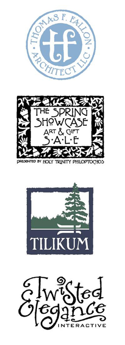
When architect Thomas Fallon was seeking an identity for his firm, he explained that much of his residential home design was reflective of the Arts & Craft era. I immediately felt that P22 would be a possible resource for type to be used in any designs. I was drawn to the unique letterforms of the font Dard Hunter for use on his logo text. In fact, to create the icon in the center of his logo, I combined elements from a lowercase Dard Hunter "t" to create an image representing the initials "t" and "f." Additional research lead to the subtle blue color being selected as representative of the time and Arts & Craft stylings.

The Fallon identity received an American Corporate Identity 21 honor and appears in the book American Corporate Identity 2006 as a result. It is also in the volume Logo Design for Small Business 2.

Another P22 font, Terracotta, was used in designing the event identity for The Spring Showcase Art & Gift Sale for Portland's Greek Orthodox Church. Organizers of the annual event, the Holy Trinity Philoptochos, desired a somewhat classic-looking logo that would work well for flyers, ads, notecards and other promotion items. The frame of the logo was inspired by an old floral graphic I had seen in a book of wallpaper patterns. Again, P22 seemed like the perfect place to find a typeface complimentary to the art elements. The typeface, and graphic elements, also worked well with the architecture and interior of the beautiful church.

A long-time client, George Fox University, contacted me a couple years ago to redesign the identity for their Tilikum Center for Retreats & Outdoor Ministries. The center includes 92 acres of green meadows, quiet lake waters, and wooded hiking trails. The previous logo was a somewhat free-from shape and did not work well in some applications. A more concise identity, still conveying the serenity and beauty of the retreat location, was desired. The P22 font Pan-Am worked very well with the stylized organic frame created for the new logo image.

Although not using one of the P22 fonts that are historically inspired, the identity for Jason Holland's Twisted Elegance Interactive does make use of a font selection from the company's International House of Fonts. The typeface Bramble was selected to convey a sense of elegance - with a bit of twist.

The Twisted Elegance logo was recognized by P22's Fonts-In-Use competition in March 2005. It was also recognized with an American Corporate Identity 22 award and is included in the new book American Corporate Identity 2007.

P22 also has a variety of other font selections in addition to the International House of Fonts. Be sure to check out the offerings of the Langston Type Company, the Rimmer Type Foundry and the Sherwood Type Collection All offer excellent type suggestions for logo designer.

© 2006 Jeff Fisher LogoMotives
Calls for entries:

Upcoming design competition deadlines

All of the following competitions deadlines present great opportunities to showcase your design efforts, market your work on an international scale through the published books, and "toot!" your own horn to clients, peers and the media:

I.D. Annual Design Review
(I.D. Magazine - USA)
Deadline: Entries accepted until December 15, 2006
Entry fees charged - late fees now apply

American Corporate Identity
(David E. Carter - USA)
Deadline: Entries accepted until December 18, 2006
Entry fees charged - late fees now apply

Photoshop User Awards
(National Association of Photoshop Professionals - USA)
Deadline: December 31, 2006
Entry fees charged

Brochures from North to South America
(Index Book - Spain)
Deadline: No specific date published
No entry fees charged

Hungry Design
(Index Book - Spain)
Deadline: No specific date published
No entry fees charged

Packaging Identity
(Index Book - Spain)
Deadline: No specific date published
No entry fees charged

Instant Graphics
(Rotovision - UK)
Deadline Extended: January 5, 2007
No entry fees charged

CA Interactive Media Design
(Communications Arts - USA)
Deadline: January 12, 2007
Entry fees charged

TDC53 - Typography
(Type Directors Club - USA)
Deadline: January 12, 2007
Entry fees charged

Letterhead and Logo Design 10
(Rockport Publishers - USA)
Deadline Extended: January 15, 2007
No entry fees charged

Summit Creative Awards
(Summit Awards - USA)
Deadline: January 29, 2007
Entry fees charged

The Art Directors Club Annual Awards
(The Art Directors Club - USA)
Professional Deadline: January 19, 2007
Student Deadline: January 31, 2007

Entry fees charged

Identity: Best of the Best 2007
(Identity Magazine - Russia)
Deadline: January 31, 2007
No entry fees charged

European Design Awards
(Europe)
Submission period: January 1 - February 28, 2007
Entry fees charged

PRINT Regional Design Annual
(PRINT Magazine - USA)
Deadline: March 1, 2007
Entry fees charged

HOW Promotion Design Awards
(HOW Magazine - USA)
Deadline: March 19, 2007
Entry fees charged

HOW InHOWse Design Awards
(HOW Magazine - USA)
Deadline: April 13, 2007
Entry fees charged

LogoLounge 4
(LogoLounge - USA)
Deadline: March 31, 2007
LogoLounge membership required

You may want to read my article about participating in design industry competitions: A Winning Strategy. It has appeared on the Creative Latitude and NO!SPEC web sites. A list of design competition links appears at the end of the article.

Design competition calendars are also available at Icograda and Workbook. DesignTaxi and Dexinger post competitions of great value to industry professionals - however designers need to be aware that some of the listings are for "spec" work as a requirement for submission. Requests for new, or speculative, work as a condition of entering a "contest" are much different than legitimate design competition "calls for entries," in which previously created works are judged for possible awards, exhibition, or publication in an annual or other book.

Good luck!

© 2006 Jeff Fisher LogoMotives

PRINT offers 10-year design retrospective on DVD

Now you can have immediate access to ten years' worth of PRINT Regional Design Annual winners, online and on DVD. All of the 16,000+ winners—hand-picked by PRINT editors—are organized into easily searchable categories, including Identity/Stationery, Self-Promotion, Posters, Packaging, Ads, Editorial Design, Environmental Graphics, Photography, Illustration, Invitations/Announcements, Annual Reports and Outdoor Ads.

This design resource is currently available online for $49.95 (plus $3.99 shipping & handling) — a savings of 33% off the suggested retail price. The purchase includes a DVD as well as a full year (12 months) of access to the Regional Design Annual website, both of which allow you to search and view the past ten year's Regional Design Annual winners.

Quite a few of my own designs were recognized by PRINT over the years, including logos for food bank Esther's Pantry, the "Fat Men in Skirts," hairstylist Jeff Maul, theatre venue Main Street Playhouse and the Samuels Yoelin law firm. The identities for writer Kimberly Webster, Jeff Fisher LogoMotives, and Black Dog Furniture Design have also been featured in the annual. A few of the designs also appeared in the resulting late, great PRINT's Best Logo & Symbols series of books.

Hmmm...I just realized, for the first time, that all but one of the images selected for inclusion over the years has been a one-color design.

A few years ago, when I noticed the annual was exhibiting less and less of a focus on logo design, I quit submitting entries for consideration. I do think it is unfortunate that identity design has been given less exposure in recent editions.

Those wishing to submit designs for the upcoming PRINT Regional Design Annual need to do so by March 1, 2007. Entry forms and details are available on the PRINT website.

© 2006 Jeff Fisher LogoMotives

Client gift-giving: The good and the gaffes

"As the song goes, it's 'the most wonderful time of the year,' but for many the holiday season is also the most stressful. If you're a freelancer, you might spend more time racking your brain for client gift ideas than roasting chestnuts over an open fire. While shopping for family and friends can happily be postponed, coming up with the perfect way to say "thank-you" to your customers - especially on a budget - is a challenge that requires planning."

So begins the article, Client gift-giving: The good and the gaffes on The Creative Group eZine. TCG eZine interviewed author and marketing mentor Ilise Benun, and yours truly, about client (and vendor) gift ideas for the piece that was originally posted a few years ago. The advice holds true today as the holiday season quickly sneaks up on us all.

© 2006 Jeff Fisher LogoMotives

UCDA designer poster auction under way on eBay

The University & College Designers Association (UCDA) is currently conducting an eBay auction of designer posters. Most of the posters are signed by the designer. All proceeds from the auction will benefit the UCDA Foundation which supports scholarships and programming and helps elevate the image of designers and design educators in education.

The current auction items include:

Spring Poster (signed), by Michael Manwaring

Summer Poster (signed), by Michael Manwaring

Winter Poster (signed), by Michael Manwaring

Wolfgang Weingart: Misc. Thoughts on Typography Poster (signed), by Chris Pullman

Wine Graphics Letterpress Poster (signed), by Mo Lebowitz

Earth Day 1990 Poster (signed), by Seymour Chwast

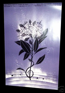
Mountain Laurels Poster (signed), by Lanny Sommese

Seasons Greetings Double-sided Vintage Postcard Poster (signed), by Deborah Sussman

Ohio Arts Council Grants in Design Arts Poster (signed), by Gordon Salchow

Fish Gulfstream Poster, Savage Design Group; Illustration by: Jack Unruh

Cooperstown Chamber Music Festival 2006 Poster, by Milton Glaser

Holocaust Museum Poster (Ten Years: Remembrance.), by Milton Glaser

Illustration: Mountain Laurels Poster, by Lanny Sommese

(Hey, they may have spelled my last name wrong - but I'm thrilled that UnBeige picked this entry up and mentioned it in their graphic design category on Monday. Hopefully more creative types will participate in the bidding.)

© 2006 Jeff Fisher LogoMotives
World AIDS Day 2006:

A day of reflection and a call to action


Just over 25 years ago a small article in The New York Times reported the outbreak of a rare "cancer" among 41 gay men in New York and California. No one could have predicted the impact that news item would eventually have on the world.

Today, an estimated 22-25 million men, women and children have died of AIDS or AIDS-related illnesses, and an estimated 40 million individuals are living with HIV. AIDS impacts people of all ethnicities, ages, genders and sexual orientations. AIDS is devasting generations in Africa. The United Nations AIDS agency estimates that India has the largest caseload for a single country with 5.7 million individuals infected with HIV. AIDS continues to impact Americans in huge numbers.

World AIDS Day, December 1st, is a time for all people worldwide to unite in the ongoing fight against AIDS. It is up to all of us to stop the spread of HIV - and prejudice - through education, prevention programs, assisting in the care of those with HIV/AIDS, and doing what we can to help find a cure. World AIDS Day also offers a time to reflect on the personal impact of AIDS in our lives.

In December 1985 I got the news that one of my best friends had AIDS - one of the earliest cases in Oregon. Still, I was not prepared for what was to come. Over the next decade so many people I knew died of AIDS, including my college roommate, a fraternity brother, teachers, friends, clients, vendors, neighbors, other roommates, a distant cousin and others. I literally lost count as the number of people I personally knew who died from AIDS neared 100. My cousin, promising playwright and director Bradford O'Neil, was HIV-positive and committed suicide after caring for his partner until his death. This past year my best friend, Brad Hall, - who was diagnosed HIV-positive many years ago - died from what had extended his life. The "cocktail" of medications he'd taken for quite some time destroyed his liver and he did not live to get a proposed transplant. I've thought about many of these individuals with recent AIDS, and World AIDS Day, news.

As "creative types" - designers, photographers, writers and others - we are in a unique position to take action in the ongoing battle against AIDS. It's hard to believe that it has been 20 years since I first started doing design work related to HIV and AIDS. The projects have included logos for AIDS Walks, fundraising events, AIDS organizations, theatrical presentations about AIDS, a food bank for people with HIV, hospices and related clients. I've also created posters, newsletters, banners, ads, education booklets and other collateral items used in informing the public about the prevention of AIDS and the care of those with HIV.

I encourage - or challenge - others in the creative professions to do the same. Contact your local AIDS organizations, health departments, hospices and related groups to offer your services as a designer, photographer, writer, or even as person with some time to donate in providing any service needed.

The following resources may be helpful in locating organizations needing your assistance:

amFARKnowHIVAIDS.orgMTV/Staying AliveUNAIDSBill & Melinda Gates FoundationClinton Foundation HIV/AIDS InitiativeThe Elizabeth Glaser Pediatric AIDS FoundationDesigners Without BordersONEWe All Have AIDSWorldAIDSDay.orgBroadway Cares/Equity Fights AIDSDoctors Without BordersGuideStarDesign for Social ImpactAIDS Healthcare Foundation

© 2006 Jeff Fisher LogoMotives